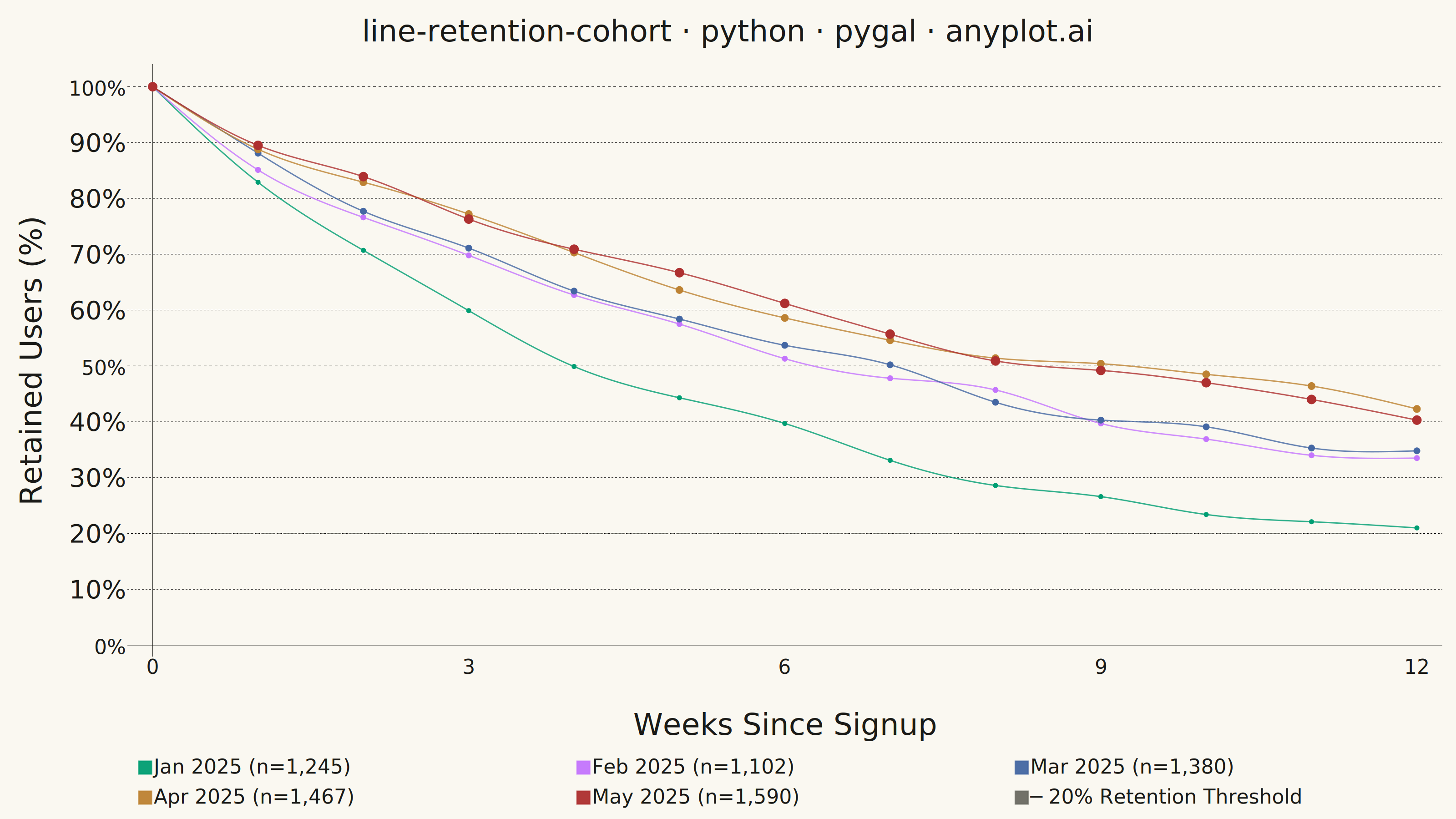
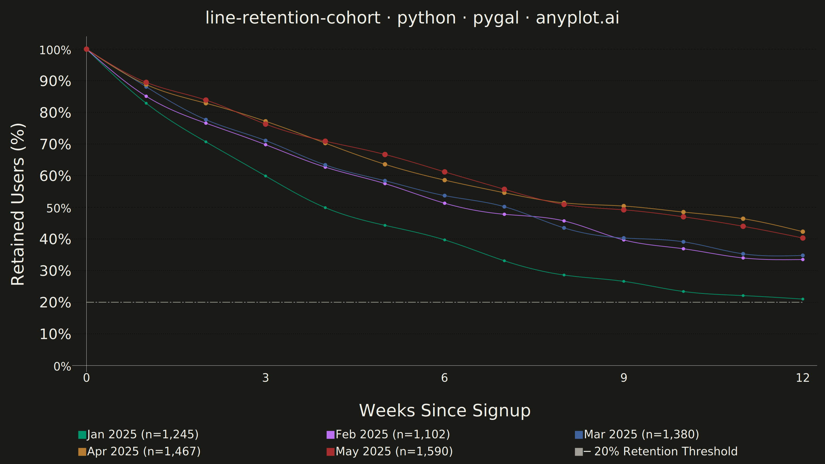
A line chart showing the percentage of retained users over time since signup, with separate curves for different cohorts. All curves start at 100% at time zero and typically exhibit exponential decay, revealing how well a product retains users over their lifecycle. By overlaying multiple cohorts, teams can visually compare whether retention is improving or degrading across signup periods.
""" anyplot.ai
line-retention-cohort: User Retention Curve by Cohort
Library: pygal 3.1.3 | Python 3.13.14
Quality: 86/100 | Updated: 2026-06-20
"""

import os
import sys


# Script filename shadows the installed `pygal` package when run as `python pygal.py`;
# dropping the script directory from sys.path lets the real package resolve.
sys.path.pop(0)

import numpy as np
import pygal
from pygal.style import Style


# Theme tokens — Imprint palette chrome
THEME = os.getenv("ANYPLOT_THEME", "light")
PAGE_BG = "#FAF8F1" if THEME == "light" else "#1A1A17"
INK = "#1A1A17" if THEME == "light" else "#F0EFE8"
INK_MUTED = "#6B6A63" if THEME == "light" else "#A8A79F"

# Imprint categorical palette — canonical order, position 1 = brand green
IMPRINT_PALETTE = ("#009E73", "#C475FD", "#4467A3", "#BD8233", "#AE3030", "#2ABCCD", "#954477", "#99B314")
# 5 cohort series use positions 1-5; threshold reference line gets muted neutral
SERIES_COLORS = IMPRINT_PALETTE[:5] + (INK_MUTED,)

# Data — Monthly signup cohorts tracked weekly for 12 weeks
np.random.seed(42)

cohorts = {
    "Jan 2025": {"size": 1245, "decay": 0.18},
    "Feb 2025": {"size": 1102, "decay": 0.16},
    "Mar 2025": {"size": 1380, "decay": 0.14},
    "Apr 2025": {"size": 1467, "decay": 0.12},
    "May 2025": {"size": 1590, "decay": 0.11},
}

weeks = list(range(13))
retention_data = {}
for cohort, params in cohorts.items():
    retention = [100.0]
    for week in range(1, 13):
        noise = np.random.normal(0, 1.5)
        prev = retention[-1]
        drop = prev * params["decay"] * (1 / (1 + 0.1 * week)) + noise
        retention.append(max(round(prev - max(drop, 0.5), 1), 5.0))
    retention_data[cohort] = retention

# Title — 51 chars, within 67-char baseline so no font scaling needed
title = "line-retention-cohort · python · pygal · anyplot.ai"

# Style — theme-adaptive Imprint palette tokens
custom_style = Style(
    background=PAGE_BG,
    plot_background=PAGE_BG,
    foreground=INK,
    foreground_strong=INK,
    foreground_subtle=INK_MUTED,
    colors=SERIES_COLORS,
    title_font_size=66,
    label_font_size=56,
    major_label_font_size=44,
    legend_font_size=44,
    value_font_size=36,
    opacity=".95",
    opacity_hover="1",
    stroke_width=3,
    font_family="'Segoe UI', 'Helvetica Neue', Arial, sans-serif",
    title_font_family="'Segoe UI', 'Helvetica Neue', Arial, sans-serif",
    legend_font_family="'Segoe UI', 'Helvetica Neue', Arial, sans-serif",
    label_font_family="'Segoe UI', 'Helvetica Neue', Arial, sans-serif",
    major_label_font_family="'Segoe UI', 'Helvetica Neue', Arial, sans-serif",
    value_font_family="'Segoe UI', 'Helvetica Neue', Arial, sans-serif",
)

# Plot
chart = pygal.Line(
    width=3200,
    height=1800,
    title=title,
    x_title="Weeks Since Signup",
    y_title="Retained Users (%)",
    style=custom_style,
    show_dots=True,
    dots_size=6,
    stroke_style={"width": 4},
    show_y_guides=True,
    show_x_guides=False,
    legend_at_bottom=True,
    legend_at_bottom_columns=3,
    legend_box_size=28,
    truncate_legend=-1,
    range=(0, 102),
    x_label_rotation=0,
    value_formatter=lambda x: f"{x:.0f}%" if x is not None else "",
    tooltip_fancy_mode=True,
    tooltip_border_radius=8,
    interpolate="cubic",
    show_minor_x_labels=False,
    y_labels=[0, 10, 20, 30, 40, 50, 60, 70, 80, 90, 100],
    margin_top=50,
    margin_bottom=50,
    margin_left=30,
    margin_right=30,
    spacing=25,
    print_values=False,
    dynamic_print_values=True,
    no_data_text="No data available",
)

chart.x_labels = [str(w) for w in weeks]
chart.x_labels_major = ["0", "3", "6", "9", "12"]

# Add cohorts: oldest=thinnest/smaller dots, newest=thickest/larger for visual emphasis
stroke_widths = [4, 5, 6, 7, 8.5]
dot_sizes = [5, 6, 7, 8, 10]
cohort_list = list(cohorts.items())

for i, (cohort, params) in enumerate(cohort_list):
    label = f"{cohort} (n={params['size']:,})"
    values = retention_data[cohort]
    chart.add(
        label,
        [
            {"value": v, "label": f"Week {w}: {v:.1f}% retained ({int(params['size'] * v / 100):,} users)"}
            for w, v in zip(weeks, values, strict=True)
        ],
        stroke_style={"width": stroke_widths[i], "linecap": "round", "linejoin": "round"},
        dots_size=dot_sizes[i],
        allow_interruptions=False,
    )

# Reference threshold at 20% retention (gets muted neutral — 6th color in SERIES_COLORS)
# Dash-dot pattern "28, 8, 4, 8" is visually distinct from pygal's Y-guide dashes in light mode
chart.add(
    "─ 20% Retention Threshold",
    [{"value": 20.0, "label": "Target: 20% retention benchmark"}] * len(weeks),
    stroke_style={"width": 5.5, "dasharray": "28, 8, 4, 8", "linecap": "round"},
    show_dots=False,
    dots_size=0,
    allow_interruptions=False,
)

# Save PNG and interactive HTML
chart.render_to_png(f"plot-{THEME}.png")
with open(f"plot-{THEME}.html", "wb") as f:
    f.write(chart.render())
Runnable source as JSON, for any HTTP client: https://api.anyplot.ai/specs/line-retention-cohort/pygal/code. Any spec id and library id listed in llms-full.txt fit the same URL shape; every URL below is complete and callable.
{
  "spec_id": "line-retention-cohort",
  "language": "python",
  "library": "pygal",
  "page": "https://anyplot.ai/line-retention-cohort/python/pygal",
  "hub": "https://anyplot.ai/line-retention-cohort",
  "code_json": "https://api.anyplot.ai/specs/line-retention-cohort/pygal/code",
  "spec_json": "https://api.anyplot.ai/specs/line-retention-cohort",
  "render_light_png": "https://storage.googleapis.com/anyplot-images/plots/line-retention-cohort/python/pygal/plot-light.png",
  "render_dark_png": "https://storage.googleapis.com/anyplot-images/plots/line-retention-cohort/python/pygal/plot-dark.png",
  "interactive_light_html": "https://storage.googleapis.com/anyplot-images/plots/line-retention-cohort/python/pygal/plot-light.html",
  "interactive_dark_html": "https://storage.googleapis.com/anyplot-images/plots/line-retention-cohort/python/pygal/plot-dark.html",
  "quality_score": 86.0,
  "license": "MIT",
  "guide": "https://anyplot.ai/llms.txt"
}
Part of User Retention Curve by Cohort on anyplot.ai.