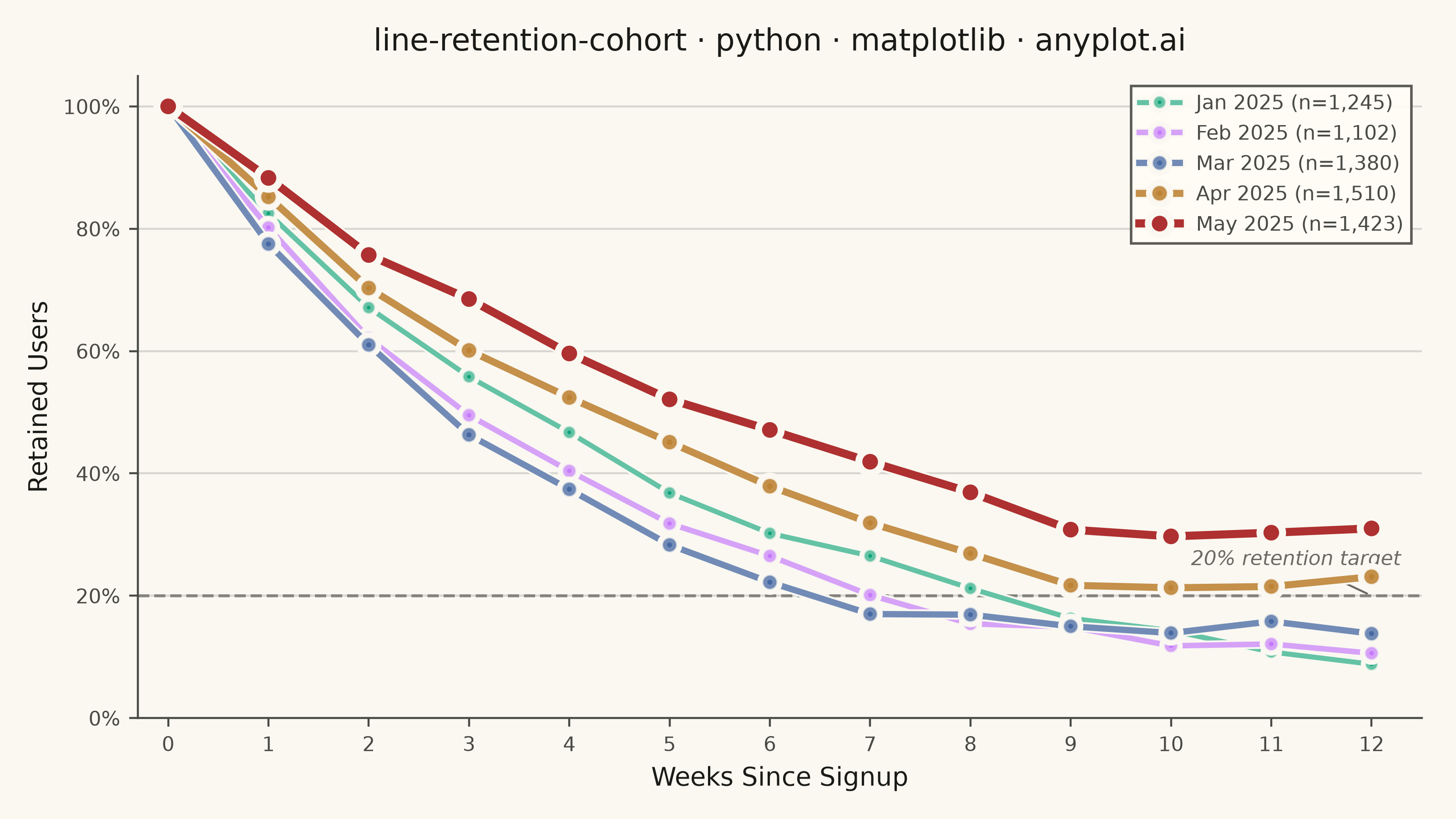
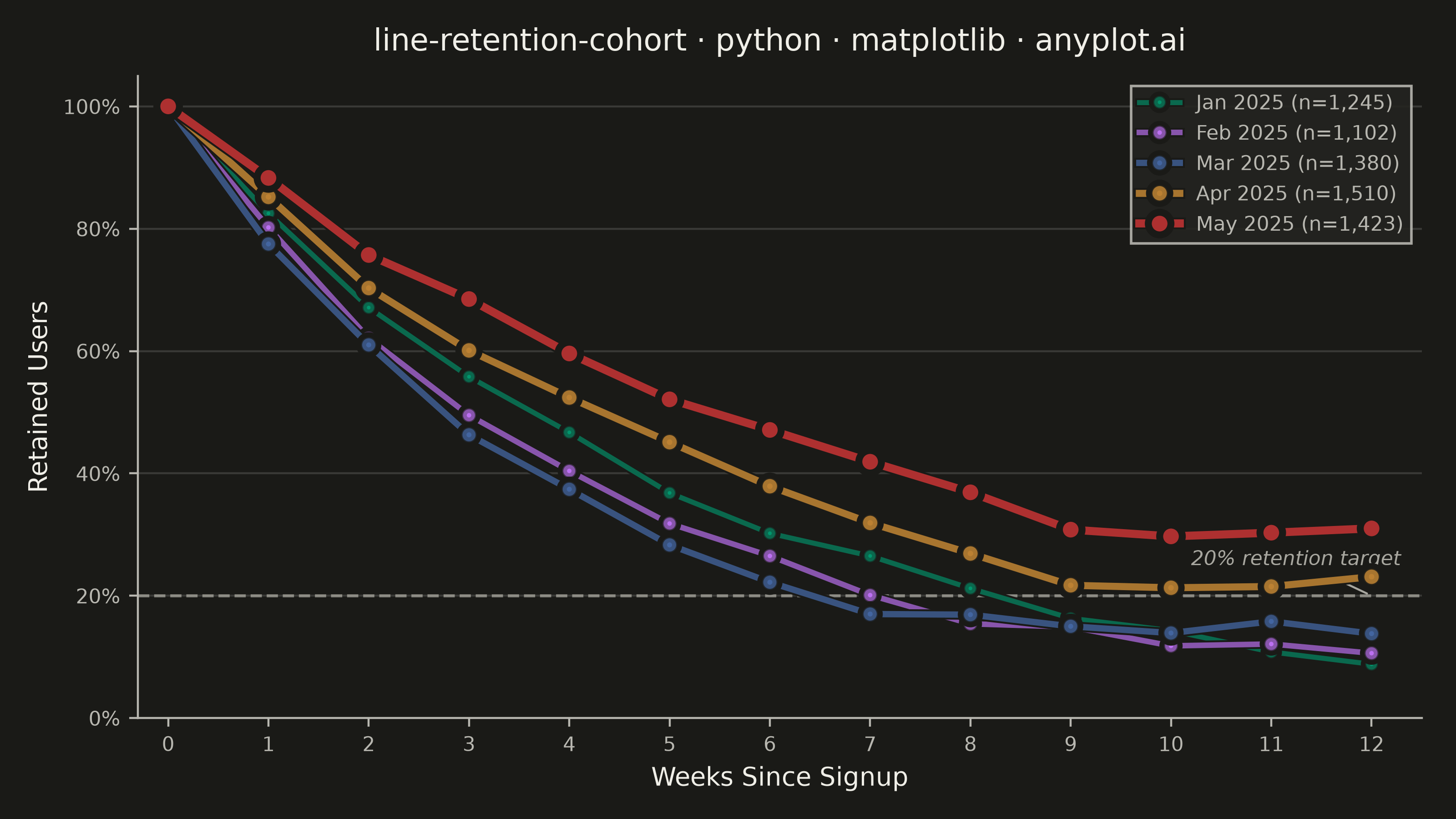
A line chart showing the percentage of retained users over time since signup, with separate curves for different cohorts. All curves start at 100% at time zero and typically exhibit exponential decay, revealing how well a product retains users over their lifecycle. By overlaying multiple cohorts, teams can visually compare whether retention is improving or degrading across signup periods.
""" anyplot.ai
line-retention-cohort: User Retention Curve by Cohort
Library: matplotlib 3.11.0 | Python 3.13.14
Quality: 90/100 | Updated: 2026-06-20
"""

import os
import sys


# Prevent this file (matplotlib.py) from shadowing the matplotlib package
_d = os.path.dirname(os.path.abspath(__file__))
while _d in sys.path:
    sys.path.remove(_d)

import matplotlib.patheffects as pe
import matplotlib.pyplot as plt
import matplotlib.ticker as mticker
import numpy as np


# Theme tokens — Imprint palette, theme-adaptive chrome
THEME = os.getenv("ANYPLOT_THEME", "light")
PAGE_BG = "#FAF8F1" if THEME == "light" else "#1A1A17"
ELEVATED_BG = "#FFFDF6" if THEME == "light" else "#242420"
INK = "#1A1A17" if THEME == "light" else "#F0EFE8"
INK_SOFT = "#4A4A44" if THEME == "light" else "#B8B7B0"
INK_MUTED = "#6B6A63" if THEME == "light" else "#A8A79F"

# Imprint categorical palette — positions 1→5 in canonical order
IMPRINT_PALETTE = ["#009E73", "#C475FD", "#4467A3", "#BD8233", "#AE3030"]

# Data
np.random.seed(42)

cohorts = {
    "Jan 2025": {"size": 1245, "base_rate": 0.82, "plateau": 8},
    "Feb 2025": {"size": 1102, "base_rate": 0.80, "plateau": 12},
    "Mar 2025": {"size": 1380, "base_rate": 0.78, "plateau": 15},
    "Apr 2025": {"size": 1510, "base_rate": 0.85, "plateau": 22},
    "May 2025": {"size": 1423, "base_rate": 0.88, "plateau": 30},
}

weeks = np.arange(0, 13)

retention_data = {}
for cohort, info in cohorts.items():
    retention = [100.0]
    for week in weeks[1:]:
        decay = info["base_rate"] ** week * 100
        plateau = info["plateau"]
        value = max(decay, plateau) + np.random.normal(0, 1.0)
        value = max(value, plateau - 2)
        retention.append(round(value, 1))
    retention_data[cohort] = retention

# Plot — landscape 3200×1800 (figsize=(8,4.5) × dpi=400)
title = "line-retention-cohort · python · matplotlib · anyplot.ai"
n = len(title)
title_fontsize = max(8, round(12 * 67 / n)) if n > 67 else 12

fig, ax = plt.subplots(figsize=(8, 4.5), dpi=400, facecolor=PAGE_BG)
ax.set_facecolor(PAGE_BG)

# Graduated styling: older cohorts thinner and more transparent to emphasise recent ones
linewidths = [2.0, 2.2, 2.5, 2.8, 3.2]
alphas = [0.60, 0.65, 0.75, 0.88, 1.0]
marker_sizes = [5, 5.5, 6, 6.5, 7]

for i, (cohort, retention) in enumerate(retention_data.items()):
    size = cohorts[cohort]["size"]
    label = f"{cohort} (n={size:,})"
    ax.plot(
        weeks,
        retention,
        color=IMPRINT_PALETTE[i],
        linewidth=linewidths[i],
        alpha=alphas[i],
        marker="o",
        markersize=marker_sizes[i],
        markeredgecolor=PAGE_BG,
        markeredgewidth=0.8,
        label=label,
        zorder=2 + i,
        path_effects=[pe.Stroke(linewidth=linewidths[i] + 1.5, foreground=PAGE_BG), pe.Normal()],
    )

# Reference line at 20% retention benchmark
ax.axhline(y=20, color=INK_MUTED, linestyle="--", linewidth=1.2, alpha=0.7, zorder=1)
ax.annotate(
    "20% retention target",
    xy=(12, 20),
    xytext=(10.2, 25),
    fontsize=8,
    color=INK_MUTED,
    fontstyle="italic",
    arrowprops={"arrowstyle": "-", "color": INK_MUTED, "lw": 0.8},
)

# Y-axis percentage formatter
ax.yaxis.set_major_formatter(mticker.FuncFormatter(lambda x, _: f"{int(x)}%"))

# Style
ax.set_xlabel("Weeks Since Signup", fontsize=10, color=INK)
ax.set_ylabel("Retained Users", fontsize=10, color=INK)
ax.set_title(title, fontsize=title_fontsize, fontweight="medium", color=INK, pad=10)
ax.tick_params(axis="both", labelsize=8, colors=INK_SOFT, labelcolor=INK_SOFT)

ax.set_xlim(-0.3, 12.5)
ax.set_ylim(0, 105)
ax.set_xticks(weeks)
ax.set_yticks([0, 20, 40, 60, 80, 100])

ax.spines["top"].set_visible(False)
ax.spines["right"].set_visible(False)
ax.spines["left"].set_color(INK_SOFT)
ax.spines["bottom"].set_color(INK_SOFT)
ax.yaxis.grid(True, alpha=0.15, linewidth=0.8, color=INK)

leg = ax.legend(fontsize=8, loc="upper right", framealpha=0.9, fancybox=False)
if leg:
    leg.get_frame().set_facecolor(ELEVATED_BG)
    leg.get_frame().set_edgecolor(INK_SOFT)
    plt.setp(leg.get_texts(), color=INK_SOFT)

plt.tight_layout()
plt.savefig(f"plot-{THEME}.png", dpi=400, facecolor=PAGE_BG)
Runnable source as JSON, for any HTTP client: https://api.anyplot.ai/specs/line-retention-cohort/matplotlib/code. Any spec id and library id listed in llms-full.txt fit the same URL shape; every URL below is complete and callable.
{
  "spec_id": "line-retention-cohort",
  "language": "python",
  "library": "matplotlib",
  "page": "https://anyplot.ai/line-retention-cohort/python/matplotlib",
  "hub": "https://anyplot.ai/line-retention-cohort",
  "code_json": "https://api.anyplot.ai/specs/line-retention-cohort/matplotlib/code",
  "spec_json": "https://api.anyplot.ai/specs/line-retention-cohort",
  "render_light_png": "https://storage.googleapis.com/anyplot-images/plots/line-retention-cohort/python/matplotlib/plot-light.png",
  "render_dark_png": "https://storage.googleapis.com/anyplot-images/plots/line-retention-cohort/python/matplotlib/plot-dark.png",
  "quality_score": 90.0,
  "license": "MIT",
  "guide": "https://anyplot.ai/llms.txt"
}
Part of User Retention Curve by Cohort on anyplot.ai.