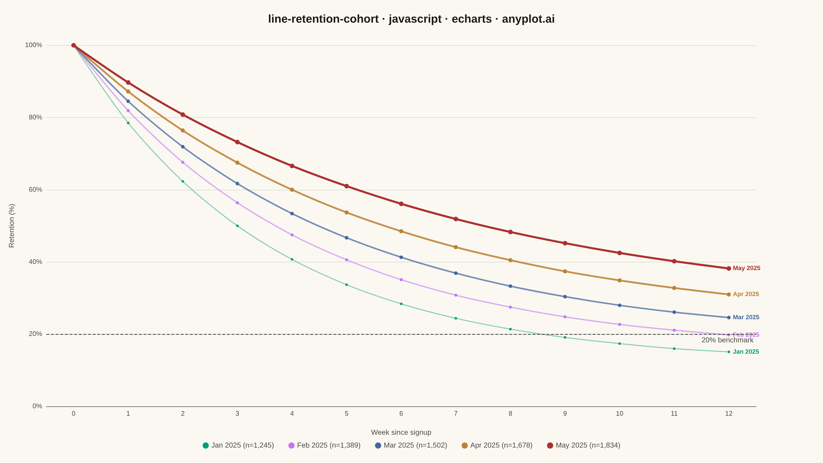
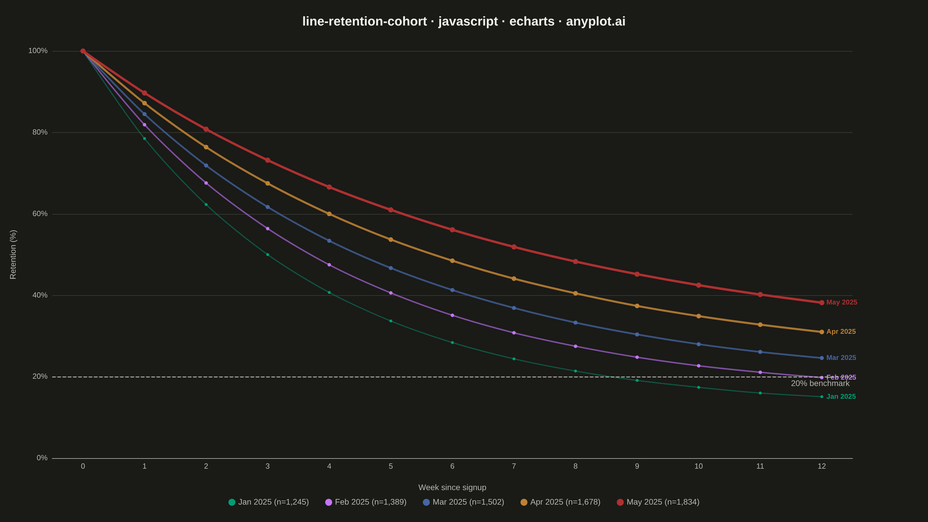
A line chart showing the percentage of retained users over time since signup, with separate curves for different cohorts. All curves start at 100% at time zero and typically exhibit exponential decay, revealing how well a product retains users over their lifecycle. By overlaying multiple cohorts, teams can visually compare whether retention is improving or degrading across signup periods.
// anyplot.ai
// line-retention-cohort: User Retention Curve by Cohort
// Library: echarts 5.5.1 | JavaScript 22.22.3
// Quality: 87/100 | Created: 2026-06-20

const t = window.ANYPLOT_TOKENS;

// Monthly sign-up cohorts tracked weekly for 12 weeks (improving retention over time)
const cohorts = [
  { label: "Jan 2025", size: 1245, decay: 0.28, floor: 12 },
  { label: "Feb 2025", size: 1389, decay: 0.24, floor: 15 },
  { label: "Mar 2025", size: 1502, decay: 0.21, floor: 18 },
  { label: "Apr 2025", size: 1678, decay: 0.18, floor: 22 },
  { label: "May 2025", size: 1834, decay: 0.15, floor: 26 },
];

const weeks = Array.from({ length: 13 }, (_, i) => i); // weeks 0–12

function retentionAt(week, decay, floor) {
  return Math.round((floor + (100 - floor) * Math.exp(-decay * week)) * 10) / 10;
}

// Older cohorts: thinner + less opaque; newer cohorts: thicker + more prominent
const series = cohorts.map(function (c, i) {
  const lineWidth = 2 + i * 0.5;              // 2 … 4 px
  const opacity = Math.min(0.45 + i * 0.14, 1); // 0.45 … 1.0
  const obj = {
    name: c.label + " (n=" + c.size.toLocaleString() + ")",
    type: "line",
    data: weeks.map(function (w) { return retentionAt(w, c.decay, c.floor); }),
    lineStyle: { color: t.palette[i], width: lineWidth, opacity: opacity },
    itemStyle: { color: t.palette[i] },
    symbol: "circle",
    symbolSize: 5 + i,
    smooth: 0.3,
    endLabel: {
      show: true,
      formatter: function () { return c.label; },
      color: t.palette[i],
      fontSize: 12,
      fontWeight: "bold",
      distance: 8,
    },
    emphasis: {
      focus: "series",
      lineStyle: { width: lineWidth + 2, opacity: 1 },
    },
  };
  // Attach 20% benchmark reference line to the newest cohort only
  if (i === cohorts.length - 1) {
    obj.markLine = {
      silent: true,
      symbol: "none",
      data: [{ yAxis: 20 }],
      lineStyle: { type: "dashed", color: t.inkSoft, width: 1.5 },
      label: {
        position: "insideEndBottom",
        formatter: "20% benchmark",
        color: t.inkSoft,
        fontSize: 14,
      },
    };
  }
  return obj;
});

const chart = echarts.init(document.getElementById("container"));

chart.setOption({
  animation: false,
  color: t.palette,
  backgroundColor: "transparent",
  title: {
    text: "line-retention-cohort · javascript · echarts · anyplot.ai",
    left: "center",
    top: 22,
    textStyle: { color: t.ink, fontSize: 22, fontWeight: "bold" },
  },
  legend: {
    bottom: 22,
    orient: "horizontal",
    textStyle: { color: t.inkSoft, fontSize: 14 },
    icon: "circle",
    itemWidth: 12,
    itemHeight: 12,
    itemGap: 28,
  },
  tooltip: {
    trigger: "axis",
    formatter: function (params) {
      var html = "<b>Week " + params[0].axisValue + "</b><br/>";
      params.forEach(function (p) {
        html += p.marker + " " + p.seriesName + ": <b>" + p.value + "%</b><br/>";
      });
      return html;
    },
  },
  grid: {
    left: 90,
    right: 130,
    top: 88,
    bottom: 110,
  },
  xAxis: {
    type: "category",
    name: "Week since signup",
    nameLocation: "middle",
    nameGap: 44,
    nameTextStyle: { color: t.inkSoft, fontSize: 14 },
    data: weeks.map(String),
    axisLabel: { color: t.inkSoft, fontSize: 13 },
    axisLine: { lineStyle: { color: t.inkSoft } },
    axisTick: { show: false },
    splitLine: { show: false },
  },
  yAxis: {
    type: "value",
    name: "Retention (%)",
    nameLocation: "middle",
    nameGap: 60,
    nameTextStyle: { color: t.inkSoft, fontSize: 14 },
    min: 0,
    max: 100,
    axisLabel: {
      color: t.inkSoft,
      fontSize: 13,
      formatter: "{value}%",
    },
    axisLine: { show: false },
    axisTick: { show: false },
    splitLine: { lineStyle: { color: t.grid, width: 1 } },
  },
  series: series,
});
Runnable source as JSON, for any HTTP client: https://api.anyplot.ai/specs/line-retention-cohort/echarts/code. Any spec id and library id listed in llms-full.txt fit the same URL shape; every URL below is complete and callable.
{
  "spec_id": "line-retention-cohort",
  "language": "javascript",
  "library": "echarts",
  "page": "https://anyplot.ai/line-retention-cohort/javascript/echarts",
  "hub": "https://anyplot.ai/line-retention-cohort",
  "code_json": "https://api.anyplot.ai/specs/line-retention-cohort/echarts/code",
  "spec_json": "https://api.anyplot.ai/specs/line-retention-cohort",
  "render_light_png": "https://storage.googleapis.com/anyplot-images/plots/line-retention-cohort/javascript/echarts/plot-light.png",
  "render_dark_png": "https://storage.googleapis.com/anyplot-images/plots/line-retention-cohort/javascript/echarts/plot-dark.png",
  "interactive_light_html": "https://storage.googleapis.com/anyplot-images/plots/line-retention-cohort/javascript/echarts/plot-light.html",
  "interactive_dark_html": "https://storage.googleapis.com/anyplot-images/plots/line-retention-cohort/javascript/echarts/plot-dark.html",
  "quality_score": 87.0,
  "license": "MIT",
  "guide": "https://anyplot.ai/llms.txt"
}
Part of User Retention Curve by Cohort on anyplot.ai.