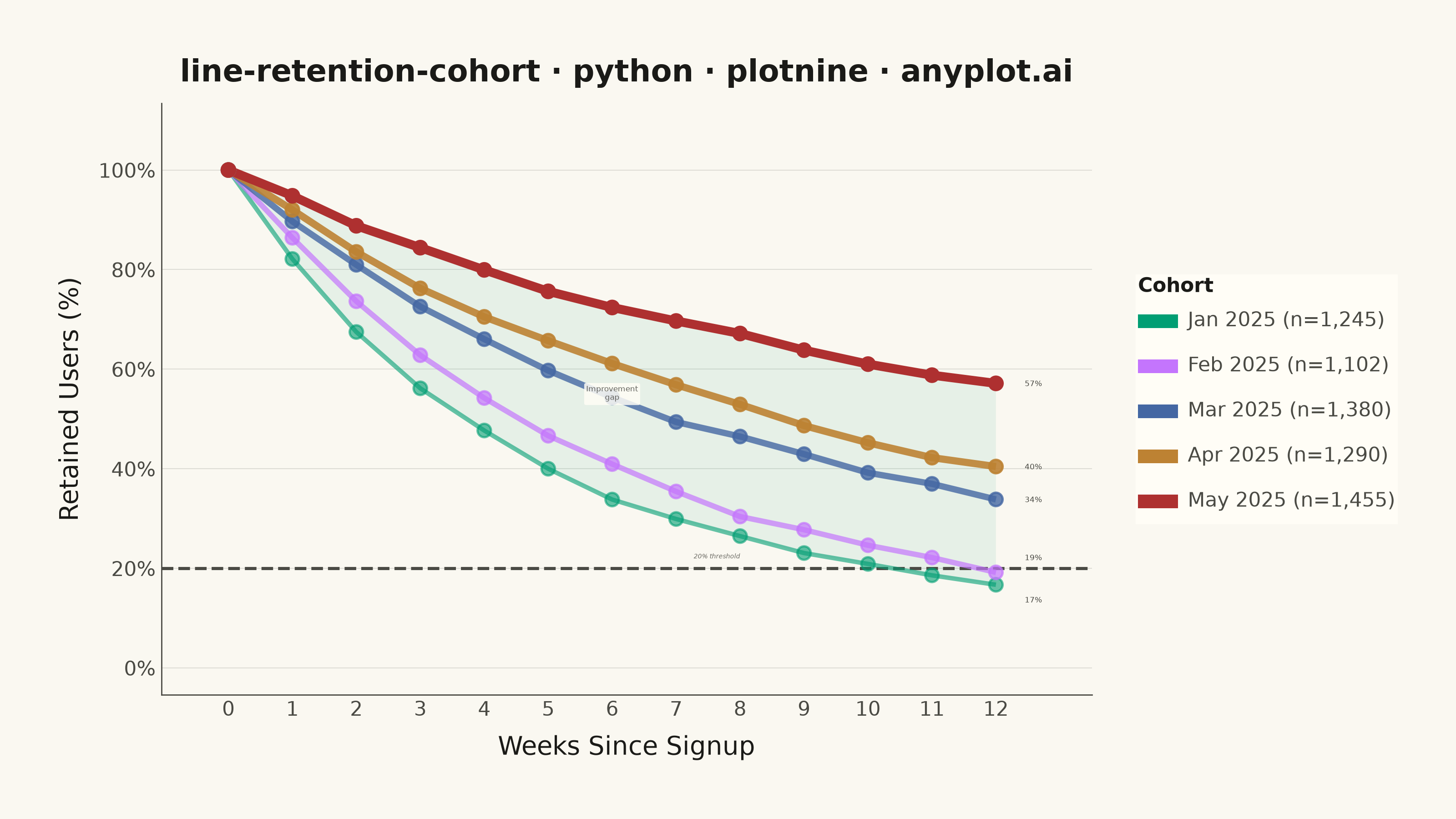
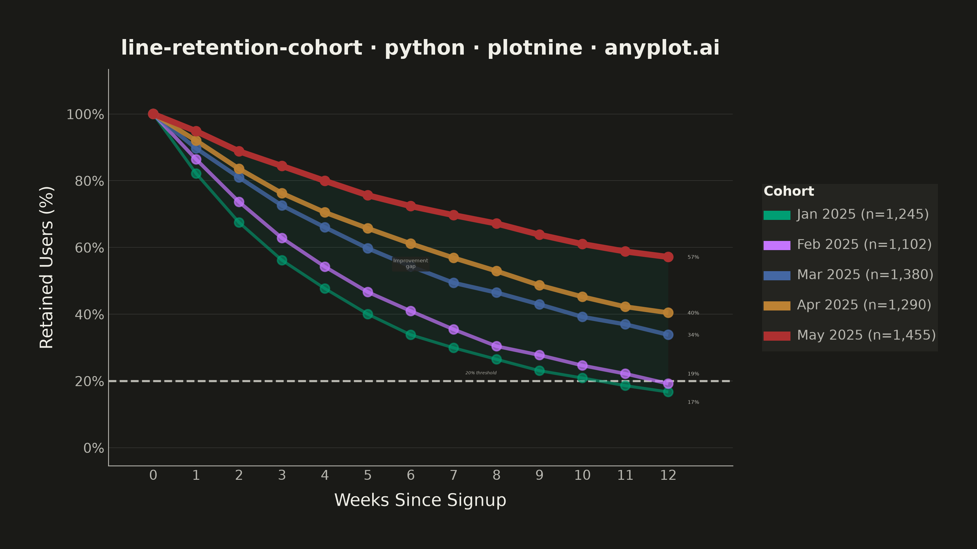
A line chart showing the percentage of retained users over time since signup, with separate curves for different cohorts. All curves start at 100% at time zero and typically exhibit exponential decay, revealing how well a product retains users over their lifecycle. By overlaying multiple cohorts, teams can visually compare whether retention is improving or degrading across signup periods.
""" anyplot.ai
line-retention-cohort: User Retention Curve by Cohort
Library: plotnine 0.15.7 | Python 3.13.14
Quality: 90/100 | Updated: 2026-06-20
"""

import os

import numpy as np
import pandas as pd
from plotnine import (
    aes,
    annotate,
    element_blank,
    element_line,
    element_rect,
    element_text,
    geom_hline,
    geom_line,
    geom_point,
    geom_ribbon,
    geom_text,
    ggplot,
    guide_legend,
    guides,
    labs,
    scale_alpha_identity,
    scale_color_manual,
    scale_size_identity,
    scale_x_continuous,
    scale_y_continuous,
    theme,
    theme_minimal,
)


# Theme tokens (Imprint palette — theme-adaptive chrome)
THEME = os.getenv("ANYPLOT_THEME", "light")
PAGE_BG = "#FAF8F1" if THEME == "light" else "#1A1A17"
ELEVATED_BG = "#FFFDF6" if THEME == "light" else "#242420"
INK = "#1A1A17" if THEME == "light" else "#F0EFE8"
INK_SOFT = "#4A4A44" if THEME == "light" else "#B8B7B0"
INK_MUTED = "#6B6A63" if THEME == "light" else "#A8A79F"

IMPRINT_PALETTE = ["#009E73", "#C475FD", "#4467A3", "#BD8233", "#AE3030"]

# Data
np.random.seed(42)

cohorts = {
    "Jan 2025": {"size": 1245, "decay": 0.22, "plateau": 8},
    "Feb 2025": {"size": 1102, "decay": 0.17, "plateau": 12},
    "Mar 2025": {"size": 1380, "decay": 0.13, "plateau": 18},
    "Apr 2025": {"size": 1290, "decay": 0.11, "plateau": 22},
    "May 2025": {"size": 1455, "decay": 0.08, "plateau": 30},
}

weeks = np.arange(0, 13)
rows = []

for cohort_name, info in cohorts.items():
    base = (100 - info["plateau"]) * np.exp(-info["decay"] * weeks) + info["plateau"]
    noise = np.concatenate(([0], np.cumsum(np.random.normal(0, 0.6, len(weeks) - 1))))
    retention = np.clip(base + noise, 0, 100)
    retention[0] = 100.0
    label = f"{cohort_name} (n={info['size']:,})"
    for w, r in zip(weeks, retention, strict=True):
        rows.append({"week": w, "retention": r, "cohort": label})

df = pd.DataFrame(rows)

cohort_labels = list(df["cohort"].unique())
df["cohort"] = pd.Categorical(df["cohort"], categories=cohort_labels, ordered=True)

# Alpha: oldest is most faded, newest is full opacity
alpha_values = [0.6, 0.7, 0.8, 0.9, 1.0]
alpha_map = dict(zip(cohort_labels, alpha_values, strict=True))
df["line_alpha"] = df["cohort"].map(alpha_map).astype(float)

# Line width: thinner for older cohorts, bolder for newer
size_values = [1.0, 1.2, 1.4, 1.6, 2.0]
size_map = dict(zip(cohort_labels, size_values, strict=True))
df["line_size"] = df["cohort"].map(size_map).astype(float)

# Ribbon between oldest and newest cohort to show improvement gap
oldest_label = cohort_labels[0]
newest_label = cohort_labels[-1]
df_oldest = df[df["cohort"] == oldest_label][["week", "retention"]].rename(columns={"retention": "ymin"})
df_newest = df[df["cohort"] == newest_label][["week", "retention"]].rename(columns={"retention": "ymax"})
df_ribbon = df_oldest.merge(df_newest, on="week")

# Endpoint labels — stagger the two closest to prevent overlap
df_endpoints = df[df["week"] == 12].copy()
df_endpoints["ret_label"] = df_endpoints["retention"].apply(lambda x: f"{x:.0f}%")

sorted_ends = df_endpoints.sort_values("retention").reset_index(drop=True)
y_offsets = {row["cohort"]: 0.0 for _, row in df_endpoints.iterrows()}
if abs(sorted_ends.loc[1, "retention"] - sorted_ends.loc[0, "retention"]) < 5:
    y_offsets[sorted_ends.loc[0, "cohort"]] = -3.0
    y_offsets[sorted_ends.loc[1, "cohort"]] = 3.0
df_endpoints["label_y"] = df_endpoints.apply(lambda row: row["retention"] + y_offsets.get(row["cohort"], 0.0), axis=1)

# Plot
title = "line-retention-cohort · python · plotnine · anyplot.ai"

plot = (
    ggplot(df, aes(x="week", y="retention", color="cohort", group="cohort"))
    + geom_ribbon(
        aes(x="week", ymin="ymin", ymax="ymax"), data=df_ribbon, inherit_aes=False, fill=IMPRINT_PALETTE[0], alpha=0.08
    )
    + geom_hline(yintercept=20, linetype="dashed", color=INK_SOFT, size=0.7)
    + geom_line(aes(alpha="line_alpha", size="line_size"))
    + scale_alpha_identity()
    + scale_size_identity()
    + geom_point(aes(alpha="line_alpha"), size=2.5, show_legend=False)
    + geom_text(
        aes(y="label_y", label="ret_label"),
        data=df_endpoints,
        nudge_x=0.45,
        size=3.0,
        ha="left",
        show_legend=False,
        color=INK_SOFT,
    )
    + scale_color_manual(values=IMPRINT_PALETTE)
    + scale_x_continuous(breaks=list(range(0, 13)), labels=[str(w) for w in range(0, 13)], expand=(0.02, 0.8))
    + scale_y_continuous(
        limits=(0, 108), breaks=[0, 20, 40, 60, 80, 100], labels=["0%", "20%", "40%", "60%", "80%", "100%"]
    )
    + annotate("text", x=8, y=22.5, label="20% threshold", size=2.5, color=INK_MUTED, ha="right", fontstyle="italic")
    + annotate(
        "label",
        x=6,
        y=55,
        label="Improvement\ngap",
        size=3.0,
        color=INK_SOFT,
        fill=ELEVATED_BG,
        alpha=0.85,
        ha="center",
        label_size=0,
    )
    + labs(x="Weeks Since Signup", y="Retained Users (%)", color="Cohort", title=title)
    + guides(color=guide_legend(override_aes={"size": 3, "alpha": 1}))
    + theme_minimal()
    + theme(
        figure_size=(8, 4.5),
        plot_background=element_rect(fill=PAGE_BG, color=PAGE_BG),
        panel_background=element_rect(fill=PAGE_BG),
        text=element_text(family="sans-serif", size=7, color=INK_SOFT),
        plot_title=element_text(size=12, weight="bold", color=INK),
        axis_title=element_text(size=10, color=INK),
        axis_text=element_text(size=8, color=INK_SOFT),
        legend_title=element_text(size=8, weight="bold", color=INK),
        legend_text=element_text(size=8, color=INK_SOFT),
        legend_position="right",
        legend_background=element_rect(fill=ELEVATED_BG, color="none"),
        legend_key=element_rect(fill="none", color="none"),
        panel_grid_major_x=element_blank(),
        panel_grid_minor=element_blank(),
        panel_grid_major_y=element_line(color=INK, size=0.3, alpha=0.15),
        axis_line_x=element_line(color=INK_SOFT, size=0.5),
        axis_line_y=element_line(color=INK_SOFT, size=0.5),
        plot_margin=0.04,
    )
)

# Save
plot.save(f"plot-{THEME}.png", dpi=400, width=8, height=4.5, units="in", verbose=False)
Runnable source as JSON, for any HTTP client: https://api.anyplot.ai/specs/line-retention-cohort/plotnine/code. Any spec id and library id listed in llms-full.txt fit the same URL shape; every URL below is complete and callable.
{
  "spec_id": "line-retention-cohort",
  "language": "python",
  "library": "plotnine",
  "page": "https://anyplot.ai/line-retention-cohort/python/plotnine",
  "hub": "https://anyplot.ai/line-retention-cohort",
  "code_json": "https://api.anyplot.ai/specs/line-retention-cohort/plotnine/code",
  "spec_json": "https://api.anyplot.ai/specs/line-retention-cohort",
  "render_light_png": "https://storage.googleapis.com/anyplot-images/plots/line-retention-cohort/python/plotnine/plot-light.png",
  "render_dark_png": "https://storage.googleapis.com/anyplot-images/plots/line-retention-cohort/python/plotnine/plot-dark.png",
  "quality_score": 90.0,
  "license": "MIT",
  "guide": "https://anyplot.ai/llms.txt"
}
Part of User Retention Curve by Cohort on anyplot.ai.