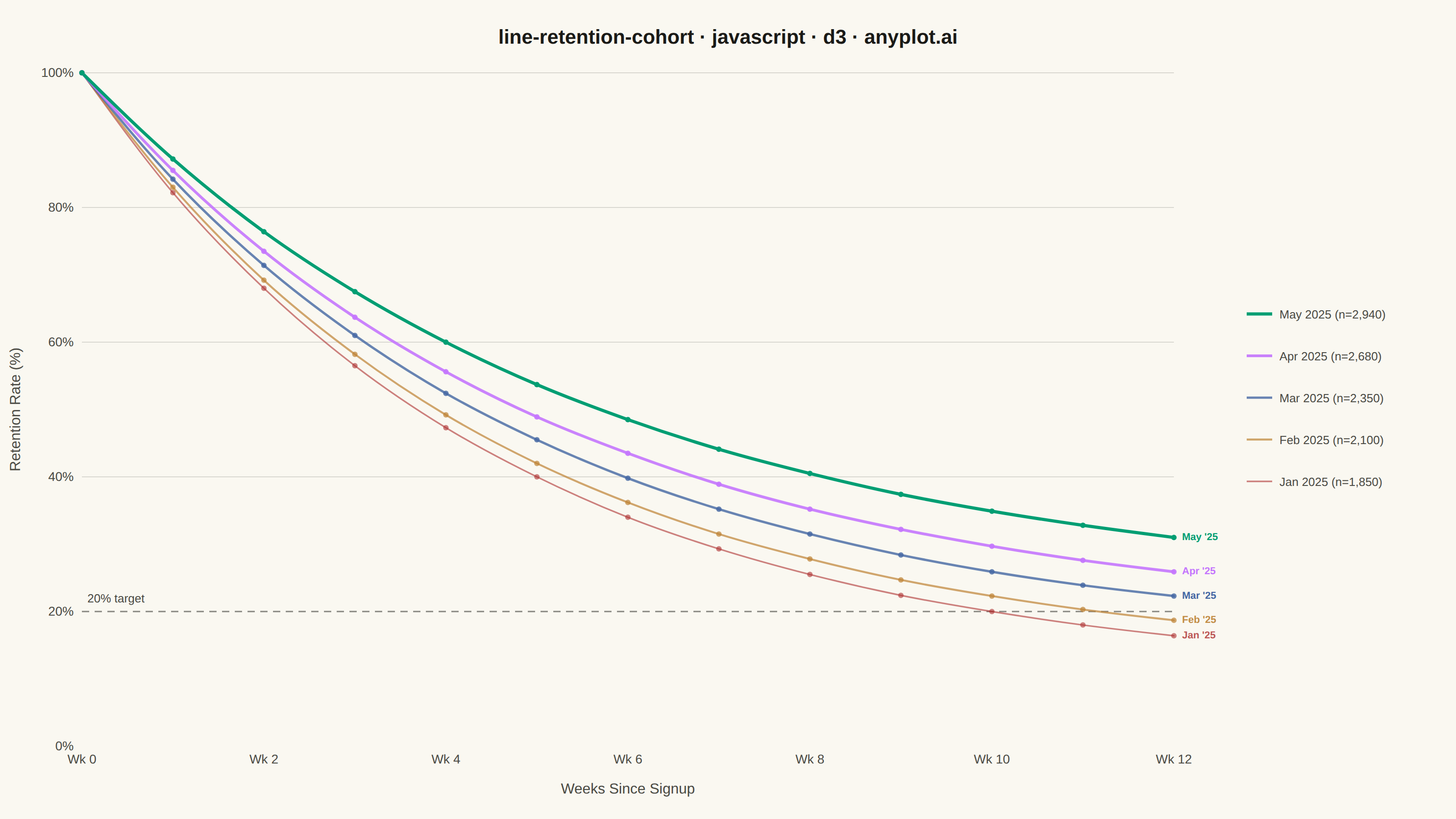
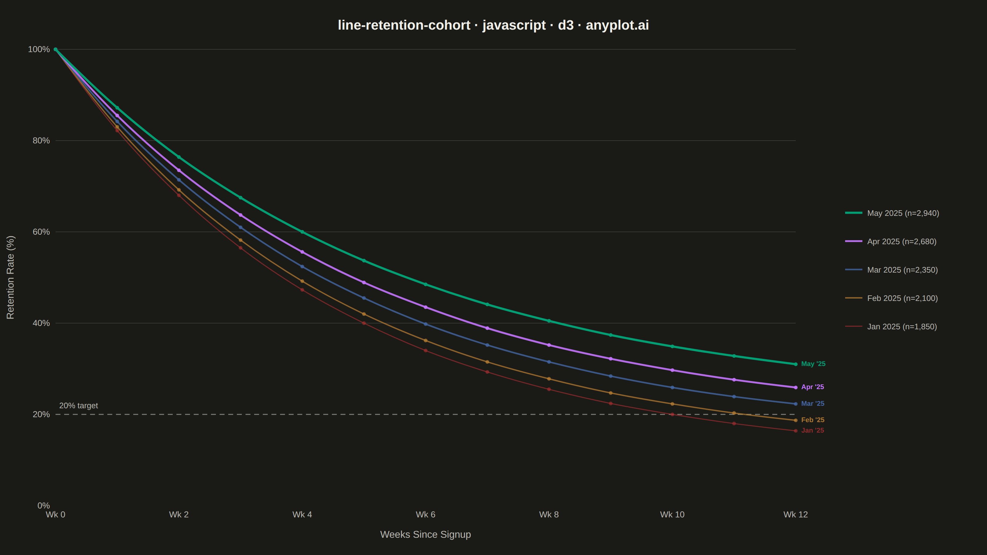
A line chart showing the percentage of retained users over time since signup, with separate curves for different cohorts. All curves start at 100% at time zero and typically exhibit exponential decay, revealing how well a product retains users over their lifecycle. By overlaying multiple cohorts, teams can visually compare whether retention is improving or degrading across signup periods.
// anyplot.ai
// line-retention-cohort: User Retention Curve by Cohort
// Library: d3 7.9.0 | JavaScript 22.22.3
// Quality: 88/100 | Created: 2026-06-20

const t = window.ANYPLOT_TOKENS;
const { width, height } = window.ANYPLOT_SIZE;
const margin = { top: 80, right: 310, bottom: 80, left: 90 };
const iw = width - margin.left - margin.right;
const ih = height - margin.top - margin.bottom;

// Data: monthly signup cohorts tracked weekly for 12 weeks
// Retention model: r(t) = plateau + (100 - plateau) * exp(-k * t)
// Newer cohorts show improving retention (higher long-term plateau, gentler decay)
const cohortDefs = [
  { label: "May 2025", sizeStr: "2,940", plateau: 22, k: 0.180 },
  { label: "Apr 2025", sizeStr: "2,680", plateau: 18, k: 0.195 },
  { label: "Mar 2025", sizeStr: "2,350", plateau: 15, k: 0.205 },
  { label: "Feb 2025", sizeStr: "2,100", plateau: 12, k: 0.215 },
  { label: "Jan 2025", sizeStr: "1,850", plateau: 10, k: 0.220 },
];

const weekNums = Array.from({ length: 13 }, (_, i) => i);

const cohorts = cohortDefs.map((c, ci) => ({
  ...c,
  color: t.palette[ci],
  opacity: 1.0 - ci * 0.1,
  strokeWidth: 3.5 - ci * 0.45,
  values: weekNums.map(w => ({
    week: w,
    retention: w === 0
      ? 100
      : Math.round((c.plateau + (100 - c.plateau) * Math.exp(-c.k * w)) * 10) / 10,
  })),
}));

// SVG mount
const svg = d3.select("#container")
  .append("svg")
  .attr("width", width)
  .attr("height", height);

const g = svg.append("g")
  .attr("transform", `translate(${margin.left},${margin.top})`);

// Scales
const x = d3.scaleLinear().domain([0, 12]).range([0, iw]);
const y = d3.scaleLinear().domain([0, 100]).range([ih, 0]);

// Y-axis gridlines (40–100 only; 20% is reserved for the reference line to stand alone)
[40, 60, 80, 100].forEach(val => {
  g.append("line")
    .attr("x1", 0).attr("x2", iw)
    .attr("y1", y(val)).attr("y2", y(val))
    .attr("stroke", t.grid)
    .attr("stroke-width", 1);
});

// Dashed reference line at 20% retention threshold
g.append("line")
  .attr("x1", 0).attr("x2", iw)
  .attr("y1", y(20)).attr("y2", y(20))
  .attr("stroke", t.inkSoft)
  .attr("stroke-width", 1.5)
  .attr("stroke-dasharray", "8,6")
  .attr("opacity", 0.65);

g.append("text")
  .attr("x", 6)
  .attr("y", y(20) - 10)
  .attr("text-anchor", "start")
  .attr("fill", t.inkSoft)
  .style("font-size", "13px")
  .text("20% target");

// Line generator with smooth monotone curve
const lineGen = d3.line()
  .x(d => x(d.week))
  .y(d => y(d.retention))
  .curve(d3.curveMonotoneX);

// Draw lines oldest-first so newest (May 2025, brand green) renders on top
[...cohorts].reverse().forEach(c => {
  g.append("path")
    .datum(c.values)
    .attr("fill", "none")
    .attr("stroke", c.color)
    .attr("stroke-width", c.strokeWidth)
    .attr("stroke-linejoin", "round")
    .attr("stroke-linecap", "round")
    .attr("opacity", c.opacity)
    .attr("d", lineGen);
});

// Circle markers at every data point via D3 join pattern (newest cohort on top)
[...cohorts].reverse().forEach(c => {
  g.selectAll(null)
    .data(c.values)
    .join("circle")
    .attr("cx", d => x(d.week))
    .attr("cy", d => y(d.retention))
    .attr("r", 3)
    .attr("fill", c.color)
    .attr("opacity", c.opacity);
});

// Inline end-of-line labels at week 12 — direct D3 SVG text placement
cohorts.forEach(c => {
  const last = c.values[c.values.length - 1];
  g.append("text")
    .attr("x", x(12) + 9)
    .attr("y", y(last.retention))
    .attr("dominant-baseline", "middle")
    .attr("fill", c.color)
    .attr("opacity", Math.min(c.opacity + 0.2, 1.0))
    .style("font-size", "11px")
    .style("font-weight", "700")
    .text(c.label.replace(" 20", " '"));
});

// Axes
const xAxis = g.append("g")
  .attr("transform", `translate(0,${ih})`)
  .call(d3.axisBottom(x)
    .tickValues([0, 2, 4, 6, 8, 10, 12])
    .tickFormat(d => `Wk ${d}`));

const yAxis = g.append("g")
  .call(d3.axisLeft(y)
    .tickValues([0, 20, 40, 60, 80, 100])
    .tickFormat(d => `${d}%`));

// Remove domain lines and tick marks for clean axis aesthetic
for (const ax of [xAxis, yAxis]) {
  ax.selectAll("text").attr("fill", t.inkSoft).style("font-size", "14px");
  ax.selectAll(".tick line").remove();
  ax.select(".domain").remove();
}

// Axis labels
g.append("text")
  .attr("x", iw / 2)
  .attr("y", ih + 52)
  .attr("text-anchor", "middle")
  .attr("fill", t.inkSoft)
  .style("font-size", "16px")
  .text("Weeks Since Signup");

g.append("text")
  .attr("transform", "rotate(-90)")
  .attr("x", -(ih / 2))
  .attr("y", -68)
  .attr("text-anchor", "middle")
  .attr("fill", t.inkSoft)
  .style("font-size", "16px")
  .text("Retention Rate (%)");

// Legend centered vertically within the chart area
const legendX = iw + 80;
const legendStartY = Math.round((ih - cohorts.length * 46) / 2);

cohorts.forEach((c, i) => {
  const ly = legendStartY + i * 46;
  g.append("line")
    .attr("x1", legendX).attr("x2", legendX + 28)
    .attr("y1", ly + 10).attr("y2", ly + 10)
    .attr("stroke", c.color)
    .attr("stroke-width", c.strokeWidth)
    .attr("opacity", c.opacity);
  g.append("text")
    .attr("x", legendX + 36)
    .attr("y", ly + 15)
    .attr("fill", t.inkSoft)
    .style("font-size", "13px")
    .text(`${c.label} (n=${c.sizeStr})`);
});

// Title
svg.append("text")
  .attr("x", width / 2)
  .attr("y", 48)
  .attr("text-anchor", "middle")
  .attr("fill", t.ink)
  .style("font-size", "22px")
  .style("font-weight", "600")
  .text("line-retention-cohort · javascript · d3 · anyplot.ai");
Runnable source as JSON, for any HTTP client: https://api.anyplot.ai/specs/line-retention-cohort/d3/code. Any spec id and library id listed in llms-full.txt fit the same URL shape; every URL below is complete and callable.
{
  "spec_id": "line-retention-cohort",
  "language": "javascript",
  "library": "d3",
  "page": "https://anyplot.ai/line-retention-cohort/javascript/d3",
  "hub": "https://anyplot.ai/line-retention-cohort",
  "code_json": "https://api.anyplot.ai/specs/line-retention-cohort/d3/code",
  "spec_json": "https://api.anyplot.ai/specs/line-retention-cohort",
  "render_light_png": "https://storage.googleapis.com/anyplot-images/plots/line-retention-cohort/javascript/d3/plot-light.png",
  "render_dark_png": "https://storage.googleapis.com/anyplot-images/plots/line-retention-cohort/javascript/d3/plot-dark.png",
  "interactive_light_html": "https://storage.googleapis.com/anyplot-images/plots/line-retention-cohort/javascript/d3/plot-light.html",
  "interactive_dark_html": "https://storage.googleapis.com/anyplot-images/plots/line-retention-cohort/javascript/d3/plot-dark.html",
  "quality_score": 88.0,
  "license": "MIT",
  "guide": "https://anyplot.ai/llms.txt"
}
Part of User Retention Curve by Cohort on anyplot.ai.