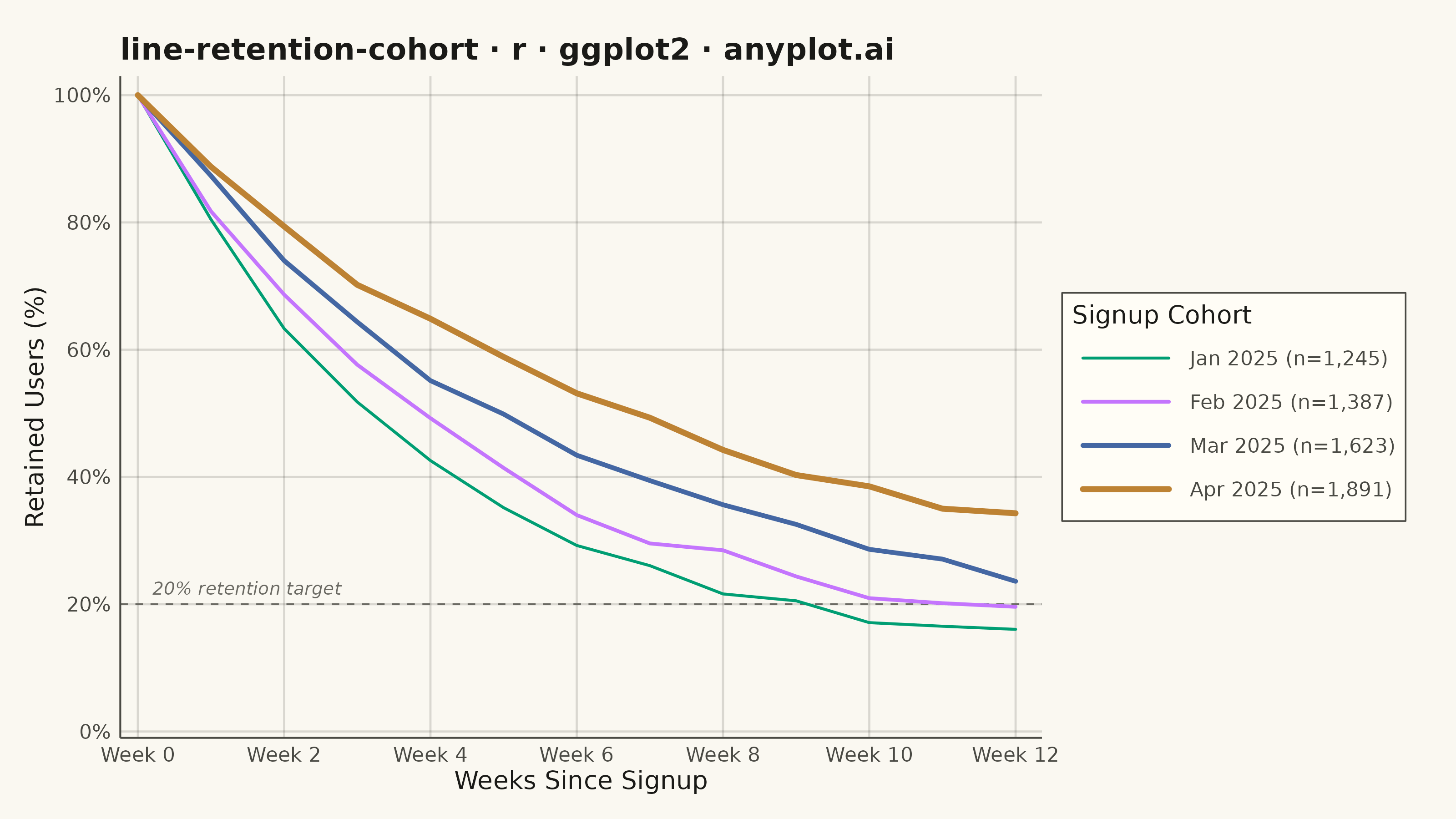
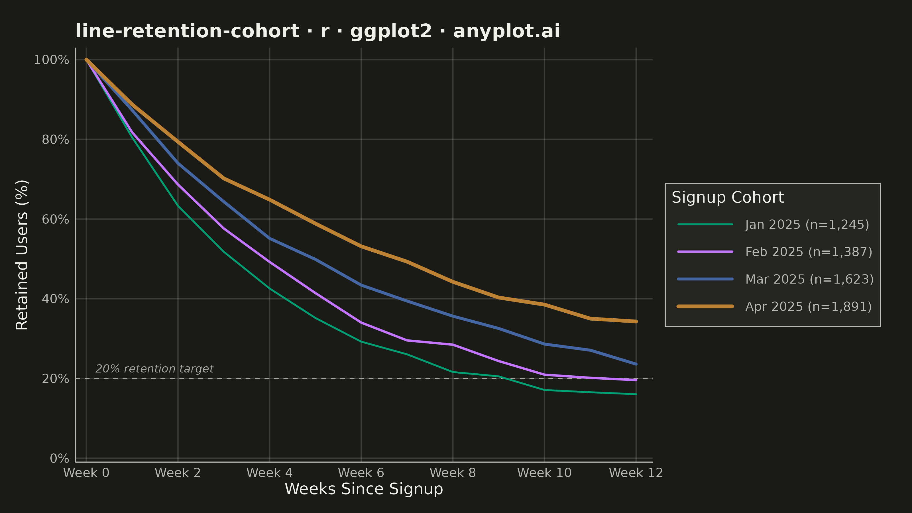
A line chart showing the percentage of retained users over time since signup, with separate curves for different cohorts. All curves start at 100% at time zero and typically exhibit exponential decay, revealing how well a product retains users over their lifecycle. By overlaying multiple cohorts, teams can visually compare whether retention is improving or degrading across signup periods.
#' anyplot.ai
#' line-retention-cohort: User Retention Curve by Cohort
#' Library: ggplot2 3.5.1 | R 4.4.1
#' Quality: 90/100 | Created: 2026-06-20

library(ggplot2)
library(scales)
library(ragg)

set.seed(42)

# Theme tokens
THEME       <- Sys.getenv("ANYPLOT_THEME", "light")
PAGE_BG     <- if (THEME == "light") "#FAF8F1" else "#1A1A17"
ELEVATED_BG <- if (THEME == "light") "#FFFDF6" else "#242420"
INK         <- if (THEME == "light") "#1A1A17" else "#F0EFE8"
INK_SOFT    <- if (THEME == "light") "#4A4A44" else "#B8B7B0"
INK_MUTED   <- if (THEME == "light") "#6B6A63" else "#A8A79F"
GRID_COLOR  <- scales::alpha(INK, 0.15)

# Imprint palette positions 1-4 for 4 categorical cohorts
COHORT_COLORS <- c("#009E73", "#C475FD", "#4467A3", "#BD8233")

# Data — 4 monthly signup cohorts tracked weekly for 12 weeks
cohort_info <- data.frame(
  cohort    = c("Jan 2025", "Feb 2025", "Mar 2025", "Apr 2025"),
  n_users   = c(1245L, 1387L, 1623L, 1891L),
  floor_pct = c(10.5, 12.5, 15.0, 18.0),
  decay     = c(0.26, 0.22, 0.18, 0.14),
  stringsAsFactors = FALSE
)

weeks <- 0:12

df <- do.call(rbind, lapply(seq_len(nrow(cohort_info)), function(i) {
  cp  <- cohort_info[i, ]
  # Exponential decay toward a floor; week 0 = exactly 100%
  ret   <- cp$floor_pct + (100 - cp$floor_pct) * exp(-cp$decay * weeks)
  noise <- c(0, rnorm(length(weeks) - 1, 0, 0.7))
  data.frame(
    week      = weeks,
    retention = pmax(0, pmin(100, ret + noise)),
    cohort    = cp$cohort,
    n_users   = cp$n_users
  )
}))

df$cohort <- factor(df$cohort, levels = cohort_info$cohort)

legend_labels <- setNames(
  paste0(cohort_info$cohort, " (n=", format(cohort_info$n_users, big.mark = ","), ")"),
  cohort_info$cohort
)

# Thinner lines for older cohorts → visual emphasis on recent improvement
lw_vals <- c(0.55, 0.70, 0.88, 1.10)

plot_title <- "line-retention-cohort · r · ggplot2 · anyplot.ai"

p <- ggplot(df, aes(x = week, y = retention, color = cohort, linewidth = cohort)) +
  # 20% retention benchmark reference
  geom_hline(
    yintercept = 20,
    linetype   = "dashed",
    color      = INK_MUTED,
    linewidth  = 0.35
  ) +
  annotate(
    "text",
    x = 0.2, y = 22.5,
    label    = "20% retention target",
    color    = INK_MUTED,
    size     = 2.5,
    hjust    = 0,
    fontface = "italic"
  ) +
  geom_line(lineend = "round") +
  scale_color_manual(
    values = COHORT_COLORS,
    labels = legend_labels,
    name   = "Signup Cohort"
  ) +
  scale_linewidth_manual(
    values = lw_vals,
    labels = legend_labels,
    name   = "Signup Cohort"
  ) +
  scale_x_continuous(
    breaks = seq(0, 12, by = 2),
    labels = paste0("Week ", seq(0, 12, by = 2)),
    expand = expansion(mult = c(0.02, 0.03))
  ) +
  scale_y_continuous(
    limits = c(0, 100),
    breaks = seq(0, 100, by = 20),
    labels = function(x) paste0(x, "%"),
    expand = expansion(mult = c(0.01, 0.03))
  ) +
  labs(
    title = plot_title,
    x     = "Weeks Since Signup",
    y     = "Retained Users (%)"
  ) +
  theme_minimal(base_size = 8) +
  theme(
    plot.background   = element_rect(fill = PAGE_BG,     color = PAGE_BG),
    panel.background  = element_rect(fill = PAGE_BG,     color = NA),
    panel.grid.major  = element_line(color = GRID_COLOR, linewidth = 0.4),
    panel.grid.minor  = element_blank(),
    panel.border      = element_blank(),
    axis.line         = element_line(color = INK_SOFT,   linewidth = 0.35),
    axis.title        = element_text(color = INK,        size = 10),
    axis.text         = element_text(color = INK_SOFT,   size = 8),
    plot.title        = element_text(color = INK,        size = 12, face = "bold"),
    legend.background = element_rect(fill = ELEVATED_BG, color = INK_SOFT, linewidth = 0.3),
    legend.text       = element_text(color = INK_SOFT,   size = 8),
    legend.title      = element_text(color = INK,        size = 10),
    legend.position   = "right",
    legend.key.width  = unit(1.5, "cm"),
    plot.margin       = margin(15, 20, 10, 10)
  )

ggsave(
  filename = sprintf("plot-%s.png", THEME),
  plot     = p,
  device   = ragg::agg_png,
  width    = 8,
  height   = 4.5,
  units    = "in",
  dpi      = 400
)
Runnable source as JSON, for any HTTP client: https://api.anyplot.ai/specs/line-retention-cohort/ggplot2/code. Any spec id and library id listed in llms-full.txt fit the same URL shape; every URL below is complete and callable.
{
  "spec_id": "line-retention-cohort",
  "language": "r",
  "library": "ggplot2",
  "page": "https://anyplot.ai/line-retention-cohort/r/ggplot2",
  "hub": "https://anyplot.ai/line-retention-cohort",
  "code_json": "https://api.anyplot.ai/specs/line-retention-cohort/ggplot2/code",
  "spec_json": "https://api.anyplot.ai/specs/line-retention-cohort",
  "render_light_png": "https://storage.googleapis.com/anyplot-images/plots/line-retention-cohort/r/ggplot2/plot-light.png",
  "render_dark_png": "https://storage.googleapis.com/anyplot-images/plots/line-retention-cohort/r/ggplot2/plot-dark.png",
  "quality_score": 90.0,
  "license": "MIT",
  "guide": "https://anyplot.ai/llms.txt"
}
Part of User Retention Curve by Cohort on anyplot.ai.