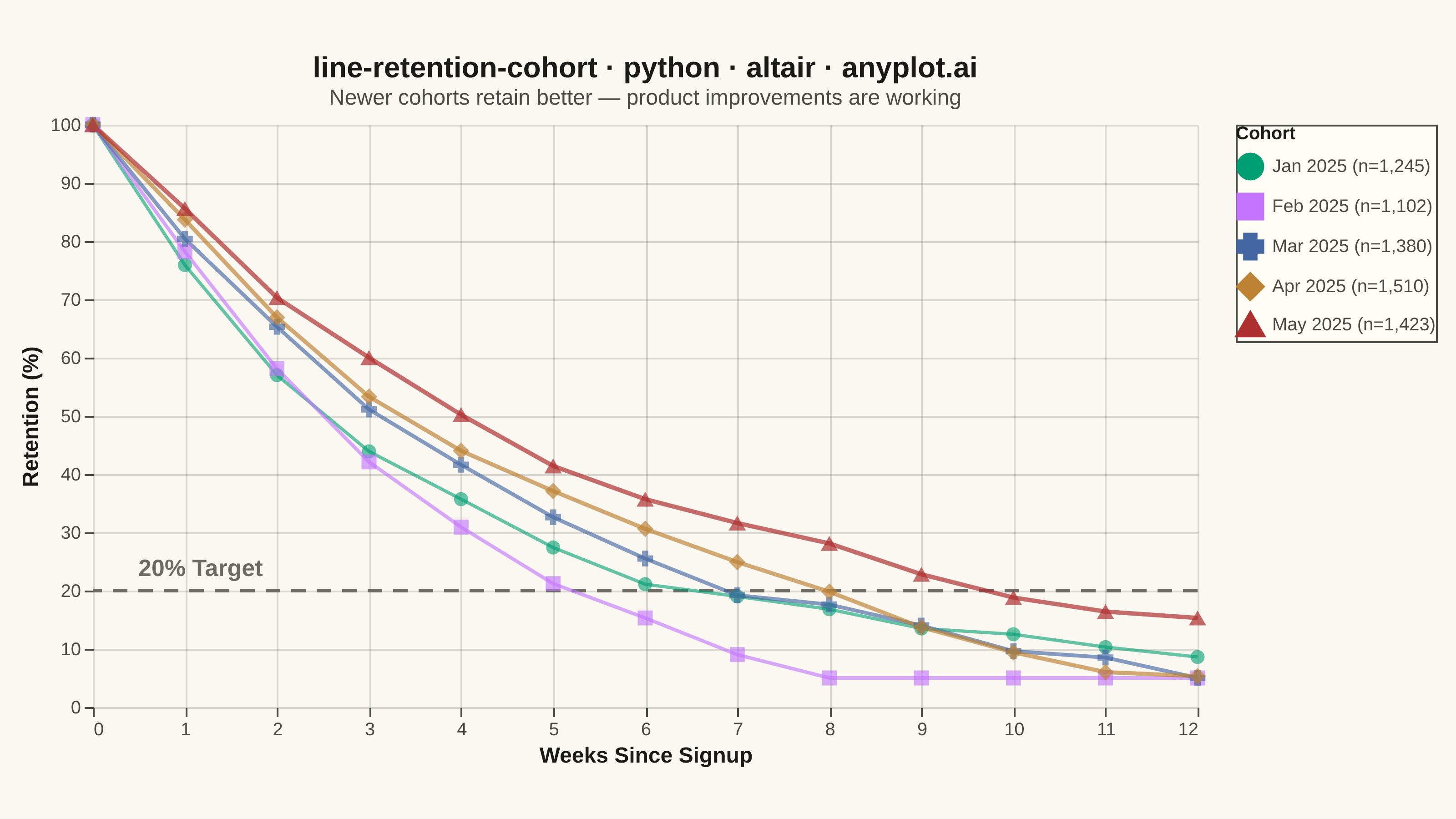
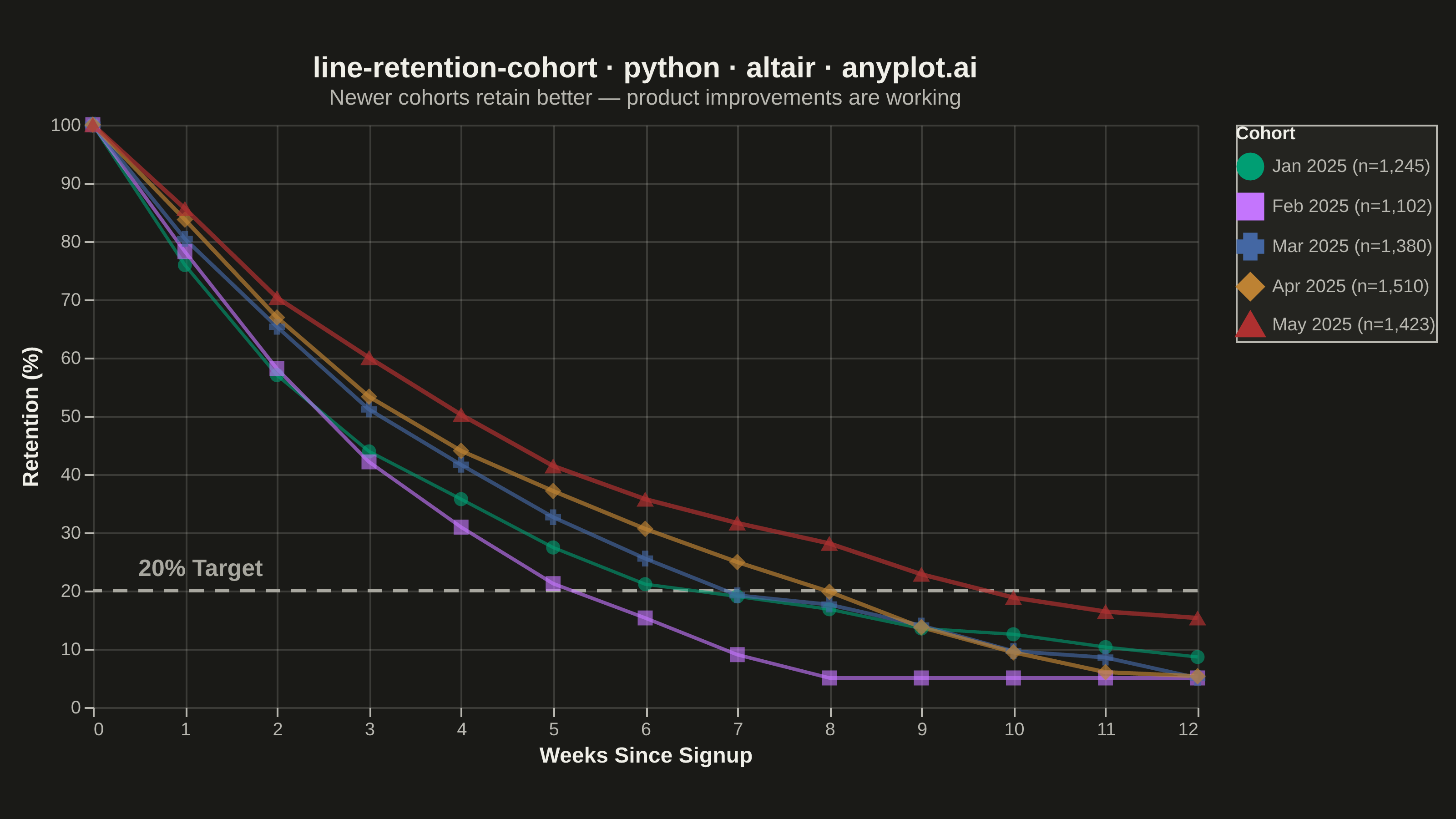
A line chart showing the percentage of retained users over time since signup, with separate curves for different cohorts. All curves start at 100% at time zero and typically exhibit exponential decay, revealing how well a product retains users over their lifecycle. By overlaying multiple cohorts, teams can visually compare whether retention is improving or degrading across signup periods.
""" anyplot.ai
line-retention-cohort: User Retention Curve by Cohort
Library: altair 6.2.1 | Python 3.13.14
Quality: 93/100 | Updated: 2026-06-20
"""

import os
import sys


# Prevent this file from shadowing the installed altair package
_this_dir = os.path.dirname(os.path.abspath(__file__))
sys.path = [p for p in sys.path if os.path.abspath(p) != _this_dir]

import altair as alt
import numpy as np
import pandas as pd
from PIL import Image


# Theme tokens
THEME = os.getenv("ANYPLOT_THEME", "light")
PAGE_BG = "#FAF8F1" if THEME == "light" else "#1A1A17"
ELEVATED_BG = "#FFFDF6" if THEME == "light" else "#242420"
INK = "#1A1A17" if THEME == "light" else "#F0EFE8"
INK_SOFT = "#4A4A44" if THEME == "light" else "#B8B7B0"
INK_MUTED = "#6B6A63" if THEME == "light" else "#A8A79F"

# Imprint categorical palette — positions 1→5 for five cohorts
IMPRINT_PALETTE = ["#009E73", "#C475FD", "#4467A3", "#BD8233", "#AE3030"]

# Data — monthly signup cohorts tracked weekly for 12 weeks
np.random.seed(42)

cohorts = {
    "Jan 2025": {"size": 1245, "half_life": 3.5},
    "Feb 2025": {"size": 1102, "half_life": 4.0},
    "Mar 2025": {"size": 1380, "half_life": 4.8},
    "Apr 2025": {"size": 1510, "half_life": 5.5},
    "May 2025": {"size": 1423, "half_life": 6.2},
}

weeks = np.arange(0, 13)
rows = []
for i, (cohort_label, info) in enumerate(cohorts.items()):
    retention = 100 * np.exp(-weeks / info["half_life"])
    noise = np.concatenate([[0], np.cumsum(np.random.randn(12) * 1.5)])
    retention = np.clip(retention + noise, 5, 100)
    retention[0] = 100.0
    legend_label = f"{cohort_label} (n={info['size']:,})"
    for w, r in zip(weeks, retention, strict=True):
        rows.append({"Week": w, "Retention (%)": round(r, 1), "Cohort": legend_label, "order": i})

df = pd.DataFrame(rows)

cohort_labels = list(df["Cohort"].unique())
order_domain = list(range(5))
opacity_range = [0.60, 0.70, 0.80, 0.90, 1.0]
width_range = [1.8, 2.4, 3.0, 3.6, 4.2]
size_range = [60, 90, 120, 150, 180]

# Interactive hover highlight
highlight = alt.selection_point(fields=["Cohort"], on="pointerover", empty=False)

# Reference line at 20% retention threshold
threshold_df = pd.DataFrame({"y": [20]})
threshold = alt.Chart(threshold_df).mark_rule(strokeDash=[8, 6], strokeWidth=2, color=INK_MUTED).encode(y="y:Q")
threshold_label = (
    alt.Chart(threshold_df)
    .mark_text(text="20% Target", align="left", dx=5, dy=-12, fontSize=13, fontWeight="bold", color=INK_MUTED)
    .encode(x=alt.value(20), y="y:Q")
)

# Axis encodings
x_enc = alt.X("Week:Q", title="Weeks Since Signup", scale=alt.Scale(domain=[0, 12]), axis=alt.Axis(tickMinStep=1))
y_enc = alt.Y("Retention (%):Q", title="Retention (%)", scale=alt.Scale(domain=[0, 100]), axis=alt.Axis(format=".0f"))
color_enc = alt.Color(
    "Cohort:N",
    scale=alt.Scale(domain=cohort_labels, range=IMPRINT_PALETTE),
    sort=cohort_labels,
    legend=alt.Legend(title="Cohort", symbolStrokeWidth=3, symbolSize=150),
)

# Lines with graduated width and opacity — newer cohorts thicker and more opaque
lines = (
    alt.Chart(df)
    .mark_line()
    .encode(
        x=x_enc,
        y=y_enc,
        color=color_enc,
        strokeWidth=alt.condition(
            highlight,
            alt.value(6),
            alt.StrokeWidth("order:O", scale=alt.Scale(domain=order_domain, range=width_range), legend=None),
        ),
        opacity=alt.condition(
            highlight,
            alt.value(1.0),
            alt.Opacity("order:O", scale=alt.Scale(domain=order_domain, range=opacity_range), legend=None),
        ),
        detail="Cohort:N",
        tooltip=["Cohort:N", "Week:Q", "Retention (%):Q"],
    )
    .add_params(highlight)
)

# Points with graduated size + distinct shapes for CVD accessibility
shape_range = ["circle", "square", "cross", "diamond", "triangle-up"]
points = (
    alt.Chart(df)
    .mark_point(filled=True)
    .encode(
        x="Week:Q",
        y="Retention (%):Q",
        color=alt.Color("Cohort:N", scale=alt.Scale(domain=cohort_labels, range=IMPRINT_PALETTE), legend=None),
        shape=alt.Shape("Cohort:N", scale=alt.Scale(domain=cohort_labels, range=shape_range), legend=None),
        opacity=alt.condition(
            highlight,
            alt.value(1.0),
            alt.Opacity("order:O", scale=alt.Scale(domain=order_domain, range=opacity_range), legend=None),
        ),
        size=alt.condition(
            highlight,
            alt.value(200),
            alt.Size("order:O", scale=alt.Scale(domain=order_domain, range=size_range), legend=None),
        ),
        tooltip=["Cohort:N", "Week:Q", "Retention (%):Q"],
    )
)

title_str = "line-retention-cohort · python · altair · anyplot.ai"
chart = (
    alt.layer(threshold, threshold_label, lines, points)
    .properties(
        width=607,
        height=320,
        background=PAGE_BG,
        title=alt.Title(
            title_str,
            fontSize=16,
            fontWeight="bold",
            color=INK,
            subtitle="Newer cohorts retain better — product improvements are working",
            subtitleFontSize=12,
            subtitleColor=INK_SOFT,
        ),
    )
    .configure_view(fill=PAGE_BG, strokeWidth=0)
    .configure_axis(
        domain=False,
        tickColor=INK_SOFT,
        gridColor=INK,
        gridOpacity=0.15,
        labelColor=INK_SOFT,
        titleColor=INK,
        labelFontSize=10,
        titleFontSize=12,
    )
    .configure_legend(
        fillColor=ELEVATED_BG,
        strokeColor=INK_SOFT,
        labelColor=INK_SOFT,
        titleColor=INK,
        labelFontSize=10,
        titleFontSize=10,
    )
    .configure_title(color=INK)
)

# Save — landscape canvas target: 3200 × 1800
TW, TH = 3200, 1800
chart.save(f"plot-{THEME}.png", scale_factor=4.0)
_img = Image.open(f"plot-{THEME}.png").convert("RGB")
_w, _h = _img.size
if _w > TW or _h > TH:
    raise SystemExit(
        f"altair vl-convert produced {_w}×{_h}, exceeds target {TW}×{TH}. "
        f"Shrink chart .properties(width=, height=) values and re-render."
    )
if _w < TW or _h < TH:
    _canvas = Image.new("RGB", (TW, TH), PAGE_BG)
    _canvas.paste(_img, ((TW - _w) // 2, (TH - _h) // 2))
    _canvas.save(f"plot-{THEME}.png")

chart.save(f"plot-{THEME}.html")
Runnable source as JSON, for any HTTP client: https://api.anyplot.ai/specs/line-retention-cohort/altair/code. Any spec id and library id listed in llms-full.txt fit the same URL shape; every URL below is complete and callable.
{
  "spec_id": "line-retention-cohort",
  "language": "python",
  "library": "altair",
  "page": "https://anyplot.ai/line-retention-cohort/python/altair",
  "hub": "https://anyplot.ai/line-retention-cohort",
  "code_json": "https://api.anyplot.ai/specs/line-retention-cohort/altair/code",
  "spec_json": "https://api.anyplot.ai/specs/line-retention-cohort",
  "render_light_png": "https://storage.googleapis.com/anyplot-images/plots/line-retention-cohort/python/altair/plot-light.png",
  "render_dark_png": "https://storage.googleapis.com/anyplot-images/plots/line-retention-cohort/python/altair/plot-dark.png",
  "interactive_light_html": "https://storage.googleapis.com/anyplot-images/plots/line-retention-cohort/python/altair/plot-light.html",
  "interactive_dark_html": "https://storage.googleapis.com/anyplot-images/plots/line-retention-cohort/python/altair/plot-dark.html",
  "quality_score": 93.0,
  "license": "MIT",
  "guide": "https://anyplot.ai/llms.txt"
}
Part of User Retention Curve by Cohort on anyplot.ai.