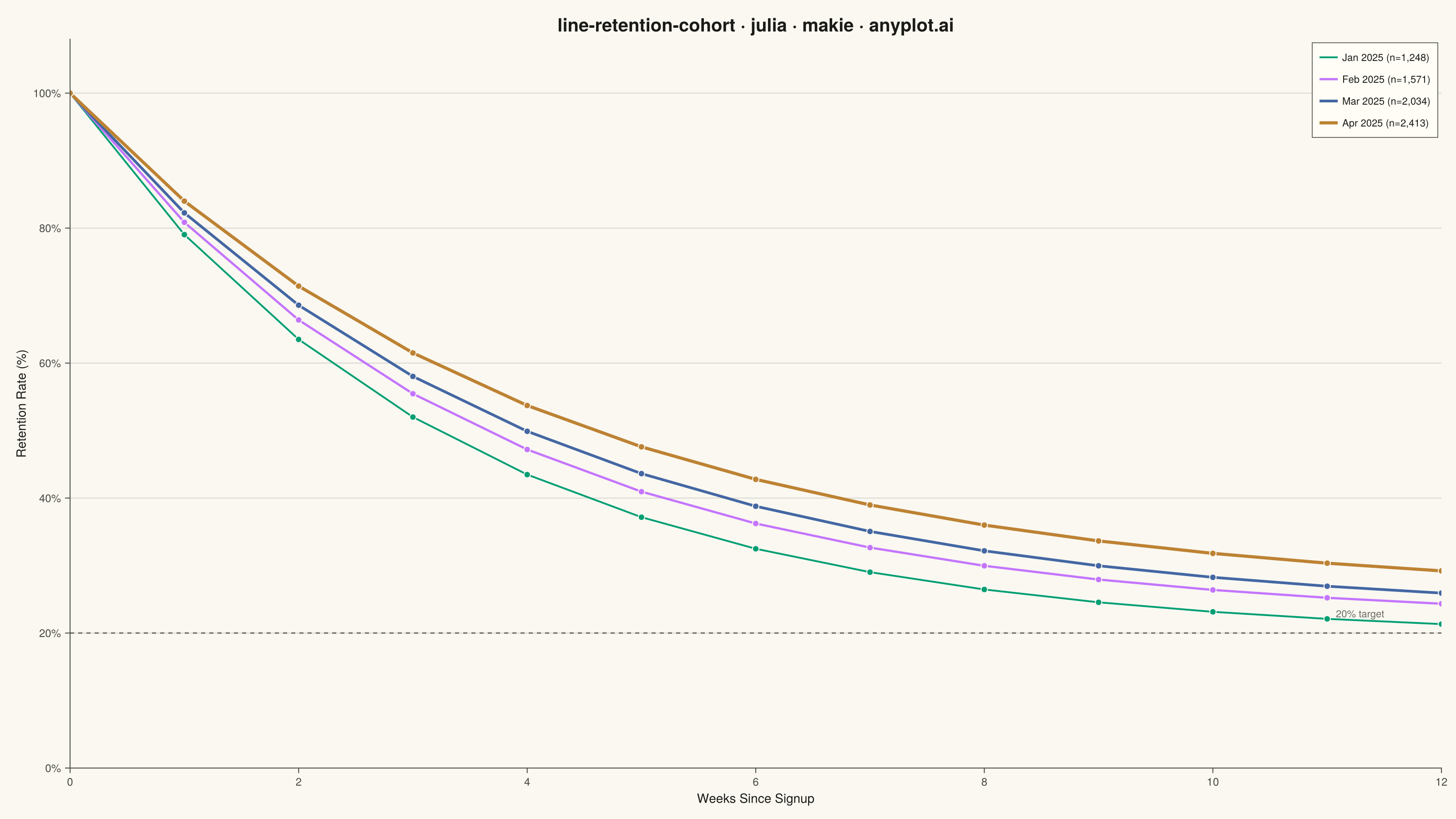
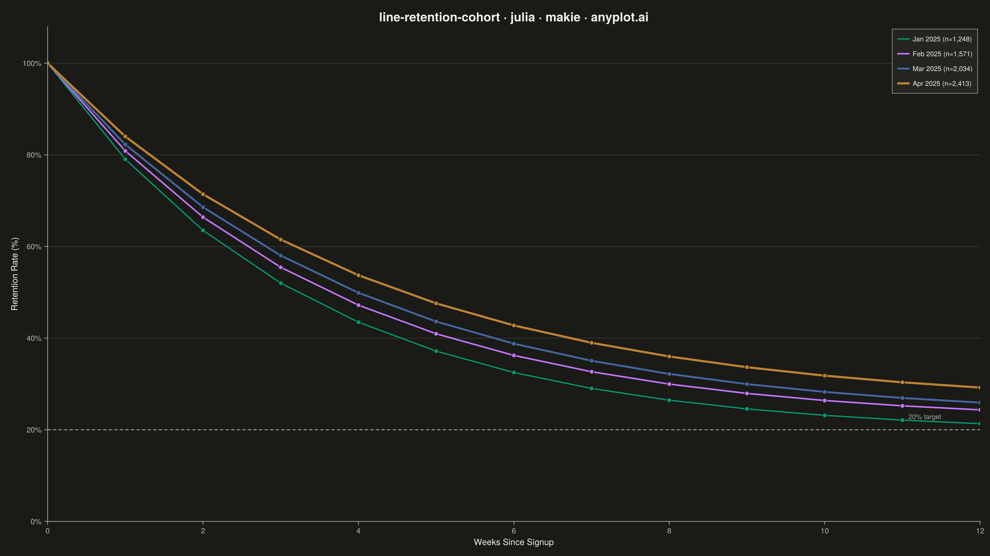
A line chart showing the percentage of retained users over time since signup, with separate curves for different cohorts. All curves start at 100% at time zero and typically exhibit exponential decay, revealing how well a product retains users over their lifecycle. By overlaying multiple cohorts, teams can visually compare whether retention is improving or degrading across signup periods.
# anyplot.ai
# line-retention-cohort: User Retention Curve by Cohort
# Library: makie 0.22.10 | Julia 1.11.9
# Quality: 89/100 | Created: 2026-06-20

using CairoMakie
using Colors
using Random

Random.seed!(42)

# Theme tokens
const THEME       = get(ENV, "ANYPLOT_THEME", "light")
const PAGE_BG     = THEME == "light" ? colorant"#FAF8F1" : colorant"#1A1A17"
const ELEVATED_BG = THEME == "light" ? colorant"#FFFDF6" : colorant"#242420"
const INK         = THEME == "light" ? colorant"#1A1A17" : colorant"#F0EFE8"
const INK_SOFT    = THEME == "light" ? colorant"#4A4A44" : colorant"#B8B7B0"
const INK_MUTED   = THEME == "light" ? colorant"#6B6A63" : colorant"#A8A79F"

const IMPRINT_PALETTE = [
    colorant"#009E73",  # 1 — brand green (Jan 2025)
    colorant"#C475FD",  # 2 — lavender (Feb 2025)
    colorant"#4467A3",  # 3 — blue (Mar 2025)
    colorant"#BD8233",  # 4 — ochre (Apr 2025)
]

# Data — monthly signup cohorts tracked weekly for 12 weeks
const weeks = Float64.(0:12)
const cohort_labels = [
    "Jan 2025 (n=1,248)",
    "Feb 2025 (n=1,571)",
    "Mar 2025 (n=2,034)",
    "Apr 2025 (n=2,413)",
]

# Long-tail retention model: a * exp(-b * t) + c, normalised so t=0 gives 100%
# Parameters improve Jan→Apr, showing product retention gains over time
const a_vals = [55.0, 58.0, 62.0, 66.0]
const b_vals = [0.30, 0.28, 0.26, 0.24]
const c_vals = [13.0, 16.0, 18.0, 22.0]

retention_matrix = Matrix{Float64}(undef, length(weeks), 4)
for i in 1:4
    raw = a_vals[i] .* exp.(-b_vals[i] .* weeks) .+ c_vals[i]
    retention_matrix[:, i] = raw ./ raw[1] .* 100.0
end

# Thicker lines for newer cohorts to emphasise improving retention
const line_widths = [2.0, 2.5, 3.0, 3.5]

# Plot
fig = Figure(
    resolution      = (1600, 900),
    fontsize        = 14,
    backgroundcolor = PAGE_BG,
)

ax = Axis(
    fig[1, 1];
    title              = "line-retention-cohort · julia · makie · anyplot.ai",
    titlesize          = 20,
    titlecolor         = INK,
    xlabel             = "Weeks Since Signup",
    ylabel             = "Retention Rate (%)",
    xlabelsize         = 14,
    ylabelsize         = 14,
    xlabelcolor        = INK,
    ylabelcolor        = INK,
    xticklabelsize     = 12,
    yticklabelsize     = 12,
    xticklabelcolor    = INK_SOFT,
    yticklabelcolor    = INK_SOFT,
    xtickcolor         = INK_SOFT,
    ytickcolor         = INK_SOFT,
    backgroundcolor    = PAGE_BG,
    topspinevisible    = false,
    rightspinevisible  = false,
    leftspinecolor     = INK_SOFT,
    bottomspinecolor   = INK_SOFT,
    xgridvisible       = false,
    ygridcolor         = RGBAf(INK.r, INK.g, INK.b, 0.15),
    xminorgridvisible  = false,
    yminorgridvisible  = false,
    yticks             = 0:20:100,
    xticks             = 0:2:12,
)

ax.ytickformat = vs -> ["$(round(Int, v))%" for v in vs]

ylims!(ax, 0, 108)
xlims!(ax, 0, 12)

for i in 1:4
    lines!(ax, weeks, retention_matrix[:, i];
        color     = IMPRINT_PALETTE[i],
        linewidth = line_widths[i],
        label     = cohort_labels[i],
    )
    scatter!(ax, weeks, retention_matrix[:, i];
        color       = IMPRINT_PALETTE[i],
        markersize  = 10,
        strokewidth = 1,
        strokecolor = PAGE_BG,
    )
end

# Reference line at 20% retention threshold
hlines!(ax, [20.0];
    color     = INK_MUTED,
    linewidth = 1.5,
    linestyle = :dash,
)
text!(ax, "20% target";
    position = (11.5, 22.0),
    align    = (:right, :bottom),
    fontsize = 12,
    color    = INK_MUTED,
)

axislegend(ax;
    title           = "Signup Cohort",
    titlecolor      = INK,
    titlesize       = 12,
    position        = :rt,
    backgroundcolor = ELEVATED_BG,
    framecolor      = INK_SOFT,
    framevisible    = true,
    framewidth      = 0.8,
    labelcolor      = INK,
    labelsize       = 12,
    rowgap          = 4,
    padding         = (8, 8, 6, 6),
    margin          = (4, 4, 4, 4),
)

save("plot-$(THEME).png", fig; px_per_unit = 2)
Runnable source as JSON, for any HTTP client: https://api.anyplot.ai/specs/line-retention-cohort/makie/code. Any spec id and library id listed in llms-full.txt fit the same URL shape; every URL below is complete and callable.
{
  "spec_id": "line-retention-cohort",
  "language": "julia",
  "library": "makie",
  "page": "https://anyplot.ai/line-retention-cohort/julia/makie",
  "hub": "https://anyplot.ai/line-retention-cohort",
  "code_json": "https://api.anyplot.ai/specs/line-retention-cohort/makie/code",
  "spec_json": "https://api.anyplot.ai/specs/line-retention-cohort",
  "render_light_png": "https://storage.googleapis.com/anyplot-images/plots/line-retention-cohort/julia/makie/plot-light.png",
  "render_dark_png": "https://storage.googleapis.com/anyplot-images/plots/line-retention-cohort/julia/makie/plot-dark.png",
  "quality_score": 89.0,
  "license": "MIT",
  "guide": "https://anyplot.ai/llms.txt"
}
Part of User Retention Curve by Cohort on anyplot.ai.