The same plot in 14 other libraries — JavaScript: Chart.js, D3.js, Apache ECharts, MUI X Charts; Python: Altair, Bokeh, lets-plot, Matplotlib, Plotly, plotnine, Pygal, Seaborn; R: ggplot2; Julia: Makie.jl. Compare all 15 side by side: Logistic Regression Curve Plot in Python, R, Julia and JavaScript.
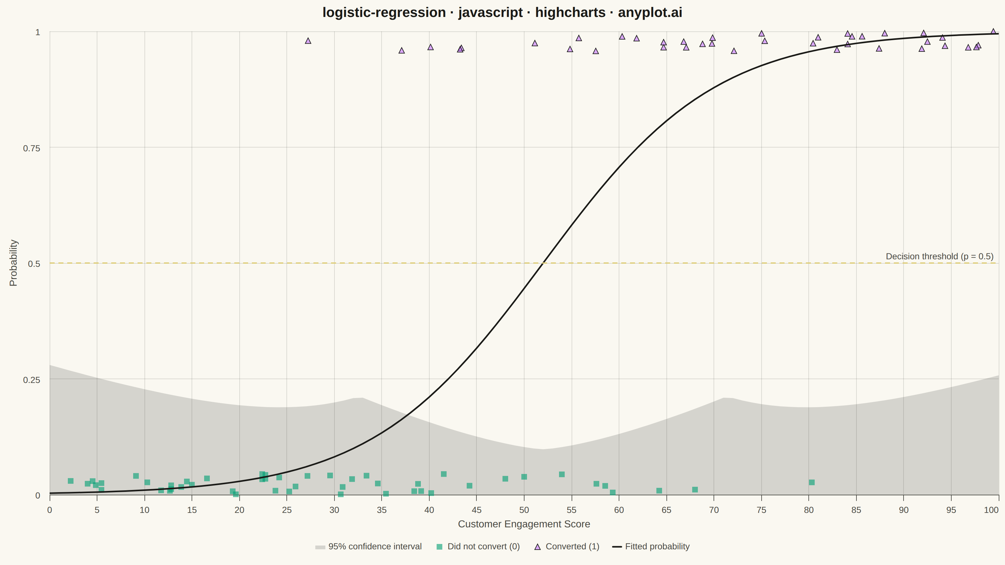
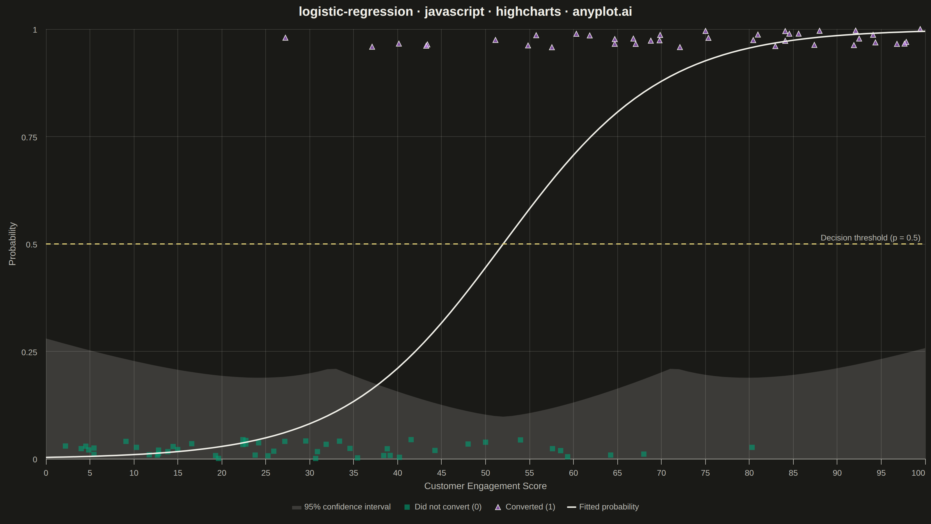
A logistic regression visualization showing the characteristic S-shaped (sigmoid) probability curve for binary classification. The plot displays data points colored by their binary class, the fitted logistic curve representing predicted probabilities, confidence intervals around the curve, and a dashed decision threshold line at probability 0.5. This visualization is essential for understanding how a logistic model maps continuous input features to class probabilities.
// anyplot.ai
// logistic-regression: Logistic Regression Curve Plot
// Library: highcharts 12.6.0 | JavaScript 22.23.2
// Quality: 90/100 | Created: 2026-09-02

const t = window.ANYPLOT_TOKENS;

// --- Data (in-memory, deterministic) ----------------------------------------
// Marketing conversion: probability of converting as a function of an
// engagement score (0-100). A small LCG stands in for a seeded RNG (the
// browser has no seedable Math.random).
function lcg(seed) {
  let state = seed >>> 0;
  return () => {
    state = (Math.imul(state, 1664525) + 1013904223) >>> 0;
    return state / 4294967296;
  };
}
const rand = lcg(42);

const midpoint = 52; // engagement score at 50% conversion probability
const steepness = 0.11;
const sigmoid = (x) => 1 / (1 + Math.exp(-steepness * (x - midpoint)));
const clamp01 = (v) => Math.min(1, Math.max(0, v));

// Fitted probability curve, sampled across the full engagement range.
const curveX = [];
for (let x = 0; x <= 100; x += 1) curveX.push(x);
const curveY = curveX.map(sigmoid);

// Approximate 95% confidence band — narrowest near the midpoint (where
// observations are densest), widening toward the extremes.
const seMin = 0.025;
const seScale = 0.11;
const standardError = (x) => seMin + seScale * Math.pow(Math.abs(x - midpoint) / 50, 1.4);
const ciLower = curveX.map((x) => [x, clamp01(sigmoid(x) - 1.96 * standardError(x))]);
const ciWidth = curveX.map((x, i) => [x, clamp01(sigmoid(x) + 1.96 * standardError(x)) - ciLower[i][1]]);

// Observed binary outcomes, jittered on the y-axis so points near 0/1 don't
// stack exactly on top of each other.
const notConverted = [];
const converted = [];
const pointCount = 180;
for (let i = 0; i < pointCount; i += 1) {
  const x = rand() * 100;
  const p = sigmoid(x);
  const outcome = rand() < p ? 1 : 0;
  const jitter = (rand() - 0.5) * 0.09;
  const point = [x, outcome + jitter];
  (outcome === 1 ? converted : notConverted).push(point);
}

// --- Chart -------------------------------------------------------------------
const classColor0 = t.palette[0]; // brand green — always the first series
const classColor1 = t.palette[1];
const curveColor = t.ink;
const bandColor = Highcharts.color(curveColor).setOpacity(0.16).get("rgba");
const markerFill0 = Highcharts.color(classColor0).setOpacity(0.6).get("rgba");
const markerFill1 = Highcharts.color(classColor1).setOpacity(0.6).get("rgba");

Highcharts.chart("container", {
  chart: {
    type: "scatter",
    backgroundColor: "transparent",
    animation: false,
    style: { fontFamily: "inherit" },
  },
  credits: { enabled: false },
  title: {
    text: "logistic-regression · javascript · highcharts · anyplot.ai",
    style: { color: t.ink, fontSize: "22px", fontWeight: "600" },
  },
  xAxis: {
    title: { text: "Customer Engagement Score", style: { color: t.inkSoft, fontSize: "16px" } },
    min: 0,
    max: 100,
    lineColor: t.inkSoft,
    tickColor: t.inkSoft,
    gridLineColor: t.grid,
    gridLineWidth: 1,
    labels: { style: { color: t.inkSoft, fontSize: "14px" } },
  },
  yAxis: {
    title: { text: "Probability", style: { color: t.inkSoft, fontSize: "16px" } },
    min: -0.07,
    max: 1.07,
    tickPositions: [0, 0.25, 0.5, 0.75, 1],
    lineColor: t.inkSoft,
    tickColor: t.inkSoft,
    gridLineColor: t.grid,
    labels: { style: { color: t.inkSoft, fontSize: "14px" } },
    plotLines: [
      {
        value: 0.5,
        color: t.amber,
        width: 2,
        dashStyle: "Dash",
        zIndex: 4,
        label: {
          text: "Decision threshold (p = 0.5)",
          align: "right",
          x: -8,
          y: -6,
          style: { color: t.inkSoft, fontSize: "14px" },
        },
      },
    ],
  },
  legend: {
    itemStyle: { color: t.inkSoft, fontSize: "14px" },
    itemHoverStyle: { color: t.ink },
  },
  plotOptions: {
    series: { animation: false, enableMouseTracking: true },
    scatter: { marker: { radius: 4.5, lineWidth: 0 } },
  },
  series: [
    {
      name: "ci-lower",
      type: "area",
      data: ciLower,
      color: "transparent",
      fillOpacity: 0,
      lineWidth: 0,
      marker: { enabled: false },
      enableMouseTracking: false,
      showInLegend: false,
      stacking: "normal",
      stack: "ci",
    },
    {
      name: "95% confidence interval",
      type: "area",
      data: ciWidth,
      color: bandColor,
      fillOpacity: 1,
      lineWidth: 0,
      marker: { enabled: false },
      enableMouseTracking: false,
      showInLegend: true,
      stacking: "normal",
      stack: "ci",
    },
    {
      name: "Did not convert (0)",
      type: "scatter",
      data: notConverted,
      color: classColor0,
      marker: { fillColor: markerFill0 },
    },
    {
      name: "Converted (1)",
      type: "scatter",
      data: converted,
      color: classColor1,
      marker: { fillColor: markerFill1, lineColor: t.ink, lineWidth: 1 },
    },
    {
      name: "Fitted probability",
      type: "line",
      data: curveX.map((x, i) => [x, curveY[i]]),
      color: curveColor,
      lineWidth: 2.5,
      marker: { enabled: false },
      enableMouseTracking: false,
    },
  ],
});
Runnable source as JSON, for any HTTP client: https://api.anyplot.ai/specs/logistic-regression/highcharts/code. Any spec id and library id listed in llms-full.txt fit the same URL shape; every URL below is complete and callable.
{
  "spec_id": "logistic-regression",
  "language": "javascript",
  "library": "highcharts",
  "page": "https://anyplot.ai/logistic-regression/javascript/highcharts",
  "hub": "https://anyplot.ai/logistic-regression",
  "code_json": "https://api.anyplot.ai/specs/logistic-regression/highcharts/code",
  "spec_json": "https://api.anyplot.ai/specs/logistic-regression",
  "render_light_png": "https://storage.googleapis.com/anyplot-images/plots/logistic-regression/javascript/highcharts/plot-light.png",
  "render_dark_png": "https://storage.googleapis.com/anyplot-images/plots/logistic-regression/javascript/highcharts/plot-dark.png",
  "interactive_light_html": "https://storage.googleapis.com/anyplot-images/plots/logistic-regression/javascript/highcharts/plot-light.html",
  "interactive_dark_html": "https://storage.googleapis.com/anyplot-images/plots/logistic-regression/javascript/highcharts/plot-dark.html",
  "quality_score": 90.0,
  "license": "MIT",
  "guide": "https://anyplot.ai/llms.txt"
}
Part of Logistic Regression Curve Plot on anyplot.ai.