The same plot in 14 other libraries — Python: Altair, Bokeh, lets-plot, Matplotlib, Plotly, plotnine, Pygal, Seaborn; R: ggplot2; JavaScript: Chart.js, D3.js, Apache ECharts, Highcharts, MUI X Charts. Compare all 15 side by side: Logistic Regression Curve Plot in Python, R, Julia and JavaScript.
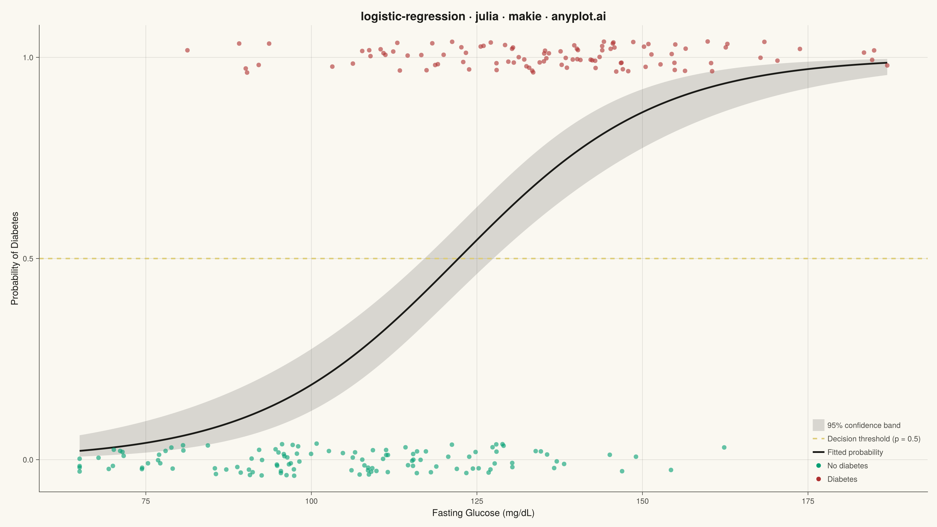
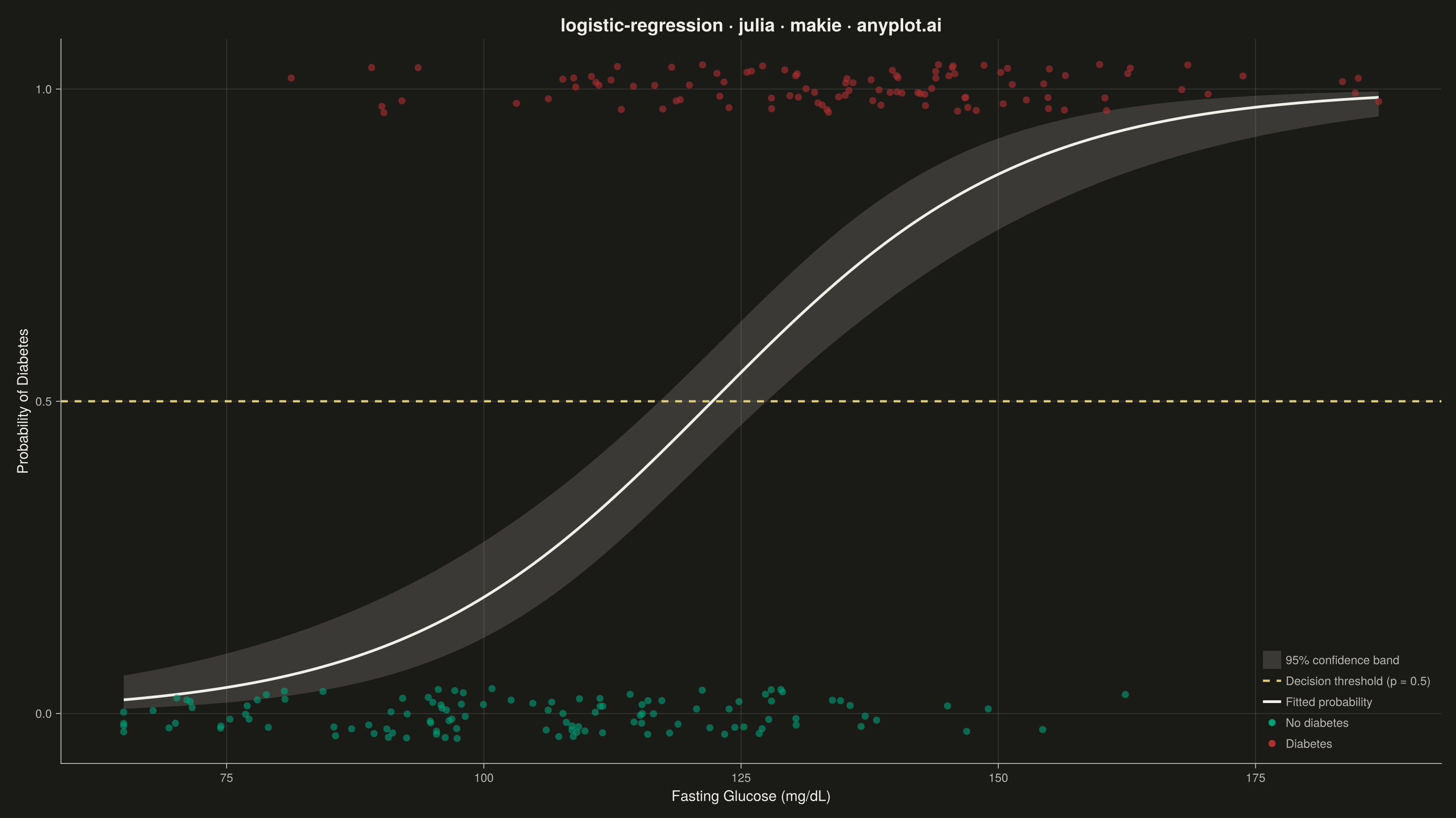
A logistic regression visualization showing the characteristic S-shaped (sigmoid) probability curve for binary classification. The plot displays data points colored by their binary class, the fitted logistic curve representing predicted probabilities, confidence intervals around the curve, and a dashed decision threshold line at probability 0.5. This visualization is essential for understanding how a logistic model maps continuous input features to class probabilities.
# anyplot.ai
# logistic-regression: Logistic Regression Curve Plot
# Library: makie 0.21.9 | Julia 1.11.9
# Quality: 92/100 | Created: 2026-09-02

using CairoMakie
using Colors
using LinearAlgebra
using Random
using Statistics

Random.seed!(42)

# --- Theme tokens ------------------------------------------------------------
THEME     = get(ENV, "ANYPLOT_THEME", "light")
PAGE_BG   = THEME == "light" ? colorant"#FAF8F1" : colorant"#1A1A17"
ELEVATED_BG = THEME == "light" ? colorant"#FFFDF6" : colorant"#242420"
INK       = THEME == "light" ? colorant"#1A1A17" : colorant"#F0EFE8"
INK_SOFT  = THEME == "light" ? colorant"#4A4A44" : colorant"#B8B7B0"

# Imprint palette — semantic exception: outcome maps to health status (good/bad)
HEALTHY_COLOR  = colorant"#009E73"  # class 0, no diabetes — brand green, always-first series
DIABETIC_COLOR = colorant"#AE3030"  # class 1, diabetes — semantic anchor for the adverse outcome
CURVE_COLOR    = INK                # fitted probability curve — neutral reference line
THRESHOLD_COLOR = colorant"#DDCC77" # decision threshold — amber warning anchor

# --- Data: fasting glucose vs. diabetes diagnosis -----------------------------
n = 220
glucose = clamp.(120.0 .+ 28.0 .* randn(n), 65.0, 210.0)        # fasting glucose, mg/dL
glucose_mean = mean(glucose)
glucose_std = std(glucose)
glucose_z = (glucose .- glucose_mean) ./ glucose_std

true_intercept = -0.3
true_slope = 1.6
true_prob = 1.0 ./ (1.0 .+ exp.(-(true_intercept .+ true_slope .* glucose_z)))
diagnosis = Float64.(rand(n) .< true_prob)                     # 0 = no diabetes, 1 = diabetes

# --- Fit logistic regression via Newton-Raphson (IRLS) ------------------------
design = hcat(ones(n), glucose_z)
beta = zeros(2)
weights = ones(n)
for _ in 1:25
    eta = design * beta
    mu = 1.0 ./ (1.0 .+ exp.(-eta))
    global weights = max.(mu .* (1.0 .- mu), 1e-8)
    hessian = design' * (design .* weights)
    gradient = design' * (diagnosis .- mu)
    global beta = beta + hessian \ gradient
end
covariance = inv(design' * (design .* weights))

# --- Fitted curve + 95% confidence band on a smooth glucose grid --------------
grid_n = 200
glucose_grid = collect(range(minimum(glucose), maximum(glucose), length=grid_n))
grid_z = (glucose_grid .- glucose_mean) ./ glucose_std
design_grid = hcat(ones(grid_n), grid_z)

eta_grid = design_grid * beta
prob_grid = 1.0 ./ (1.0 .+ exp.(-eta_grid))
se_eta = [sqrt(design_grid[i, :]' * covariance * design_grid[i, :]) for i in 1:grid_n]
prob_lower = 1.0 ./ (1.0 .+ exp.(-(eta_grid .- 1.96 .* se_eta)))
prob_upper = 1.0 ./ (1.0 .+ exp.(-(eta_grid .+ 1.96 .* se_eta)))

# Jitter the binary outcomes slightly so overlapping points stay visible
y_jitter = diagnosis .+ (rand(n) .- 0.5) .* 0.08
healthy_mask = diagnosis .== 0.0

# --- Plot ----------------------------------------------------------------------
fig = Figure(
    size            = (1600, 900),
    fontsize        = 14,
    backgroundcolor = PAGE_BG,
)

ax = Axis(
    fig[1, 1];
    title             = "logistic-regression · julia · makie · anyplot.ai",
    titlesize         = 20,
    titlecolor        = INK,
    xlabel            = "Fasting Glucose (mg/dL)",
    ylabel            = "Probability of Diabetes",
    xlabelsize        = 16,
    ylabelsize        = 16,
    xlabelcolor       = INK,
    ylabelcolor       = INK,
    xticklabelsize    = 13,
    yticklabelsize    = 13,
    xticklabelcolor   = INK_SOFT,
    yticklabelcolor   = INK_SOFT,
    xtickcolor        = INK_SOFT,
    ytickcolor        = INK_SOFT,
    backgroundcolor   = PAGE_BG,
    topspinevisible   = false,
    rightspinevisible = false,
    leftspinecolor    = INK_SOFT,
    bottomspinecolor  = INK_SOFT,
    xgridcolor        = RGBAf(INK.r, INK.g, INK.b, 0.12),
    ygridcolor        = RGBAf(INK.r, INK.g, INK.b, 0.12),
    xminorgridvisible = false,
    yminorgridvisible = false,
)
ylims!(ax, -0.08, 1.08)

band!(ax, glucose_grid, prob_lower, prob_upper; color = (CURVE_COLOR, 0.15), label = "95% confidence band")
hlines!(ax, [0.5]; color = THRESHOLD_COLOR, linewidth = 2.5, linestyle = :dash, label = "Decision threshold (p = 0.5)")
lines!(ax, glucose_grid, prob_grid; color = CURVE_COLOR, linewidth = 3, label = "Fitted probability")
scatter!(ax, glucose[healthy_mask], y_jitter[healthy_mask];
         color = HEALTHY_COLOR, markersize = 11, alpha = 0.6, strokewidth = 0, label = "No diabetes")
scatter!(ax, glucose[.!healthy_mask], y_jitter[.!healthy_mask];
         color = DIABETIC_COLOR, markersize = 11, alpha = 0.6, strokewidth = 0, label = "Diabetes")

axislegend(ax; position = :rb, backgroundcolor = ELEVATED_BG, framevisible = false, labelcolor = INK_SOFT, labelsize = 13)

# --- Save ----------------------------------------------------------------------
save("plot-$(THEME).png", fig; px_per_unit = 2)
Runnable source as JSON, for any HTTP client: https://api.anyplot.ai/specs/logistic-regression/makie/code. Any spec id and library id listed in llms-full.txt fit the same URL shape; every URL below is complete and callable.
{
  "spec_id": "logistic-regression",
  "language": "julia",
  "library": "makie",
  "page": "https://anyplot.ai/logistic-regression/julia/makie",
  "hub": "https://anyplot.ai/logistic-regression",
  "code_json": "https://api.anyplot.ai/specs/logistic-regression/makie/code",
  "spec_json": "https://api.anyplot.ai/specs/logistic-regression",
  "render_light_png": "https://storage.googleapis.com/anyplot-images/plots/logistic-regression/julia/makie/plot-light.png",
  "render_dark_png": "https://storage.googleapis.com/anyplot-images/plots/logistic-regression/julia/makie/plot-dark.png",
  "quality_score": 92.0,
  "license": "MIT",
  "guide": "https://anyplot.ai/llms.txt"
}
Part of Logistic Regression Curve Plot on anyplot.ai.