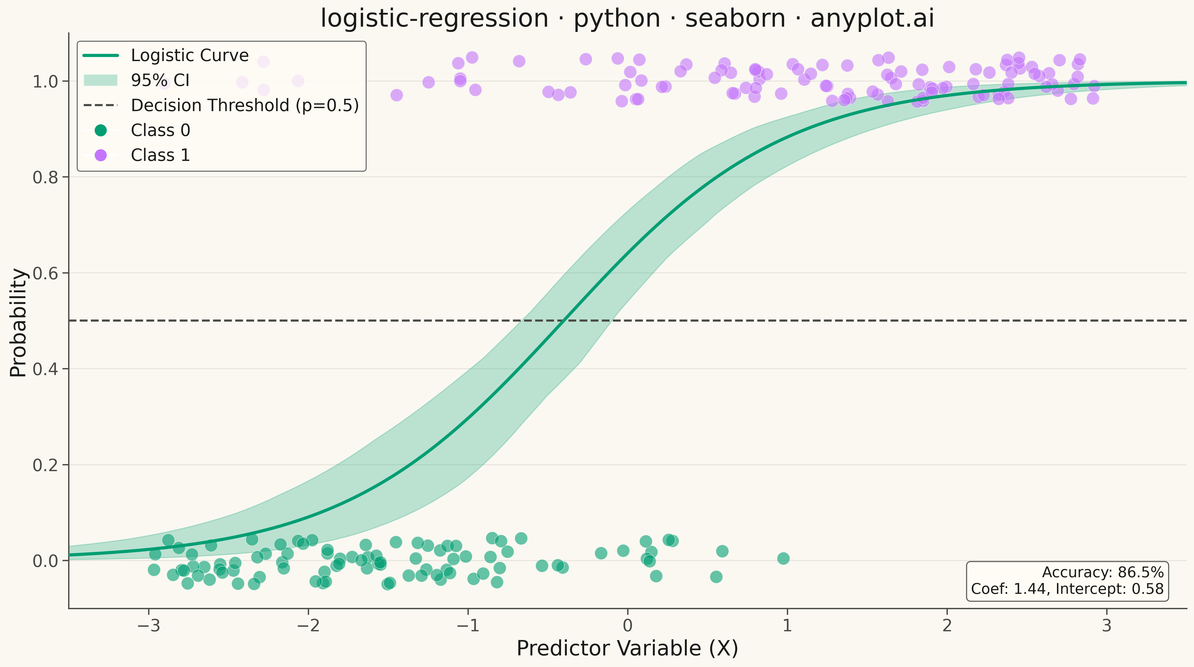
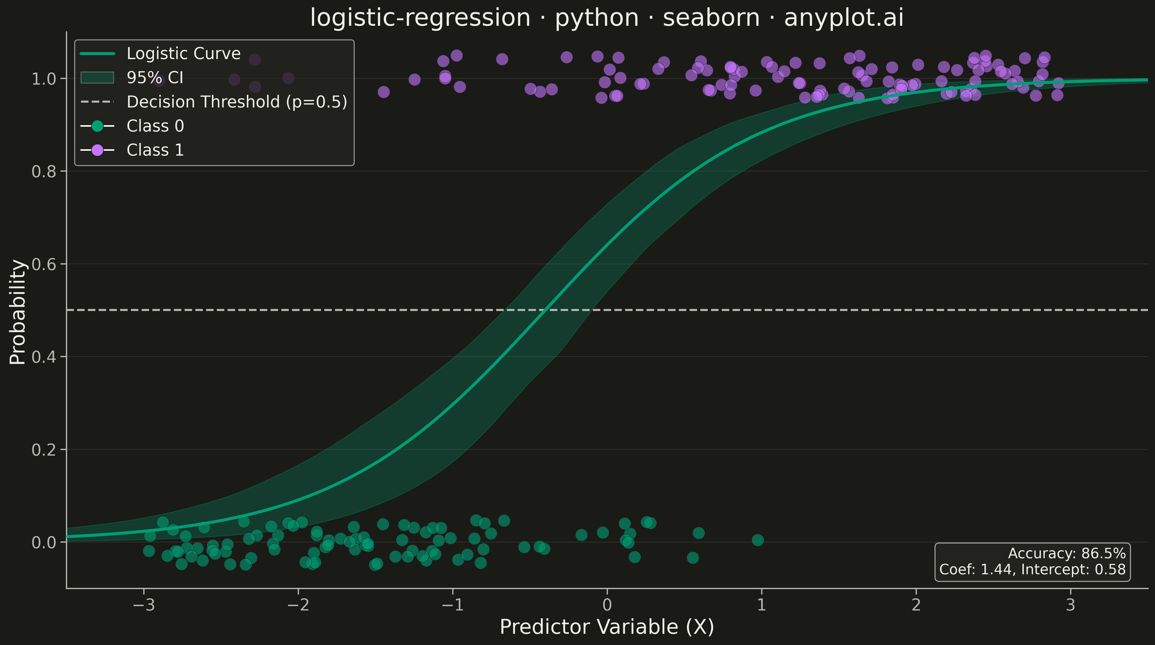
A logistic regression visualization showing the characteristic S-shaped (sigmoid) probability curve for binary classification. The plot displays data points colored by their binary class, the fitted logistic curve representing predicted probabilities, confidence intervals around the curve, and an optional decision threshold line. This visualization is essential for understanding how a logistic model maps continuous input features to class probabilities.
""" anyplot.ai
logistic-regression: Logistic Regression Curve Plot
Library: seaborn 0.13.2 | Python 3.13.13
Quality: 94/100 | Updated: 2026-05-18
"""

import os

import matplotlib.pyplot as plt
import numpy as np
import seaborn as sns
from matplotlib.lines import Line2D
from matplotlib.patches import Patch
from scipy.special import expit
from sklearn.linear_model import LogisticRegression


# Theme tokens
THEME = os.getenv("ANYPLOT_THEME", "light")
PAGE_BG = "#FAF8F1" if THEME == "light" else "#1A1A17"
ELEVATED_BG = "#FFFDF6" if THEME == "light" else "#242420"
INK = "#1A1A17" if THEME == "light" else "#F0EFE8"
INK_SOFT = "#4A4A44" if THEME == "light" else "#B8B7B0"

# Okabe-Ito palette
COLOR_CLASS_0 = "#009E73"
COLOR_CLASS_1 = "#C475FD"

# Data
np.random.seed(42)
n_samples = 200

x = np.random.uniform(-3, 3, n_samples)
true_prob = expit(1.5 * x + 0.5)
y = (np.random.random(n_samples) < true_prob).astype(int)

X_train = x.reshape(-1, 1)
model = LogisticRegression()
model.fit(X_train, y)

x_curve = np.linspace(-3.5, 3.5, 300)
X_curve = x_curve.reshape(-1, 1)
prob_curve = model.predict_proba(X_curve)[:, 1]

n_bootstrap = 100
bootstrap_probs = np.zeros((n_bootstrap, len(x_curve)))
for i in range(n_bootstrap):
    idx = np.random.choice(n_samples, n_samples, replace=True)
    X_boot = x[idx].reshape(-1, 1)
    y_boot = y[idx]
    model_boot = LogisticRegression()
    model_boot.fit(X_boot, y_boot)
    bootstrap_probs[i] = model_boot.predict_proba(X_curve)[:, 1]

ci_lower = np.percentile(bootstrap_probs, 2.5, axis=0)
ci_upper = np.percentile(bootstrap_probs, 97.5, axis=0)

y_jittered = y + np.random.uniform(-0.05, 0.05, n_samples)

sns.set_theme(
    style="ticks",
    rc={
        "figure.facecolor": PAGE_BG,
        "axes.facecolor": PAGE_BG,
        "axes.edgecolor": INK_SOFT,
        "axes.labelcolor": INK,
        "text.color": INK,
        "xtick.color": INK_SOFT,
        "ytick.color": INK_SOFT,
        "grid.color": INK,
        "grid.alpha": 0.10,
        "legend.facecolor": ELEVATED_BG,
        "legend.edgecolor": INK_SOFT,
    },
)

# Create plot
fig, ax = plt.subplots(figsize=(16, 9), facecolor=PAGE_BG)
ax.set_facecolor(PAGE_BG)

# Confidence interval
ax.fill_between(x_curve, ci_lower, ci_upper, alpha=0.25, color=COLOR_CLASS_0)

# Logistic curve
ax.plot(x_curve, prob_curve, color=COLOR_CLASS_0, linewidth=3, zorder=5)

# Data points
class_0_mask = y == 0
class_1_mask = y == 1

ax.scatter(
    x[class_0_mask],
    y_jittered[class_0_mask],
    s=150,
    alpha=0.6,
    color=COLOR_CLASS_0,
    edgecolors=PAGE_BG,
    linewidth=0.5,
    zorder=4,
)
ax.scatter(
    x[class_1_mask],
    y_jittered[class_1_mask],
    s=150,
    alpha=0.6,
    color=COLOR_CLASS_1,
    edgecolors=PAGE_BG,
    linewidth=0.5,
    zorder=4,
)

# Decision threshold line
ax.axhline(y=0.5, color=INK_SOFT, linestyle="--", linewidth=2, zorder=3)

# Legend
legend_elements = [
    Line2D([0], [0], color=COLOR_CLASS_0, linewidth=3, label="Logistic Curve"),
    Patch(facecolor=COLOR_CLASS_0, alpha=0.25, label="95% CI"),
    Line2D([0], [0], color=INK_SOFT, linestyle="--", linewidth=2, label="Decision Threshold (p=0.5)"),
    Line2D(
        [0],
        [0],
        marker="o",
        color="w",
        markerfacecolor=COLOR_CLASS_0,
        markersize=12,
        label="Class 0",
        markeredgecolor=PAGE_BG,
        markeredgewidth=0.5,
    ),
    Line2D(
        [0],
        [0],
        marker="o",
        color="w",
        markerfacecolor=COLOR_CLASS_1,
        markersize=12,
        label="Class 1",
        markeredgecolor=PAGE_BG,
        markeredgewidth=0.5,
    ),
]
ax.legend(handles=legend_elements, fontsize=16, loc="upper left")

# Model info annotation
accuracy = model.score(X_train, y)
coef = model.coef_[0][0]
intercept = model.intercept_[0]
ax.annotate(
    f"Accuracy: {accuracy:.1%}\nCoef: {coef:.2f}, Intercept: {intercept:.2f}",
    xy=(0.98, 0.02),
    xycoords="axes fraction",
    fontsize=14,
    ha="right",
    va="bottom",
    bbox={"boxstyle": "round", "facecolor": ELEVATED_BG, "edgecolor": INK_SOFT, "alpha": 0.9},
    color=INK,
)

# Styling
ax.set_xlabel("Predictor Variable (X)", fontsize=20, color=INK)
ax.set_ylabel("Probability", fontsize=20, color=INK)
ax.set_title("logistic-regression · python · seaborn · anyplot.ai", fontsize=24, color=INK)
ax.tick_params(axis="both", labelsize=16, colors=INK_SOFT)
ax.set_ylim(-0.1, 1.1)
ax.set_xlim(-3.5, 3.5)

# Remove top and right spines
ax.spines["top"].set_visible(False)
ax.spines["right"].set_visible(False)
ax.spines["left"].set_color(INK_SOFT)
ax.spines["bottom"].set_color(INK_SOFT)

# Subtle grid
ax.grid(True, alpha=0.10, axis="y", linewidth=0.8)

plt.tight_layout()
plt.savefig(f"plot-{THEME}.png", dpi=300, bbox_inches="tight", facecolor=PAGE_BG)
Runnable source as JSON, for any HTTP client: https://api.anyplot.ai/specs/logistic-regression/seaborn/code. Any spec id and library id listed in llms-full.txt fit the same URL shape; every URL below is complete and callable.
{
  "spec_id": "logistic-regression",
  "language": "python",
  "library": "seaborn",
  "page": "https://anyplot.ai/logistic-regression/python/seaborn",
  "hub": "https://anyplot.ai/logistic-regression",
  "code_json": "https://api.anyplot.ai/specs/logistic-regression/seaborn/code",
  "spec_json": "https://api.anyplot.ai/specs/logistic-regression",
  "render_light_png": "https://storage.googleapis.com/anyplot-images/plots/logistic-regression/python/seaborn/plot-light.png",
  "render_dark_png": "https://storage.googleapis.com/anyplot-images/plots/logistic-regression/python/seaborn/plot-dark.png",
  "quality_score": 94.0,
  "license": "MIT",
  "guide": "https://anyplot.ai/llms.txt"
}
Part of Logistic Regression Curve Plot on anyplot.ai.