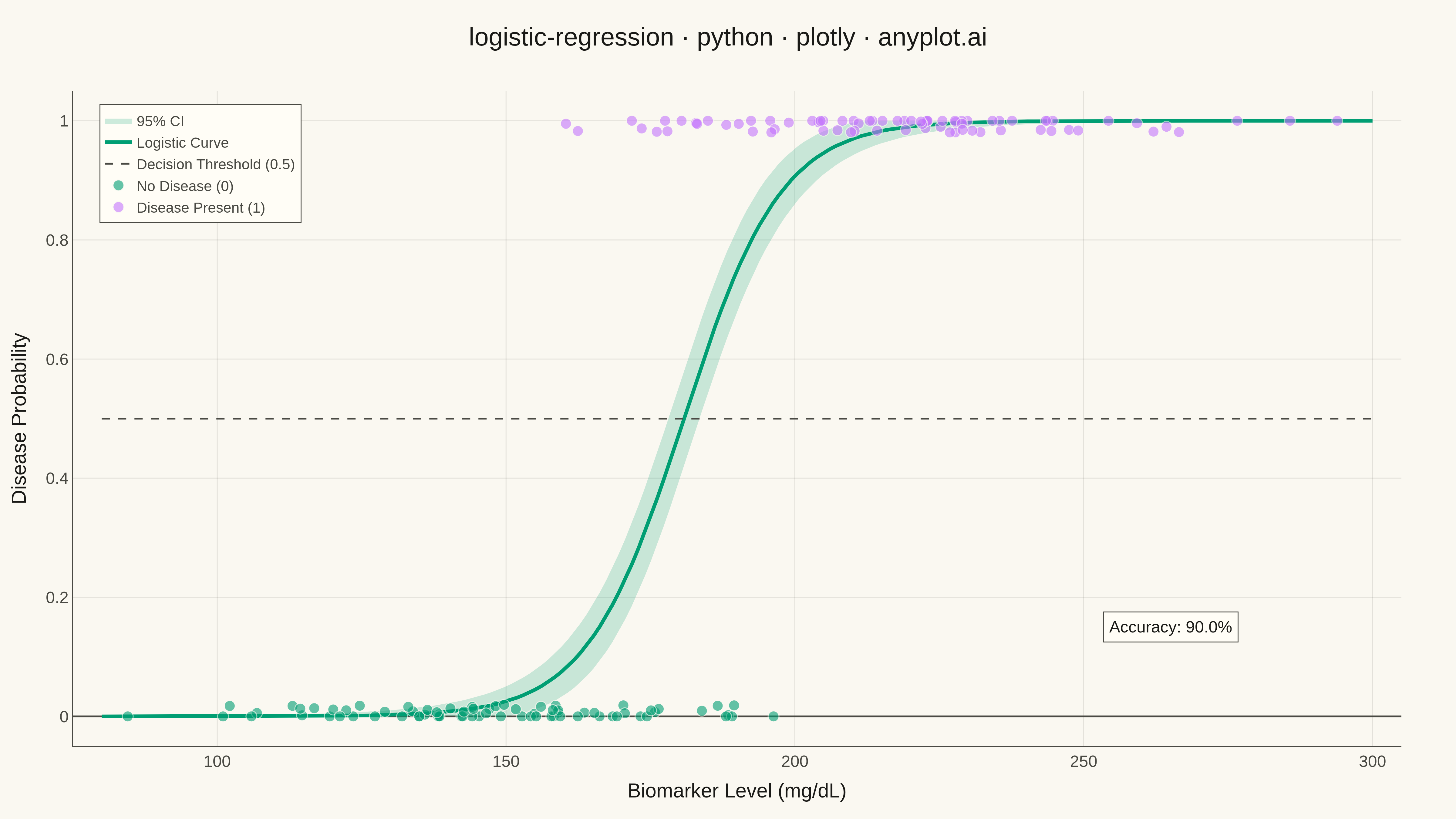
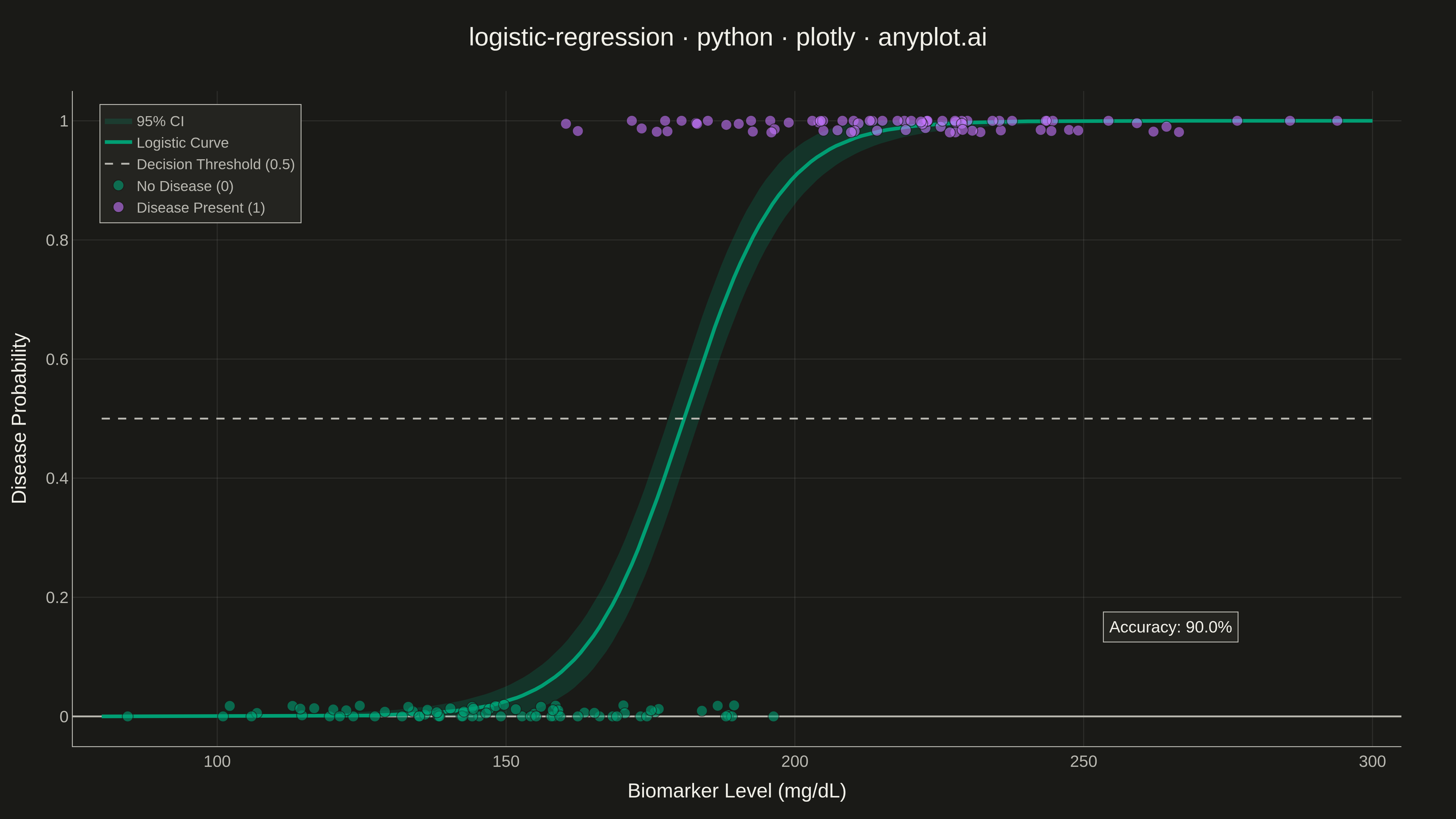
A logistic regression visualization showing the characteristic S-shaped (sigmoid) probability curve for binary classification. The plot displays data points colored by their binary class, the fitted logistic curve representing predicted probabilities, confidence intervals around the curve, and an optional decision threshold line. This visualization is essential for understanding how a logistic model maps continuous input features to class probabilities.
""" anyplot.ai
logistic-regression: Logistic Regression Curve Plot
Library: plotly 6.7.0 | Python 3.13.13
Quality: 93/100 | Updated: 2026-05-18
"""

import os
import sys


# Remove current directory from path to avoid importing local plotly.py
sys.path = [p for p in sys.path if p not in ("", ".", os.path.dirname(__file__))]

import numpy as np
import plotly.graph_objects as go
from sklearn.linear_model import LogisticRegression


# Theme tokens
THEME = os.getenv("ANYPLOT_THEME", "light")
PAGE_BG = "#FAF8F1" if THEME == "light" else "#1A1A17"
ELEVATED_BG = "#FFFDF6" if THEME == "light" else "#242420"
INK = "#1A1A17" if THEME == "light" else "#F0EFE8"
INK_SOFT = "#4A4A44" if THEME == "light" else "#B8B7B0"

# Okabe-Ito palette
BRAND = "#009E73"  # First series - bluish green
ACCENT = "#C475FD"  # Second series - vermillion

# Data - medical biomarker vs disease diagnosis
np.random.seed(42)
n_samples = 150

# Generate biomarker values (e.g., cholesterol, glucose level)
biomarker = np.concatenate(
    [
        np.random.normal(150, 25, n_samples // 2),  # Patients without disease
        np.random.normal(220, 30, n_samples // 2),  # Patients with disease
    ]
)
biomarker = np.clip(biomarker, 80, 300)

# Binary outcome (0=no disease, 1=disease present)
y = np.array([0] * (n_samples // 2) + [1] * (n_samples // 2))

# Shuffle data
shuffle_idx = np.random.permutation(len(biomarker))
biomarker = biomarker[shuffle_idx]
y = y[shuffle_idx]

# Fit logistic regression
X = biomarker.reshape(-1, 1)
model = LogisticRegression()
model.fit(X, y)

# Generate smooth curve for predictions
x_curve = np.linspace(80, 300, 200)
y_proba = model.predict_proba(x_curve.reshape(-1, 1))[:, 1]

# Calculate confidence intervals (approximate using standard error)
se = np.sqrt(y_proba * (1 - y_proba) / n_samples) * 1.96
y_upper = np.clip(y_proba + se, 0, 1)
y_lower = np.clip(y_proba - se, 0, 1)

# Jitter y values for visibility (constrained to [0, 1])
y_jittered = y + np.random.uniform(-0.02, 0.02, len(y))
y_jittered = np.clip(y_jittered, 0, 1)

# Model accuracy
accuracy = model.score(X, y)

# Create figure
fig = go.Figure()

# Confidence interval band
fig.add_trace(
    go.Scatter(
        x=np.concatenate([x_curve, x_curve[::-1]]),
        y=np.concatenate([y_upper, y_lower[::-1]]),
        fill="toself",
        fillcolor="rgba(0, 158, 115, 0.2)",
        line={"color": "rgba(0,0,0,0)"},
        name="95% CI",
        showlegend=True,
        hoverinfo="skip",
    )
)

# Logistic regression curve
fig.add_trace(
    go.Scatter(
        x=x_curve,
        y=y_proba,
        mode="lines",
        line={"color": BRAND, "width": 4},
        name="Logistic Curve",
        hovertemplate="<b>Biomarker:</b> %{x:.1f}<br><b>Probability:</b> %{y:.3f}<extra></extra>",
    )
)

# Decision threshold line at 0.5
fig.add_trace(
    go.Scatter(
        x=[80, 300],
        y=[0.5, 0.5],
        mode="lines",
        line={"color": INK_SOFT, "width": 2, "dash": "dash"},
        name="Decision Threshold (0.5)",
        hoverinfo="skip",
    )
)

# Data points - Class 0 (No Disease)
mask_0 = y == 0
fig.add_trace(
    go.Scatter(
        x=biomarker[mask_0],
        y=y_jittered[mask_0],
        mode="markers",
        marker={"size": 12, "color": BRAND, "opacity": 0.6, "line": {"width": 1, "color": PAGE_BG}},
        name="No Disease (0)",
        hovertemplate="<b>Biomarker:</b> %{x:.1f}<br><b>Outcome:</b> No Disease<extra></extra>",
    )
)

# Data points - Class 1 (Disease Present)
mask_1 = y == 1
fig.add_trace(
    go.Scatter(
        x=biomarker[mask_1],
        y=y_jittered[mask_1],
        mode="markers",
        marker={"size": 12, "color": ACCENT, "opacity": 0.6, "line": {"width": 1, "color": PAGE_BG}},
        name="Disease Present (1)",
        hovertemplate="<b>Biomarker:</b> %{x:.1f}<br><b>Outcome:</b> Disease Present<extra></extra>",
    )
)

# Layout
fig.update_layout(
    title={
        "text": "logistic-regression · python · plotly · anyplot.ai",
        "font": {"size": 28, "color": INK},
        "x": 0.5,
        "xanchor": "center",
    },
    xaxis={
        "title": {"text": "Biomarker Level (mg/dL)", "font": {"size": 22, "color": INK}},
        "tickfont": {"size": 18, "color": INK_SOFT},
        "range": [75, 305],
        "gridcolor": "rgba(26,26,23,0.10)" if THEME == "light" else "rgba(240,239,232,0.10)",
        "gridwidth": 1,
        "linecolor": INK_SOFT,
        "zerolinecolor": INK_SOFT,
    },
    yaxis={
        "title": {"text": "Disease Probability", "font": {"size": 22, "color": INK}},
        "tickfont": {"size": 18, "color": INK_SOFT},
        "range": [-0.05, 1.05],
        "gridcolor": "rgba(26,26,23,0.10)" if THEME == "light" else "rgba(240,239,232,0.10)",
        "gridwidth": 1,
        "linecolor": INK_SOFT,
        "zerolinecolor": INK_SOFT,
    },
    paper_bgcolor=PAGE_BG,
    plot_bgcolor=PAGE_BG,
    font={"color": INK},
    legend={
        "font": {"size": 16, "color": INK_SOFT},
        "x": 0.02,
        "y": 0.98,
        "bgcolor": ELEVATED_BG,
        "bordercolor": INK_SOFT,
        "borderwidth": 1,
    },
    annotations=[
        {
            "x": 265,
            "y": 0.15,
            "text": f"Accuracy: {accuracy:.1%}",
            "showarrow": False,
            "font": {"size": 18, "color": INK},
            "bgcolor": ELEVATED_BG,
            "bordercolor": INK_SOFT,
            "borderwidth": 1,
            "borderpad": 6,
        }
    ],
    margin={"l": 80, "r": 60, "t": 100, "b": 80},
)

# Save as PNG (4800x2700)
fig.write_image(f"plot-{THEME}.png", width=1600, height=900, scale=3)

# Save interactive HTML
fig.write_html(f"plot-{THEME}.html", include_plotlyjs="cdn")
Runnable source as JSON, for any HTTP client: https://api.anyplot.ai/specs/logistic-regression/plotly/code. Any spec id and library id listed in llms-full.txt fit the same URL shape; every URL below is complete and callable.
{
  "spec_id": "logistic-regression",
  "language": "python",
  "library": "plotly",
  "page": "https://anyplot.ai/logistic-regression/python/plotly",
  "hub": "https://anyplot.ai/logistic-regression",
  "code_json": "https://api.anyplot.ai/specs/logistic-regression/plotly/code",
  "spec_json": "https://api.anyplot.ai/specs/logistic-regression",
  "render_light_png": "https://storage.googleapis.com/anyplot-images/plots/logistic-regression/python/plotly/plot-light.png",
  "render_dark_png": "https://storage.googleapis.com/anyplot-images/plots/logistic-regression/python/plotly/plot-dark.png",
  "interactive_light_html": "https://storage.googleapis.com/anyplot-images/plots/logistic-regression/python/plotly/plot-light.html",
  "interactive_dark_html": "https://storage.googleapis.com/anyplot-images/plots/logistic-regression/python/plotly/plot-dark.html",
  "quality_score": 93.0,
  "license": "MIT",
  "guide": "https://anyplot.ai/llms.txt"
}
Part of Logistic Regression Curve Plot on anyplot.ai.