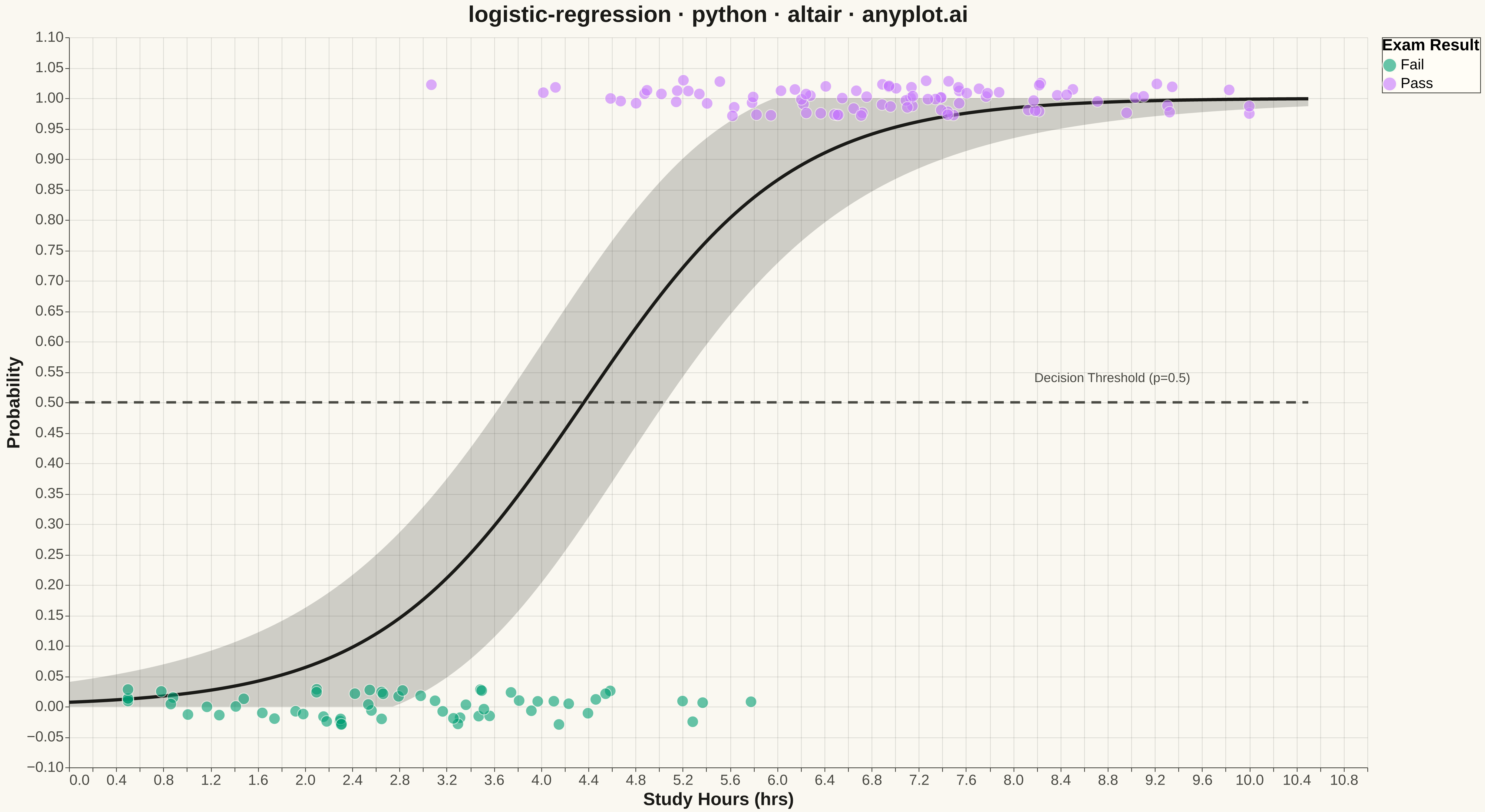
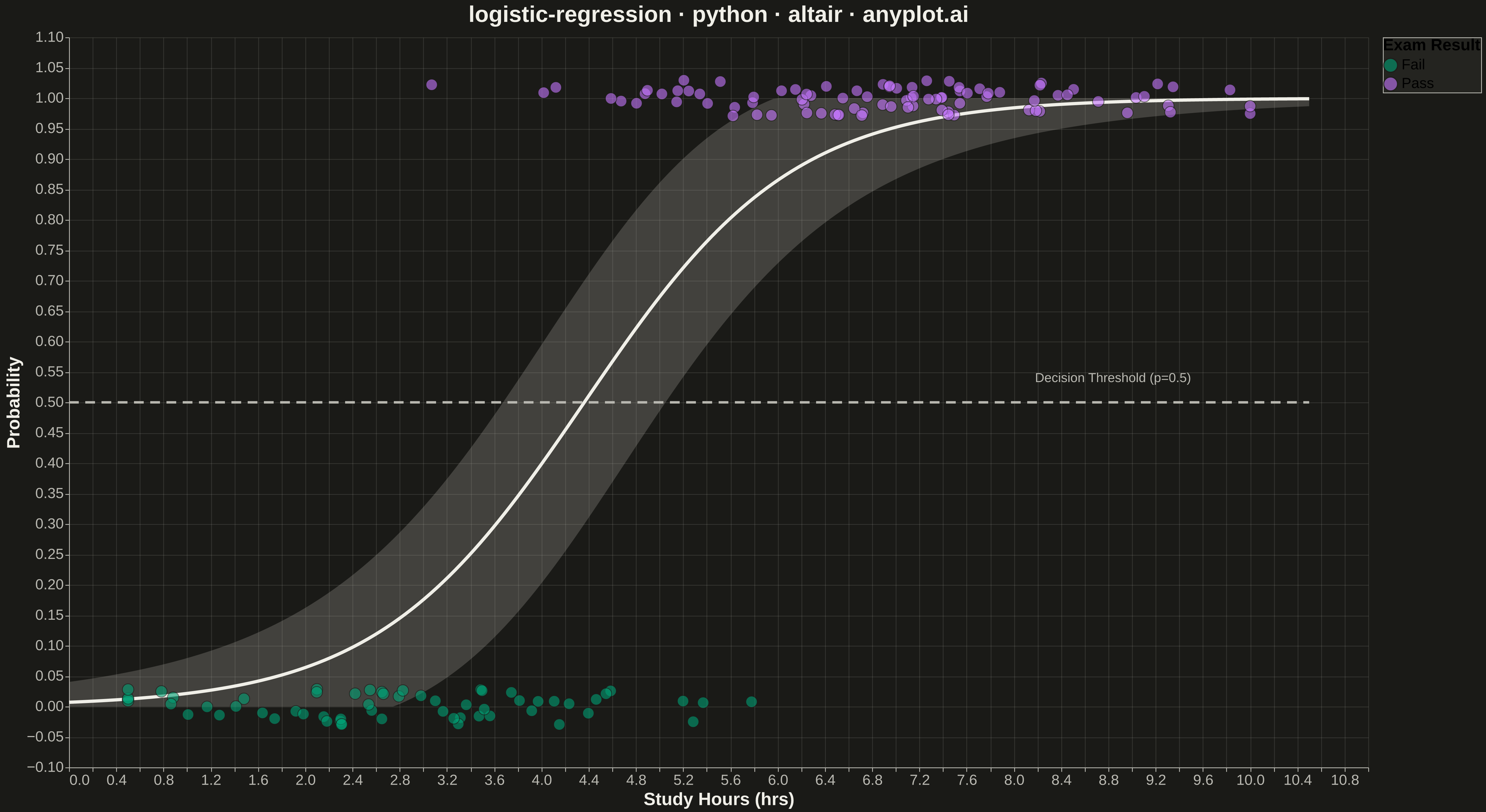
A logistic regression visualization showing the characteristic S-shaped (sigmoid) probability curve for binary classification. The plot displays data points colored by their binary class, the fitted logistic curve representing predicted probabilities, confidence intervals around the curve, and an optional decision threshold line. This visualization is essential for understanding how a logistic model maps continuous input features to class probabilities.
""" anyplot.ai
logistic-regression: Logistic Regression Curve Plot
Library: altair 6.1.0 | Python 3.13.13
Quality: 89/100 | Updated: 2026-05-18
"""

import os
import sys

import numpy as np
import pandas as pd


# Work around filename shadowing the altair library
sys.path.pop(0)
import altair as alt


# Theme configuration
THEME = os.getenv("ANYPLOT_THEME", "light")
PAGE_BG = "#FAF8F1" if THEME == "light" else "#1A1A17"
ELEVATED_BG = "#FFFDF6" if THEME == "light" else "#242420"
INK = "#1A1A17" if THEME == "light" else "#F0EFE8"
INK_SOFT = "#4A4A44" if THEME == "light" else "#B8B7B0"

# Okabe-Ito palette
BRAND = "#009E73"  # First series (Fail)
SECONDARY = "#C475FD"  # Second series (Pass)

# Data - Study hours vs exam pass/fail
np.random.seed(42)
n_samples = 150

# Generate study hours with different distributions for pass/fail
hours_fail = np.random.normal(3, 1.5, 60)
hours_pass = np.random.normal(7, 1.5, 90)
hours = np.concatenate([hours_fail, hours_pass])
hours = np.clip(hours, 0.5, 10)

outcome = np.concatenate([np.zeros(60), np.ones(90)])

# Fit logistic regression using gradient descent
X_b = np.column_stack([np.ones(n_samples), hours])
w = np.zeros(2)

for _ in range(1000):
    z = X_b @ w
    predictions = 1 / (1 + np.exp(-z))
    gradient = X_b.T @ (predictions - outcome) / n_samples
    w -= 0.1 * gradient

b0, b1 = w[0], w[1]

# Generate smooth curve points
x_curve = np.linspace(0, 10.5, 200)
y_proba = 1 / (1 + np.exp(-(b0 + b1 * x_curve)))

# Calculate confidence intervals
se = np.sqrt(y_proba * (1 - y_proba) / n_samples) * 2.5
ci_lower = np.clip(y_proba - 1.96 * se, 0, 1)
ci_upper = np.clip(y_proba + 1.96 * se, 0, 1)

# Create curve DataFrame
curve_df = pd.DataFrame({"Study Hours": x_curve, "Probability": y_proba, "CI Lower": ci_lower, "CI Upper": ci_upper})

# Add jitter to data points for visibility
jitter = np.random.uniform(-0.03, 0.03, len(outcome))
y_jittered = outcome + jitter

# Create data points DataFrame
points_df = pd.DataFrame(
    {
        "Study Hours": hours,
        "Outcome": outcome,
        "Outcome Jittered": y_jittered,
        "Class": ["Fail" if o == 0 else "Pass" for o in outcome],
    }
)

# Decision threshold line
threshold_df = pd.DataFrame({"Study Hours": [0, 10.5], "Probability": [0.5, 0.5]})

# Create the confidence interval band
ci_band = (
    alt.Chart(curve_df)
    .mark_area(opacity=0.25, color=INK_SOFT)
    .encode(x=alt.X("Study Hours:Q"), y=alt.Y("CI Lower:Q"), y2=alt.Y2("CI Upper:Q"))
)

# Create the logistic curve
curve = (
    alt.Chart(curve_df).mark_line(strokeWidth=4, color=INK).encode(x=alt.X("Study Hours:Q"), y=alt.Y("Probability:Q"))
)

# Create the data points with Okabe-Ito colors
points = (
    alt.Chart(points_df)
    .mark_circle(size=200, opacity=0.6, strokeWidth=1, stroke=PAGE_BG)
    .encode(
        x=alt.X("Study Hours:Q", title="Study Hours (hrs)", scale=alt.Scale(domain=[0, 10.5])),
        y=alt.Y("Outcome Jittered:Q", title="Probability", scale=alt.Scale(domain=[-0.05, 1.05])),
        color=alt.Color(
            "Class:N",
            scale=alt.Scale(domain=["Fail", "Pass"], range=[BRAND, SECONDARY]),
            legend=alt.Legend(
                title="Exam Result",
                titleFontSize=20,
                labelFontSize=18,
                symbolSize=300,
                fillColor=ELEVATED_BG,
                strokeColor=INK_SOFT,
            ),
        ),
        tooltip=["Study Hours", "Class"],
    )
)

# Decision threshold line
threshold = (
    alt.Chart(threshold_df)
    .mark_line(strokeDash=[12, 8], strokeWidth=3, color=INK_SOFT)
    .encode(x=alt.X("Study Hours:Q"), y=alt.Y("Probability:Q"))
)

# Threshold label
threshold_label = (
    alt.Chart(pd.DataFrame({"x": [9.5], "y": [0.54], "text": ["Decision Threshold (p=0.5)"]}))
    .mark_text(fontSize=16, color=INK_SOFT, align="right")
    .encode(x="x:Q", y="y:Q", text="text:N")
)

# Combine all layers
chart = (
    alt.layer(ci_band, curve, threshold, threshold_label, points)
    .properties(
        width=1600,
        height=900,
        background=PAGE_BG,
        title=alt.Title("logistic-regression · python · altair · anyplot.ai", fontSize=28, anchor="middle", color=INK),
    )
    .configure_axis(
        labelFontSize=18,
        titleFontSize=22,
        gridOpacity=0.15,
        domainColor=INK_SOFT,
        tickColor=INK_SOFT,
        gridColor=INK_SOFT,
        labelColor=INK_SOFT,
        titleColor=INK,
    )
    .configure_view(strokeWidth=0, fill=PAGE_BG)
    .configure_title(color=INK)
)

# Save outputs
chart.save(f"plot-{THEME}.png", scale_factor=3.0)
chart.save(f"plot-{THEME}.html")
Runnable source as JSON, for any HTTP client: https://api.anyplot.ai/specs/logistic-regression/altair/code. Any spec id and library id listed in llms-full.txt fit the same URL shape; every URL below is complete and callable.
{
  "spec_id": "logistic-regression",
  "language": "python",
  "library": "altair",
  "page": "https://anyplot.ai/logistic-regression/python/altair",
  "hub": "https://anyplot.ai/logistic-regression",
  "code_json": "https://api.anyplot.ai/specs/logistic-regression/altair/code",
  "spec_json": "https://api.anyplot.ai/specs/logistic-regression",
  "render_light_png": "https://storage.googleapis.com/anyplot-images/plots/logistic-regression/python/altair/plot-light.png",
  "render_dark_png": "https://storage.googleapis.com/anyplot-images/plots/logistic-regression/python/altair/plot-dark.png",
  "interactive_light_html": "https://storage.googleapis.com/anyplot-images/plots/logistic-regression/python/altair/plot-light.html",
  "interactive_dark_html": "https://storage.googleapis.com/anyplot-images/plots/logistic-regression/python/altair/plot-dark.html",
  "quality_score": 89.0,
  "license": "MIT",
  "guide": "https://anyplot.ai/llms.txt"
}
Part of Logistic Regression Curve Plot on anyplot.ai.