The same plot in 14 other libraries — Python: Altair, Bokeh, lets-plot, Matplotlib, Plotly, plotnine, Pygal, Seaborn; Julia: Makie.jl; JavaScript: Chart.js, D3.js, Apache ECharts, Highcharts, MUI X Charts. Compare all 15 side by side: Logistic Regression Curve Plot in Python, R, Julia and JavaScript.
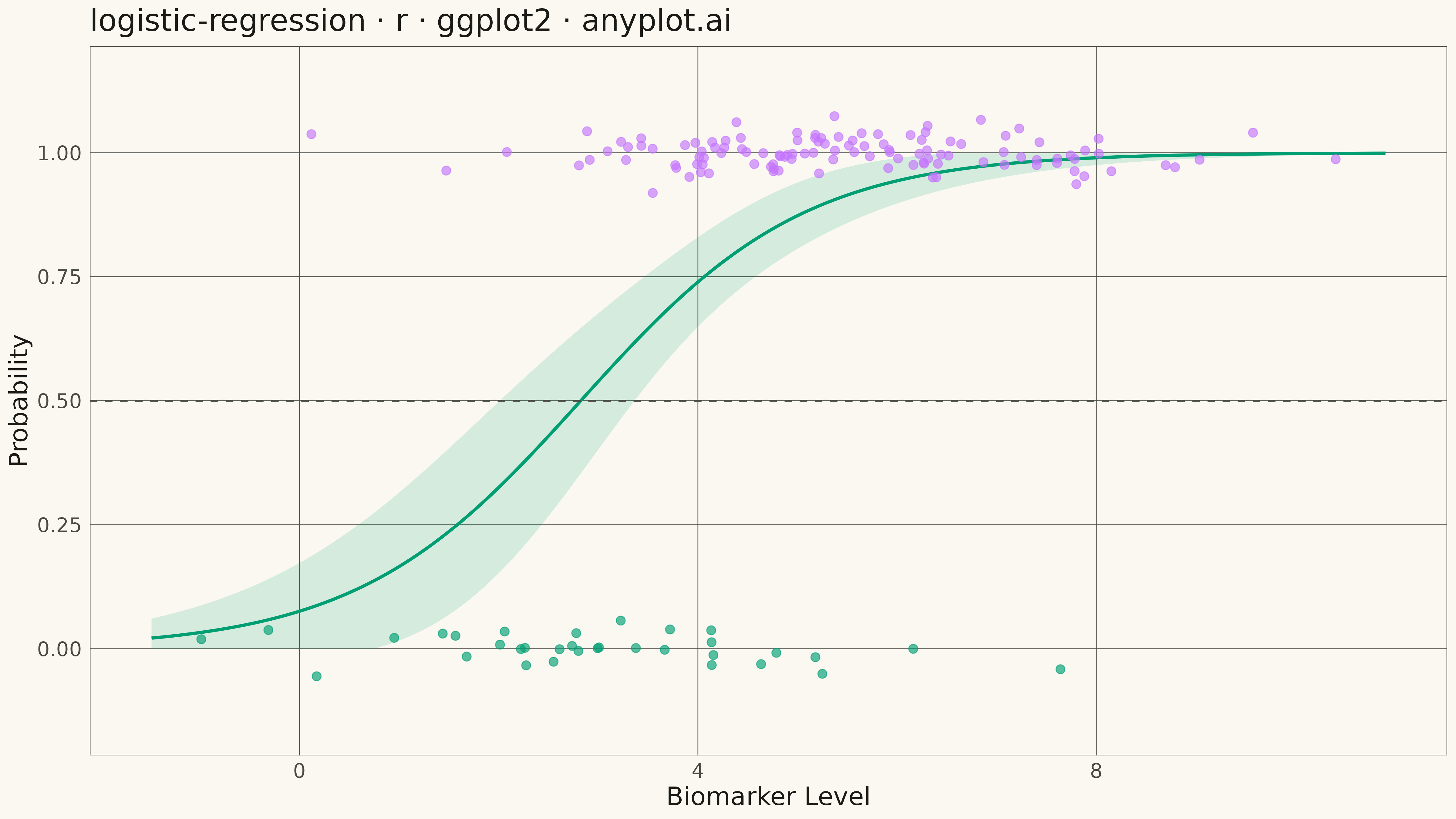
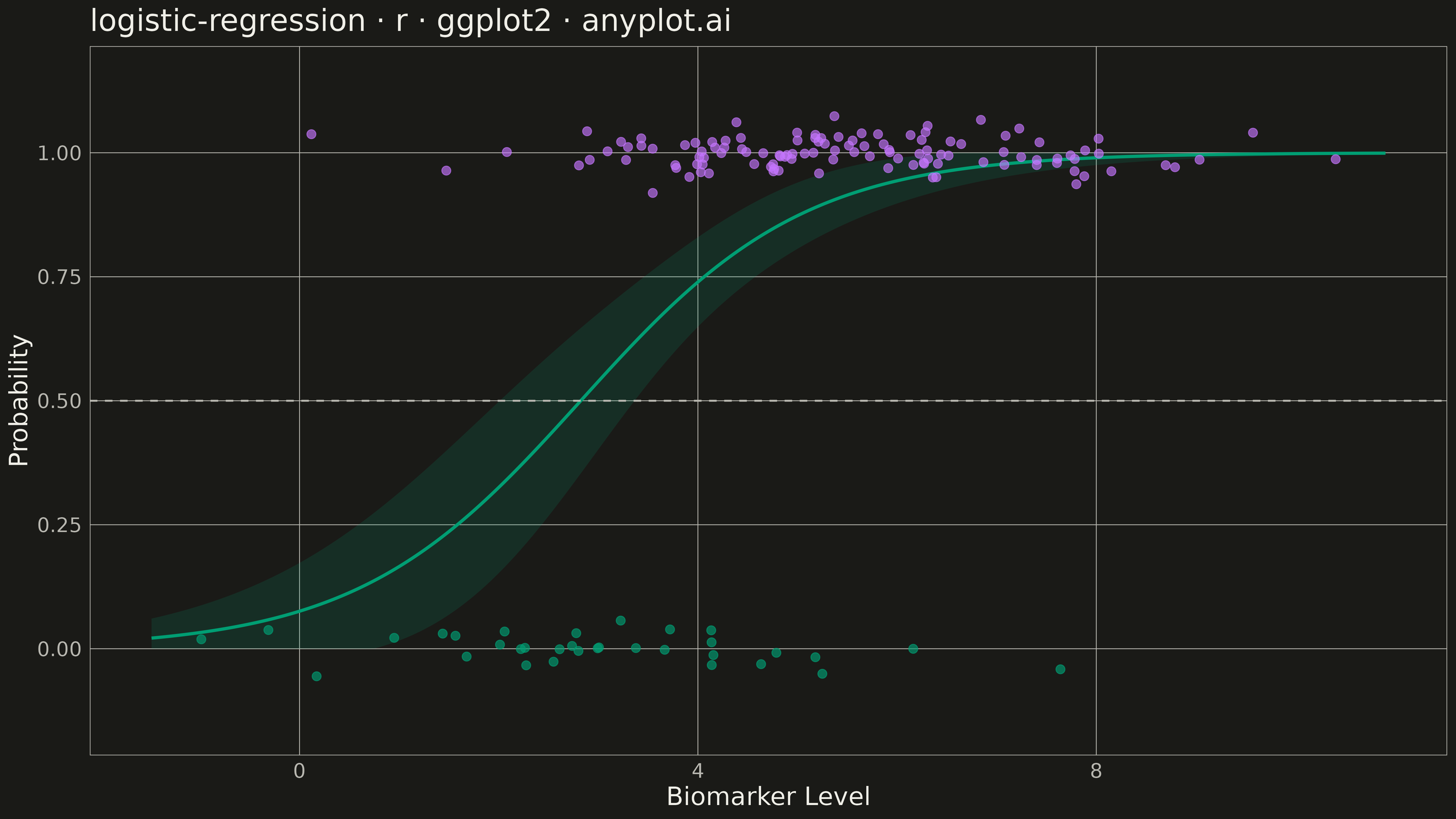
A logistic regression visualization showing the characteristic S-shaped (sigmoid) probability curve for binary classification. The plot displays data points colored by their binary class, the fitted logistic curve representing predicted probabilities, confidence intervals around the curve, and an optional decision threshold line. This visualization is essential for understanding how a logistic model maps continuous input features to class probabilities.
#' anyplot.ai
#' logistic-regression: Logistic Regression Curve Plot
#' Library: ggplot2 3.5.1 | R 4.4.1
#' Quality: 89/100 | Created: 2026-05-18

library(ggplot2)
library(dplyr)
library(ragg)

set.seed(42)

# --- Theme tokens -----------------------------------------------------------
THEME       <- Sys.getenv("ANYPLOT_THEME", "light")
PAGE_BG     <- if (THEME == "light") "#FAF8F1" else "#1A1A17"
ELEVATED_BG <- if (THEME == "light") "#FFFDF6" else "#242420"
INK         <- if (THEME == "light") "#1A1A17" else "#F0EFE8"
INK_SOFT    <- if (THEME == "light") "#4A4A44" else "#B8B7B0"
IMPRINT   <- c("#009E73", "#C475FD", "#4467A3", "#BD8233",
                 "#AE3030", "#2ABCCD", "#954477")

# --- Data -------------------------------------------------------------------
# Medical diagnostic context: biomarker level predicts disease probability
n <- 150
biomarker <- rnorm(n, mean = 5, sd = 2)
# Logistic function: P(disease) = 1 / (1 + exp(-(intercept + slope*biomarker)))
true_prob <- 1 / (1 + exp(-(0.8 * biomarker - 2)))
disease <- rbinom(n, size = 1, prob = true_prob)

# Fit logistic regression
model <- glm(disease ~ biomarker, family = binomial(link = "logit"))

# Generate prediction data for smooth curve
biomarker_range <- seq(min(biomarker) - 0.5, max(biomarker) + 0.5, length.out = 300)
pred_data <- data.frame(biomarker = biomarker_range)
pred <- predict(model, newdata = pred_data, type = "response", se.fit = TRUE)

pred_data$probability <- pred$fit
pred_data$se <- pred$se.fit
pred_data$upper <- pmin(pred$fit + 1.96 * pred$se.fit, 1)
pred_data$lower <- pmax(pred$fit - 1.96 * pred$se.fit, 0)

# Prepare data for plotting with jitter on y-axis
plot_data <- data.frame(
  biomarker = biomarker,
  disease = factor(disease, labels = c("No Disease", "Disease")),
  y_jittered = disease + rnorm(n, mean = 0, sd = 0.03)
)

# --- Plot -------------------------------------------------------------------
p <- ggplot() +
  # Confidence interval band
  geom_ribbon(data = pred_data, aes(x = biomarker, ymin = lower, ymax = upper),
              fill = IMPRINT[1], alpha = 0.15) +
  # Fitted curve
  geom_line(data = pred_data, aes(x = biomarker, y = probability),
            color = IMPRINT[1], linewidth = 1.2) +
  # Data points colored by class
  geom_point(data = plot_data, aes(x = biomarker, y = y_jittered, color = disease),
             size = 3, alpha = 0.65) +
  # Decision threshold line
  geom_hline(yintercept = 0.5, linetype = "dashed", color = INK_SOFT,
             linewidth = 0.7) +
  # Scales
  scale_color_manual(values = c(IMPRINT[1], IMPRINT[2])) +
  scale_y_continuous(limits = c(-0.15, 1.15), breaks = seq(0, 1, 0.25)) +
  # Labels
  labs(
    title = "logistic-regression · r · ggplot2 · anyplot.ai",
    x = "Biomarker Level",
    y = "Probability",
    color = "Status"
  ) +
  # Theme
  theme_minimal(base_size = 14) +
  theme(
    plot.background   = element_rect(fill = PAGE_BG, color = PAGE_BG),
    panel.background  = element_rect(fill = PAGE_BG, color = NA),
    panel.grid.major  = element_line(color = INK_SOFT, linewidth = 0.3),
    panel.grid.minor  = element_blank(),
    panel.border      = element_rect(color = INK_SOFT, fill = NA, linewidth = 0.5),
    axis.title        = element_text(color = INK, size = 20),
    axis.text         = element_text(color = INK_SOFT, size = 16),
    plot.title        = element_text(color = INK, size = 24, face = "plain"),
    legend.background = element_rect(fill = ELEVATED_BG, color = INK_SOFT, linewidth = 0.5),
    legend.text       = element_text(color = INK_SOFT, size = 16),
    legend.title      = element_text(color = INK, size = 18),
    legend.position   = "topleft"
  )

# --- Save -------------------------------------------------------------------
output_file <- sprintf("plot-%s.png", THEME)
ggsave(
  filename = output_file,
  plot     = p,
  device   = ragg::agg_png,
  width    = 16,
  height   = 9,
  units    = "in",
  dpi      = 300
)
Runnable source as JSON, for any HTTP client: https://api.anyplot.ai/specs/logistic-regression/ggplot2/code. Any spec id and library id listed in llms-full.txt fit the same URL shape; every URL below is complete and callable.
{
  "spec_id": "logistic-regression",
  "language": "r",
  "library": "ggplot2",
  "page": "https://anyplot.ai/logistic-regression/r/ggplot2",
  "hub": "https://anyplot.ai/logistic-regression",
  "code_json": "https://api.anyplot.ai/specs/logistic-regression/ggplot2/code",
  "spec_json": "https://api.anyplot.ai/specs/logistic-regression",
  "render_light_png": "https://storage.googleapis.com/anyplot-images/plots/logistic-regression/r/ggplot2/plot-light.png",
  "render_dark_png": "https://storage.googleapis.com/anyplot-images/plots/logistic-regression/r/ggplot2/plot-dark.png",
  "quality_score": 89.0,
  "license": "MIT",
  "guide": "https://anyplot.ai/llms.txt"
}
Part of Logistic Regression Curve Plot on anyplot.ai.