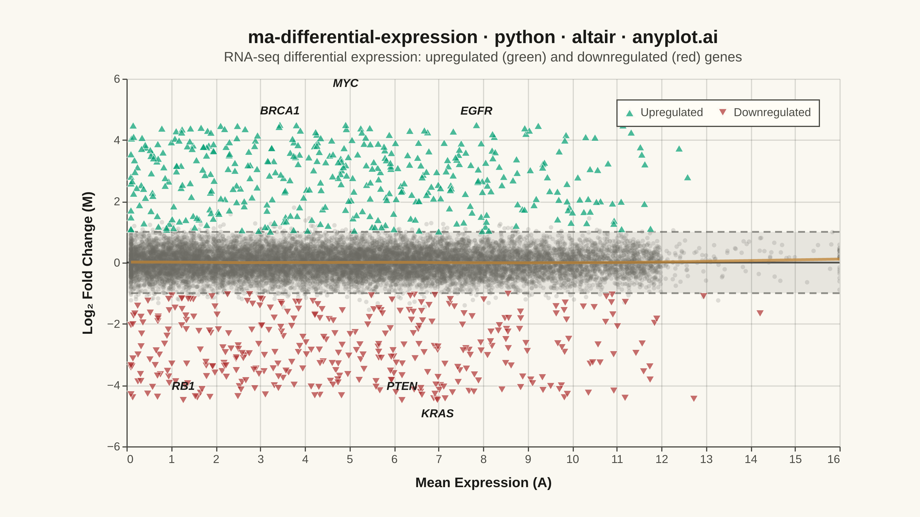
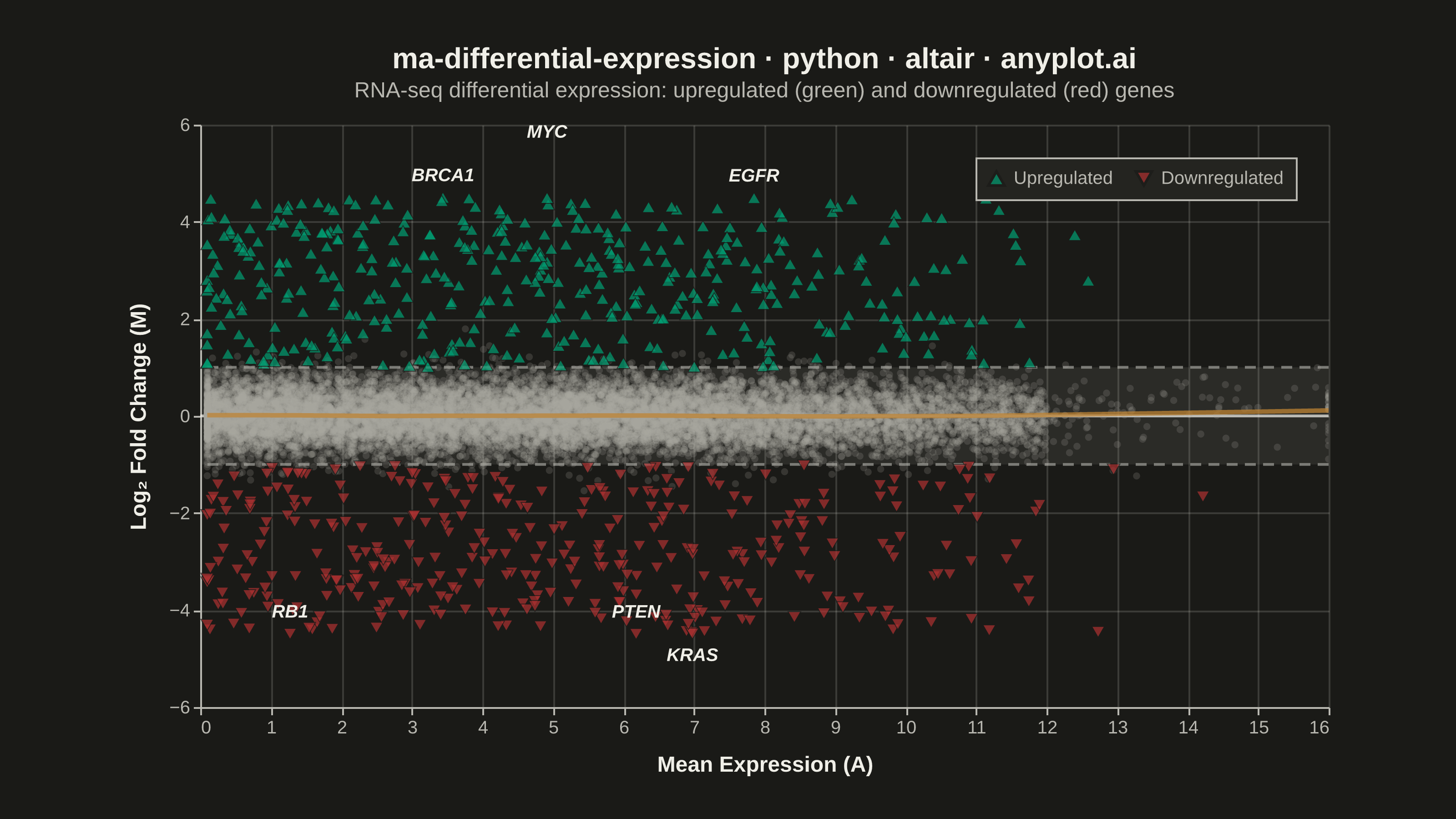
An MA plot (M-versus-A plot) visualizes the relationship between log fold change (M) and mean average expression (A) when comparing two experimental conditions. Each point represents a gene or feature, with significantly differentially expressed genes highlighted. This plot is a standard diagnostic tool in RNA-seq and microarray analysis for assessing differential expression results and detecting systematic expression-dependent bias.
""" anyplot.ai
ma-differential-expression: MA Plot for Differential Expression
Library: altair 6.2.1 | Python 3.13.14
Quality: 86/100 | Updated: 2026-06-21
"""

import os

import altair as alt
import numpy as np
import pandas as pd
from PIL import Image


THEME = os.getenv("ANYPLOT_THEME", "light")

# Theme-adaptive chrome tokens (Imprint palette)
PAGE_BG = "#FAF8F1" if THEME == "light" else "#1A1A17"
ELEVATED_BG = "#FFFDF6" if THEME == "light" else "#242420"
INK = "#1A1A17" if THEME == "light" else "#F0EFE8"
INK_SOFT = "#4A4A44" if THEME == "light" else "#B8B7B0"
INK_MUTED = "#6B6A63" if THEME == "light" else "#A8A79F"

# Imprint categorical palette — semantic assignment for DE context:
# upregulated (gain) → brand green pos 1; downregulated (loss) → matte red pos 5
COLOR_UP = "#009E73"  # Imprint pos 1: brand green
COLOR_DOWN = "#AE3030"  # Imprint pos 5: matte red (semantic anchor for loss/down)
COLOR_LOESS = "#BD8233"  # Imprint pos 4: ochre (diagnostic overlay)

# Data — simulated RNA-seq differential expression results
np.random.seed(42)
n_genes = 15000

mean_expression = np.concatenate(
    [
        np.random.exponential(3, n_genes // 3),
        np.random.uniform(0.5, 12, n_genes // 3),
        np.random.normal(6, 2.5, n_genes - 2 * (n_genes // 3)),
    ]
)
mean_expression = np.clip(mean_expression, 0.1, 16)

log_fold_change = np.random.normal(0, 0.4, n_genes)
n_up = 400
n_down = 350
up_idx = np.random.choice(n_genes, n_up, replace=False)
remaining = np.setdiff1d(np.arange(n_genes), up_idx)
down_idx = np.random.choice(remaining, n_down, replace=False)
log_fold_change[up_idx] = np.random.uniform(1.0, 4.5, n_up)
log_fold_change[down_idx] = np.random.uniform(-4.5, -1.0, n_down)

significant = np.zeros(n_genes, dtype=bool)
significant[up_idx] = True
significant[down_idx] = True

gene_names = [f"Gene{i}" for i in range(n_genes)]

# Label top DE genes spread across the expression range
top_up_sorted = up_idx[np.argsort(-log_fold_change[up_idx])]
top_down_sorted = down_idx[np.argsort(log_fold_change[down_idx])]
up_names = ["BRCA1", "MYC", "EGFR"]
down_names = ["PTEN", "RB1", "KRAS"]
label_idx = np.concatenate([top_up_sorted[:3], top_down_sorted[:3]])
example_names = up_names + down_names
for i, idx in enumerate(label_idx):
    gene_names[idx] = example_names[i]

df = pd.DataFrame(
    {
        "mean_expression": mean_expression,
        "log_fold_change": log_fold_change,
        "significant": significant,
        "gene_name": gene_names,
    }
)
df["status"] = np.where(
    ~df["significant"], "Not significant", np.where(df["log_fold_change"] > 0, "Upregulated", "Downregulated")
)

df_labels = df.loc[df["gene_name"].isin(example_names)].copy()
df_labels = df_labels.sort_values("mean_expression").reset_index(drop=True)
df_labels["label_x"] = df_labels["mean_expression"].values
df_labels["label_y"] = df_labels["log_fold_change"].values
for i in range(1, len(df_labels)):
    if abs(df_labels.loc[i, "label_x"] - df_labels.loc[i - 1, "label_x"]) < 1.5:
        if abs(df_labels.loc[i, "label_y"] - df_labels.loc[i - 1, "label_y"]) < 0.8:
            df_labels.loc[i, "label_y"] += 0.9 * (1 if df_labels.loc[i, "log_fold_change"] > 0 else -1)

df_nonsig = df[~df["significant"]].copy()
df_sig = df[df["significant"]].copy()

# Background shading for ±1 FC region
fc_band_data = pd.DataFrame({"y": [-1], "y2": [1]})
fc_band = alt.Chart(fc_band_data).mark_rect(color=INK_SOFT, opacity=0.11).encode(y="y:Q", y2="y2:Q")

# Non-significant points — small, faint, muted
points_nonsig = (
    alt.Chart(df_nonsig)
    .mark_point(filled=True, size=15, opacity=0.2, strokeWidth=0, color=INK_MUTED)
    .encode(
        x=alt.X("mean_expression:Q", title="Mean Expression (A)"),
        y=alt.Y("log_fold_change:Q", title="Log₂ Fold Change (M)"),
        tooltip=[
            alt.Tooltip("gene_name:N", title="Gene"),
            alt.Tooltip("mean_expression:Q", title="Mean Expr", format=".2f"),
            alt.Tooltip("log_fold_change:Q", title="Log₂ FC", format=".2f"),
        ],
    )
)

# Hover highlight for significant genes
highlight = alt.selection_point(on="pointerover", fields=["gene_name"], empty=False)

# Significant points with color + shape redundant encoding for accessibility
color_scale = alt.Scale(domain=["Upregulated", "Downregulated"], range=[COLOR_UP, COLOR_DOWN])
shape_scale = alt.Scale(domain=["Upregulated", "Downregulated"], range=["triangle-up", "triangle-down"])
points_sig = (
    alt.Chart(df_sig)
    .mark_point(filled=True, stroke=PAGE_BG, strokeWidth=0.5)
    .encode(
        x=alt.X("mean_expression:Q"),
        y=alt.Y("log_fold_change:Q"),
        color=alt.Color(
            "status:N",
            scale=color_scale,
            legend=alt.Legend(
                title=None, labelFontSize=10, symbolSize=80, orient="top-right", direction="horizontal", padding=6
            ),
        ),
        shape=alt.Shape("status:N", scale=shape_scale, legend=None),
        size=alt.condition(highlight, alt.value(100), alt.value(50)),
        tooltip=[
            alt.Tooltip("gene_name:N", title="Gene"),
            alt.Tooltip("mean_expression:Q", title="Mean Expr", format=".2f"),
            alt.Tooltip("log_fold_change:Q", title="Log₂ FC", format=".2f"),
            alt.Tooltip("status:N", title="Status"),
        ],
    )
    .add_params(highlight)
)

# Reference lines
zero_line = alt.Chart(pd.DataFrame({"y": [0]})).mark_rule(color=INK, strokeWidth=1.5, opacity=0.7).encode(y="y:Q")
fc_thresholds = (
    alt.Chart(pd.DataFrame({"y": [-1, 1]}))
    .mark_rule(color=INK_SOFT, strokeWidth=1.5, strokeDash=[6, 4], opacity=0.6)
    .encode(y="y:Q")
)

# LOESS trend to reveal expression-dependent bias
loess_line = (
    alt.Chart(df)
    .transform_loess("mean_expression", "log_fold_change", bandwidth=0.3)
    .mark_line(color=COLOR_LOESS, strokeWidth=2.5, opacity=0.75)
    .encode(x="mean_expression:Q", y="log_fold_change:Q")
)

# Gene labels for top DE genes
labels = (
    alt.Chart(df_labels)
    .mark_text(fontSize=10, fontStyle="italic", fontWeight="bold", color=INK, dy=-12, align="center")
    .encode(x="label_x:Q", y="label_y:Q", text="gene_name:N")
)

# Compose chart — landscape canvas: width=620, height=320 → pads to 3200×1800 after save
chart = (
    (fc_band + zero_line + fc_thresholds + points_nonsig + points_sig + loess_line + labels)
    .properties(
        width=620,
        height=320,
        background=PAGE_BG,
        title=alt.Title(
            "ma-differential-expression · python · altair · anyplot.ai",
            fontSize=16,
            color=INK,
            anchor="middle",
            offset=8,
            subtitle="RNA-seq differential expression: upregulated (green) and downregulated (red) genes",
            subtitleFontSize=12,
            subtitleColor=INK_SOFT,
            subtitlePadding=4,
        ),
    )
    .configure_view(fill=PAGE_BG, stroke="transparent")
    .configure_axis(
        labelFontSize=10,
        titleFontSize=12,
        titlePadding=10,
        titleColor=INK,
        labelColor=INK_SOFT,
        domainColor=INK_SOFT,
        tickColor=INK_SOFT,
        tickSize=4,
        grid=True,
        gridOpacity=0.15,
        gridColor=INK,
    )
    .configure_title(color=INK)
    .configure_legend(
        fillColor=ELEVATED_BG,
        strokeColor=INK_SOFT,
        labelColor=INK_SOFT,
        titleColor=INK,
        labelFontSize=10,
        titleFontSize=10,
        symbolSize=80,
        padding=6,
    )
    .interactive()
)

# Save PNG then pad to exact 3200×1800 target (vl-convert adds title/axis padding outside width/height)
TW, TH = 3200, 1800
chart.save(f"plot-{THEME}.png", scale_factor=4.0)
_img = Image.open(f"plot-{THEME}.png").convert("RGB")
_w, _h = _img.size
if _w > TW or _h > TH:
    raise SystemExit(
        f"altair vl-convert produced {_w}×{_h}, exceeds target {TW}×{TH}. "
        f"Shrink chart .properties(width=, height=) values and re-render."
    )
if _w < TW or _h < TH:
    _canvas = Image.new("RGB", (TW, TH), PAGE_BG)
    _canvas.paste(_img, ((TW - _w) // 2, (TH - _h) // 2))
    _canvas.save(f"plot-{THEME}.png")

chart.save(f"plot-{THEME}.html")
Runnable source as JSON, for any HTTP client: https://api.anyplot.ai/specs/ma-differential-expression/altair/code. Any spec id and library id listed in llms-full.txt fit the same URL shape; every URL below is complete and callable.
{
  "spec_id": "ma-differential-expression",
  "language": "python",
  "library": "altair",
  "page": "https://anyplot.ai/ma-differential-expression/python/altair",
  "hub": "https://anyplot.ai/ma-differential-expression",
  "code_json": "https://api.anyplot.ai/specs/ma-differential-expression/altair/code",
  "spec_json": "https://api.anyplot.ai/specs/ma-differential-expression",
  "render_light_png": "https://storage.googleapis.com/anyplot-images/plots/ma-differential-expression/python/altair/plot-light.png",
  "render_dark_png": "https://storage.googleapis.com/anyplot-images/plots/ma-differential-expression/python/altair/plot-dark.png",
  "interactive_light_html": "https://storage.googleapis.com/anyplot-images/plots/ma-differential-expression/python/altair/plot-light.html",
  "interactive_dark_html": "https://storage.googleapis.com/anyplot-images/plots/ma-differential-expression/python/altair/plot-dark.html",
  "quality_score": 86.0,
  "license": "MIT",
  "guide": "https://anyplot.ai/llms.txt"
}
Part of MA Plot for Differential Expression on anyplot.ai.