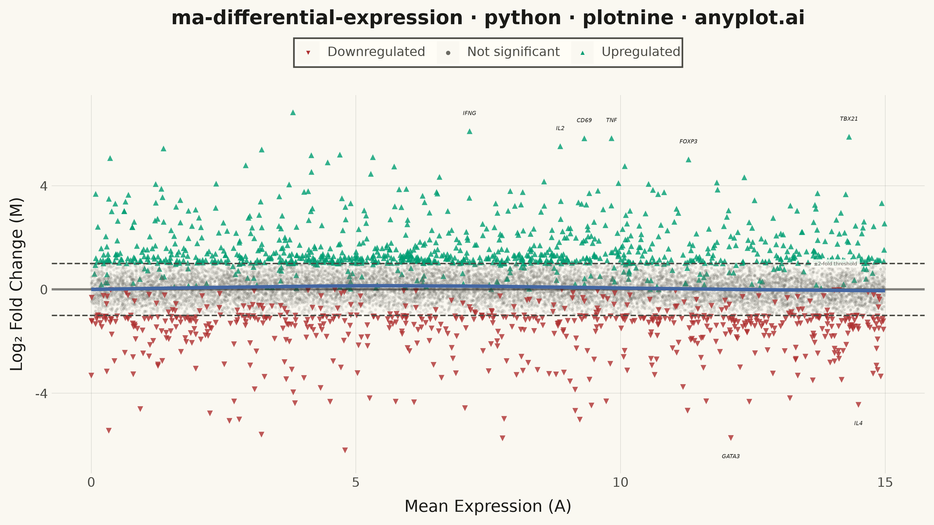
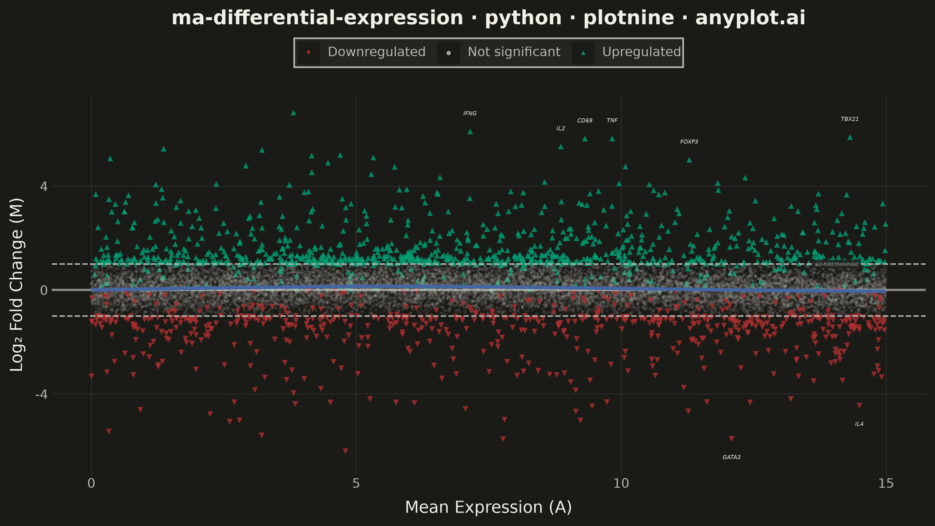
An MA plot (M-versus-A plot) visualizes the relationship between log fold change (M) and mean average expression (A) when comparing two experimental conditions. Each point represents a gene or feature, with significantly differentially expressed genes highlighted. This plot is a standard diagnostic tool in RNA-seq and microarray analysis for assessing differential expression results and detecting systematic expression-dependent bias.
""" anyplot.ai
ma-differential-expression: MA Plot for Differential Expression
Library: plotnine 0.15.7 | Python 3.13.14
Quality: 86/100 | Updated: 2026-06-21
"""

import os

import numpy as np
import pandas as pd
from plotnine import (
    aes,
    annotate,
    element_blank,
    element_line,
    element_rect,
    element_text,
    geom_hline,
    geom_point,
    geom_text,
    ggplot,
    guide_legend,
    guides,
    labs,
    scale_alpha_manual,
    scale_color_manual,
    scale_shape_manual,
    scale_size_manual,
    stat_smooth,
    theme,
    theme_minimal,
)


# Theme tokens
THEME = os.getenv("ANYPLOT_THEME", "light")
PAGE_BG = "#FAF8F1" if THEME == "light" else "#1A1A17"
ELEVATED_BG = "#FFFDF6" if THEME == "light" else "#242420"
INK = "#1A1A17" if THEME == "light" else "#F0EFE8"
INK_SOFT = "#4A4A44" if THEME == "light" else "#B8B7B0"
INK_MUTED = "#6B6A63" if THEME == "light" else "#A8A79F"

# Semantic Imprint palette: green=gain, matte-red=loss, muted=background noise
COLOR_UP = "#009E73"  # Imprint position 1 — upregulation (positive/gain)
COLOR_DOWN = "#AE3030"  # Imprint position 5 — downregulation (loss/error)
COLOR_NS = INK_MUTED  # theme-adaptive muted — non-significant genes

# Data — T-cell activation study (activated vs resting), immunology domain
np.random.seed(42)
n_genes = 15000

mean_expression = np.random.uniform(0, 15, n_genes)
log_fold_change = np.random.normal(0, 0.5, n_genes)
log_fold_change += 0.12 * np.sin(mean_expression * 0.25)

n_sig = int(n_genes * 0.08)
sig_indices = np.random.choice(n_genes, n_sig, replace=False)
log_fold_change[sig_indices] *= np.random.uniform(2.5, 5.0, n_sig)

significant = np.abs(log_fold_change) > 1.0
significant[sig_indices[: n_sig // 2]] = True

category = np.where(~significant, "Not significant", np.where(log_fold_change > 0, "Upregulated", "Downregulated"))

# Immunology genes — T-cell activation markers, ranked by p-value proxy (|LFC| × sqrt(baseMean))
gene_names = [f"Gene{i}" for i in range(n_genes)]
pvalue_score = np.abs(log_fold_change) * np.sqrt(mean_expression + 1)
immune_genes = ["IL2", "IFNG", "IL4", "FOXP3", "CD69", "TNF", "GATA3", "TBX21"]
top_idx = np.argsort(pvalue_score)[-len(immune_genes) :]
for i, idx in enumerate(top_idx):
    gene_names[idx] = immune_genes[i]

df = pd.DataFrame(
    {
        "mean_expression": mean_expression,
        "log_fold_change": log_fold_change,
        "significant": significant,
        "gene_name": gene_names,
        "category": pd.Categorical(
            category, categories=["Downregulated", "Not significant", "Upregulated"], ordered=True
        ),
    }
)

df_labels = df.loc[top_idx].copy()
nudge = np.where(df_labels["log_fold_change"] > 0, 0.7, -0.7)
df_labels["label_y"] = df_labels["log_fold_change"] + nudge

# Plot
plot = (
    ggplot(df, aes(x="mean_expression", y="log_fold_change", color="category", shape="category"))
    + geom_point(aes(alpha="category", size="category"), stroke=0)
    + geom_hline(yintercept=0, color=INK, size=0.8, alpha=0.5)
    + geom_hline(yintercept=1, linetype="dashed", color=INK_SOFT, size=0.5)
    + geom_hline(yintercept=-1, linetype="dashed", color=INK_SOFT, size=0.5)
    + annotate(
        "label",
        x=14.5,
        y=1.0,
        label=" ±2-fold threshold ",
        size=3.0,
        color=INK_SOFT,
        fill=ELEVATED_BG,
        alpha=0.9,
        label_size=0,
        ha="right",
        va="center",
    )
    + stat_smooth(aes(group=1), method="lowess", color="#4467A3", size=1.2, se=False, span=0.3, linetype="solid")
    + geom_text(
        aes(x="mean_expression", y="label_y", label="gene_name"),
        data=df_labels,
        color=INK,
        size=3.5,
        fontstyle="italic",
        inherit_aes=False,
        show_legend=False,
    )
    + scale_color_manual(values={"Upregulated": COLOR_UP, "Not significant": COLOR_NS, "Downregulated": COLOR_DOWN})
    + scale_alpha_manual(values={"Upregulated": 0.8, "Not significant": 0.15, "Downregulated": 0.8})
    + scale_shape_manual(values={"Upregulated": "^", "Not significant": "o", "Downregulated": "v"})
    + scale_size_manual(values={"Upregulated": 2.0, "Not significant": 1.0, "Downregulated": 2.0})
    + labs(
        x="Mean Expression (A)",
        y="Log₂ Fold Change (M)",
        title="ma-differential-expression · python · plotnine · anyplot.ai",
        color="",
        shape="",
    )
    + guides(
        color=guide_legend(override_aes={"alpha": 1, "size": 3}),
        shape=guide_legend(override_aes={"alpha": 1, "size": 3}),
        alpha="none",
        size="none",
    )
    + theme_minimal()
    + theme(
        figure_size=(8, 4.5),
        plot_background=element_rect(fill=PAGE_BG, color=PAGE_BG),
        panel_background=element_rect(fill=PAGE_BG),
        panel_grid_major=element_line(color=INK, size=0.3, alpha=0.15),
        panel_grid_minor=element_blank(),
        axis_title=element_text(size=10, color=INK),
        axis_text=element_text(size=8, color=INK_SOFT),
        plot_title=element_text(size=12, weight="bold", color=INK),
        legend_text=element_text(size=8, color=INK_SOFT),
        legend_title=element_blank(),
        legend_position="top",
        legend_background=element_rect(fill=ELEVATED_BG, color=INK_SOFT),
    )
)

# Save
plot.save(f"plot-{THEME}.png", dpi=400, width=8, height=4.5, units="in", verbose=False)
Runnable source as JSON, for any HTTP client: https://api.anyplot.ai/specs/ma-differential-expression/plotnine/code. Any spec id and library id listed in llms-full.txt fit the same URL shape; every URL below is complete and callable.
{
  "spec_id": "ma-differential-expression",
  "language": "python",
  "library": "plotnine",
  "page": "https://anyplot.ai/ma-differential-expression/python/plotnine",
  "hub": "https://anyplot.ai/ma-differential-expression",
  "code_json": "https://api.anyplot.ai/specs/ma-differential-expression/plotnine/code",
  "spec_json": "https://api.anyplot.ai/specs/ma-differential-expression",
  "render_light_png": "https://storage.googleapis.com/anyplot-images/plots/ma-differential-expression/python/plotnine/plot-light.png",
  "render_dark_png": "https://storage.googleapis.com/anyplot-images/plots/ma-differential-expression/python/plotnine/plot-dark.png",
  "quality_score": 86.0,
  "license": "MIT",
  "guide": "https://anyplot.ai/llms.txt"
}
Part of MA Plot for Differential Expression on anyplot.ai.