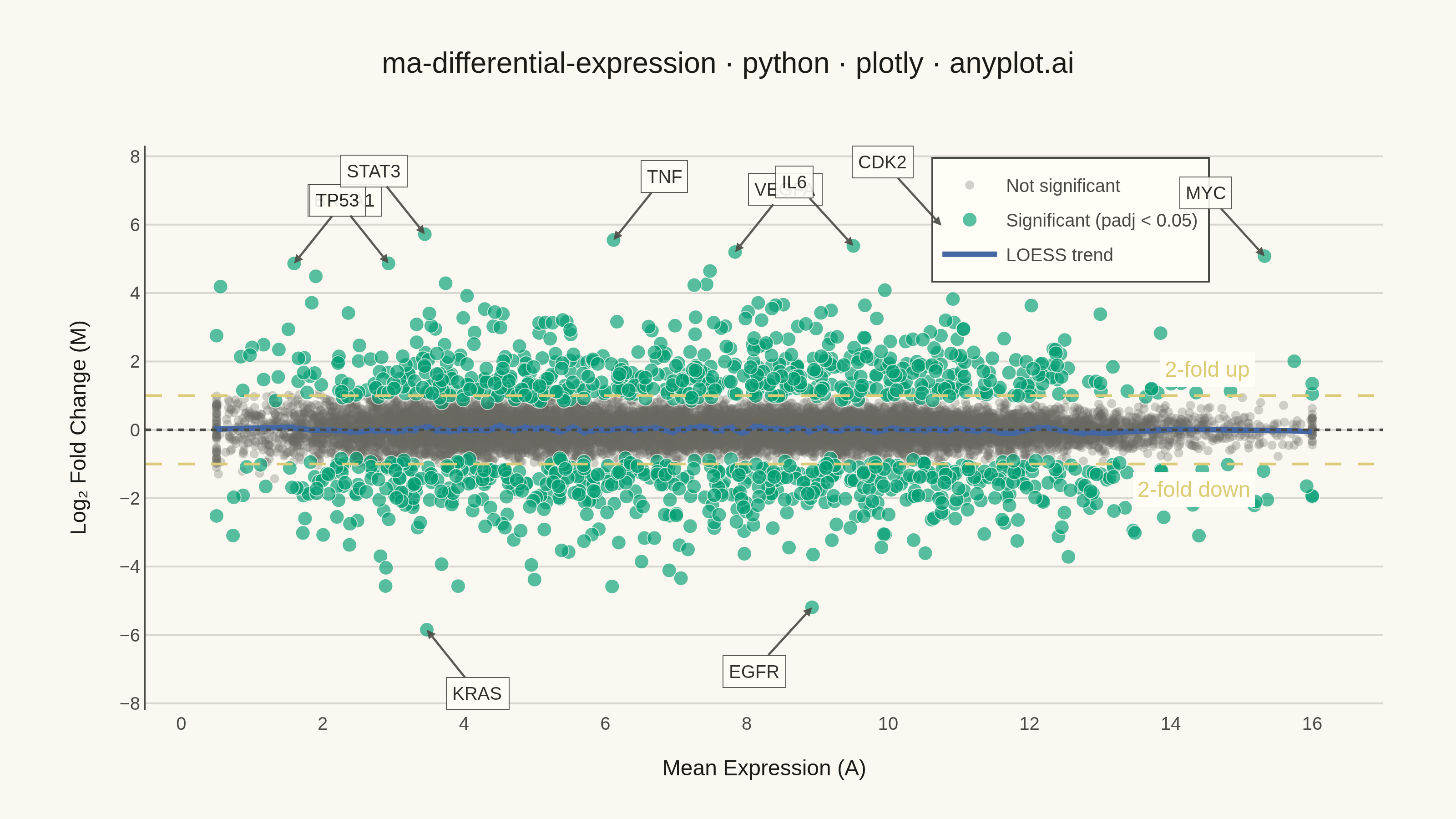
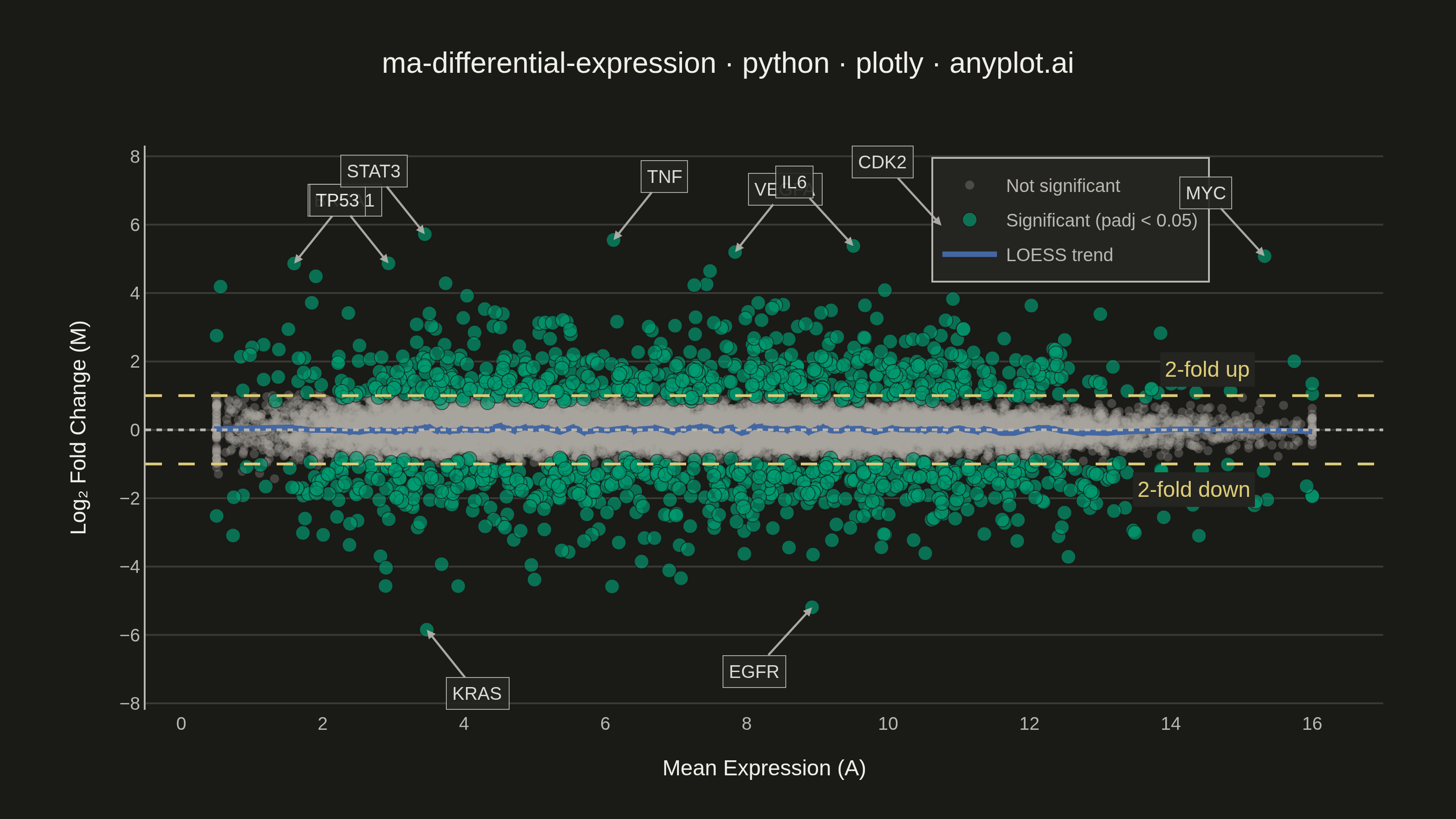
An MA plot (M-versus-A plot) visualizes the relationship between log fold change (M) and mean average expression (A) when comparing two experimental conditions. Each point represents a gene or feature, with significantly differentially expressed genes highlighted. This plot is a standard diagnostic tool in RNA-seq and microarray analysis for assessing differential expression results and detecting systematic expression-dependent bias.
""" anyplot.ai
ma-differential-expression: MA Plot for Differential Expression
Library: plotly 6.8.0 | Python 3.13.14
Quality: 82/100 | Updated: 2026-06-21
"""

import os

import numpy as np
import plotly.graph_objects as go
from scipy.signal import savgol_filter


# Theme tokens — Imprint palette, theme-adaptive chrome
THEME = os.getenv("ANYPLOT_THEME", "light")
PAGE_BG = "#FAF8F1" if THEME == "light" else "#1A1A17"
ELEVATED_BG = "#FFFDF6" if THEME == "light" else "#242420"
INK = "#1A1A17" if THEME == "light" else "#F0EFE8"
INK_SOFT = "#4A4A44" if THEME == "light" else "#B8B7B0"
INK_MUTED = "#6B6A63" if THEME == "light" else "#A8A79F"
GRID = "rgba(26,26,23,0.15)" if THEME == "light" else "rgba(240,239,232,0.15)"

# Imprint palette assignments
COLOR_SIG = "#009E73"  # Imprint position 1 — significant genes (first series)
COLOR_LOESS = "#4467A3"  # Imprint position 3 — LOESS trend line
COLOR_THRESHOLD = "#DDCC77"  # Imprint amber — fold-change threshold markers

# Data — simulated RNA-seq differential expression results
np.random.seed(42)
n_genes = 15000

mean_expression = np.concatenate([np.random.normal(4, 1.5, 5000), np.random.normal(9, 2.5, 10000)])
mean_expression = np.clip(mean_expression, 0.5, 16)

log_fold_change = np.random.normal(0, 0.3, n_genes)

n_de = 1200
de_indices = np.random.choice(n_genes, n_de, replace=False)
log_fold_change[de_indices] = np.random.choice([-1, 1], n_de) * (np.random.exponential(0.8, n_de) + 1.0)

noise_scale = 0.5 / (1 + mean_expression * 0.3)
log_fold_change += np.random.normal(0, noise_scale)

significant = np.abs(log_fold_change) > 1.0
significant &= mean_expression > 2.0
significant[de_indices] = np.abs(log_fold_change[de_indices]) > 0.8

gene_names = [f"Gene{i}" for i in range(n_genes)]
top_gene_names = ["BRCA1", "TP53", "MYC", "EGFR", "VEGFA", "IL6", "TNF", "STAT3", "KRAS", "CDK2"]
top_de = np.argsort(np.abs(log_fold_change[significant]))[-10:]
sig_indices = np.where(significant)[0]
for i, name in zip(top_de, top_gene_names, strict=False):
    gene_names[sig_indices[i]] = name

non_sig_mask = ~significant
sig_mask = significant

# LOESS-like smoothing curve via Savitzky-Golay filter
sort_idx = np.argsort(mean_expression)
sorted_expr = mean_expression[sort_idx]
sorted_lfc = log_fold_change[sort_idx]
window = min(501, len(sorted_lfc) // 4 * 2 + 1)
smoothed = savgol_filter(sorted_lfc, window, 3)

# Plot
fig = go.Figure()

# Non-significant genes — muted, recede into background
fig.add_trace(
    go.Scatter(
        x=mean_expression[non_sig_mask],
        y=log_fold_change[non_sig_mask],
        mode="markers",
        marker={"size": 5, "color": INK_MUTED, "opacity": 0.3, "line": {"width": 0}},
        name="Not significant",
        hovertemplate="A: %{x:.1f}<br>M: %{y:.2f}<extra>Not significant</extra>",
    )
)

# Significant genes — Imprint brand green (first series)
fig.add_trace(
    go.Scatter(
        x=mean_expression[sig_mask],
        y=log_fold_change[sig_mask],
        mode="markers",
        marker={"size": 8, "color": COLOR_SIG, "opacity": 0.65, "line": {"width": 0.5, "color": PAGE_BG}},
        name="Significant (padj < 0.05)",
        hovertemplate="A: %{x:.1f}<br>M: %{y:.2f}<extra>Significant</extra>",
    )
)

# LOESS smoothing curve — Imprint blue
fig.add_trace(
    go.Scatter(
        x=sorted_expr,
        y=smoothed,
        mode="lines",
        line={"color": COLOR_LOESS, "width": 3},
        name="LOESS trend",
        hoverinfo="skip",
    )
)

# Reference line at M = 0 (no fold change)
fig.add_hline(y=0, line={"color": INK_SOFT, "width": 1.5, "dash": "dot"})

# Fold-change threshold lines (amber = caution/threshold role)
fig.add_hline(y=1, line={"color": COLOR_THRESHOLD, "width": 1.5, "dash": "dash"})
fig.add_hline(y=-1, line={"color": COLOR_THRESHOLD, "width": 1.5, "dash": "dash"})

# Threshold labels — right-justified on the threshold lines, inside plot
fig.add_annotation(
    x=15.2,
    y=1,
    text="2-fold up",
    showarrow=False,
    font={"size": 12, "color": COLOR_THRESHOLD},
    xanchor="right",
    yanchor="bottom",
    yshift=4,
    bgcolor=ELEVATED_BG,
    borderpad=2,
)
fig.add_annotation(
    x=15.2,
    y=-1,
    text="2-fold down",
    showarrow=False,
    font={"size": 12, "color": COLOR_THRESHOLD},
    xanchor="right",
    yanchor="top",
    yshift=-4,
    bgcolor=ELEVATED_BG,
    borderpad=2,
)

# Label top DE genes with arrow connectors to avoid overlap with data points
label_indices = [sig_indices[i] for i in top_de]
expr_mid = (mean_expression.max() + mean_expression.min()) / 2
for i, gene_idx in enumerate(label_indices):
    lfc = log_fold_change[gene_idx]
    expr = mean_expression[gene_idx]
    # Right-side genes point left; left-side genes alternate direction to reduce crowding
    ax = -32 if expr > expr_mid else (28 if i % 2 == 0 else -28)
    ay = -35 if lfc > 0 else 35
    fig.add_annotation(
        x=expr,
        y=lfc,
        text=gene_names[gene_idx],
        showarrow=True,
        arrowhead=2,
        arrowsize=0.8,
        arrowwidth=1.2,
        arrowcolor=INK_SOFT,
        ax=ax,
        ay=ay,
        font={"size": 10, "color": INK},
        bgcolor=ELEVATED_BG,
        bordercolor=INK_SOFT,
        borderwidth=0.5,
        borderpad=3,
        opacity=0.9,
    )

title_text = "ma-differential-expression · python · plotly · anyplot.ai"
title_fontsize = max(11, round(16 * min(1.0, 67 / len(title_text))))

fig.update_layout(
    autosize=False,
    title={
        "text": title_text,
        "font": {"size": title_fontsize, "color": INK, "family": "Arial, sans-serif"},
        "x": 0.5,
        "xanchor": "center",
    },
    xaxis={
        "title": {"text": "Mean Expression (A)", "font": {"size": 12, "color": INK}},
        "tickfont": {"size": 10, "color": INK_SOFT},
        "showgrid": False,
        "zeroline": False,
        "showline": False,
    },
    yaxis={
        "title": {"text": "Log₂ Fold Change (M)", "font": {"size": 12, "color": INK}},
        "tickfont": {"size": 10, "color": INK_SOFT},
        "gridcolor": GRID,
        "showgrid": True,
        "zeroline": False,
        "linecolor": INK_SOFT,
    },
    paper_bgcolor=PAGE_BG,
    plot_bgcolor=PAGE_BG,
    font={"color": INK},
    legend={
        "font": {"size": 10, "color": INK_SOFT},
        "x": 0.86,
        "y": 0.98,
        "xanchor": "right",
        "bgcolor": ELEVATED_BG,
        "bordercolor": INK_SOFT,
        "borderwidth": 1,
    },
    margin={"l": 80, "r": 40, "t": 80, "b": 60},
)

# Save — canonical 3200×1800 landscape (width=800, height=450, scale=4)
fig.write_image(f"plot-{THEME}.png", width=800, height=450, scale=4)
fig.write_html(f"plot-{THEME}.html", include_plotlyjs="cdn")
Runnable source as JSON, for any HTTP client: https://api.anyplot.ai/specs/ma-differential-expression/plotly/code. Any spec id and library id listed in llms-full.txt fit the same URL shape; every URL below is complete and callable.
{
  "spec_id": "ma-differential-expression",
  "language": "python",
  "library": "plotly",
  "page": "https://anyplot.ai/ma-differential-expression/python/plotly",
  "hub": "https://anyplot.ai/ma-differential-expression",
  "code_json": "https://api.anyplot.ai/specs/ma-differential-expression/plotly/code",
  "spec_json": "https://api.anyplot.ai/specs/ma-differential-expression",
  "render_light_png": "https://storage.googleapis.com/anyplot-images/plots/ma-differential-expression/python/plotly/plot-light.png",
  "render_dark_png": "https://storage.googleapis.com/anyplot-images/plots/ma-differential-expression/python/plotly/plot-dark.png",
  "interactive_light_html": "https://storage.googleapis.com/anyplot-images/plots/ma-differential-expression/python/plotly/plot-light.html",
  "interactive_dark_html": "https://storage.googleapis.com/anyplot-images/plots/ma-differential-expression/python/plotly/plot-dark.html",
  "quality_score": 82.0,
  "license": "MIT",
  "guide": "https://anyplot.ai/llms.txt"
}
Part of MA Plot for Differential Expression on anyplot.ai.