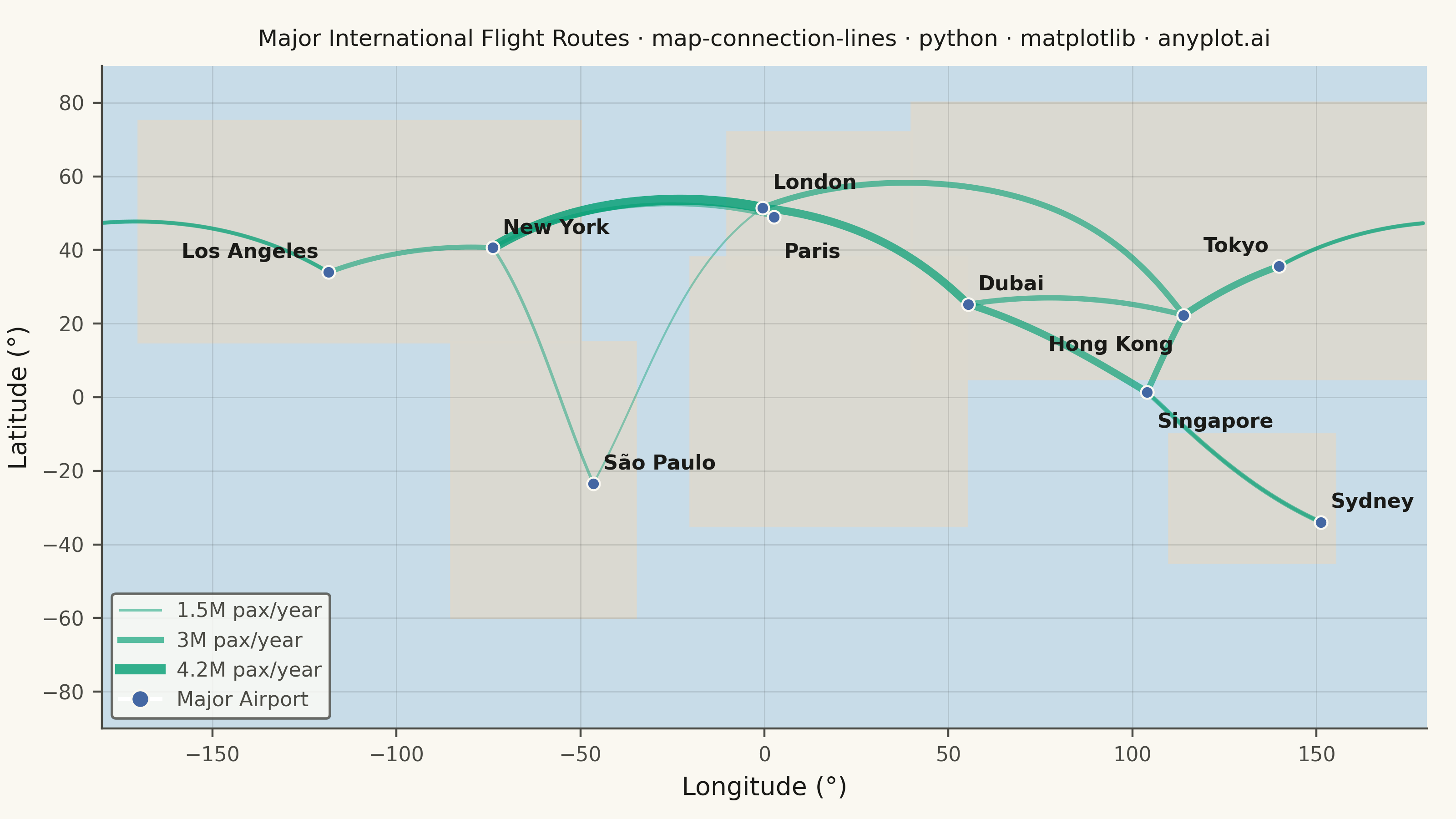
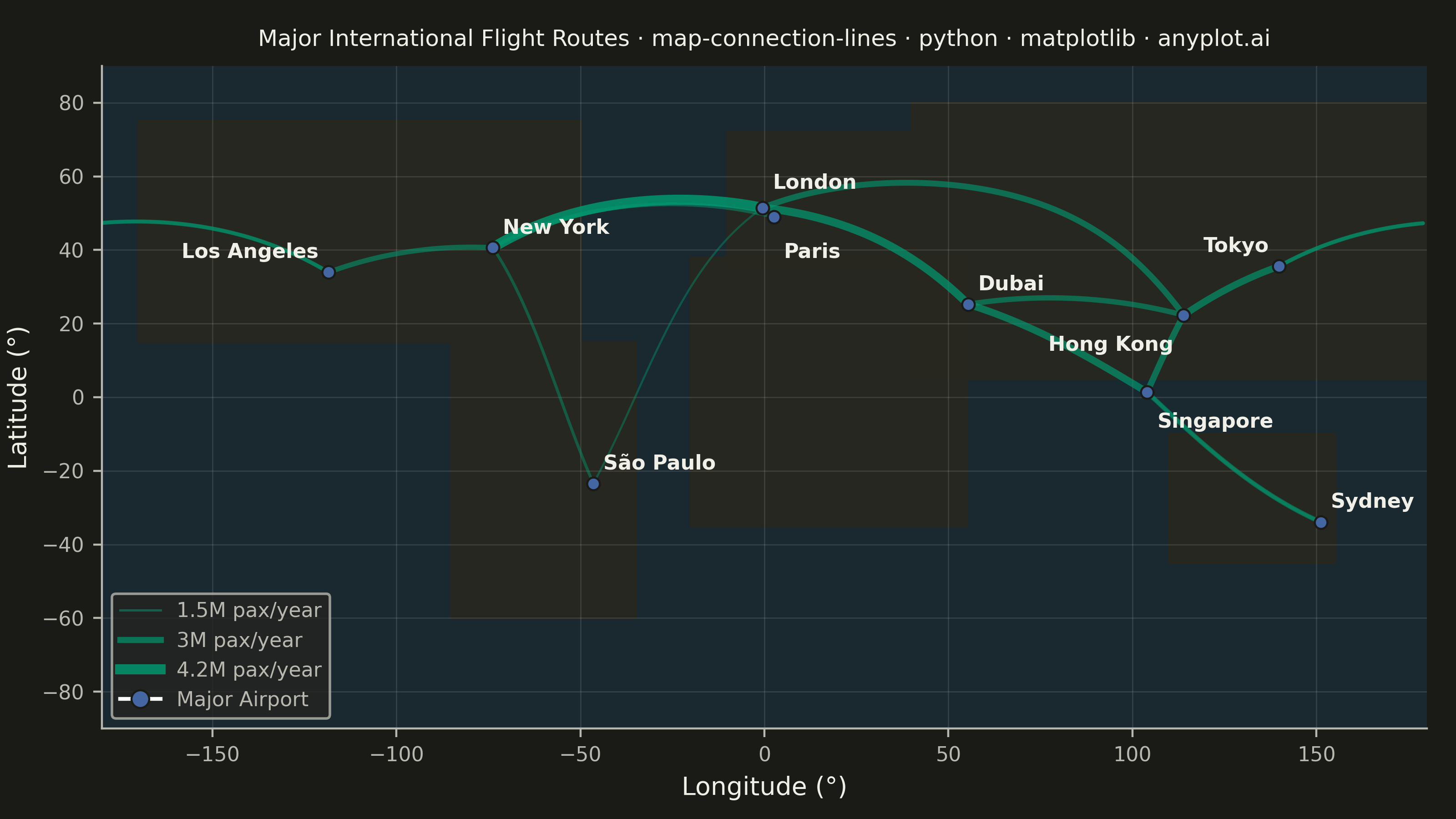
A geographic map visualization showing connection lines (arcs or great circles) between pairs of locations. This plot excels at revealing spatial patterns in flows, routes, and relationships between places. The curved lines naturally represent shortest paths on Earth's surface while avoiding visual overlap with straight lines. Line properties like thickness or color can encode additional variables such as traffic volume or connection type.
""" anyplot.ai
map-connection-lines: Connection Lines Map (Origin-Destination)
Library: matplotlib 3.10.9 | Python 3.13.13
Quality: 90/100 | Updated: 2026-05-28
"""

import os

import matplotlib.pyplot as plt
import numpy as np
from matplotlib.lines import Line2D


# Theme tokens
THEME = os.getenv("ANYPLOT_THEME", "light")
PAGE_BG = "#FAF8F1" if THEME == "light" else "#1A1A17"
ELEVATED_BG = "#FFFDF6" if THEME == "light" else "#242420"
INK = "#1A1A17" if THEME == "light" else "#F0EFE8"
INK_SOFT = "#4A4A44" if THEME == "light" else "#B8B7B0"
INK_MUTED = "#6B6A63" if THEME == "light" else "#A8A79F"

# Geographic background (map chrome, not data series)
OCEAN_BG = "#C8DCE8" if THEME == "light" else "#1A2830"
LAND_COLOR = "#DDD9CF" if THEME == "light" else "#28271F"

# anyplot categorical palette — positions 1 and 3
BRAND = "#009E73"  # connection lines — first series
AIRPORT_COLOR = "#4467A3"  # airport markers — third series (blue fits sky/travel)


# Data — Major international flight routes with passenger volume
airports = [
    ("New York", 40.6413, -73.7781, 4, 4),
    ("London", 51.4700, -0.4543, 4, 6),
    ("Tokyo", 35.5494, 139.7798, -4, 4),
    ("Dubai", 25.2532, 55.3657, 4, 4),
    ("Singapore", 1.3644, 103.9915, 4, -8),
    ("Sydney", -33.9399, 151.1753, 4, 4),
    ("São Paulo", -23.4356, -46.4731, 4, 4),
    ("Los Angeles", 33.9416, -118.4085, -4, 4),
    ("Paris", 49.0097, 2.5479, 4, -10),
    ("Hong Kong", 22.3080, 113.9185, -4, -8),
]

connections = [
    (0, 1, 4.2),  # NYC - London (busiest transatlantic)
    (0, 8, 2.1),  # NYC - Paris
    (1, 3, 3.5),  # London - Dubai
    (1, 9, 2.8),  # London - Hong Kong
    (3, 4, 3.2),  # Dubai - Singapore
    (4, 5, 2.4),  # Singapore - Sydney
    (4, 9, 2.9),  # Singapore - Hong Kong
    (2, 9, 3.1),  # Tokyo - Hong Kong
    (2, 7, 2.2),  # Tokyo - LA
    (0, 7, 2.5),  # NYC - LA
    (6, 0, 1.8),  # São Paulo - NYC
    (6, 1, 1.5),  # São Paulo - London
    (5, 4, 1.9),  # Sydney - Singapore
    (3, 9, 2.6),  # Dubai - Hong Kong
    (7, 2, 2.0),  # LA - Tokyo
]

routes = []
for orig_idx, dest_idx, volume in connections:
    orig = airports[orig_idx]
    dest = airports[dest_idx]
    routes.append(
        {"origin_lat": orig[1], "origin_lon": orig[2], "dest_lat": dest[1], "dest_lon": dest[2], "volume": volume}
    )


# Plot
fig, ax = plt.subplots(figsize=(8, 4.5), dpi=400, facecolor=PAGE_BG)
ax.set_facecolor(OCEAN_BG)
ax.set_xlim(-180, 180)
ax.set_ylim(-90, 90)

# Base map — simplified continent polygons
continents = [
    [(-170, 15), (-170, 75), (-50, 75), (-50, 15)],
    [(-85, -60), (-85, 15), (-35, 15), (-35, -60)],
    [(-10, 35), (-10, 72), (40, 72), (40, 35)],
    [(-20, -35), (-20, 38), (55, 38), (55, -35)],
    [(40, 5), (40, 80), (180, 80), (180, 5)],
    [(110, -45), (110, -10), (155, -10), (155, -45)],
]
for cont in continents:
    xs = [p[0] for p in cont] + [cont[0][0]]
    ys = [p[1] for p in cont] + [cont[0][1]]
    ax.fill(xs, ys, color=LAND_COLOR, alpha=0.9, zorder=1)

# Volume normalization
volumes = [r["volume"] for r in routes]
vol_min, vol_max = min(volumes), max(volumes)

# Draw great circle connection lines using spherical interpolation
n_points = 100
for route in routes:
    norm = (route["volume"] - vol_min) / (vol_max - vol_min)
    linewidth = 0.8 + norm * 3.2
    alpha = 0.40 + norm * 0.40

    lon1, lat1 = route["origin_lon"], route["origin_lat"]
    lon2, lat2 = route["dest_lon"], route["dest_lat"]
    lon1_r, lat1_r = np.radians(lon1), np.radians(lat1)
    lon2_r, lat2_r = np.radians(lon2), np.radians(lat2)

    cos_d = np.clip(
        np.sin(lat1_r) * np.sin(lat2_r) + np.cos(lat1_r) * np.cos(lat2_r) * np.cos(lon2_r - lon1_r), -1.0, 1.0
    )
    d = np.arccos(cos_d)

    if d < 1e-10:
        lons, lats = np.array([lon1, lon2]), np.array([lat1, lat2])
    else:
        t = np.linspace(0, 1, n_points)
        a = np.sin((1 - t) * d) / np.sin(d)
        b = np.sin(t * d) / np.sin(d)
        x = a * np.cos(lat1_r) * np.cos(lon1_r) + b * np.cos(lat2_r) * np.cos(lon2_r)
        y = a * np.cos(lat1_r) * np.sin(lon1_r) + b * np.cos(lat2_r) * np.sin(lon2_r)
        z = a * np.sin(lat1_r) + b * np.sin(lat2_r)
        lats = np.degrees(np.arctan2(z, np.sqrt(x**2 + y**2)))
        lons = np.degrees(np.arctan2(y, x))

    # Handle date line crossing by splitting the line
    if np.any(np.abs(np.diff(lons)) > 180):
        split_idx = np.where(np.abs(np.diff(lons)) > 180)[0][0] + 1
        ax.plot(
            lons[:split_idx],
            lats[:split_idx],
            color=BRAND,
            linewidth=linewidth,
            alpha=alpha,
            solid_capstyle="round",
            zorder=2,
        )
        ax.plot(
            lons[split_idx:],
            lats[split_idx:],
            color=BRAND,
            linewidth=linewidth,
            alpha=alpha,
            solid_capstyle="round",
            zorder=2,
        )
    else:
        ax.plot(lons, lats, color=BRAND, linewidth=linewidth, alpha=alpha, solid_capstyle="round", zorder=2)

# Airport markers
for _name, lat, lon, _ox, _oy in airports:
    ax.plot(
        lon, lat, marker="o", markersize=5, color=AIRPORT_COLOR, markeredgecolor=PAGE_BG, markeredgewidth=0.8, zorder=3
    )

# Airport labels with custom offsets to prevent overlap
for name, lat, lon, offset_x, offset_y in airports:
    ax.annotate(
        name,
        (lon, lat),
        xytext=(offset_x, offset_y),
        textcoords="offset points",
        fontsize=8,
        fontweight="bold",
        color=INK,
        ha="left" if offset_x > 0 else "right",
        va="bottom" if offset_y > 0 else "top",
        zorder=4,
    )

# Style
ax.set_xlabel("Longitude (°)", fontsize=10, color=INK)
ax.set_ylabel("Latitude (°)", fontsize=10, color=INK)
ax.tick_params(axis="both", labelsize=8, colors=INK_SOFT, labelcolor=INK_SOFT)
ax.set_aspect("equal", adjustable="box")
ax.grid(True, alpha=0.12, linewidth=0.5, color=INK)
ax.spines["top"].set_visible(False)
ax.spines["right"].set_visible(False)
for spine in ("left", "bottom"):
    ax.spines[spine].set_color(INK_SOFT)

# Title — scale fontsize for long title to avoid overflow
title = "Major International Flight Routes · map-connection-lines · python · matplotlib · anyplot.ai"
title_fontsize = max(8, round(12 * 67 / len(title)))
ax.set_title(title, fontsize=title_fontsize, fontweight="medium", color=INK, pad=8)

# Legend
legend_elements = [
    Line2D([0], [0], color=BRAND, linewidth=0.9, alpha=0.50, label="1.5M pax/year"),
    Line2D([0], [0], color=BRAND, linewidth=2.4, alpha=0.65, label="3M pax/year"),
    Line2D([0], [0], color=BRAND, linewidth=4.0, alpha=0.80, label="4.2M pax/year"),
    Line2D(
        [0],
        [0],
        marker="o",
        color="w",
        markerfacecolor=AIRPORT_COLOR,
        markeredgecolor=PAGE_BG,
        markeredgewidth=0.8,
        markersize=7,
        label="Major Airport",
    ),
]
leg = ax.legend(handles=legend_elements, loc="lower left", fontsize=8)
if leg:
    leg.get_frame().set_facecolor(ELEVATED_BG)
    leg.get_frame().set_edgecolor(INK_SOFT)
    plt.setp(leg.get_texts(), color=INK_SOFT)

fig.subplots_adjust(left=0.07, right=0.98, top=0.93, bottom=0.10)

# Save
plt.savefig(f"plot-{THEME}.png", dpi=400, facecolor=PAGE_BG)
Runnable source as JSON, for any HTTP client: https://api.anyplot.ai/specs/map-connection-lines/matplotlib/code. Any spec id and library id listed in llms-full.txt fit the same URL shape; every URL below is complete and callable.
{
  "spec_id": "map-connection-lines",
  "language": "python",
  "library": "matplotlib",
  "page": "https://anyplot.ai/map-connection-lines/python/matplotlib",
  "hub": "https://anyplot.ai/map-connection-lines",
  "code_json": "https://api.anyplot.ai/specs/map-connection-lines/matplotlib/code",
  "spec_json": "https://api.anyplot.ai/specs/map-connection-lines",
  "render_light_png": "https://storage.googleapis.com/anyplot-images/plots/map-connection-lines/python/matplotlib/plot-light.png",
  "render_dark_png": "https://storage.googleapis.com/anyplot-images/plots/map-connection-lines/python/matplotlib/plot-dark.png",
  "quality_score": 90.0,
  "license": "MIT",
  "guide": "https://anyplot.ai/llms.txt"
}
Part of Connection Lines Map (Origin-Destination) on anyplot.ai.