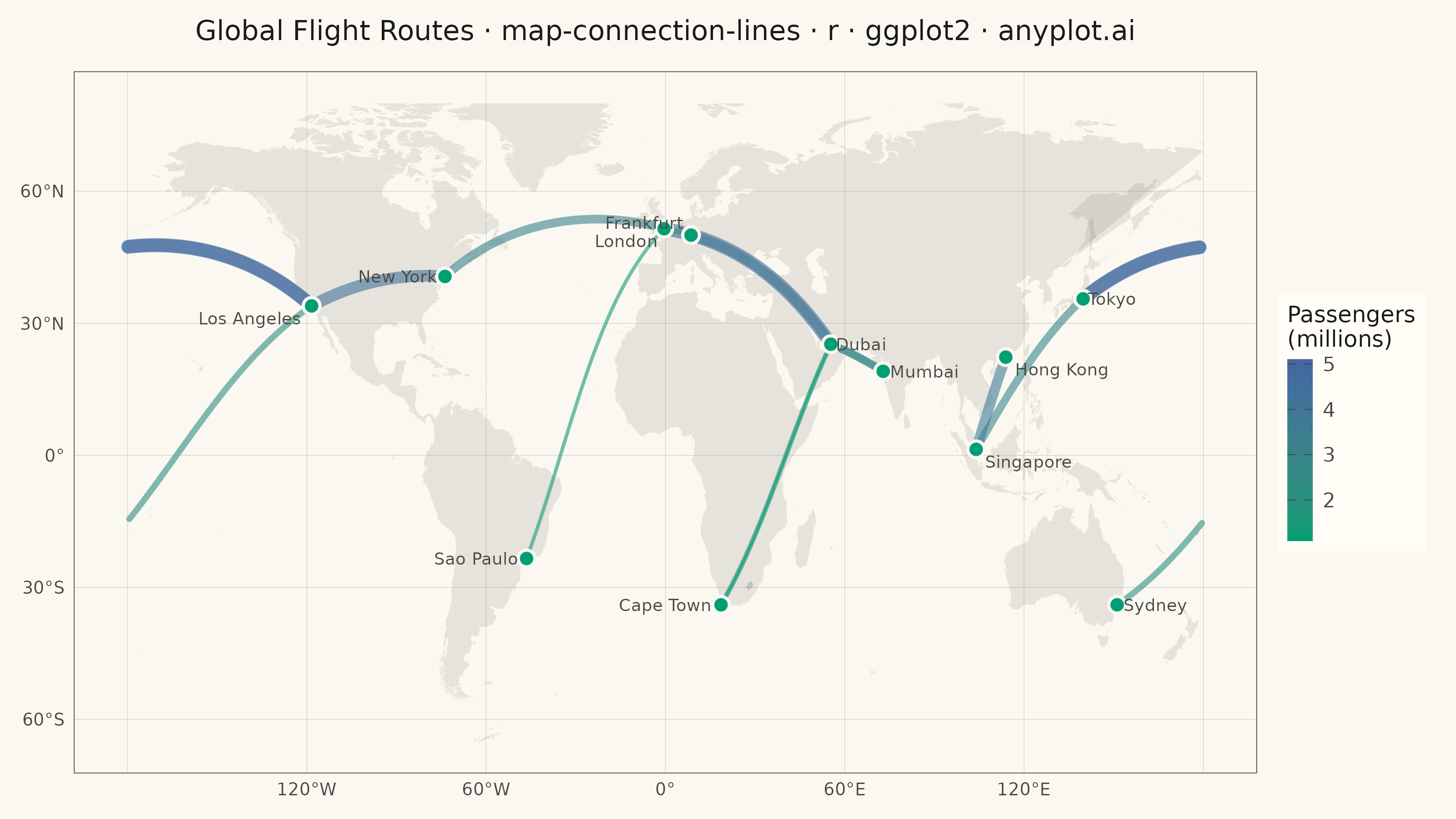
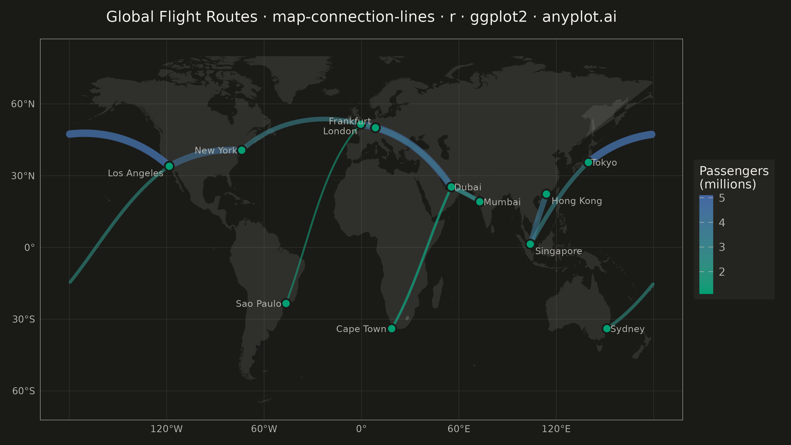
The same plot in 14 other libraries — Python: Altair, Bokeh, lets-plot, Matplotlib, Plotly, plotnine, Pygal, Seaborn; Julia: Makie.jl; JavaScript: Chart.js, D3.js, Apache ECharts, Highcharts, MUI X Charts. Compare all 15 side by side: Connection Lines Map (Origin-Destination) in Python, R, Julia and JavaScript.
A geographic map visualization showing connection lines (arcs or great circles) between pairs of locations. This plot excels at revealing spatial patterns in flows, routes, and relationships between places. The curved lines naturally represent shortest paths on Earth's surface while avoiding visual overlap with straight lines. Line properties like thickness or color can encode additional variables such as traffic volume or connection type.
#' anyplot.ai
#' map-connection-lines: Connection Lines Map (Origin-Destination)
#' Library: ggplot2 3.5.1 | R 4.4.1
#' Quality: 85/100 | Created: 2026-05-28

library(ggplot2)
library(dplyr)
library(ragg)
if (!requireNamespace("maps", quietly = TRUE)) install.packages("maps", repos = "https://cran.r-project.org")

set.seed(42)

# Theme tokens
THEME       <- Sys.getenv("ANYPLOT_THEME", "light")
PAGE_BG     <- if (THEME == "light") "#FAF8F1" else "#1A1A17"
ELEVATED_BG <- if (THEME == "light") "#FFFDF6" else "#242420"
INK         <- if (THEME == "light") "#1A1A17" else "#F0EFE8"
INK_SOFT    <- if (THEME == "light") "#4A4A44" else "#B8B7B0"
INK_MUTED   <- if (THEME == "light") "#6B6A63" else "#A8A79F"
IMPRINT_PALETTE <- c("#009E73", "#C475FD", "#4467A3", "#BD8233",
                     "#AE3030", "#2ABCCD", "#954477", "#99B314")

# Helper: spherical linear interpolation along a great circle arc
great_circle_arc <- function(lon1, lat1, lon2, lat2, n = 80L) {
  to_rad <- function(x) x * pi / 180
  to_deg <- function(x) x * 180 / pi

  lon1r <- to_rad(lon1); lat1r <- to_rad(lat1)
  lon2r <- to_rad(lon2); lat2r <- to_rad(lat2)

  x1 <- cos(lat1r) * cos(lon1r); y1 <- cos(lat1r) * sin(lon1r); z1 <- sin(lat1r)
  x2 <- cos(lat2r) * cos(lon2r); y2 <- cos(lat2r) * sin(lon2r); z2 <- sin(lat2r)

  d <- acos(pmax(pmin(x1 * x2 + y1 * y2 + z1 * z2, 1.0), -1.0))
  if (d < 1e-9) return(data.frame(lon = lon1, lat = lat1))

  t  <- seq(0, 1, length.out = n)
  xa <- (sin((1 - t) * d) * x1 + sin(t * d) * x2) / sin(d)
  ya <- (sin((1 - t) * d) * y1 + sin(t * d) * y2) / sin(d)
  za <- (sin((1 - t) * d) * z1 + sin(t * d) * z2) / sin(d)

  data.frame(
    lon = to_deg(atan2(ya, xa)),
    lat = to_deg(atan2(za, sqrt(xa^2 + ya^2)))
  )
}

# Data: major international hub airports
airports <- data.frame(
  city = c("New York", "London",    "Tokyo",      "Dubai",
           "Sydney",   "Sao Paulo", "Singapore",  "Cape Town",
           "Mumbai",   "Los Angeles","Frankfurt", "Hong Kong"),
  lat  = c( 40.64,  51.48,  35.55,  25.25,
            -33.95, -23.43,   1.36, -33.96,
             19.09,  33.94,  50.03,  22.31),
  lon  = c(-73.78,  -0.45, 139.78,  55.36,
           151.17, -46.47, 103.99,  18.60,
            72.87, -118.41,  8.57, 113.91),
  stringsAsFactors = FALSE
)

# Label nudge direction (avoid overlaps at map boundaries)
airports$hjust <- c(1.1, 1.1, -0.1, -0.1,
                    -0.1,  1.1, -0.1,  1.1,
                    -0.1,  1.1,  1.1, -0.1)
airports$vjust <- c(0.5, 1.5, 0.5, 0.5,
                    0.5, 0.5, 1.5, 0.5,
                    0.5, 1.5, -0.5, 1.5)

# Routes: international flight connections with annual passengers (millions)
routes_raw <- data.frame(
  origin       = c("New York",  "London",    "Dubai",     "Singapore", "Los Angeles",
                   "Frankfurt", "New York",  "London",    "Dubai",     "Sao Paulo",
                   "Tokyo",     "Hong Kong", "Mumbai",    "Sydney",    "Cape Town"),
  dest         = c("London",    "Dubai",     "Mumbai",    "Tokyo",     "Tokyo",
                   "Dubai",     "Los Angeles","Frankfurt", "Cape Town", "London",
                   "Los Angeles","Singapore","Dubai",     "Los Angeles","Dubai"),
  passengers_m = c(3.2, 4.8, 3.1, 2.9, 5.1,
                   3.6, 4.3, 2.1, 1.9, 1.4,
                   4.7, 3.8, 2.6, 2.3, 1.1),
  stringsAsFactors = FALSE
)

# Join airport coordinates
routes <- routes_raw |>
  left_join(airports[, c("city", "lat", "lon")], by = c("origin" = "city")) |>
  rename(origin_lat = lat, origin_lon = lon) |>
  left_join(airports[, c("city", "lat", "lon")], by = c("dest" = "city")) |>
  rename(dest_lat = lat, dest_lon = lon)

# Build arc segments — split at antimeridian to avoid horizontal line artifacts
all_segs    <- list()
seg_counter <- 1L

for (i in seq_len(nrow(routes))) {
  row <- routes[i, ]
  pts <- great_circle_arc(row$origin_lon, row$origin_lat,
                          row$dest_lon,   row$dest_lat)
  pts$passengers <- row$passengers_m

  jump_pos <- which(abs(diff(pts$lon)) > 180)

  if (length(jump_pos) == 0L) {
    pts$seg_id      <- seg_counter
    seg_counter     <- seg_counter + 1L
    all_segs[[length(all_segs) + 1]] <- pts
  } else {
    bounds <- c(0L, jump_pos, nrow(pts))
    for (j in seq_len(length(bounds) - 1L)) {
      seg        <- pts[(bounds[j] + 1L):bounds[j + 1L], ]
      seg$seg_id <- seg_counter
      seg_counter <- seg_counter + 1L
      all_segs[[length(all_segs) + 1]] <- seg
    }
  }
}

arc_df <- do.call(rbind, all_segs)

# Graticule grid lines (every 30°)
graticule_h <- data.frame(lat = seq(-60, 60, by = 30))
graticule_v <- data.frame(lon = seq(-180, 180, by = 60))

# Title with font-size scaling
title_str  <- "Global Flight Routes · map-connection-lines · r · ggplot2 · anyplot.ai"
title_size <- max(round(12 * 67 / nchar(title_str)), 8L)

world_map <- map_data("world")

p <- ggplot() +
  # Base map: country borders for geographic context
  geom_polygon(
    data    = world_map,
    mapping = aes(x = long, y = lat, group = group),
    fill    = INK_MUTED,
    color   = NA,
    alpha   = 0.15
  ) +
  # Horizontal graticule lines
  geom_hline(
    data    = graticule_h,
    mapping = aes(yintercept = lat),
    color   = INK_SOFT,
    linewidth = 0.1,
    alpha   = 0.25
  ) +
  # Vertical graticule lines
  geom_vline(
    data    = graticule_v,
    mapping = aes(xintercept = lon),
    color   = INK_SOFT,
    linewidth = 0.1,
    alpha   = 0.25
  ) +
  # Flight route arcs colored and weighted by passenger volume
  geom_path(
    data    = arc_df,
    mapping = aes(x = lon, y = lat, group = seg_id,
                  color = passengers, linewidth = passengers),
    alpha   = 0.60,
    lineend = "round"
  ) +
  # Airport markers (hollow circles, brand green)
  geom_point(
    data    = airports,
    mapping = aes(x = lon, y = lat),
    shape   = 21,
    size    = 2.5,
    fill    = IMPRINT_PALETTE[1],
    color   = PAGE_BG,
    stroke  = 0.9
  ) +
  # City labels for geographic context
  geom_text(
    data    = airports,
    mapping = aes(x = lon, y = lat, label = city,
                  hjust = hjust, vjust = vjust),
    color   = INK_SOFT,
    size    = 2.4,
    fontface = "plain"
  ) +
  scale_color_gradient(
    low   = "#009E73",
    high  = "#4467A3",
    name  = "Passengers\n(millions)",
    guide = guide_colorbar(
      barwidth       = 0.7,
      barheight      = 5.0,
      title.position = "top",
      ticks.colour   = INK_SOFT
    )
  ) +
  scale_linewidth_continuous(range = c(0.5, 2.6), guide = "none") +
  scale_x_continuous(
    limits = c(-180, 180),
    breaks = seq(-120, 120, by = 60),
    labels = function(x) paste0(abs(x), ifelse(x < 0, "°W", ifelse(x > 0, "°E", "°")))
  ) +
  scale_y_continuous(
    limits = c(-65, 80),
    breaks = seq(-60, 60, by = 30),
    labels = function(y) paste0(abs(y), ifelse(y < 0, "°S", ifelse(y > 0, "°N", "°")))
  ) +
  labs(title = title_str, x = NULL, y = NULL) +
  theme_minimal(base_size = 8) +
  theme(
    plot.background  = element_rect(fill = PAGE_BG, color = PAGE_BG),
    panel.background = element_rect(fill = PAGE_BG, color = NA),
    panel.grid.major = element_blank(),
    panel.grid.minor = element_blank(),
    panel.border     = element_rect(color = INK_SOFT, fill = NA, linewidth = 0.3),
    axis.text        = element_text(color = INK_SOFT, size = 7),
    axis.title       = element_blank(),
    axis.ticks       = element_blank(),
    plot.title       = element_text(
      color  = INK,
      size   = title_size,
      hjust  = 0.5,
      margin = margin(b = 10)
    ),
    legend.background = element_rect(fill = ELEVATED_BG, color = NA),
    legend.text       = element_text(color = INK_SOFT, size = 8),
    legend.title      = element_text(color = INK, size = 9),
    legend.position   = "right",
    plot.margin       = margin(8, 12, 8, 8)
  )

ggsave(
  filename = sprintf("plot-%s.png", THEME),
  plot     = p,
  device   = ragg::agg_png,
  width    = 8,
  height   = 4.5,
  units    = "in",
  dpi      = 400
)
Runnable source as JSON, for any HTTP client: https://api.anyplot.ai/specs/map-connection-lines/ggplot2/code. Any spec id and library id listed in llms-full.txt fit the same URL shape; every URL below is complete and callable.
{
  "spec_id": "map-connection-lines",
  "language": "r",
  "library": "ggplot2",
  "page": "https://anyplot.ai/map-connection-lines/r/ggplot2",
  "hub": "https://anyplot.ai/map-connection-lines",
  "code_json": "https://api.anyplot.ai/specs/map-connection-lines/ggplot2/code",
  "spec_json": "https://api.anyplot.ai/specs/map-connection-lines",
  "render_light_png": "https://storage.googleapis.com/anyplot-images/plots/map-connection-lines/r/ggplot2/plot-light.png",
  "render_dark_png": "https://storage.googleapis.com/anyplot-images/plots/map-connection-lines/r/ggplot2/plot-dark.png",
  "quality_score": 85.0,
  "license": "MIT",
  "guide": "https://anyplot.ai/llms.txt"
}
Part of Connection Lines Map (Origin-Destination) on anyplot.ai.