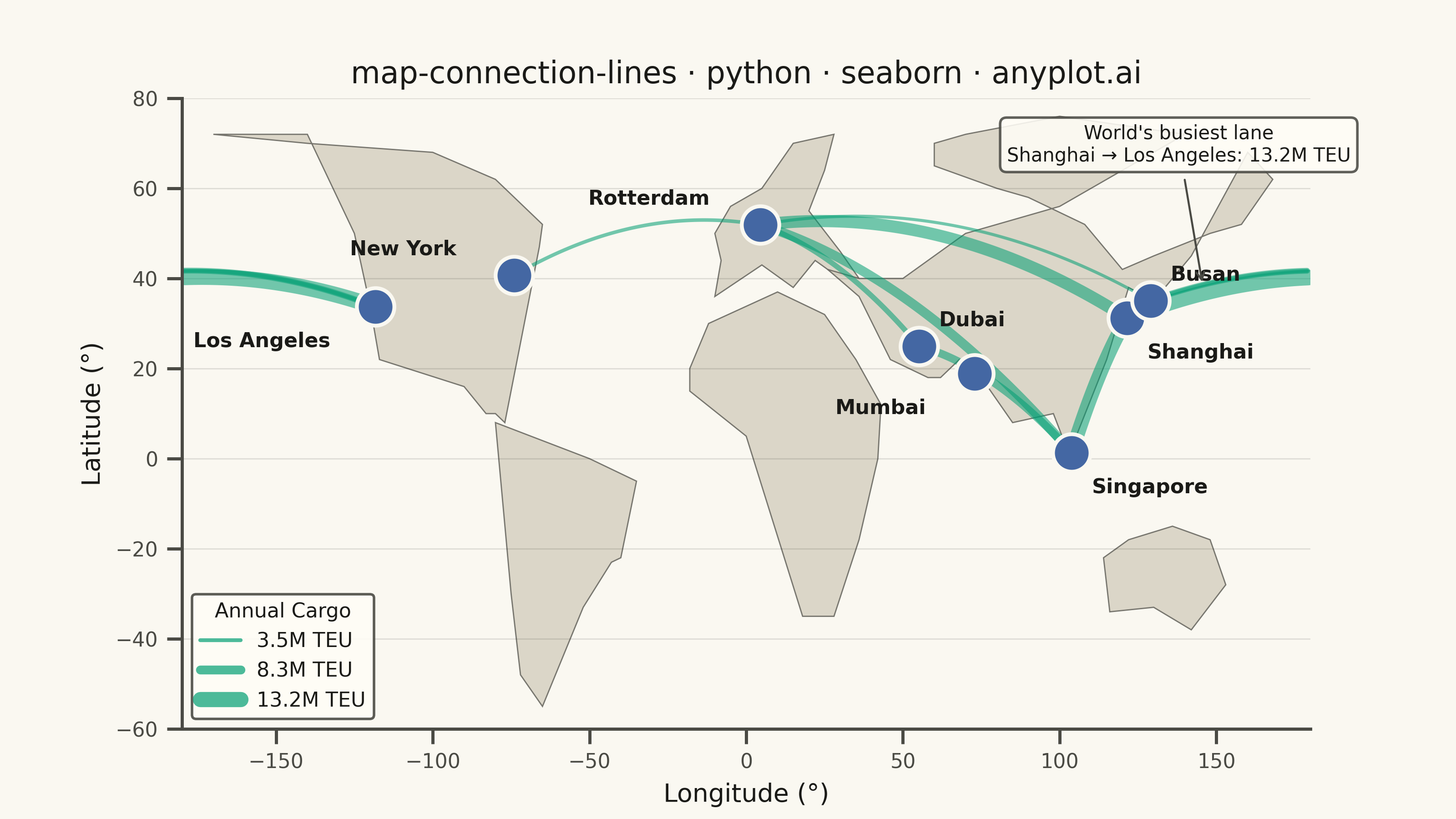
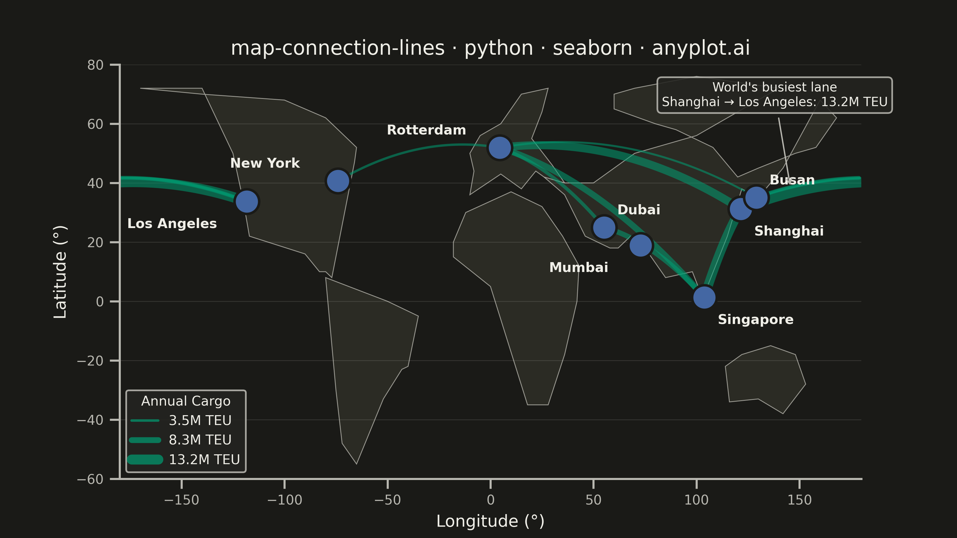
A geographic map visualization showing connection lines (arcs or great circles) between pairs of locations. This plot excels at revealing spatial patterns in flows, routes, and relationships between places. The curved lines naturally represent shortest paths on Earth's surface while avoiding visual overlap with straight lines. Line properties like thickness or color can encode additional variables such as traffic volume or connection type.
""" anyplot.ai
map-connection-lines: Connection Lines Map (Origin-Destination)
Library: seaborn 0.13.2 | Python 3.13.13
Quality: 89/100 | Updated: 2026-05-28
"""

import os

import matplotlib.pyplot as plt
import numpy as np
import pandas as pd
import seaborn as sns
from matplotlib.lines import Line2D


# Theme tokens
THEME = os.getenv("ANYPLOT_THEME", "light")
PAGE_BG = "#FAF8F1" if THEME == "light" else "#1A1A17"
ELEVATED_BG = "#FFFDF6" if THEME == "light" else "#242420"
INK = "#1A1A17" if THEME == "light" else "#F0EFE8"
INK_SOFT = "#4A4A44" if THEME == "light" else "#B8B7B0"
INK_MUTED = "#6B6A63" if THEME == "light" else "#A8A79F"

IMPRINT_PALETTE = ["#009E73", "#C475FD", "#4467A3", "#BD8233", "#AE3030", "#2ABCCD", "#954477", "#99B314"]
BRAND = IMPRINT_PALETTE[0]  # green — connection lines
PORT_COLOR = IMPRINT_PALETTE[2]  # blue — port markers

LAND_COLOR = "#D8D3C4" if THEME == "light" else "#2D2D26"
LAND_EDGE = INK_MUTED

sns.set_theme(
    style="ticks",
    rc={
        "figure.facecolor": PAGE_BG,
        "axes.facecolor": PAGE_BG,
        "axes.edgecolor": INK_SOFT,
        "axes.labelcolor": INK,
        "text.color": INK,
        "xtick.color": INK_SOFT,
        "ytick.color": INK_SOFT,
        "grid.color": INK,
        "grid.alpha": 0.15,
        "legend.facecolor": ELEVATED_BG,
        "legend.edgecolor": INK_SOFT,
    },
)

# Data: Major global maritime shipping routes (cargo in million TEUs / year)
np.random.seed(42)

ports = pd.DataFrame(
    {
        "city": ["Shanghai", "Los Angeles", "Rotterdam", "Singapore", "Busan", "Dubai", "New York", "Mumbai"],
        "lat": [31.2, 33.7, 51.9, 1.3, 35.1, 25.0, 40.7, 18.9],
        "lon": [121.5, -118.3, 4.5, 103.8, 129.0, 55.1, -74.0, 72.8],
    }
)

routes = pd.DataFrame(
    {
        "origin": [
            "Shanghai",
            "Shanghai",
            "Shanghai",
            "Singapore",
            "Busan",
            "Rotterdam",
            "Singapore",
            "Busan",
            "Dubai",
            "Los Angeles",
        ],
        "origin_lat": [31.2, 31.2, 31.2, 1.3, 35.1, 51.9, 1.3, 35.1, 25.0, 33.7],
        "origin_lon": [121.5, 121.5, 121.5, 103.8, 129.0, 4.5, 103.8, 129.0, 55.1, -118.3],
        "dest": [
            "Los Angeles",
            "Rotterdam",
            "Singapore",
            "Rotterdam",
            "Los Angeles",
            "New York",
            "Dubai",
            "Rotterdam",
            "Rotterdam",
            "Busan",
        ],
        "dest_lat": [33.7, 51.9, 1.3, 51.9, 33.7, 40.7, 25.0, 51.9, 51.9, 35.1],
        "dest_lon": [-118.3, 4.5, 103.8, 4.5, -118.3, -74.0, 55.1, 4.5, 4.5, 129.0],
        "cargo_mteu": [13.2, 10.5, 12.1, 8.4, 5.6, 3.9, 7.2, 3.5, 5.2, 4.1],
    }
)

cargo_min = routes["cargo_mteu"].min()
cargo_max = routes["cargo_mteu"].max()
routes["line_width"] = 1.2 + (routes["cargo_mteu"] - cargo_min) / (cargo_max - cargo_min) * 5.0

# Continent polygons (lon, lat) — simplified outlines for geographic context
land_polygons = [
    # North America
    (
        np.array([-170, -140, -125, -120, -117, -90, -83, -80, -77, -66, -65, -80, -100, -140, -170]),
        np.array([72, 72, 50, 34, 22, 16, 10, 10, 8, 47, 52, 62, 68, 70, 72]),
    ),
    # South America
    (
        np.array([-80, -50, -35, -40, -43, -52, -65, -72, -75, -80]),
        np.array([8, 0, -5, -22, -23, -33, -55, -48, -30, 8]),
    ),
    # Europe
    (
        np.array([-10, 5, 15, 22, 28, 36, 30, 20, 25, 28, 15, 5, -5, -10, -8, -10]),
        np.array([36, 43, 38, 44, 41, 40, 46, 55, 64, 72, 70, 60, 56, 50, 44, 36]),
    ),
    # Africa
    (
        np.array([-18, -18, -12, 10, 25, 35, 43, 42, 36, 28, 18, 0, -18]),
        np.array([15, 20, 30, 37, 32, 22, 12, 0, -18, -35, -35, 5, 15]),
    ),
    # Asia (simplified — main landmass tracing coast then Arctic closure)
    (
        np.array(
            [
                26,
                36,
                46,
                58,
                62,
                68,
                75,
                85,
                98,
                103,
                115,
                122,
                130,
                142,
                160,
                168,
                158,
                148,
                130,
                120,
                108,
                90,
                80,
                60,
                60,
                70,
                100,
                140,
                100,
                70,
                50,
                36,
                26,
            ]
        ),
        np.array(
            [
                42,
                36,
                22,
                18,
                18,
                22,
                18,
                8,
                10,
                1,
                22,
                38,
                35,
                45,
                68,
                62,
                52,
                50,
                45,
                42,
                52,
                58,
                60,
                65,
                70,
                72,
                76,
                72,
                56,
                50,
                40,
                40,
                42,
            ]
        ),
    ),
    # Australia
    (np.array([114, 116, 130, 142, 153, 148, 136, 122, 114]), np.array([-22, -34, -33, -38, -28, -18, -15, -18, -22])),
]

# Plot
fig, ax = plt.subplots(figsize=(8, 4.5), dpi=400, facecolor=PAGE_BG)
ax.set_facecolor(PAGE_BG)

# Draw continents
for lons, lats in land_polygons:
    ax.fill(lons, lats, color=LAND_COLOR, edgecolor=LAND_EDGE, linewidth=0.5, alpha=0.9, zorder=0)

# Draw connection lines (Bezier arcs with antimeridian handling)
n_points = 80
t = np.linspace(0, 1, n_points)

for _, row in routes.iterrows():
    lon1, lat1 = row["origin_lon"], row["origin_lat"]
    lon2, lat2 = row["dest_lon"], row["dest_lat"]

    # Unwrap lon2 so the curve takes the shorter path (handles Pacific crossing)
    diff = lon2 - lon1
    if diff > 180:
        lon2 -= 360
    elif diff < -180:
        lon2 += 360

    mid_lon = (lon1 + lon2) / 2
    mid_lat = (lat1 + lat2) / 2
    dist = np.sqrt((lon2 - lon1) ** 2 + (lat2 - lat1) ** 2)
    curve_height = dist * 0.13

    lons = (1 - t) ** 2 * lon1 + 2 * (1 - t) * t * mid_lon + t**2 * lon2
    lats = (1 - t) ** 2 * lat1 + 2 * (1 - t) * t * (mid_lat + curve_height) + t**2 * lat2

    # Wrap to [-180, 180] and split at antimeridian discontinuities
    lons_w = ((lons + 180) % 360) - 180
    breaks = np.where(np.abs(np.diff(lons_w)) > 90)[0] + 1
    starts = np.concatenate([[0], breaks])
    ends = np.concatenate([breaks, [n_points]])

    for s, e in zip(starts, ends, strict=False):
        if e > s + 1:
            ax.plot(
                lons_w[s:e],
                lats[s:e],
                color=BRAND,
                linewidth=row["line_width"],
                alpha=0.55,
                solid_capstyle="round",
                zorder=2,
            )

# Port markers via seaborn scatterplot
sns.scatterplot(
    data=ports,
    x="lon",
    y="lat",
    s=220,
    color=PORT_COLOR,
    edgecolor=PAGE_BG,
    linewidth=1.5,
    ax=ax,
    zorder=4,
    legend=False,
)

# City labels with custom offsets to avoid overlap
label_offsets = {
    "Shanghai": (8, -16),  # below dot to separate from Busan label
    "Los Angeles": (-72, -16),
    "Rotterdam": (-68, 8),
    "Singapore": (8, -16),
    "Busan": (8, 8),
    "Dubai": (8, 8),
    "New York": (-65, 8),
    "Mumbai": (-55, -16),
}

for _, row in ports.iterrows():
    dx, dy = label_offsets.get(row["city"], (8, 8))
    ax.annotate(
        row["city"],
        xy=(row["lon"], row["lat"]),
        xytext=(dx, dy),
        textcoords="offset points",
        fontsize=8,
        fontweight="bold",
        color=INK,
        zorder=5,
    )

# Storytelling annotation: highlight world's busiest shipping lane
# Arc point at t≈0.2 for Shanghai→LA route (east of Japan, ~146°E 37°N)
ax.annotate(
    "World's busiest lane\nShanghai → Los Angeles: 13.2M TEU",
    xy=(146, 37),
    xytext=(138, 66),
    textcoords="data",
    fontsize=7.5,
    color=INK,
    ha="center",
    arrowprops={"arrowstyle": "->", "color": INK_SOFT, "lw": 0.8, "shrinkA": 3, "shrinkB": 4},
    bbox={"boxstyle": "round,pad=0.35", "facecolor": ELEVATED_BG, "edgecolor": INK_SOFT, "alpha": 0.88},
    zorder=6,
)

# Style
ax.set_xlim(-180, 180)
ax.set_ylim(-60, 80)
ax.set_xlabel("Longitude (°)", fontsize=10, color=INK)
ax.set_ylabel("Latitude (°)", fontsize=10, color=INK)
ax.tick_params(axis="both", labelsize=8, colors=INK_SOFT)
ax.spines["top"].set_visible(False)
ax.spines["right"].set_visible(False)
for sp in ("left", "bottom"):
    ax.spines[sp].set_color(INK_SOFT)
ax.yaxis.grid(True, alpha=0.12, linewidth=0.5, color=INK)
ax.xaxis.grid(False)

title = "map-connection-lines · python · seaborn · anyplot.ai"
ax.set_title(title, fontsize=12, fontweight="medium", color=INK)

# Legend showing cargo volume scale
min_vol, max_vol = routes["cargo_mteu"].min(), routes["cargo_mteu"].max()
mid_vol = (min_vol + max_vol) / 2
legend_elements = [
    Line2D([0], [0], color=BRAND, linewidth=1.5, alpha=0.7, label=f"{min_vol:.1f}M TEU"),
    Line2D([0], [0], color=BRAND, linewidth=3.5, alpha=0.7, label=f"{mid_vol:.1f}M TEU"),
    Line2D([0], [0], color=BRAND, linewidth=6.0, alpha=0.7, label=f"{max_vol:.1f}M TEU"),
]
ax.legend(
    handles=legend_elements,
    loc="lower left",
    fontsize=8,
    title="Annual Cargo",
    title_fontsize=8,
    framealpha=0.9,
    edgecolor=INK_SOFT,
)

# Save
plt.savefig(f"plot-{THEME}.png", dpi=400, facecolor=PAGE_BG)
Runnable source as JSON, for any HTTP client: https://api.anyplot.ai/specs/map-connection-lines/seaborn/code. Any spec id and library id listed in llms-full.txt fit the same URL shape; every URL below is complete and callable.
{
  "spec_id": "map-connection-lines",
  "language": "python",
  "library": "seaborn",
  "page": "https://anyplot.ai/map-connection-lines/python/seaborn",
  "hub": "https://anyplot.ai/map-connection-lines",
  "code_json": "https://api.anyplot.ai/specs/map-connection-lines/seaborn/code",
  "spec_json": "https://api.anyplot.ai/specs/map-connection-lines",
  "render_light_png": "https://storage.googleapis.com/anyplot-images/plots/map-connection-lines/python/seaborn/plot-light.png",
  "render_dark_png": "https://storage.googleapis.com/anyplot-images/plots/map-connection-lines/python/seaborn/plot-dark.png",
  "quality_score": 89.0,
  "license": "MIT",
  "guide": "https://anyplot.ai/llms.txt"
}
Part of Connection Lines Map (Origin-Destination) on anyplot.ai.