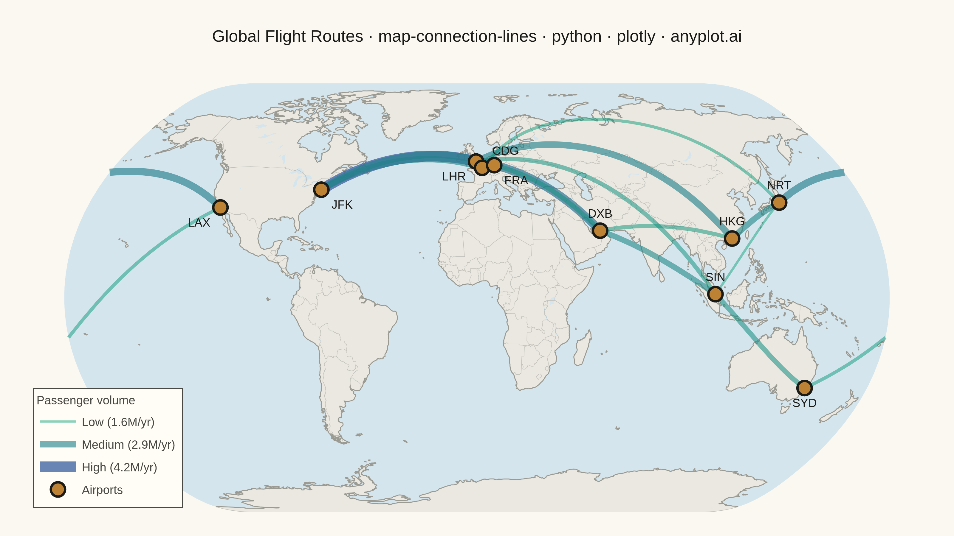
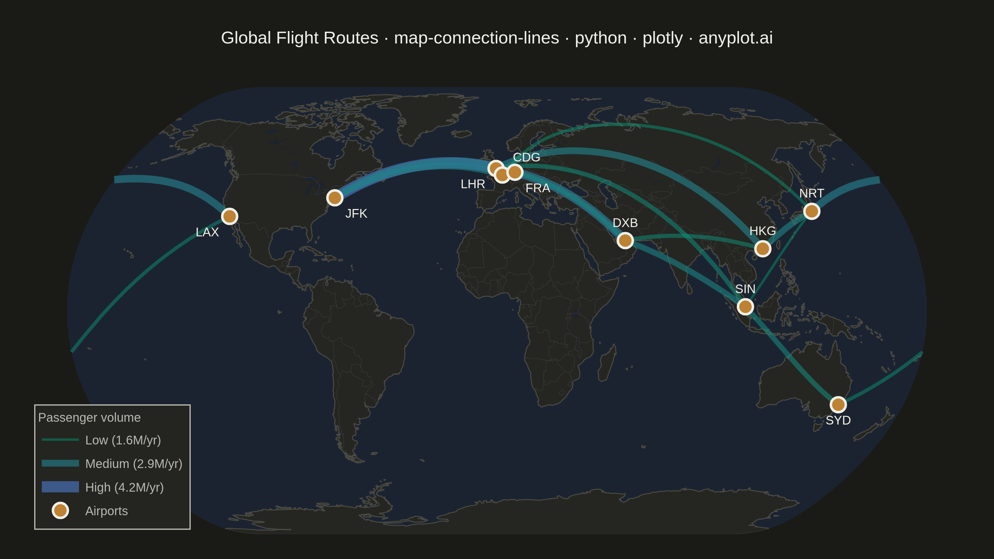
A geographic map visualization showing connection lines (arcs or great circles) between pairs of locations. This plot excels at revealing spatial patterns in flows, routes, and relationships between places. The curved lines naturally represent shortest paths on Earth's surface while avoiding visual overlap with straight lines. Line properties like thickness or color can encode additional variables such as traffic volume or connection type.
""" anyplot.ai
map-connection-lines: Connection Lines Map (Origin-Destination)
Library: plotly 6.7.0 | Python 3.13.13
Quality: 91/100 | Updated: 2026-05-28
"""

import os

import numpy as np
import plotly.graph_objects as go


# Theme tokens
THEME = os.getenv("ANYPLOT_THEME", "light")
PAGE_BG = "#FAF8F1" if THEME == "light" else "#1A1A17"
ELEVATED_BG = "#FFFDF6" if THEME == "light" else "#242420"
INK = "#1A1A17" if THEME == "light" else "#F0EFE8"
INK_SOFT = "#4A4A44" if THEME == "light" else "#B8B7B0"

# Data: Major global flight routes between airports
np.random.seed(42)

airports = {
    "JFK": (40.6413, -73.7781, "New York"),
    "LAX": (33.9416, -118.4085, "Los Angeles"),
    "LHR": (51.4700, -0.4543, "London"),
    "CDG": (49.0097, 2.5479, "Paris"),
    "NRT": (35.7720, 140.3929, "Tokyo"),
    "SYD": (-33.9399, 151.1753, "Sydney"),
    "DXB": (25.2532, 55.3657, "Dubai"),
    "SIN": (1.3644, 103.9915, "Singapore"),
    "HKG": (22.3080, 113.9185, "Hong Kong"),
    "FRA": (50.0379, 8.5622, "Frankfurt"),
}

routes = [
    ("JFK", "LHR", 4200),
    ("JFK", "CDG", 2800),
    ("LAX", "NRT", 3100),
    ("LAX", "SYD", 1900),
    ("LHR", "DXB", 3500),
    ("LHR", "SIN", 2200),
    ("LHR", "HKG", 2900),
    ("CDG", "NRT", 1800),
    ("DXB", "SIN", 2600),
    ("DXB", "HKG", 2100),
    ("SIN", "SYD", 2400),
    ("HKG", "NRT", 2700),
    ("FRA", "JFK", 3000),
    ("FRA", "DXB", 2300),
    ("SIN", "NRT", 1600),
]

min_pass = min(r[2] for r in routes)
max_pass = max(r[2] for r in routes)

# Map geographic colors (theme-adaptive)
if THEME == "light":
    land_color = "#EAE8E1"
    ocean_color = "#D5E5EE"
    coast_color = "#9A9A92"
    country_color = "#C2C0BA"
else:
    land_color = "#252521"
    ocean_color = "#1C2330"
    coast_color = "#4A4A44"
    country_color = "#383835"

# Create figure
fig = go.Figure()

# Flight routes — both color and width encode passenger volume (imprint_seq: #009E73 → #4467A3)
for origin, dest, passengers in routes:
    origin_lat, origin_lon, origin_city = airports[origin]
    dest_lat, dest_lon, dest_city = airports[dest]

    t = (passengers - min_pass) / (max_pass - min_pass)
    rc = int(0x00 + t * (0x44 - 0x00))
    gc = int(0x9E + t * (0x67 - 0x9E))
    bc = int(0x73 + t * (0xA3 - 0x73))
    route_color = f"#{rc:02X}{gc:02X}{bc:02X}"
    line_width = 2 + t * 7  # 2–9 px
    opacity = 0.45 + t * 0.35  # 0.45–0.80

    fig.add_trace(
        go.Scattergeo(
            lon=[origin_lon, dest_lon],
            lat=[origin_lat, dest_lat],
            mode="lines",
            line={"width": line_width, "color": route_color},
            opacity=opacity,
            hoverinfo="text",
            text=f"{origin_city} → {dest_city}<br>{passengers:,}K passengers/year",
            showlegend=False,
        )
    )

# Visual legend — three representative passenger volume levels with matching line style
for leg_label, leg_pass in [("Low (1.6M/yr)", 1600), ("Medium (2.9M/yr)", 2900), ("High (4.2M/yr)", 4200)]:
    t = (leg_pass - min_pass) / (max_pass - min_pass)
    rc = int(0x00 + t * (0x44 - 0x00))
    gc = int(0x9E + t * (0x67 - 0x9E))
    bc = int(0x73 + t * (0xA3 - 0x73))
    leg_color = f"#{rc:02X}{gc:02X}{bc:02X}"
    fig.add_trace(
        go.Scattergeo(
            lon=[None],
            lat=[None],
            mode="lines",
            line={"width": 2 + t * 7, "color": leg_color},
            opacity=0.45 + t * 0.35,
            name=leg_label,
            showlegend=True,
        )
    )

# Airport markers — anyplot ochre (#BD8233) contrasts with the green-blue route palette
text_positions = {
    "LHR": "bottom left",
    "CDG": "top right",
    "FRA": "bottom right",
    "JFK": "bottom right",
    "LAX": "bottom left",
    "SYD": "bottom center",
}
airport_codes = list(airports.keys())
airport_lons = [airports[code][1] for code in airport_codes]
airport_lats = [airports[code][0] for code in airport_codes]
airport_hover = [f"{airports[code][2]} ({code})" for code in airport_codes]
airport_textpos = [text_positions.get(code, "top center") for code in airport_codes]

fig.add_trace(
    go.Scattergeo(
        lon=airport_lons,
        lat=airport_lats,
        mode="markers+text",
        marker={"size": 12, "color": "#BD8233", "line": {"width": 2, "color": INK}},
        text=airport_codes,
        textposition=airport_textpos,
        textfont={"size": 10, "color": INK, "family": "Arial"},
        hoverinfo="text",
        hovertext=airport_hover,
        name="Airports",
        showlegend=True,
    )
)

# Title with auto-scaled fontsize (baseline 67 chars → 16px)
title = "Global Flight Routes · map-connection-lines · python · plotly · anyplot.ai"
title_fontsize = max(11, round(16 * 67 / len(title))) if len(title) > 67 else 16

fig.update_layout(
    autosize=False,
    paper_bgcolor=PAGE_BG,
    plot_bgcolor=PAGE_BG,
    font={"color": INK},
    title={"text": title, "font": {"size": title_fontsize, "color": INK}, "x": 0.5, "xanchor": "center"},
    geo={
        "projection_type": "natural earth",
        "showland": True,
        "landcolor": land_color,
        "showocean": True,
        "oceancolor": ocean_color,
        "showcoastlines": True,
        "coastlinecolor": coast_color,
        "coastlinewidth": 0.8,
        "showlakes": True,
        "lakecolor": ocean_color,
        "showcountries": True,
        "countrycolor": country_color,
        "countrywidth": 0.4,
        "showframe": False,
        "bgcolor": PAGE_BG,
    },
    legend={
        "bgcolor": ELEVATED_BG,
        "bordercolor": INK_SOFT,
        "borderwidth": 1,
        "font": {"color": INK_SOFT, "size": 10},
        "title": {"text": "Passenger volume", "font": {"size": 10, "color": INK_SOFT}},
        "x": 0.01,
        "y": 0.01,
        "xanchor": "left",
        "yanchor": "bottom",
    },
    margin={"l": 20, "r": 20, "t": 70, "b": 20},
)

# Save
fig.write_image(f"plot-{THEME}.png", width=800, height=450, scale=4)
fig.write_html(f"plot-{THEME}.html", include_plotlyjs="cdn")
Runnable source as JSON, for any HTTP client: https://api.anyplot.ai/specs/map-connection-lines/plotly/code. Any spec id and library id listed in llms-full.txt fit the same URL shape; every URL below is complete and callable.
{
  "spec_id": "map-connection-lines",
  "language": "python",
  "library": "plotly",
  "page": "https://anyplot.ai/map-connection-lines/python/plotly",
  "hub": "https://anyplot.ai/map-connection-lines",
  "code_json": "https://api.anyplot.ai/specs/map-connection-lines/plotly/code",
  "spec_json": "https://api.anyplot.ai/specs/map-connection-lines",
  "render_light_png": "https://storage.googleapis.com/anyplot-images/plots/map-connection-lines/python/plotly/plot-light.png",
  "render_dark_png": "https://storage.googleapis.com/anyplot-images/plots/map-connection-lines/python/plotly/plot-dark.png",
  "interactive_light_html": "https://storage.googleapis.com/anyplot-images/plots/map-connection-lines/python/plotly/plot-light.html",
  "interactive_dark_html": "https://storage.googleapis.com/anyplot-images/plots/map-connection-lines/python/plotly/plot-dark.html",
  "quality_score": 91.0,
  "license": "MIT",
  "guide": "https://anyplot.ai/llms.txt"
}
Part of Connection Lines Map (Origin-Destination) on anyplot.ai.