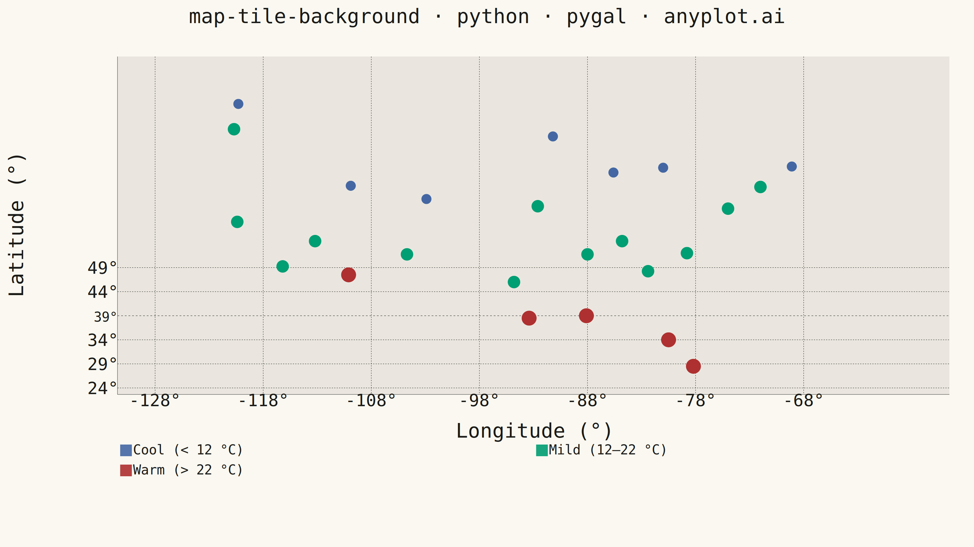
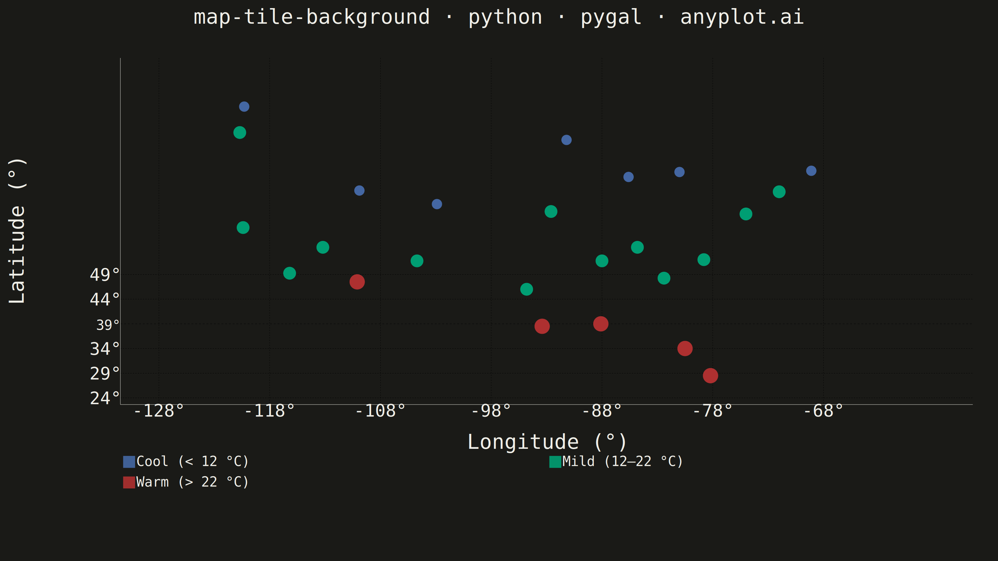
A map visualization that displays data points on top of tile-based backgrounds such as OpenStreetMap, Stamen, or satellite imagery. Unlike vector-based basemaps, tile backgrounds provide rich geographic context including street-level detail, terrain, or satellite imagery that loads dynamically as the user navigates. This visualization is essential for location-based analysis where real-world geographic context enhances data interpretation.
""" anyplot.ai
map-tile-background: Map with Tile Background
Library: pygal 3.1.0 | Python 3.13.13
Quality: 80/100 | Updated: 2026-05-27
"""

import importlib
import os
import sys


# Remove cwd from path to avoid importing this file instead of the pygal library
_cwd = sys.path[0] if sys.path and sys.path[0] else None
if _cwd:
    sys.path.remove(_cwd)
_pygal = importlib.import_module("pygal")
_style_mod = importlib.import_module("pygal.style")
if _cwd:
    sys.path.insert(0, _cwd)

Style = _style_mod.Style

# Theme tokens
THEME = os.getenv("ANYPLOT_THEME", "light")

PAGE_BG = "#FAF8F1" if THEME == "light" else "#1A1A17"
# Map-inspired plot background simulates geographic tile context
# Light: warm land beige; Dark: near-black land surface
LAND_BG = "#eae6df" if THEME == "light" else "#1A1A17"
INK = "#1A1A17" if THEME == "light" else "#F0EFE8"
INK_MUTED = "#6B6A63" if THEME == "light" else "#A8A79F"

# Semantic color exception: temperature carries strong cold→blue / hot→red expectation
# (Imprint palette positions 3, 1, 5 in semantic role order)
COLOR_COOL = "#4467A3"  # blue  — cool stations (annual mean < 12 °C)
COLOR_MILD = "#009E73"  # green — mild stations (12–22 °C)
COLOR_WARM = "#AE3030"  # red   — warm stations (> 22 °C)

# Data: US weather monitoring network — mean annual surface temperatures
stations = [
    {"label": "Seattle", "lat": 47.6, "lon": -122.3, "temp_c": 11.0},
    {"label": "Portland", "lat": 45.5, "lon": -122.7, "temp_c": 12.0},
    {"label": "San Francisco", "lat": 37.8, "lon": -122.4, "temp_c": 13.5},
    {"label": "Los Angeles", "lat": 34.1, "lon": -118.2, "temp_c": 19.0},
    {"label": "Phoenix", "lat": 33.4, "lon": -112.1, "temp_c": 28.5},
    {"label": "Denver", "lat": 39.7, "lon": -104.9, "temp_c": 10.5},
    {"label": "Dallas", "lat": 32.8, "lon": -96.8, "temp_c": 19.5},
    {"label": "Houston", "lat": 29.8, "lon": -95.4, "temp_c": 24.5},
    {"label": "Minneapolis", "lat": 44.9, "lon": -93.2, "temp_c": 7.5},
    {"label": "Chicago", "lat": 41.9, "lon": -87.6, "temp_c": 9.5},
    {"label": "Detroit", "lat": 42.3, "lon": -83.0, "temp_c": 8.5},
    {"label": "Atlanta", "lat": 33.7, "lon": -84.4, "temp_c": 17.5},
    {"label": "Miami", "lat": 25.8, "lon": -80.2, "temp_c": 27.0},
    {"label": "Washington DC", "lat": 38.9, "lon": -77.0, "temp_c": 13.5},
    {"label": "New York", "lat": 40.7, "lon": -74.0, "temp_c": 12.5},
    {"label": "Boston", "lat": 42.4, "lon": -71.1, "temp_c": 10.0},
    {"label": "Nashville", "lat": 36.2, "lon": -86.8, "temp_c": 15.5},
    {"label": "New Orleans", "lat": 30.0, "lon": -90.1, "temp_c": 23.0},
    {"label": "Kansas City", "lat": 39.1, "lon": -94.6, "temp_c": 12.5},
    {"label": "Salt Lake City", "lat": 40.8, "lon": -111.9, "temp_c": 11.5},
    {"label": "Las Vegas", "lat": 36.2, "lon": -115.2, "temp_c": 20.0},
    {"label": "Albuquerque", "lat": 35.1, "lon": -106.7, "temp_c": 14.5},
    {"label": "Memphis", "lat": 35.1, "lon": -90.0, "temp_c": 18.0},
    {"label": "Charlotte", "lat": 35.2, "lon": -80.8, "temp_c": 16.0},
    {"label": "Tampa", "lat": 28.0, "lon": -82.5, "temp_c": 25.0},
]

# Continental US bounds; chart xrange padded to give tick labels breathing room
lat_min, lat_max = 24, 51
lon_min, lon_max = -128, -62
chart_xrange = (-132, -58)

title = "map-tile-background · python · pygal · anyplot.ai"
n = len(title)
ratio = 67 / n if n > 67 else 1.0
title_font_size = max(44, round(66 * ratio))

custom_style = Style(
    background=PAGE_BG,
    plot_background=LAND_BG,
    foreground=INK,
    foreground_strong=INK,
    foreground_subtle=INK_MUTED,
    colors=(COLOR_COOL, COLOR_MILD, COLOR_WARM),
    title_font_size=title_font_size,
    label_font_size=56,
    major_label_font_size=44,
    legend_font_size=44,
    value_font_size=36,
    stroke_width=2.5,
    opacity=0.9,
    opacity_hover=1.0,
)

chart = _pygal.XY(
    width=3200,
    height=1800,
    style=custom_style,
    title=title,
    x_title="Longitude (°)",
    y_title="Latitude (°)",
    show_legend=True,
    legend_at_bottom=True,
    legend_box_size=36,
    show_x_guides=True,
    show_y_guides=True,
    dots_size=18,
    stroke=False,
    margin=60,
    margin_top=110,
    margin_bottom=240,
    margin_left=200,
    margin_right=80,
    range=(lat_min, lat_max),
    xrange=chart_xrange,
    print_values=False,
    truncate_legend=-1,
    truncate_label=-1,
    explicit_size=True,
)

# Group stations by annual mean temperature
cool_pts = []
mild_pts = []
warm_pts = []

for s in stations:
    pt = {"value": (s["lon"], s["lat"]), "label": f"{s['label']}: {s['temp_c']} °C"}
    if s["temp_c"] < 12:
        cool_pts.append(pt)
    elif s["temp_c"] < 22:
        mild_pts.append(pt)
    else:
        warm_pts.append(pt)

chart.add("Cool (< 12 °C)", cool_pts, dots_size=16)
chart.add("Mild (12–22 °C)", mild_pts, dots_size=20)
chart.add("Warm (> 22 °C)", warm_pts, dots_size=24)

chart.x_labels = [f"{lon}°" for lon in range(lon_min, lon_max + 1, 10)]
chart.y_labels = [f"{lat}°" for lat in range(lat_min, lat_max + 1, 5)]

# Save PNG and interactive HTML
chart.render_to_png(f"plot-{THEME}.png")

with open(f"plot-{THEME}.html", "wb") as f:
    f.write(chart.render())
Runnable source as JSON, for any HTTP client: https://api.anyplot.ai/specs/map-tile-background/pygal/code. Any spec id and library id listed in llms-full.txt fit the same URL shape; every URL below is complete and callable.
{
  "spec_id": "map-tile-background",
  "language": "python",
  "library": "pygal",
  "page": "https://anyplot.ai/map-tile-background/python/pygal",
  "hub": "https://anyplot.ai/map-tile-background",
  "code_json": "https://api.anyplot.ai/specs/map-tile-background/pygal/code",
  "spec_json": "https://api.anyplot.ai/specs/map-tile-background",
  "render_light_png": "https://storage.googleapis.com/anyplot-images/plots/map-tile-background/python/pygal/plot-light.png",
  "render_dark_png": "https://storage.googleapis.com/anyplot-images/plots/map-tile-background/python/pygal/plot-dark.png",
  "interactive_light_html": "https://storage.googleapis.com/anyplot-images/plots/map-tile-background/python/pygal/plot-light.html",
  "interactive_dark_html": "https://storage.googleapis.com/anyplot-images/plots/map-tile-background/python/pygal/plot-dark.html",
  "quality_score": 80.0,
  "license": "MIT",
  "guide": "https://anyplot.ai/llms.txt"
}
Part of Map with Tile Background on anyplot.ai.