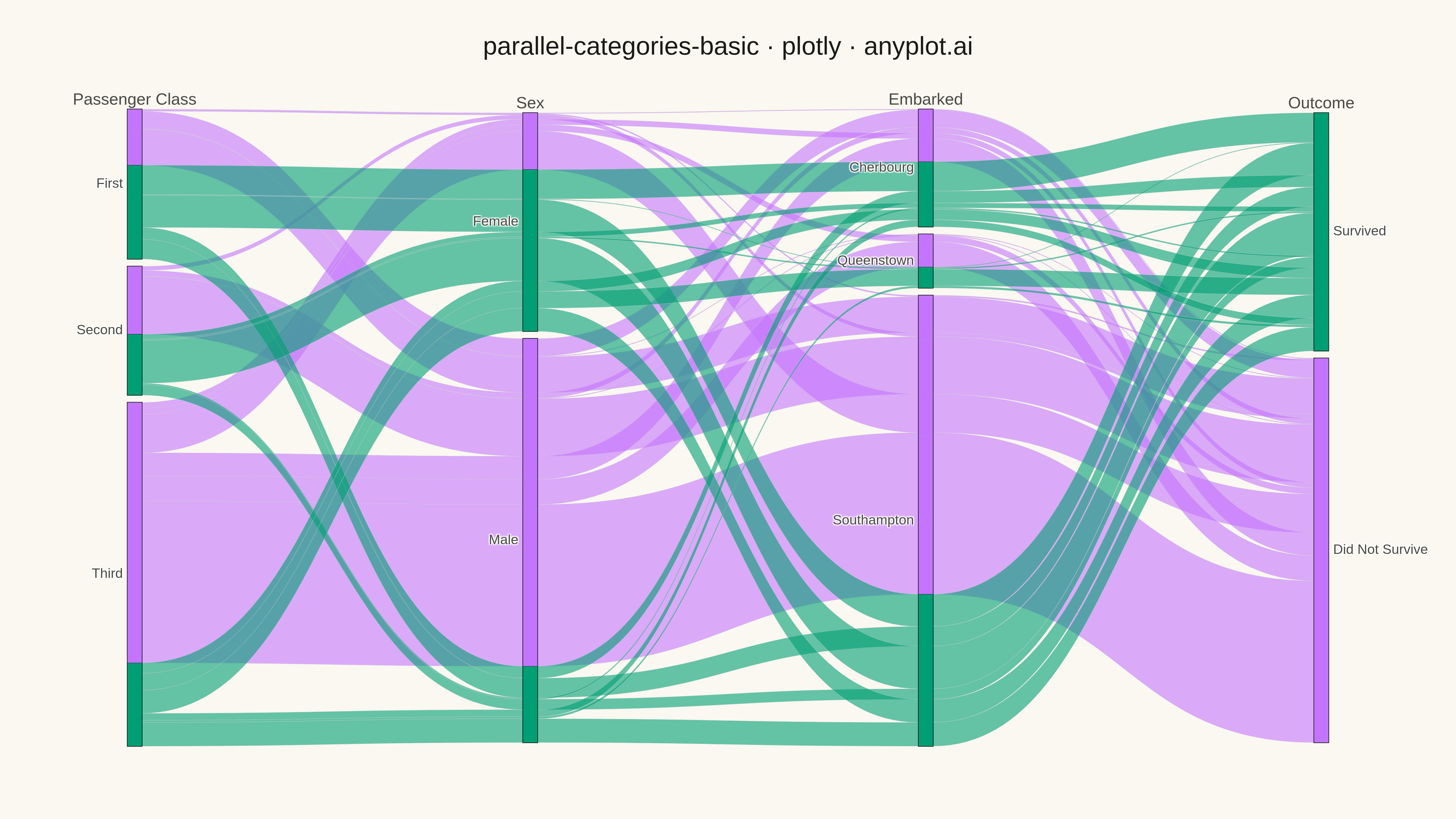
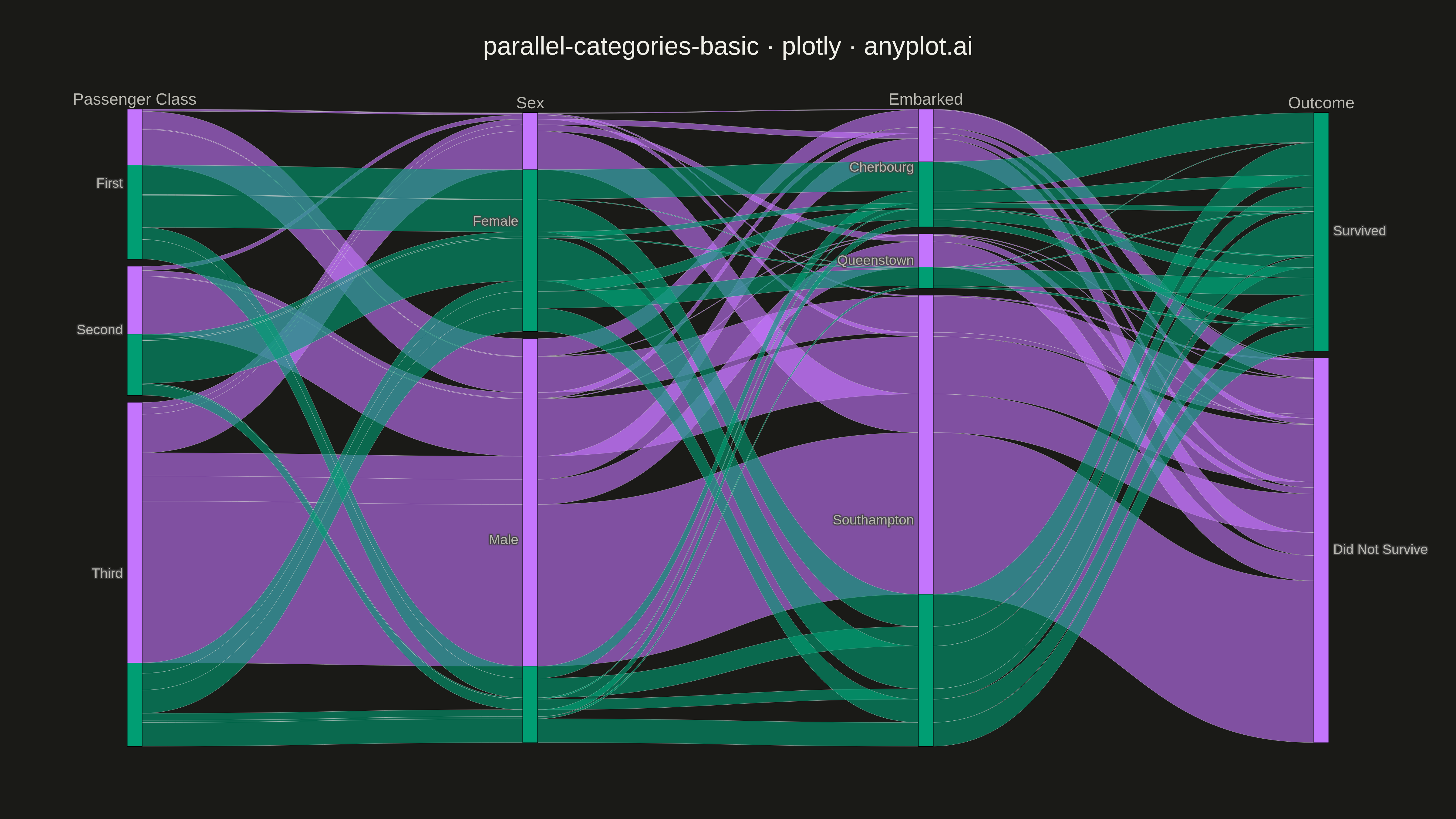
A parallel categories plot visualizes categorical data across multiple dimensions, with vertical axes representing each categorical variable and ribbons connecting categories to show observation flow. Unlike parallel coordinates (which use lines for numeric data), parallel categories use width-proportional ribbons to show counts or frequencies, making it ideal for understanding how categorical values co-occur and flow across multiple classification dimensions.
""" anyplot.ai
parallel-categories-basic: Basic Parallel Categories Plot
Library: plotly 6.7.0 | Python 3.13.13
Quality: 93/100 | Updated: 2026-05-13
"""

import os

import plotly.graph_objects as go
import seaborn as sns


# Theme tokens
THEME = os.getenv("ANYPLOT_THEME", "light")
PAGE_BG = "#FAF8F1" if THEME == "light" else "#1A1A17"
INK = "#1A1A17" if THEME == "light" else "#F0EFE8"
INK_SOFT = "#4A4A44" if THEME == "light" else "#B8B7B0"

# Okabe-Ito colors for categorical data
IMPRINT = ["#009E73", "#C475FD", "#4467A3", "#BD8233"]

# Data - Titanic survival data with multiple categorical dimensions
df = sns.load_dataset("titanic")

# Prepare data: select key categorical variables
df = df[["class", "sex", "embarked", "survived"]].dropna()

# Map survived to readable labels
df["outcome"] = df["survived"].map({0: "Did Not Survive", 1: "Survived"})

# Create dimension specifications for parallel categories
dimensions = [
    {
        "label": "Passenger Class",
        "values": df["class"].astype(str),
        "categoryorder": "array",
        "categoryarray": ["First", "Second", "Third"],
    },
    {
        "label": "Sex",
        "values": df["sex"].str.capitalize(),
        "categoryorder": "array",
        "categoryarray": ["Female", "Male"],
    },
    {
        "label": "Embarked",
        "values": df["embarked"].map({"C": "Cherbourg", "Q": "Queenstown", "S": "Southampton"}),
        "categoryorder": "array",
        "categoryarray": ["Cherbourg", "Queenstown", "Southampton"],
    },
    {
        "label": "Outcome",
        "values": df["outcome"],
        "categoryorder": "array",
        "categoryarray": ["Survived", "Did Not Survive"],
    },
]

# Create color scale based on survival outcome (Okabe-Ito palette)
color_values = df["survived"].values

# Create parallel categories plot
fig = go.Figure(
    go.Parcats(
        dimensions=dimensions,
        line={"color": color_values, "colorscale": [[0, IMPRINT[1]], [1, IMPRINT[0]]], "shape": "hspline"},
        hoveron="color",
        hoverinfo="count+probability",
        arrangement="freeform",
    )
)

# Update layout for 4800x2700 canvas with theme-adaptive styling
fig.update_layout(
    title={
        "text": "parallel-categories-basic · plotly · anyplot.ai",
        "font": {"size": 28, "color": INK},
        "x": 0.5,
        "xanchor": "center",
    },
    font={"size": 18, "color": INK_SOFT},
    paper_bgcolor=PAGE_BG,
    plot_bgcolor=PAGE_BG,
    margin={"l": 100, "r": 100, "t": 120, "b": 80},
)

# Save PNG and HTML with theme-suffixed filenames
fig.write_image(f"plot-{THEME}.png", width=1600, height=900, scale=3)
fig.write_html(f"plot-{THEME}.html", include_plotlyjs="cdn")
Runnable source as JSON, for any HTTP client: https://api.anyplot.ai/specs/parallel-categories-basic/plotly/code. Any spec id and library id listed in llms-full.txt fit the same URL shape; every URL below is complete and callable.
{
  "spec_id": "parallel-categories-basic",
  "language": "python",
  "library": "plotly",
  "page": "https://anyplot.ai/parallel-categories-basic/python/plotly",
  "hub": "https://anyplot.ai/parallel-categories-basic",
  "code_json": "https://api.anyplot.ai/specs/parallel-categories-basic/plotly/code",
  "spec_json": "https://api.anyplot.ai/specs/parallel-categories-basic",
  "render_light_png": "https://storage.googleapis.com/anyplot-images/plots/parallel-categories-basic/python/plotly/plot-light.png",
  "render_dark_png": "https://storage.googleapis.com/anyplot-images/plots/parallel-categories-basic/python/plotly/plot-dark.png",
  "interactive_light_html": "https://storage.googleapis.com/anyplot-images/plots/parallel-categories-basic/python/plotly/plot-light.html",
  "interactive_dark_html": "https://storage.googleapis.com/anyplot-images/plots/parallel-categories-basic/python/plotly/plot-dark.html",
  "quality_score": 93.0,
  "license": "MIT",
  "guide": "https://anyplot.ai/llms.txt"
}
Part of Basic Parallel Categories Plot on anyplot.ai.