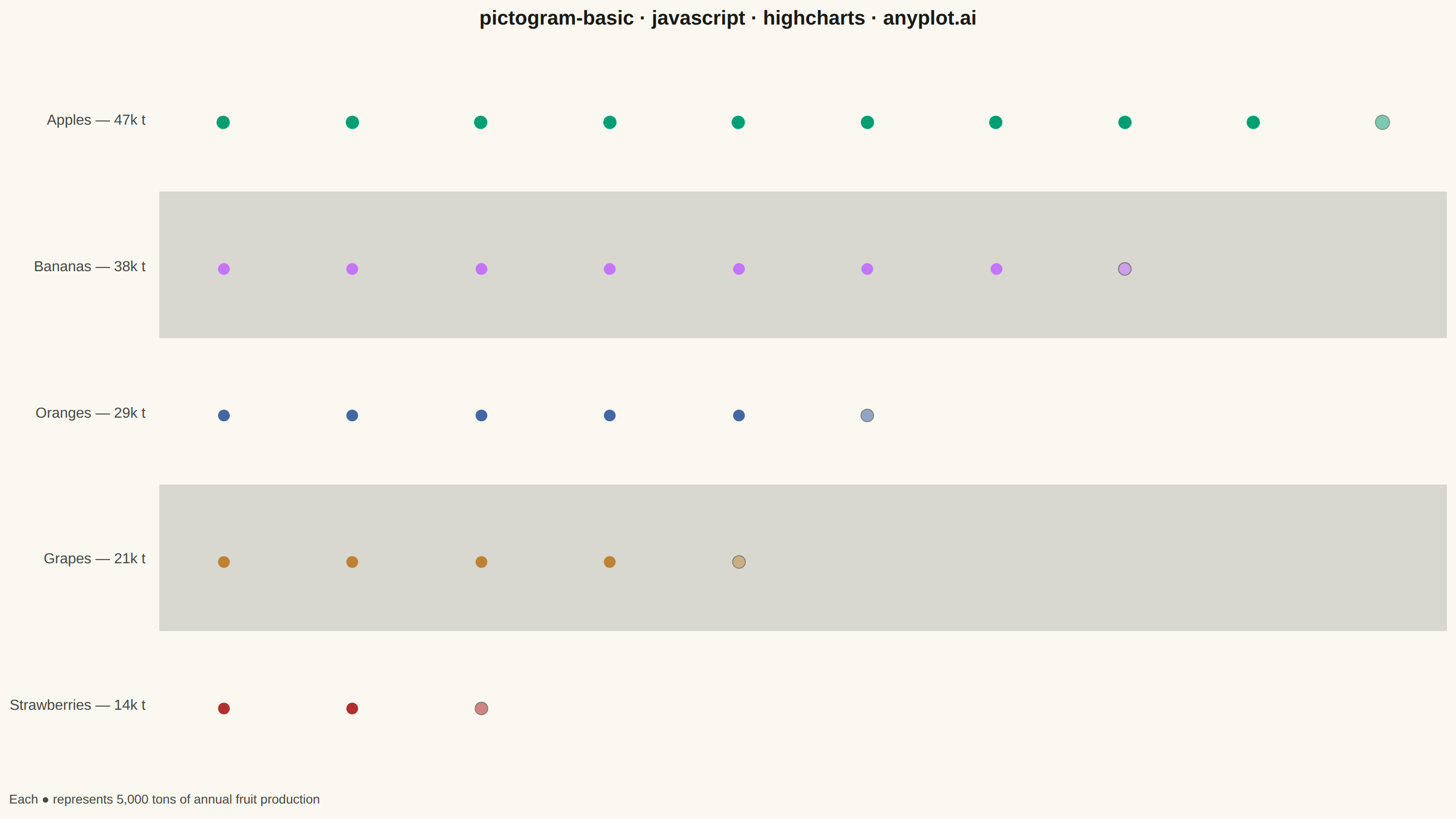
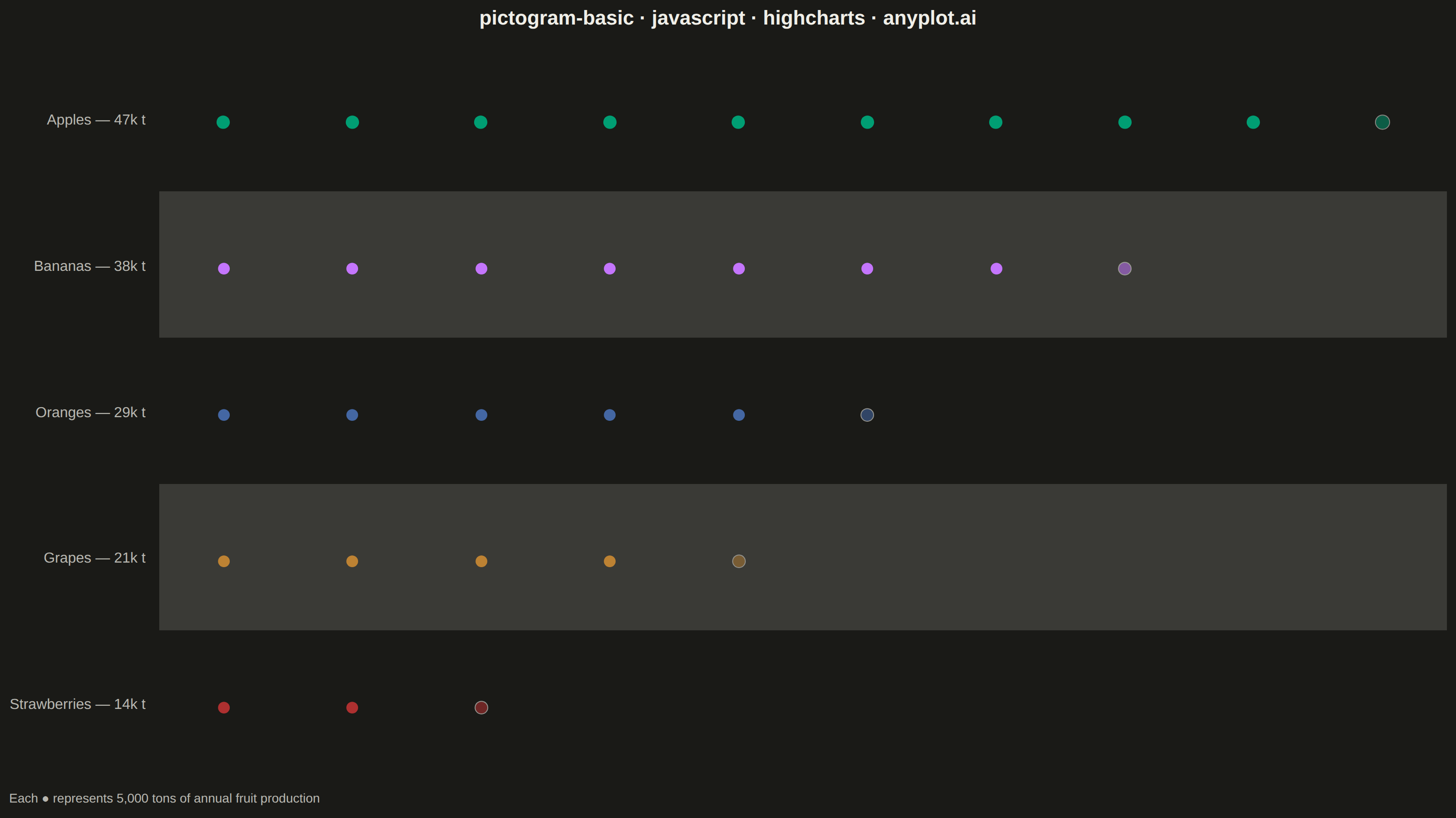
The same plot in 14 other libraries — JavaScript: Chart.js, D3.js, Apache ECharts, MUI X Charts; Python: Altair, Bokeh, lets-plot, Matplotlib, Plotly, plotnine, Pygal, Seaborn; R: ggplot2; Julia: Makie.jl. Compare all 15 side by side: Pictogram Chart (Isotype Visualization) in Python, R, Julia and JavaScript.
A pictogram chart represents quantities using repeated icons or symbols, where each icon stands for a fixed number of units. Inspired by Otto Neurath's ISOTYPE system, this visualization makes numerical comparisons more intuitive and engaging than plain bar charts. It is especially effective for public-facing data communication and infographics where visual appeal and immediate comprehension are important.
// anyplot.ai
// pictogram-basic: Pictogram Chart (Isotype Visualization)
// Library: highcharts 12.6.0 | JavaScript 22.23.2
// Quality: 90/100 | Created: 2026-08-20

const t = window.ANYPLOT_TOKENS;

// --- Data (in-memory, deterministic) ----------------------------------------
const UNIT = 5; // thousand tons represented by each icon
const rows = [
  { category: "Apples", value: 47 },
  { category: "Bananas", value: 38 },
  { category: "Oranges", value: 29 },
  { category: "Grapes", value: 21 },
  { category: "Strawberries", value: 14 },
];

const iconCounts = rows.map(({ value }) => {
  const full = Math.floor(value / UNIT);
  const remainder = (value - full * UNIT) / UNIT;
  // Cap partial-icon opacity well below full (1.0) so fractional remainders
  // stay visually distinct from whole icons at a glance.
  const partial = remainder > 0.02 ? [0.45 + 0.15 * remainder] : [];
  return [...Array(full).fill(1), ...partial];
});
const maxIcons = Math.max(...iconCounts.map((icons) => icons.length));

const categories = rows.map((row) => `${row.category} — ${row.value}k t`);

const series = rows.map((row, i) => ({
  name: row.category,
  dataLabels: { style: { color: t.palette[i] } },
  data: iconCounts[i].map((opacity, x) => ({
    x,
    y: i,
    dataLabels: {
      style: {
        opacity,
        fontSize: i === 0 ? "34px" : "30px", // emphasize the top category
        // Thin ink stroke keeps faint partial icons visible on light bg.
        textOutline: opacity < 1 ? `1px ${t.ink}` : "none",
      },
    },
  })),
}));

// --- Chart -------------------------------------------------------------------
Highcharts.chart("container", {
  chart: {
    type: "scatter",
    backgroundColor: "transparent",
    animation: false,
    style: { fontFamily: "inherit" },
  },
  credits: { enabled: false },
  colors: t.palette,
  title: {
    text: "pictogram-basic · javascript · highcharts · anyplot.ai",
    style: { color: t.ink, fontSize: "22px", fontWeight: "600" },
  },
  caption: {
    text: `Each ● represents ${UNIT},000 tons of annual fruit production`,
    align: "left",
    style: { color: t.inkSoft, fontSize: "14px" },
  },
  xAxis: {
    min: -0.5,
    max: maxIcons - 0.5,
    gridLineWidth: 0,
    lineWidth: 0,
    tickLength: 0,
    labels: { enabled: false },
    title: { text: null },
  },
  yAxis: {
    categories,
    reversed: true,
    gridLineWidth: 0,
    lineWidth: 0,
    tickLength: 0,
    title: { text: null },
    labels: { style: { color: t.inkSoft, fontSize: "16px" } },
    // Alternate subtle row banding for visual rhythm beyond icon count/opacity.
    plotBands: rows
      .map((_, i) => i)
      .filter((i) => i % 2 === 1)
      .map((i) => ({ from: i - 0.5, to: i + 0.5, color: t.grid })),
  },
  legend: { enabled: false },
  tooltip: { enabled: false },
  plotOptions: {
    scatter: {
      animation: false,
      marker: { enabled: false },
      dataLabels: {
        enabled: true,
        format: "●",
        align: "center",
        verticalAlign: "middle",
        y: 0,
        style: { fontWeight: "normal" },
      },
    },
  },
  series,
});
Runnable source as JSON, for any HTTP client: https://api.anyplot.ai/specs/pictogram-basic/highcharts/code. Any spec id and library id listed in llms-full.txt fit the same URL shape; every URL below is complete and callable.
{
  "spec_id": "pictogram-basic",
  "language": "javascript",
  "library": "highcharts",
  "page": "https://anyplot.ai/pictogram-basic/javascript/highcharts",
  "hub": "https://anyplot.ai/pictogram-basic",
  "code_json": "https://api.anyplot.ai/specs/pictogram-basic/highcharts/code",
  "spec_json": "https://api.anyplot.ai/specs/pictogram-basic",
  "render_light_png": "https://storage.googleapis.com/anyplot-images/plots/pictogram-basic/javascript/highcharts/plot-light.png",
  "render_dark_png": "https://storage.googleapis.com/anyplot-images/plots/pictogram-basic/javascript/highcharts/plot-dark.png",
  "interactive_light_html": "https://storage.googleapis.com/anyplot-images/plots/pictogram-basic/javascript/highcharts/plot-light.html",
  "interactive_dark_html": "https://storage.googleapis.com/anyplot-images/plots/pictogram-basic/javascript/highcharts/plot-dark.html",
  "quality_score": 90.0,
  "license": "MIT",
  "guide": "https://anyplot.ai/llms.txt"
}
Part of Pictogram Chart (Isotype Visualization) on anyplot.ai.