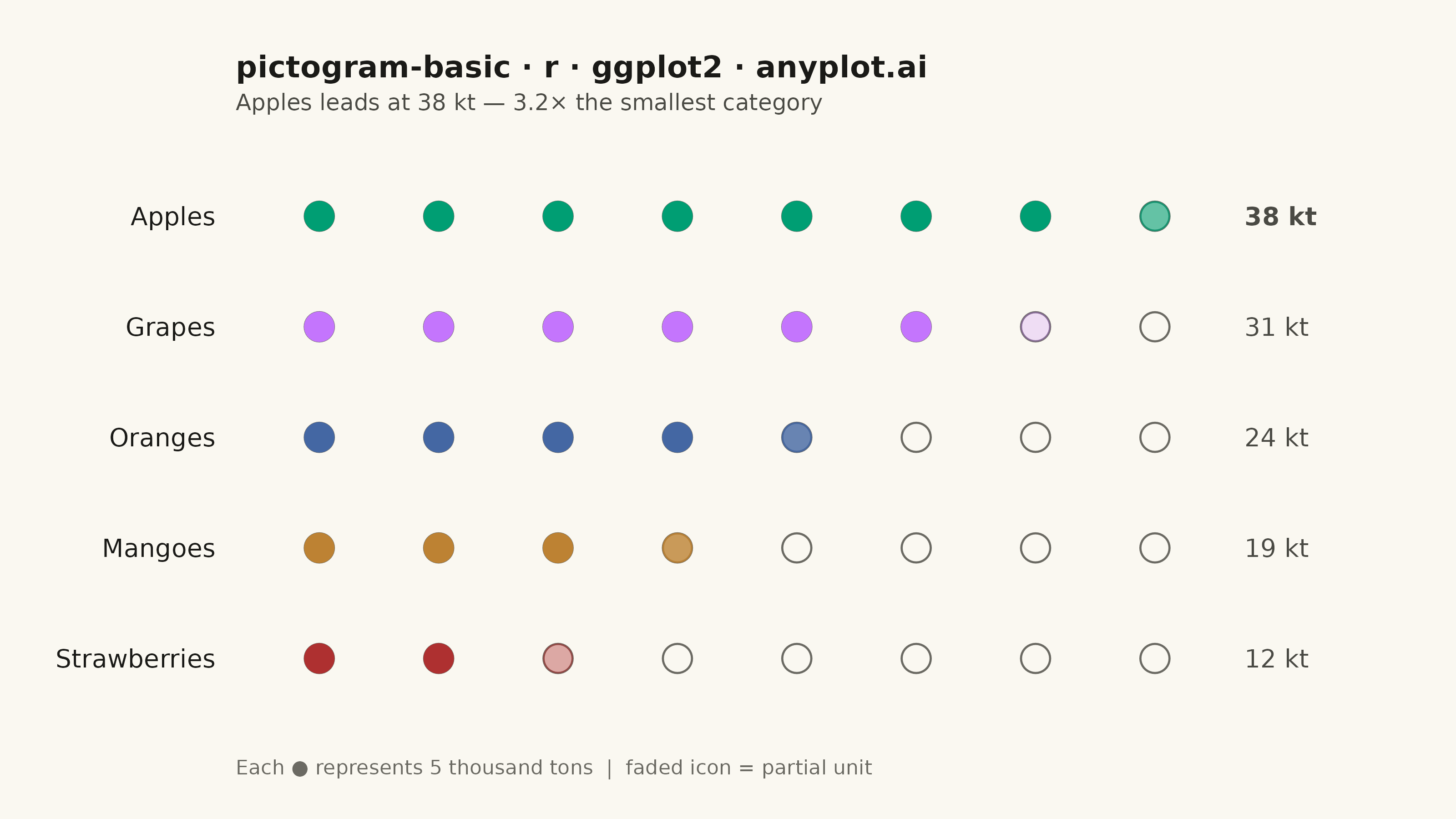
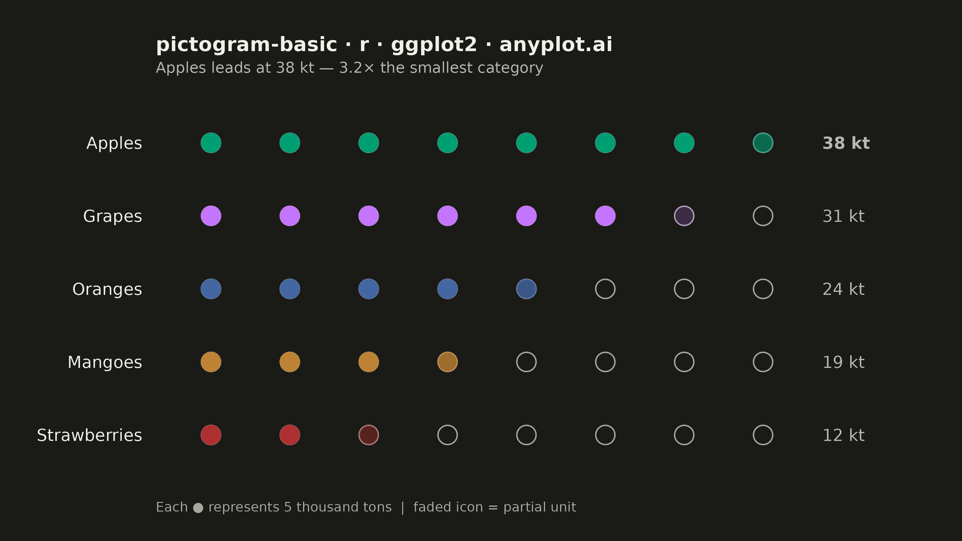
The same plot in 14 other libraries — Python: Altair, Bokeh, lets-plot, Matplotlib, Plotly, plotnine, Pygal, Seaborn; Julia: Makie.jl; JavaScript: Chart.js, D3.js, Apache ECharts, Highcharts, MUI X Charts. Compare all 15 side by side: Pictogram Chart (Isotype Visualization) in Python, R, Julia and JavaScript.
A pictogram chart represents quantities using repeated icons or symbols, where each icon stands for a fixed number of units. Inspired by Otto Neurath's ISOTYPE system, this visualization makes numerical comparisons more intuitive and engaging than plain bar charts. It is especially effective for public-facing data communication and infographics where visual appeal and immediate comprehension are important.
#' anyplot.ai
#' pictogram-basic: Pictogram Chart (Isotype Visualization)
#' Library: ggplot2 3.5.1 | R 4.4.1
#' Quality: 89/100 | Created: 2026-06-03

library(ggplot2)
library(ragg)

set.seed(42)

# Theme tokens (Imprint palette, theme-adaptive chrome)
THEME       <- Sys.getenv("ANYPLOT_THEME", "light")
PAGE_BG     <- if (THEME == "light") "#FAF8F1" else "#1A1A17"
ELEVATED_BG <- if (THEME == "light") "#FFFDF6" else "#242420"
INK         <- if (THEME == "light") "#1A1A17" else "#F0EFE8"
INK_SOFT    <- if (THEME == "light") "#4A4A44" else "#B8B7B0"
INK_MUTED   <- if (THEME == "light") "#6B6A63" else "#A8A79F"

# Imprint palette (first series always #009E73)
IMPRINT_PALETTE <- c(
  "#009E73", "#C475FD", "#4467A3", "#BD8233",
  "#AE3030", "#2ABCCD", "#954477", "#99B314"
)

# Data: illustrative fruit production (thousand tons)
ICON_UNIT <- 5  # 1 icon = 5 thousand tons

fruit_data <- data.frame(
  category = c("Apples", "Grapes", "Oranges", "Mangoes", "Strawberries"),
  value    = c(38, 31, 24, 19, 12),
  stringsAsFactors = FALSE
)

# Assign Imprint colors in descending value order (highest → brand green)
fruit_ordered <- fruit_data[order(fruit_data$value, decreasing = TRUE), ]
color_map <- setNames(
  IMPRINT_PALETTE[seq_len(nrow(fruit_data))],
  fruit_ordered$category
)

# Factor levels: ascending value → bottom-to-top y-axis order
cat_levels <- fruit_data$category[order(fruit_data$value)]

# Build icon grid: one row per (category x icon slot)
n_max <- ceiling(max(fruit_data$value) / ICON_UNIT)  # 8 slots

icon_list <- lapply(seq_len(nrow(fruit_data)), function(i) {
  v    <- fruit_data$value[i]
  cat  <- fruit_data$category[i]
  nf   <- floor(v / ICON_UNIT)
  frac <- (v / ICON_UNIT) - nf
  hp   <- frac > 0.05
  n_empty <- n_max - nf - as.integer(hp)

  data.frame(
    category   = cat,
    icon_col   = seq_len(n_max),
    icon_type  = c(rep("full", nf),
                   if (hp) "partial",
                   rep("empty", n_empty)),
    fill_alpha = c(rep(1.0, nf),
                   if (hp) frac,
                   rep(0.0, n_empty)),
    stringsAsFactors = FALSE
  )
})
icons <- do.call(rbind, icon_list)
icons$category <- factor(icons$category, levels = cat_levels)

# Focal emphasis: identify the top category for storytelling
top_cat   <- fruit_ordered$category[1]
ratio_str <- sprintf("%.1f", max(fruit_data$value) / min(fruit_data$value))
subtitle  <- paste0(top_cat, " leads at ", max(fruit_data$value), " kt — ",
                    ratio_str, "× the smallest category")

# Value labels: exact totals positioned right of last icon column
label_df <- data.frame(
  category = factor(fruit_data$category, levels = cat_levels),
  x_pos    = n_max + 0.75,
  label    = paste0(fruit_data$value, " kt"),
  fontface = ifelse(fruit_data$category == top_cat, "bold", "plain"),
  stringsAsFactors = FALSE
)

# Plot
p <- ggplot() +
  # Background rings for all icon slots
  geom_point(
    data  = icons,
    aes(x = icon_col, y = category),
    shape = 1, size = 5, color = INK_MUTED, stroke = 0.6
  ) +
  # Full icons
  geom_point(
    data  = icons[icons$icon_type == "full", ],
    aes(x = icon_col, y = category, color = category),
    shape = 19, size = 5
  ) +
  # Partial icons: alpha-faded to indicate fractional unit
  geom_point(
    data  = icons[icons$icon_type == "partial", ],
    aes(x = icon_col, y = category, color = category, alpha = fill_alpha),
    shape = 19, size = 5
  ) +
  # Exact value labels at row end; top category bolded for focal emphasis
  geom_text(
    data  = label_df,
    aes(x = x_pos, y = category, label = label, fontface = fontface),
    hjust = 0, color = INK_SOFT, size = 3.5
  ) +
  scale_alpha_identity() +
  scale_color_manual(values = color_map) +
  scale_x_continuous(
    limits = c(0.3, n_max + 2.1),
    expand = expansion(mult = 0)
  ) +
  labs(
    title    = "pictogram-basic · r · ggplot2 · anyplot.ai",
    subtitle = subtitle,
    caption  = paste0("Each ● represents ", ICON_UNIT,
                      " thousand tons  |  faded icon = partial unit")
  ) +
  theme_minimal(base_size = 8) +
  theme(
    plot.background  = element_rect(fill = PAGE_BG, color = PAGE_BG),
    panel.background = element_rect(fill = PAGE_BG, color = NA),
    panel.grid       = element_blank(),
    axis.title       = element_blank(),
    axis.text.x      = element_blank(),
    axis.text.y      = element_text(color = INK, size = 10, hjust = 1,
                                    margin = margin(r = 6)),
    axis.ticks       = element_blank(),
    plot.title       = element_text(color = INK, size = 12, hjust = 0, face = "bold",
                                    margin = margin(b = 4)),
    plot.subtitle    = element_text(color = INK_SOFT, size = 9, hjust = 0,
                                    margin = margin(b = 14)),
    plot.caption     = element_text(color = INK_MUTED, size = 8, hjust = 0,
                                    margin = margin(t = 12)),
    legend.position  = "none",
    plot.margin      = margin(22, 20, 16, 22, "pt")
  )

# Save
ggsave(
  filename = sprintf("plot-%s.png", THEME),
  plot     = p,
  device   = ragg::agg_png,
  width    = 8,
  height   = 4.5,
  units    = "in",
  dpi      = 400
)
Runnable source as JSON, for any HTTP client: https://api.anyplot.ai/specs/pictogram-basic/ggplot2/code. Any spec id and library id listed in llms-full.txt fit the same URL shape; every URL below is complete and callable.
{
  "spec_id": "pictogram-basic",
  "language": "r",
  "library": "ggplot2",
  "page": "https://anyplot.ai/pictogram-basic/r/ggplot2",
  "hub": "https://anyplot.ai/pictogram-basic",
  "code_json": "https://api.anyplot.ai/specs/pictogram-basic/ggplot2/code",
  "spec_json": "https://api.anyplot.ai/specs/pictogram-basic",
  "render_light_png": "https://storage.googleapis.com/anyplot-images/plots/pictogram-basic/r/ggplot2/plot-light.png",
  "render_dark_png": "https://storage.googleapis.com/anyplot-images/plots/pictogram-basic/r/ggplot2/plot-dark.png",
  "quality_score": 89.0,
  "license": "MIT",
  "guide": "https://anyplot.ai/llms.txt"
}
Part of Pictogram Chart (Isotype Visualization) on anyplot.ai.