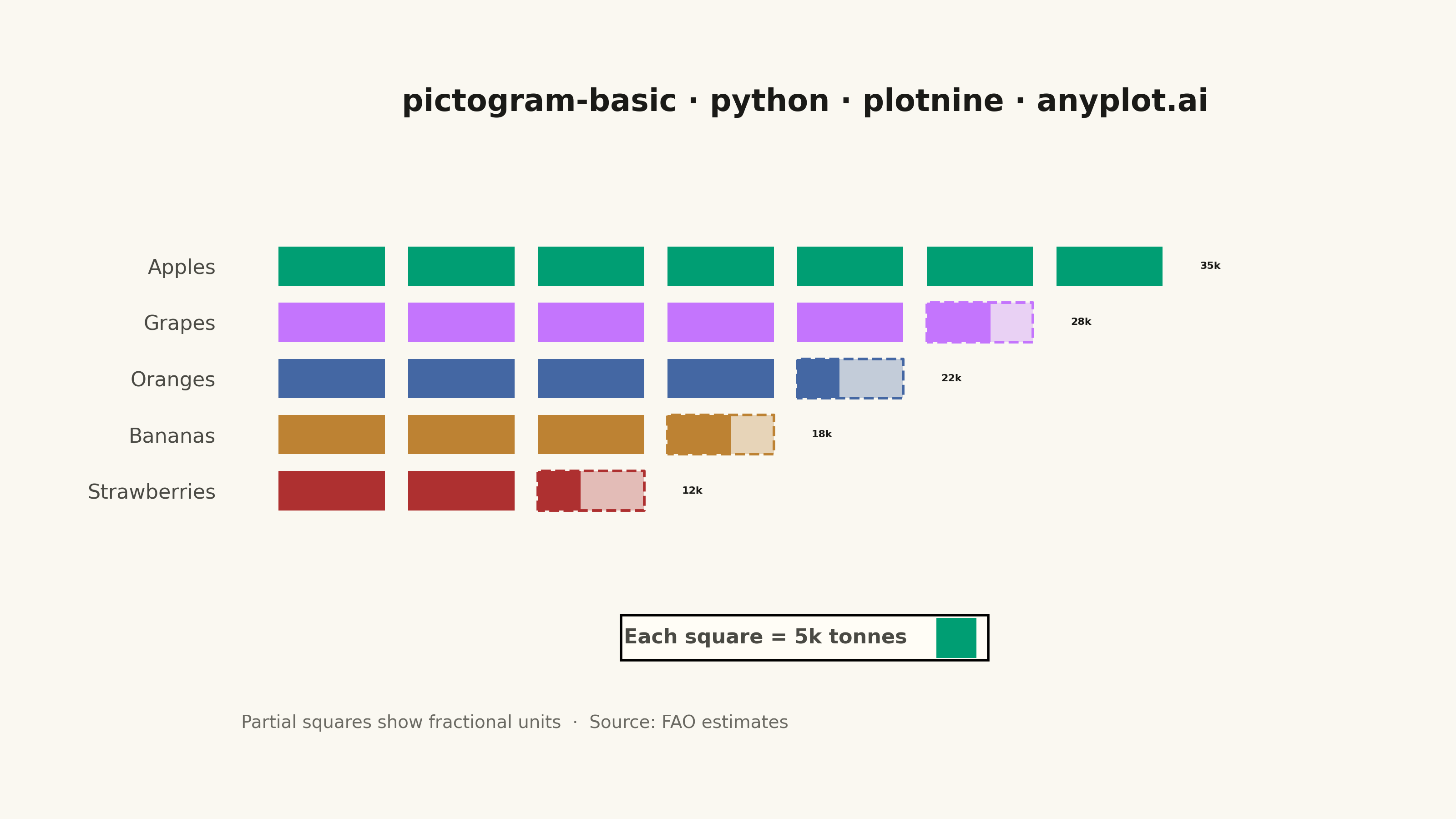
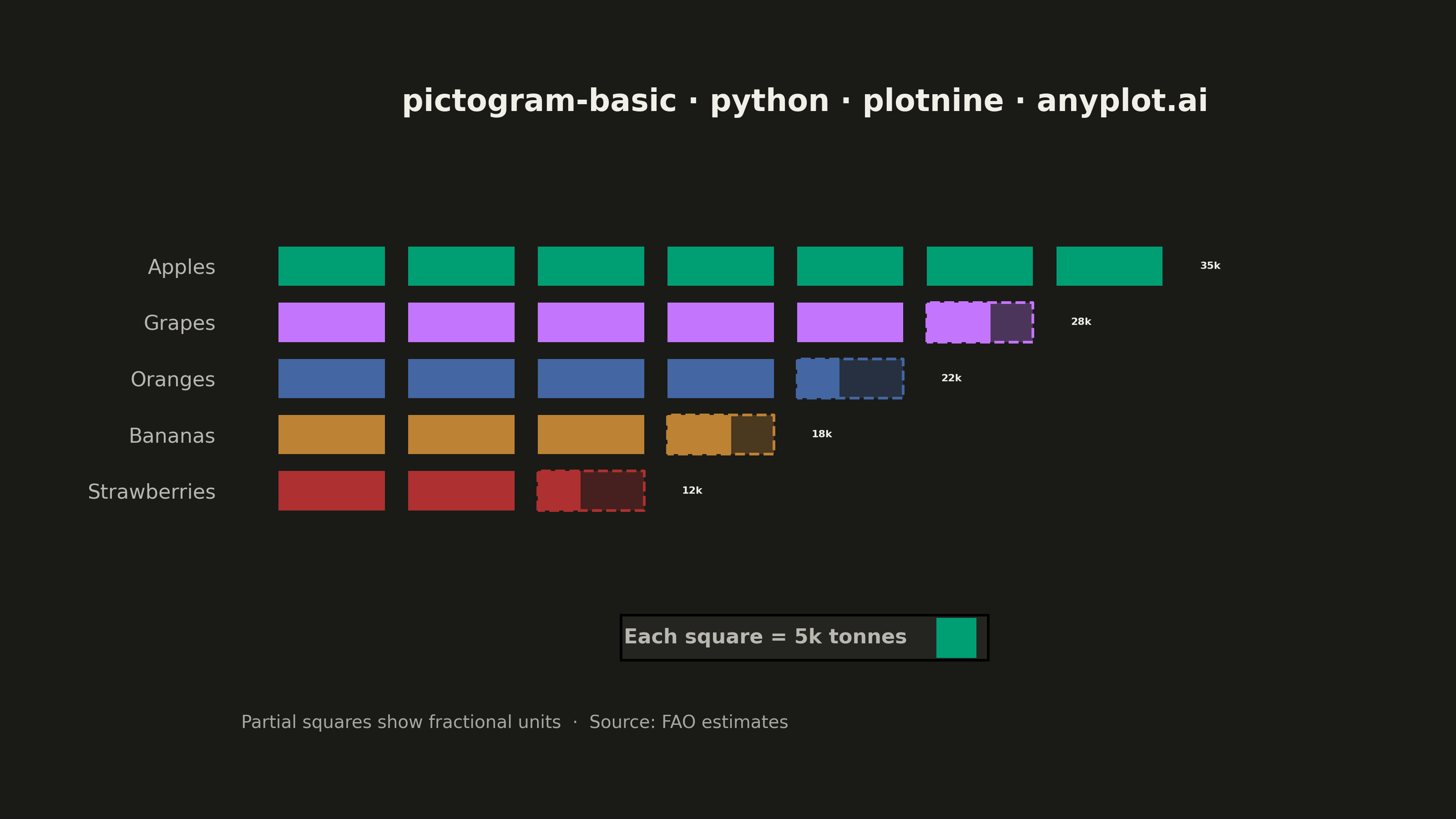
A pictogram chart represents quantities using repeated icons or symbols, where each icon stands for a fixed number of units. Inspired by Otto Neurath's ISOTYPE system, this visualization makes numerical comparisons more intuitive and engaging than plain bar charts. It is especially effective for public-facing data communication and infographics where visual appeal and immediate comprehension are important.
""" anyplot.ai
pictogram-basic: Pictogram Chart (Isotype Visualization)
Library: plotnine 0.15.5 | Python 3.13.13
Quality: 85/100 | Updated: 2026-06-03
"""

import os

import pandas as pd
from plotnine import (
    aes,
    element_blank,
    element_rect,
    element_text,
    geom_text,
    geom_tile,
    ggplot,
    guide_legend,
    labs,
    scale_color_identity,
    scale_fill_manual,
    scale_x_continuous,
    scale_y_discrete,
    theme,
    theme_void,
)


# Theme tokens — Imprint palette, theme-adaptive chrome
THEME = os.getenv("ANYPLOT_THEME", "light")
PAGE_BG = "#FAF8F1" if THEME == "light" else "#1A1A17"
ELEVATED_BG = "#FFFDF6" if THEME == "light" else "#242420"
INK = "#1A1A17" if THEME == "light" else "#F0EFE8"
INK_SOFT = "#4A4A44" if THEME == "light" else "#B8B7B0"
INK_MUTED = "#6B6A63" if THEME == "light" else "#A8A79F"

# Imprint categorical palette (hybrid-v3) — first series always #009E73
IMPRINT = ["#009E73", "#C475FD", "#4467A3", "#BD8233", "#AE3030"]

# Data: Fruit production (thousands of tonnes), sorted by value for visual hierarchy
categories = ["Apples", "Grapes", "Oranges", "Bananas", "Strawberries"]
values = [35, 28, 22, 18, 12]
unit_value = 5  # Each icon = 5 thousand tonnes

# Imprint palette by category (ordinal; Grapes=purple and Strawberries=red are semantic matches)
fruit_colors = dict(zip(categories, IMPRINT, strict=True))

# Tile dimensions
tile_w, tile_h = 0.82, 0.70

# Build icon tiles: full icons + partial icons (left-aligned fraction)
cat_order = categories[::-1]  # highest value at top

tile_rows = []
for cat, val in zip(categories, values, strict=True):
    full_icons = val // unit_value
    remainder = val % unit_value
    color = fruit_colors[cat]

    for i in range(full_icons):
        tile_rows.append({"category": cat, "col": i + 1, "border": "none", "width": tile_w, "layer": "full"})

    if remainder > 0:
        px = full_icons + 1
        frac = remainder / unit_value
        tile_rows.append({"category": cat, "col": px, "border": color, "width": tile_w, "layer": "outline"})
        filled_w = tile_w * frac
        offset = (tile_w - filled_w) / 2
        tile_rows.append(
            {"category": cat, "col": px - offset, "border": "none", "width": filled_w, "layer": "partial_fill"}
        )

df = pd.DataFrame(tile_rows)
df["category"] = pd.Categorical(df["category"], categories=cat_order, ordered=True)

df_full = df[df["layer"] == "full"].copy()
df_outline = df[df["layer"] == "outline"].copy()
df_partial = df[df["layer"] == "partial_fill"].copy()

# Value labels at end of each row
max_cols = {
    cat: (val // unit_value) + (1 if val % unit_value > 0 else 0) for cat, val in zip(categories, values, strict=True)
}
label_df = pd.DataFrame(
    {
        "category": pd.Categorical(categories, categories=cat_order, ordered=True),
        "col": [max_cols[c] + 0.7 for c in categories],
        "label": [f"{v}k" for v in values],
    }
)

x_max = max(max_cols.values()) + 2.0

TITLE = "pictogram-basic · python · plotnine · anyplot.ai"

plot = (
    ggplot(df_full, aes(x="col", y="category"))
    # Layer 1: Full icon tiles — fill mapped to category via Imprint palette
    + geom_tile(aes(fill="category"), width=tile_w, height=tile_h)
    # Layer 2: Partial icon outline (dashed border, faint fill so unfilled region is visible)
    + geom_tile(
        aes(fill="category", color="border"),
        data=df_outline,
        height=tile_h,
        width=tile_w,
        alpha=0.3,
        linetype="dashed",
        size=0.6,
        show_legend=False,
    )
    # Layer 3: Partial icon fill (left-aligned proportion)
    + geom_tile(aes(fill="category", width="width"), data=df_partial, height=tile_h, show_legend=False)
    # Layer 4: Value labels
    + geom_text(
        aes(x="col", y="category", label="label"), data=label_df, size=4.0, color=INK, ha="left", fontweight="bold"
    )
    + scale_fill_manual(
        name="Each square = 5k tonnes", values=fruit_colors, breaks=["Apples"], labels=[""], guide=guide_legend(nrow=1)
    )
    + scale_color_identity()
    + scale_x_continuous(limits=(0.3, x_max), expand=(0, 0))
    + scale_y_discrete(expand=(0.2, 0.15))
    + labs(x="", y="", title=TITLE, caption="Partial squares show fractional units  ·  Source: FAO estimates")
    + theme_void()
    + theme(
        figure_size=(8, 4.5),
        plot_background=element_rect(fill=PAGE_BG, color=PAGE_BG),
        panel_background=element_rect(fill=PAGE_BG),
        plot_title=element_text(size=12, weight="bold", color=INK, margin={"b": 15}),
        plot_caption=element_text(size=7, color=INK_MUTED, ha="left", margin={"t": 12}),
        axis_text_y=element_text(size=8, color=INK_SOFT, ha="right", margin={"r": 10}),
        axis_text_x=element_blank(),
        legend_position="bottom",
        legend_background=element_rect(fill=ELEVATED_BG),
        legend_title=element_text(size=8, weight="bold", color=INK_SOFT),
        legend_text=element_text(size=8, color=INK_SOFT),
        plot_margin=0.06,
    )
)

plot.save(f"plot-{THEME}.png", dpi=400, width=8, height=4.5, units="in", verbose=False)
Runnable source as JSON, for any HTTP client: https://api.anyplot.ai/specs/pictogram-basic/plotnine/code. Any spec id and library id listed in llms-full.txt fit the same URL shape; every URL below is complete and callable.
{
  "spec_id": "pictogram-basic",
  "language": "python",
  "library": "plotnine",
  "page": "https://anyplot.ai/pictogram-basic/python/plotnine",
  "hub": "https://anyplot.ai/pictogram-basic",
  "code_json": "https://api.anyplot.ai/specs/pictogram-basic/plotnine/code",
  "spec_json": "https://api.anyplot.ai/specs/pictogram-basic",
  "render_light_png": "https://storage.googleapis.com/anyplot-images/plots/pictogram-basic/python/plotnine/plot-light.png",
  "render_dark_png": "https://storage.googleapis.com/anyplot-images/plots/pictogram-basic/python/plotnine/plot-dark.png",
  "quality_score": 85.0,
  "license": "MIT",
  "guide": "https://anyplot.ai/llms.txt"
}
Part of Pictogram Chart (Isotype Visualization) on anyplot.ai.