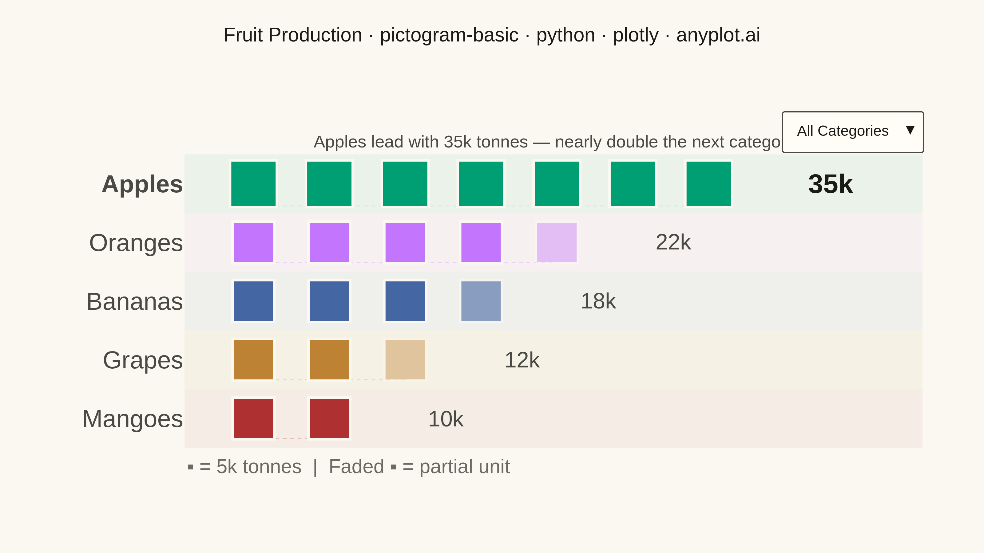
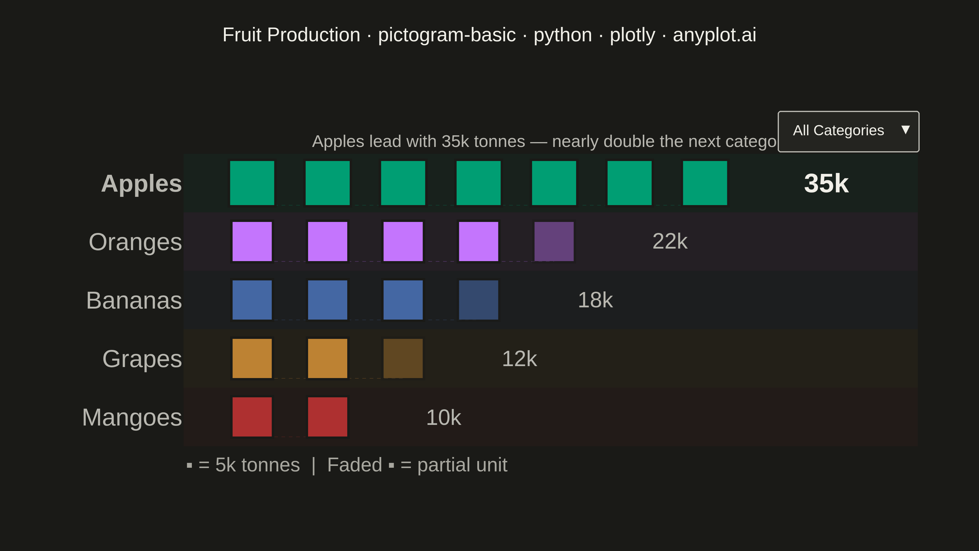
A pictogram chart represents quantities using repeated icons or symbols, where each icon stands for a fixed number of units. Inspired by Otto Neurath's ISOTYPE system, this visualization makes numerical comparisons more intuitive and engaging than plain bar charts. It is especially effective for public-facing data communication and infographics where visual appeal and immediate comprehension are important.
""" anyplot.ai
pictogram-basic: Pictogram Chart (Isotype Visualization)
Library: plotly 6.7.0 | Python 3.13.13
Quality: 88/100 | Updated: 2026-06-03
"""

import os

import plotly.graph_objects as go


# Theme tokens — Imprint palette (see prompts/default-style-guide.md)
THEME = os.getenv("ANYPLOT_THEME", "light")
PAGE_BG = "#FAF8F1" if THEME == "light" else "#1A1A17"
ELEVATED_BG = "#FFFDF6" if THEME == "light" else "#242420"
INK = "#1A1A17" if THEME == "light" else "#F0EFE8"
INK_SOFT = "#4A4A44" if THEME == "light" else "#B8B7B0"
INK_MUTED = "#6B6A63" if THEME == "light" else "#A8A79F"

# Imprint categorical palette — positions 1-5
IMPRINT_PALETTE = ["#009E73", "#C475FD", "#4467A3", "#BD8233", "#AE3030"]

# Data — fruit production (thousands of tonnes)
categories = ["Apples", "Oranges", "Bananas", "Grapes", "Mangoes"]
values = [35, 22, 18, 12, 10]
ICONS_PER_UNIT = 5

# Title — scale fontsize for length
title = "Fruit Production · pictogram-basic · python · plotly · anyplot.ai"
title_fontsize = round(16 * min(1.0, 67 / len(title)))

# Grid layout parameters
SPACING = 0.55
ROW_HEIGHT = 0.85
y_positions = [i * ROW_HEIGHT for i in range(len(categories))]
band_half = ROW_HEIGHT / 2
max_icons = max(v // ICONS_PER_UNIT + (1 if v % ICONS_PER_UNIT else 0) for v in values)

fig = go.Figure()

# Row background bands — low-opacity tint from each category's Imprint color
for y_pos, color in zip(y_positions, IMPRINT_PALETTE, strict=True):
    r, g, b = int(color[1:3], 16), int(color[3:5], 16), int(color[5:7], 16)
    fig.add_shape(
        type="rect",
        xref="paper",
        yref="y",
        x0=0,
        x1=1,
        y0=y_pos - band_half,
        y1=y_pos + band_half,
        fillcolor=f"rgba({r},{g},{b},0.06)",
        line={"width": 0},
        layer="below",
    )

# Track which row each trace belongs to (used for dropdown visibility)
trace_row_idx = []

for row, (cat, val, color) in enumerate(zip(categories, values, IMPRINT_PALETTE, strict=True)):
    full_icons = val // ICONS_PER_UNIT
    remainder = val % ICONS_PER_UNIT
    y_pos = y_positions[row]
    is_leader = row == 0
    icon_size = 38 if is_leader else 34

    if full_icons > 0:
        x_full = [i * SPACING for i in range(full_icons)]
        fig.add_trace(
            go.Scatter(
                x=x_full,
                y=[y_pos] * full_icons,
                mode="markers",
                marker={"symbol": "square", "size": icon_size, "color": color, "line": {"color": PAGE_BG, "width": 2}},
                customdata=[[cat, val, ICONS_PER_UNIT]] * full_icons,
                hovertemplate=(
                    "<b>%{customdata[0]}</b><br>%{customdata[1]}k tonnes<br>Each ▪ = %{customdata[2]}k<extra></extra>"
                ),
                showlegend=False,
            )
        )
        trace_row_idx.append(row)

    if remainder > 0:
        fraction = remainder / ICONS_PER_UNIT
        fig.add_trace(
            go.Scatter(
                x=[full_icons * SPACING],
                y=[y_pos],
                mode="markers",
                marker={
                    "symbol": "square",
                    "size": icon_size,
                    "color": color,
                    "opacity": max(0.3, fraction),
                    "line": {"color": PAGE_BG, "width": 2},
                },
                customdata=[[cat, val, remainder]],
                hovertemplate=(
                    "<b>%{customdata[0]}</b><br>%{customdata[1]}k tonnes<br>Partial: %{customdata[2]}k<extra></extra>"
                ),
                showlegend=False,
            )
        )
        trace_row_idx.append(row)

    # Value label at end of each row
    total_icons = full_icons + (1 if remainder > 0 else 0)
    fig.add_annotation(
        x=total_icons * SPACING + 0.15,
        y=y_pos,
        text=f"<b>{val}k</b>" if is_leader else f"{val}k",
        showarrow=False,
        font={"size": 22 if is_leader else 18, "color": INK if is_leader else INK_SOFT, "family": "Arial"},
        xanchor="left",
    )

    # Dotted baseline connector under each row of icons
    if total_icons > 1:
        fig.add_shape(
            type="line",
            x0=0,
            x1=(total_icons - 1) * SPACING,
            y0=y_pos + icon_size * 0.0085,
            y1=y_pos + icon_size * 0.0085,
            line={"color": color, "width": 0.5, "dash": "dot"},
            opacity=0.25,
            layer="below",
        )

# Legend at bottom
fig.add_annotation(
    xref="paper",
    yref="paper",
    x=0.0,
    y=-0.08,
    text=f"<b>▪</b> = {ICONS_PER_UNIT}k tonnes  |  Faded ▪ = partial unit",
    showarrow=False,
    font={"size": 16, "color": INK_MUTED, "family": "Arial"},
    xanchor="left",
)

# Subtitle — key insight above the chart (left-anchored to stay clear of right-side dropdown)
fig.add_annotation(
    xref="paper",
    yref="paper",
    x=0.0,
    y=1.06,
    text="Apples lead with 35k tonnes — nearly double the next category",
    showarrow=False,
    font={"size": 14, "color": INK_SOFT, "family": "Arial"},
    xanchor="left",
)

# Dropdown — toggle between all categories and top 3
all_visible = [True] * len(fig.data)
top3_visible = [trace_row_idx[i] < 3 for i in range(len(fig.data))]

fig.update_layout(
    autosize=False,
    paper_bgcolor=PAGE_BG,
    plot_bgcolor=PAGE_BG,
    font={"color": INK},
    title={
        "text": title,
        "font": {"size": title_fontsize, "color": INK, "family": "Arial"},
        "x": 0.5,
        "xanchor": "center",
        "y": 0.95,
    },
    xaxis={
        "showgrid": False,
        "zeroline": False,
        "showticklabels": False,
        "showline": False,
        "range": [-0.5, max_icons * SPACING + 1.0],
    },
    yaxis={
        "tickvals": y_positions,
        "ticktext": [f"<b>{c}</b>" if i == 0 else c for i, c in enumerate(categories)],
        "tickfont": {"size": 20, "color": INK_SOFT, "family": "Arial"},
        "showgrid": False,
        "zeroline": False,
        "showline": False,
        "range": [max(y_positions) + band_half + 0.1, min(y_positions) - band_half - 0.1],
    },
    margin={"t": 120, "b": 80, "l": 150, "r": 50},
    hoverlabel={"bgcolor": ELEVATED_BG, "font_size": 14, "font_family": "Arial", "font_color": INK},
    updatemenus=[
        {
            "buttons": [
                {"label": "All Categories", "method": "update", "args": [{"visible": all_visible}]},
                {"label": "Top 3 Only", "method": "update", "args": [{"visible": top3_visible}]},
            ],
            "direction": "down",
            "showactive": True,
            "x": 1.0,
            "xanchor": "right",
            "y": 1.12,
            "yanchor": "top",
            "bgcolor": ELEVATED_BG,
            "bordercolor": INK_SOFT,
            "font": {"size": 12, "color": INK},
        }
    ],
)

# Save — landscape 3200×1800 (width=800 height=450 scale=4)
fig.write_image(f"plot-{THEME}.png", width=800, height=450, scale=4)
fig.write_html(f"plot-{THEME}.html", include_plotlyjs="cdn")
Runnable source as JSON, for any HTTP client: https://api.anyplot.ai/specs/pictogram-basic/plotly/code. Any spec id and library id listed in llms-full.txt fit the same URL shape; every URL below is complete and callable.
{
  "spec_id": "pictogram-basic",
  "language": "python",
  "library": "plotly",
  "page": "https://anyplot.ai/pictogram-basic/python/plotly",
  "hub": "https://anyplot.ai/pictogram-basic",
  "code_json": "https://api.anyplot.ai/specs/pictogram-basic/plotly/code",
  "spec_json": "https://api.anyplot.ai/specs/pictogram-basic",
  "render_light_png": "https://storage.googleapis.com/anyplot-images/plots/pictogram-basic/python/plotly/plot-light.png",
  "render_dark_png": "https://storage.googleapis.com/anyplot-images/plots/pictogram-basic/python/plotly/plot-dark.png",
  "interactive_light_html": "https://storage.googleapis.com/anyplot-images/plots/pictogram-basic/python/plotly/plot-light.html",
  "interactive_dark_html": "https://storage.googleapis.com/anyplot-images/plots/pictogram-basic/python/plotly/plot-dark.html",
  "quality_score": 88.0,
  "license": "MIT",
  "guide": "https://anyplot.ai/llms.txt"
}
Part of Pictogram Chart (Isotype Visualization) on anyplot.ai.