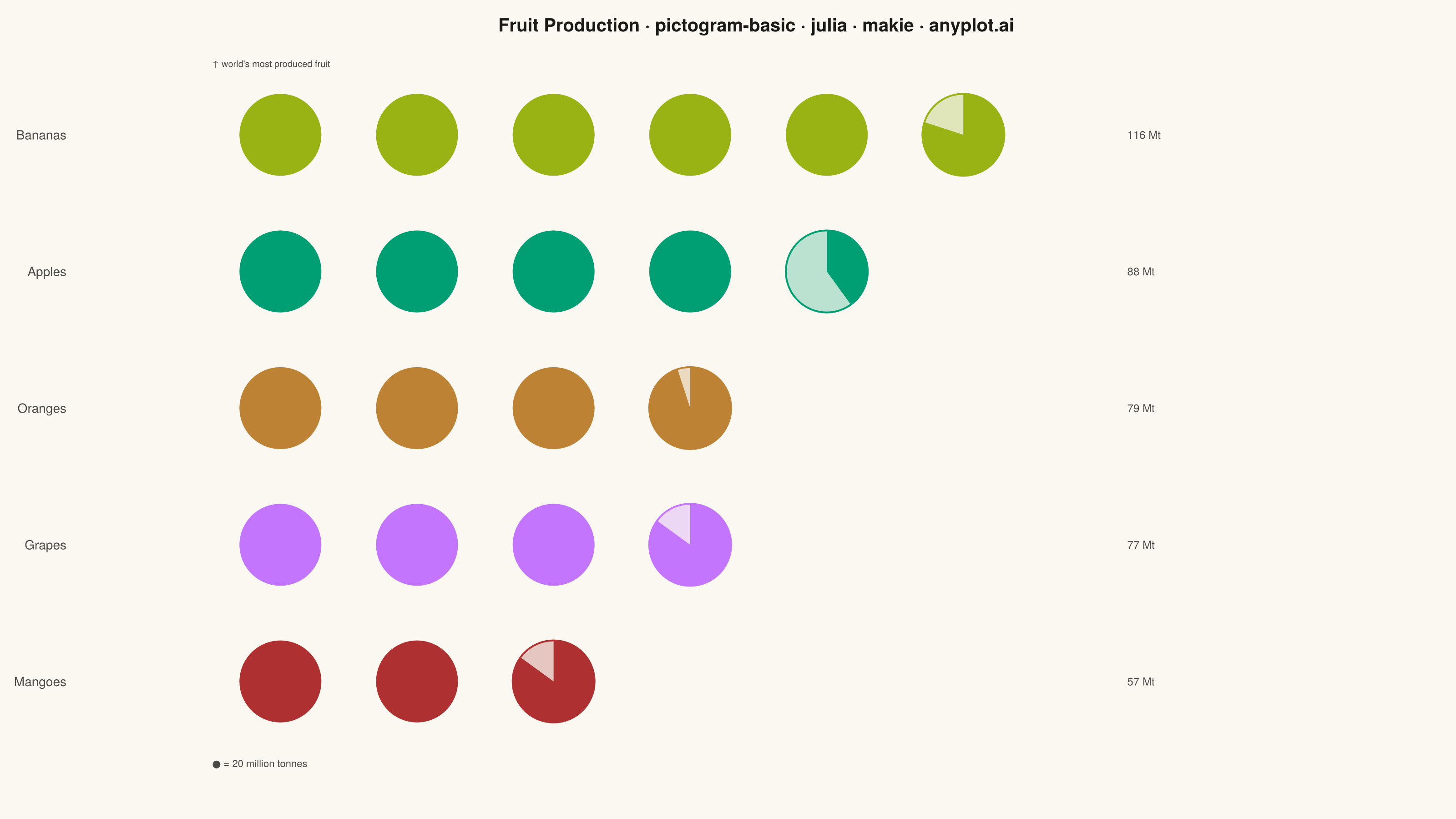
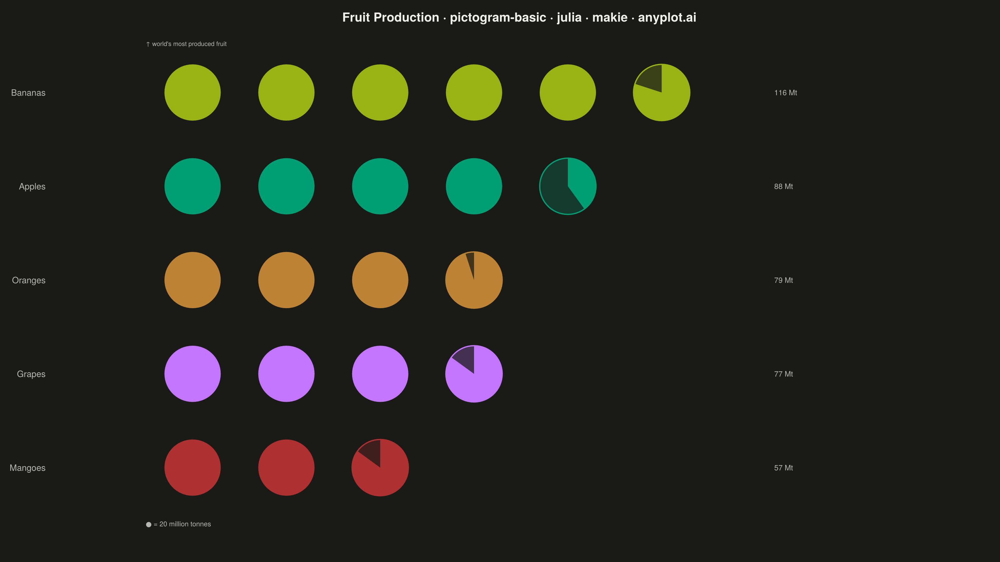
The same plot in 14 other libraries — Python: Altair, Bokeh, lets-plot, Matplotlib, Plotly, plotnine, Pygal, Seaborn; R: ggplot2; JavaScript: Chart.js, D3.js, Apache ECharts, Highcharts, MUI X Charts. Compare all 15 side by side: Pictogram Chart (Isotype Visualization) in Python, R, Julia and JavaScript.
A pictogram chart represents quantities using repeated icons or symbols, where each icon stands for a fixed number of units. Inspired by Otto Neurath's ISOTYPE system, this visualization makes numerical comparisons more intuitive and engaging than plain bar charts. It is especially effective for public-facing data communication and infographics where visual appeal and immediate comprehension are important.
# anyplot.ai
# pictogram-basic: Pictogram Chart (Isotype Visualization)
# Library: makie 0.22.10 | Julia 1.11.9
# Quality: 86/100 | Created: 2026-06-03

using CairoMakie
using Colors
using Random

Random.seed!(42)

# Theme tokens — Imprint palette, theme-adaptive chrome
const THEME    = get(ENV, "ANYPLOT_THEME", "light")
const PAGE_BG  = THEME == "light" ? colorant"#FAF8F1" : colorant"#1A1A17"
const INK      = THEME == "light" ? colorant"#1A1A17" : colorant"#F0EFE8"
const INK_SOFT = THEME == "light" ? colorant"#4A4A44" : colorant"#B8B7B0"

# Imprint palette — semantic color assignments matched to fruit identity
const COLORS = [
    colorant"#99B314",  # Bananas — lime (yellow-green banana)
    colorant"#009E73",  # Apples — brand green (green apple)
    colorant"#BD8233",  # Oranges — ochre (warm orange)
    colorant"#C475FD",  # Grapes — lavender (purple grapes)
    colorant"#AE3030",  # Mangoes — matte red (tropical warm)
]

# Data — global fruit production (million tonnes, approx. FAO 2021-22), sorted descending
const categories = ["Bananas", "Apples", "Oranges", "Grapes", "Mangoes"]
const values     = [116, 88, 79, 77, 57]
const unit_size  = 20  # each icon = 20 million tonnes

# Layout constants
const n_cats = length(categories)
const icon_r = 0.45   # icon radius in data units
const x_gap  = 1.5    # horizontal spacing between icon centres
const y_gap  = 1.5    # vertical spacing between category rows

# Y positions — first category at top (highest y), last at bottom
y_positions = [(n_cats - i + 1) * y_gap for i in 1:n_cats]

# Figure
fig = Figure(
    resolution      = (1600, 900),
    fontsize        = 14,
    backgroundcolor = PAGE_BG,
)

# max_icons = ceil(116 / 20) = 6
max_icons = ceil(Int, maximum(values) / unit_size)

ax = Axis(
    fig[1, 1];
    title              = "Fruit Production · pictogram-basic · julia · makie · anyplot.ai",
    titlesize          = 20,
    titlecolor         = INK,
    aspect             = DataAspect(),
    yticks             = (y_positions, categories),
    yticklabelsize     = 14,
    yticklabelcolor    = INK_SOFT,
    yticksvisible      = false,
    xticklabelsvisible = false,
    xticksvisible      = false,
    backgroundcolor    = PAGE_BG,
    topspinevisible    = false,
    rightspinevisible  = false,
    bottomspinevisible = false,
    leftspinevisible   = false,
    xgridvisible       = false,
    ygridvisible       = false,
)

# 60-gon circle approximation — reliable for poly! with DataAspect data-coordinate circles
θ_circle = range(0, 2π, length = 61)[1:60]

# Fixed x for right-aligned value labels
label_x = (max_icons + 1) * x_gap + 0.3

for i in 1:n_cats
    val      = values[i]
    color    = COLORS[i]
    y_pos    = y_positions[i]
    n_full   = floor(Int, val / unit_size)
    fraction = (val / unit_size) - n_full

    # Full icons — filled circle polygons
    for j in 1:n_full
        x_pos = j * x_gap
        poly!(ax,
            Point2f.(collect(zip(
                x_pos .+ icon_r .* cos.(θ_circle),
                y_pos .+ icon_r .* sin.(θ_circle),
            )));
            color = color, strokewidth = 0)
    end

    # Partial icon — ghost circle outline + filled pie-sector
    if fraction > 0.02
        x_pos = (n_full + 1) * x_gap

        # Ghost circle: 25% alpha fill + 2px stroke for readability in both themes
        poly!(ax,
            Point2f.(collect(zip(
                x_pos .+ icon_r .* cos.(θ_circle),
                y_pos .+ icon_r .* sin.(θ_circle),
            )));
            color = (color, 0.25), strokecolor = color, strokewidth = 2.0)

        # Filled pie sector (clockwise from 12 o'clock)
        θ_arc     = range(π/2, π/2 - 2π * fraction, length = 60)
        xs_sector = vcat([x_pos], x_pos .+ icon_r .* cos.(θ_arc), [x_pos])
        ys_sector = vcat([y_pos], y_pos .+ icon_r .* sin.(θ_arc), [y_pos])
        poly!(ax,
            Point2f.(collect(zip(xs_sector, ys_sector)));
            color = color, strokewidth = 0)
    end

    # Value label — aligned right for easy comparison
    text!(ax, label_x, y_pos;
        text     = "$(val) Mt",
        fontsize = 12,
        color    = INK_SOFT,
        align    = (:left, :center),
    )
end

# Focal-point annotation — draws the viewer's eye to the world leader
text!(ax, 0.5 * x_gap, y_positions[1] + y_gap * 0.52;
    text     = "↑ world's most produced fruit",
    fontsize = 10,
    color    = INK_SOFT,
    align    = (:left, :center),
)

# Axis limits — x span tuned to ~16:9 with DataAspect
xlims!(ax, -0.8, (max_icons + 3.5) * x_gap)
ylims!(ax, y_positions[end] - y_gap * 0.9, y_positions[1] + y_gap * 0.7)

# Unit legend — below the lowest category row
text!(ax, 0.5 * x_gap, y_positions[end] - y_gap * 0.6;
    text     = "● = $(unit_size) million tonnes",
    fontsize = 11,
    color    = INK_SOFT,
    align    = (:left, :center),
)

# Save
save("plot-$(THEME).png", fig; px_per_unit = 2)
Runnable source as JSON, for any HTTP client: https://api.anyplot.ai/specs/pictogram-basic/makie/code. Any spec id and library id listed in llms-full.txt fit the same URL shape; every URL below is complete and callable.
{
  "spec_id": "pictogram-basic",
  "language": "julia",
  "library": "makie",
  "page": "https://anyplot.ai/pictogram-basic/julia/makie",
  "hub": "https://anyplot.ai/pictogram-basic",
  "code_json": "https://api.anyplot.ai/specs/pictogram-basic/makie/code",
  "spec_json": "https://api.anyplot.ai/specs/pictogram-basic",
  "render_light_png": "https://storage.googleapis.com/anyplot-images/plots/pictogram-basic/julia/makie/plot-light.png",
  "render_dark_png": "https://storage.googleapis.com/anyplot-images/plots/pictogram-basic/julia/makie/plot-dark.png",
  "quality_score": 86.0,
  "license": "MIT",
  "guide": "https://anyplot.ai/llms.txt"
}
Part of Pictogram Chart (Isotype Visualization) on anyplot.ai.