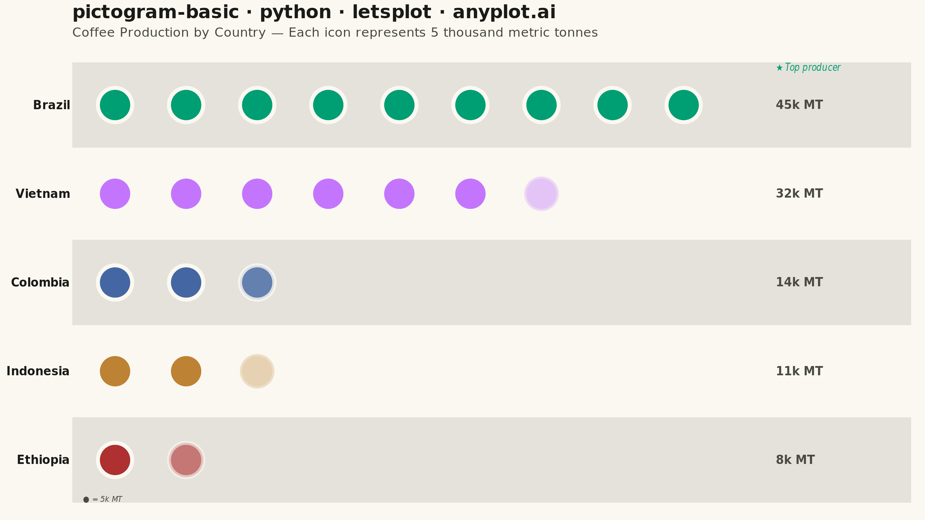
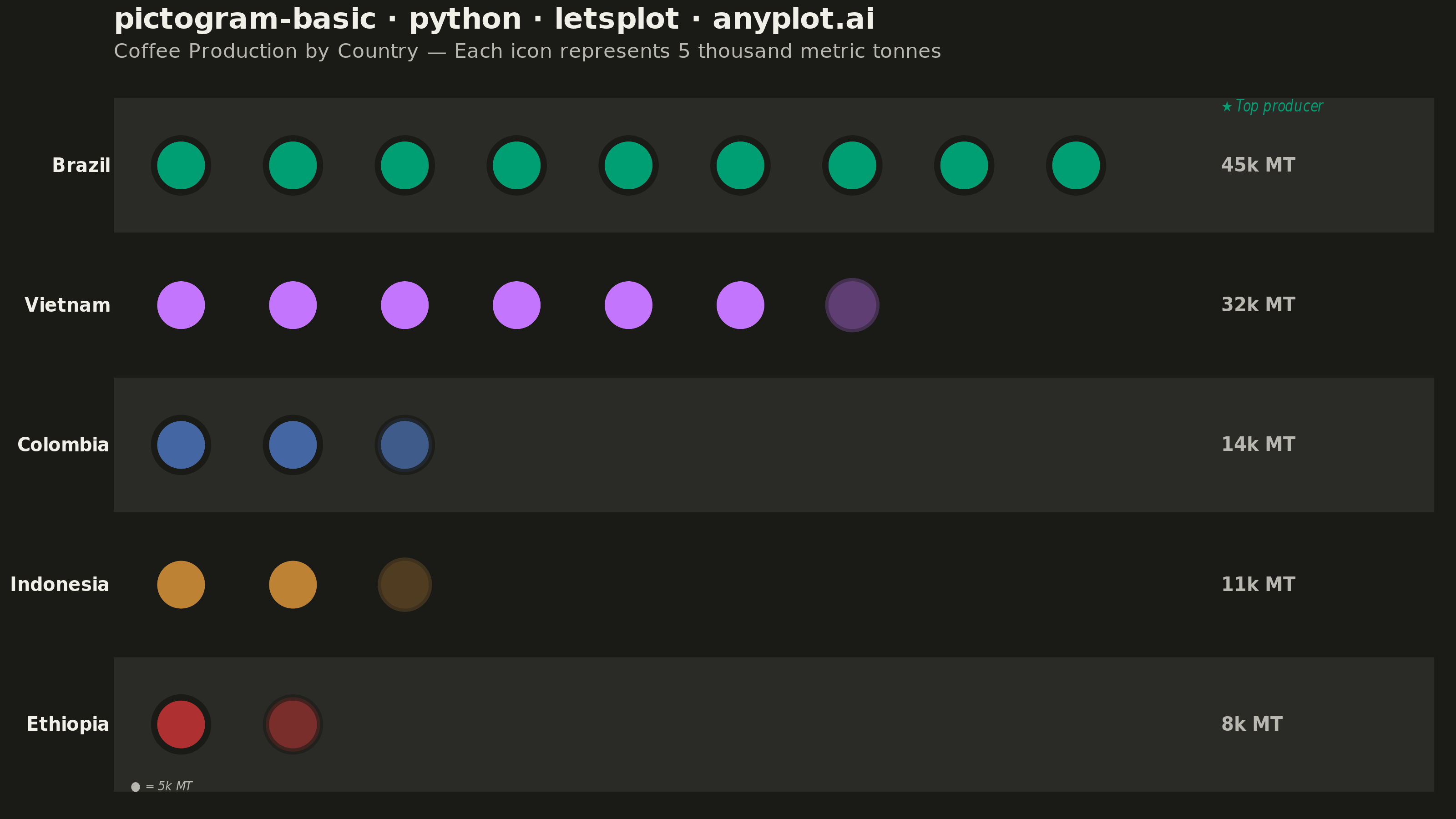
A pictogram chart represents quantities using repeated icons or symbols, where each icon stands for a fixed number of units. Inspired by Otto Neurath's ISOTYPE system, this visualization makes numerical comparisons more intuitive and engaging than plain bar charts. It is especially effective for public-facing data communication and infographics where visual appeal and immediate comprehension are important.
""" anyplot.ai
pictogram-basic: Pictogram Chart (Isotype Visualization)
Library: letsplot 4.10.1 | Python 3.13.13
Quality: 88/100 | Updated: 2026-06-03
"""

import os

from lets_plot import *


LetsPlot.setup_html()

# Theme tokens
THEME = os.getenv("ANYPLOT_THEME", "light")
PAGE_BG = "#FAF8F1" if THEME == "light" else "#1A1A17"
INK = "#1A1A17" if THEME == "light" else "#F0EFE8"
INK_SOFT = "#4A4A44" if THEME == "light" else "#B8B7B0"

# Subtle alternating lane color derived from theme surface
LANE_BG = "#E4E2DB" if THEME == "light" else "#2A2A26"

# Imprint palette — canonical order, first series always #009E73
IMPRINT_PALETTE = ["#009E73", "#C475FD", "#4467A3", "#BD8233", "#AE3030"]

# Data — Top coffee-producing countries (thousands of metric tonnes, ~2023)
categories = ["Brazil", "Vietnam", "Colombia", "Indonesia", "Ethiopia"]
values = [45, 32, 14, 11, 8]
icon_value = 5  # Each icon represents 5 thousand metric tonnes

max_icons = max(v // icon_value + (1 if v % icon_value else 0) for v in values)

MIN_ALPHA = 0.33  # floor so faintest partial icon remains clearly visible

# Build pictogram grid — full icons at alpha=1.0, partial via fractional alpha
tile_data = {"category": [], "col": [], "row": [], "alpha": [], "value": []}

for i, (cat, val) in enumerate(zip(categories, values)):
    y_pos = len(categories) - 1 - i  # Highest value at top
    full_icons = val // icon_value
    remainder = val % icon_value
    for c in range(full_icons):
        tile_data["category"].append(cat)
        tile_data["col"].append(float(c))
        tile_data["row"].append(float(y_pos))
        tile_data["alpha"].append(1.0)
        tile_data["value"].append(val)
    if remainder > 0:
        tile_data["category"].append(cat)
        tile_data["col"].append(float(full_icons))
        tile_data["row"].append(float(y_pos))
        tile_data["alpha"].append(max(MIN_ALPHA, remainder / icon_value))
        tile_data["value"].append(val)

# Alternating background lanes for readability (even category indices)
even_lanes = {
    "ymin": [float(len(categories) - 1 - i) - 0.48 for i in range(len(categories)) if i % 2 == 0],
    "ymax": [float(len(categories) - 1 - i) + 0.48 for i in range(len(categories)) if i % 2 == 0],
}

# Value labels placed to the right of each row
label_data = {
    "col": [float(max_icons) + 0.3] * len(categories),
    "row": [float(len(categories) - 1 - i) for i in range(len(categories))],
    "label": [f"{v}k MT" for v in values],
}

# Top producer annotation for data storytelling
anno_data = {"col": [float(max_icons) + 0.3], "row": [float(len(categories) - 1) + 0.42], "label": ["★ Top producer"]}

# Icon scale legend note in bottom-left corner for self-contained chart
scale_note = {"col": [-0.45], "row": [-0.44], "label": ["● = 5k MT"]}

y_breaks = [float(len(categories) - 1 - i) for i in range(len(categories))]

title = "pictogram-basic · python · letsplot · anyplot.ai"
subtitle = "Coffee Production by Country — Each icon represents 5 thousand metric tonnes"

# Plot
plot = (
    ggplot()
    + geom_rect(
        aes(ymin="ymin", ymax="ymax"), data=even_lanes, xmin=-0.6, xmax=float(max_icons) + 2.2, fill=LANE_BG, size=0
    )
    + geom_point(
        aes(x="col", y="row", alpha="alpha", fill="category"),
        data=tile_data,
        shape=21,
        size=12,
        color=PAGE_BG,
        stroke=1.5,
        tooltips=layer_tooltips().line("@category").line("Total: @value thousand metric tonnes").format("@value", "d"),
    )
    + scale_alpha_identity()
    + scale_fill_manual(values=IMPRINT_PALETTE, limits=categories)
    + geom_text(aes(x="col", y="row", label="label"), data=label_data, size=5, color=INK_SOFT, hjust=0, fontface="bold")
    + geom_text(
        aes(x="col", y="row", label="label"),
        data=anno_data,
        size=4,
        color=IMPRINT_PALETTE[0],
        hjust=0,
        fontface="italic",
    )
    + geom_text(
        aes(x="col", y="row", label="label"), data=scale_note, size=3.5, color=INK_SOFT, hjust=0, fontface="italic"
    )
    + scale_y_continuous(breaks=y_breaks, labels=categories, limits=[-0.6, len(categories) - 0.3], expand=[0, 0])
    + scale_x_continuous(limits=[-0.6, float(max_icons) + 2.3], expand=[0, 0])
    + labs(x="", y="", title=title, subtitle=subtitle)
    + ggsize(800, 450)
    + theme_minimal()
    + theme(
        plot_title=element_text(size=16, face="bold", color=INK),
        plot_subtitle=element_text(size=11, color=INK_SOFT),
        axis_title=element_blank(),
        axis_text_y=element_text(size=10, face="bold", color=INK),
        axis_text_x=element_blank(),
        axis_ticks=element_blank(),
        panel_grid=element_blank(),
        legend_position="none",
        plot_background=element_rect(fill=PAGE_BG, color=PAGE_BG, size=0),
        panel_background=element_rect(fill=PAGE_BG, color=PAGE_BG, size=0),
    )
)

# Save
ggsave(plot, f"plot-{THEME}.png", path=".", scale=4)
ggsave(plot, f"plot-{THEME}.html", path=".")
Runnable source as JSON, for any HTTP client: https://api.anyplot.ai/specs/pictogram-basic/letsplot/code. Any spec id and library id listed in llms-full.txt fit the same URL shape; every URL below is complete and callable.
{
  "spec_id": "pictogram-basic",
  "language": "python",
  "library": "letsplot",
  "page": "https://anyplot.ai/pictogram-basic/python/letsplot",
  "hub": "https://anyplot.ai/pictogram-basic",
  "code_json": "https://api.anyplot.ai/specs/pictogram-basic/letsplot/code",
  "spec_json": "https://api.anyplot.ai/specs/pictogram-basic",
  "render_light_png": "https://storage.googleapis.com/anyplot-images/plots/pictogram-basic/python/letsplot/plot-light.png",
  "render_dark_png": "https://storage.googleapis.com/anyplot-images/plots/pictogram-basic/python/letsplot/plot-dark.png",
  "interactive_light_html": "https://storage.googleapis.com/anyplot-images/plots/pictogram-basic/python/letsplot/plot-light.html",
  "interactive_dark_html": "https://storage.googleapis.com/anyplot-images/plots/pictogram-basic/python/letsplot/plot-dark.html",
  "quality_score": 88.0,
  "license": "MIT",
  "guide": "https://anyplot.ai/llms.txt"
}
Part of Pictogram Chart (Isotype Visualization) on anyplot.ai.