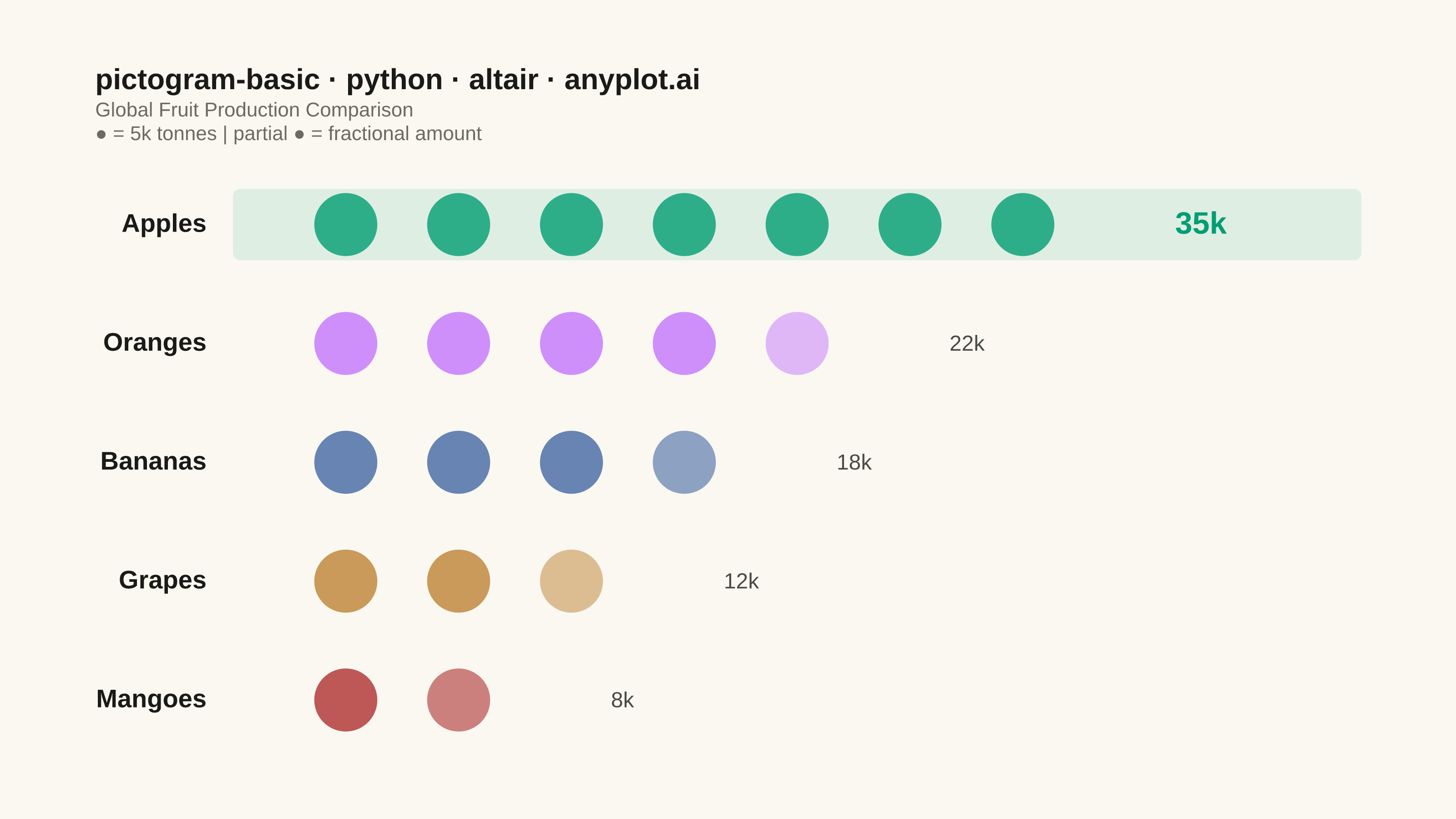
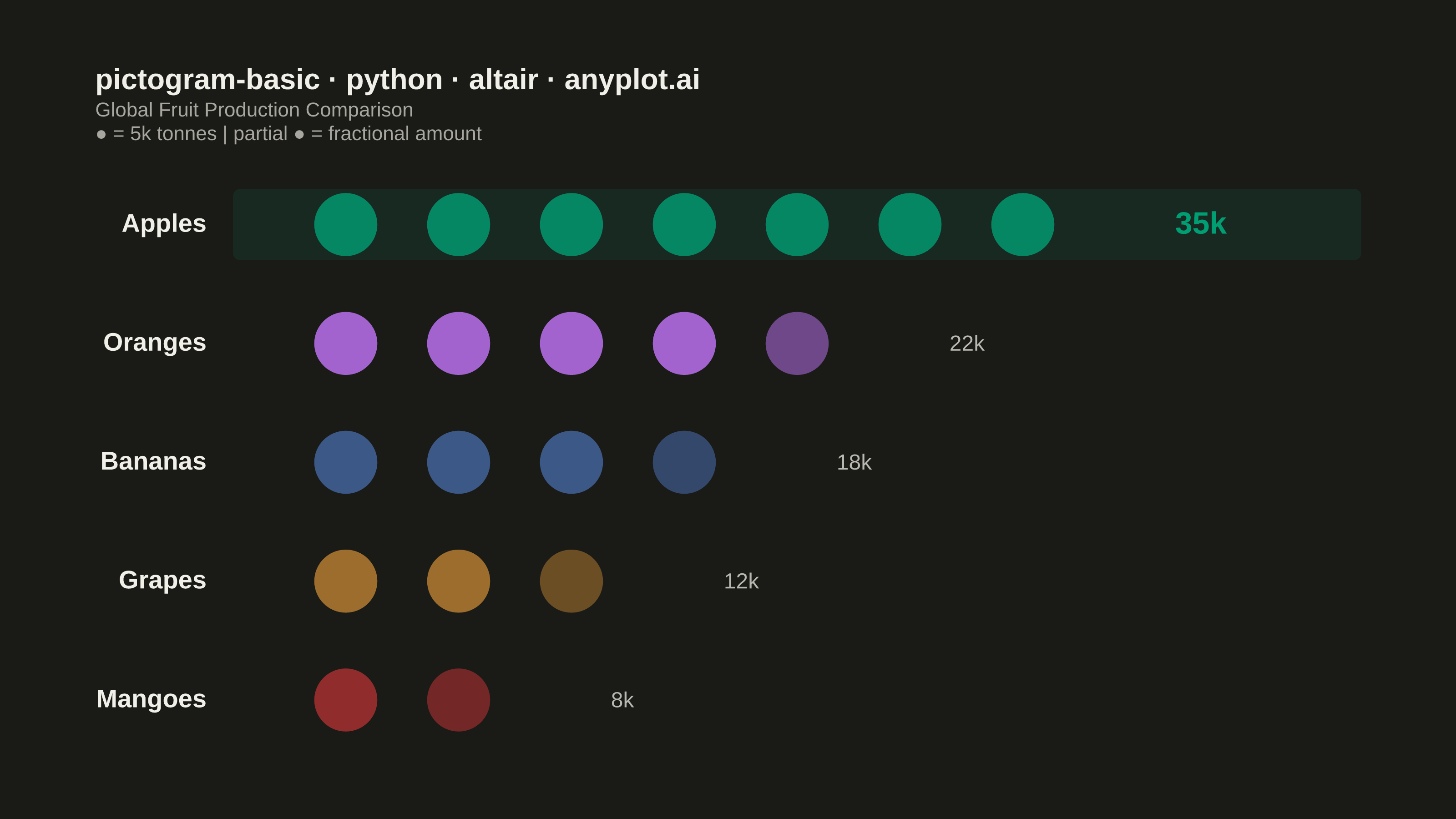
A pictogram chart represents quantities using repeated icons or symbols, where each icon stands for a fixed number of units. Inspired by Otto Neurath's ISOTYPE system, this visualization makes numerical comparisons more intuitive and engaging than plain bar charts. It is especially effective for public-facing data communication and infographics where visual appeal and immediate comprehension are important.
""" anyplot.ai
pictogram-basic: Pictogram Chart (Isotype Visualization)
Library: altair 6.1.0 | Python 3.13.13
Quality: 88/100 | Updated: 2026-06-03
"""

import importlib
import os
import sys


# Drop script dir from sys.path so `altair` resolves to the package, not this file
sys.path[:] = [p for p in sys.path if os.path.abspath(p or ".") != os.path.dirname(os.path.abspath(__file__))]
alt = importlib.import_module("altair")
pd = importlib.import_module("pandas")
Image = importlib.import_module("PIL.Image")

# Theme tokens
THEME = os.getenv("ANYPLOT_THEME", "light")
PAGE_BG = "#FAF8F1" if THEME == "light" else "#1A1A17"
ELEVATED_BG = "#FFFDF6" if THEME == "light" else "#242420"
INK = "#1A1A17" if THEME == "light" else "#F0EFE8"
INK_SOFT = "#4A4A44" if THEME == "light" else "#B8B7B0"
INK_MUTED = "#6B6A63" if THEME == "light" else "#A8A79F"

# Imprint palette — positions 1–5 for 5 categories
IMPRINT_PALETTE = ["#009E73", "#C475FD", "#4467A3", "#BD8233", "#AE3030"]

# Data - Fruit production (thousands of tonnes)
categories = ["Apples", "Oranges", "Bananas", "Grapes", "Mangoes"]
values = [35, 22, 18, 12, 8]
colors = IMPRINT_PALETTE
unit_value = 5
max_icons = max(v // unit_value + (1 if v % unit_value else 0) for v in values)
top_value = max(values)

# Build icon grid: one row per icon position per category
rows = []
for cat, val, color in zip(categories, values, colors, strict=True):
    full_icons = val // unit_value
    remainder = (val % unit_value) / unit_value
    for i in range(full_icons):
        rows.append({"category": cat, "col": i, "opacity": 1.0, "color": color, "value": val})
    if remainder > 0:
        rows.append({"category": cat, "col": full_icons, "opacity": round(remainder, 2), "color": color, "value": val})

df = pd.DataFrame(rows)

# Sort order: highest value first
sort_order = [c for _, c in sorted(zip(values, categories, strict=True), reverse=True)]

title_str = "pictogram-basic · python · altair · anyplot.ai"

# Icons layer — circles in a grid
icons = (
    alt.Chart(df)
    .mark_point(size=1200, filled=True, strokeWidth=0)
    .encode(
        x=alt.X(
            "col:Q",
            title=None,
            scale=alt.Scale(domain=[-0.4, max_icons + 1.2]),
            axis=alt.Axis(labels=False, ticks=False, domain=False, grid=False),
        ),
        y=alt.Y(
            "category:N",
            title=None,
            sort=sort_order,
            scale=alt.Scale(type="band", paddingInner=0.4, paddingOuter=0.15),
            axis=alt.Axis(
                labelFontSize=14,
                labelFontWeight="bold",
                labelColor=INK,
                ticks=False,
                domain=False,
                grid=False,
                labelPadding=15,
            ),
        ),
        color=alt.Color("color:N", scale=None),
        opacity=alt.Opacity("opacity:Q", scale=alt.Scale(domain=[0, 1]), legend=None),
        tooltip=[alt.Tooltip("category:N", title="Category"), alt.Tooltip("value:Q", title="Production (k tonnes)")],
    )
)

# Value label layer
label_data = []
for cat, val in zip(categories, values, strict=True):
    icon_count = val // unit_value + (1 if val % unit_value else 0)
    label_data.append({"category": cat, "col": icon_count + 0.35, "label": f"{val}k", "is_top": val == top_value})
label_df = pd.DataFrame(label_data)

top_labels = (
    alt.Chart(label_df[label_df["is_top"]])
    .mark_text(align="left", baseline="middle", fontSize=17, fontWeight="bold", color="#009E73")
    .encode(x=alt.X("col:Q"), y=alt.Y("category:N", sort=sort_order), text=alt.Text("label:N"))
)

other_labels = (
    alt.Chart(label_df[~label_df["is_top"]])
    .mark_text(align="left", baseline="middle", fontSize=12, color=INK_SOFT)
    .encode(x=alt.X("col:Q"), y=alt.Y("category:N", sort=sort_order), text=alt.Text("label:N"))
)

# Subtle highlight bar behind the top category for visual storytelling
highlight_df = pd.DataFrame([{"category": sort_order[0]}])
highlight = (
    alt.Chart(highlight_df)
    .mark_bar(color="#009E73", opacity=0.11, cornerRadius=4)
    .encode(y=alt.Y("category:N", sort=sort_order), x=alt.value(0), x2=alt.value(620))
)

# Combine layers
combined = (
    (highlight + icons + top_labels + other_labels)
    .properties(
        width=620,
        height=320,
        background=PAGE_BG,
        title=alt.Title(
            text=title_str,
            subtitle=[
                "Global Fruit Production Comparison",
                f"● = {unit_value}k tonnes  |  partial ● = fractional amount",
            ],
            fontSize=16,
            subtitleFontSize=11,
            subtitleColor=INK_MUTED,
            color=INK,
            anchor="start",
            offset=15,
        ),
    )
    .configure_view(fill=PAGE_BG, strokeWidth=0)
    .configure_axis(
        domainColor=INK_SOFT, tickColor=INK_SOFT, gridColor=INK, gridOpacity=0.12, labelColor=INK_SOFT, titleColor=INK
    )
    .configure_legend(fillColor=ELEVATED_BG, strokeColor=INK_SOFT, labelColor=INK_SOFT, titleColor=INK)
)

# Save PNG and HTML
combined.save(f"plot-{THEME}.png", scale_factor=4.0)
combined.save(f"plot-{THEME}.html")

# Pad PNG to exact 3200×1800 target (landscape); do NOT crop
TW, TH = 3200, 1800
_img = Image.open(f"plot-{THEME}.png").convert("RGB")
_w, _h = _img.size
if _w > TW or _h > TH:
    raise SystemExit(
        f"altair vl-convert produced {_w}×{_h}, exceeds target {TW}×{TH}. "
        "Shrink chart .properties(width=, height=) and re-render."
    )
if _w < TW or _h < TH:
    _canvas = Image.new("RGB", (TW, TH), PAGE_BG)
    _canvas.paste(_img, ((TW - _w) // 2, (TH - _h) // 2))
    _canvas.save(f"plot-{THEME}.png")
Runnable source as JSON, for any HTTP client: https://api.anyplot.ai/specs/pictogram-basic/altair/code. Any spec id and library id listed in llms-full.txt fit the same URL shape; every URL below is complete and callable.
{
  "spec_id": "pictogram-basic",
  "language": "python",
  "library": "altair",
  "page": "https://anyplot.ai/pictogram-basic/python/altair",
  "hub": "https://anyplot.ai/pictogram-basic",
  "code_json": "https://api.anyplot.ai/specs/pictogram-basic/altair/code",
  "spec_json": "https://api.anyplot.ai/specs/pictogram-basic",
  "render_light_png": "https://storage.googleapis.com/anyplot-images/plots/pictogram-basic/python/altair/plot-light.png",
  "render_dark_png": "https://storage.googleapis.com/anyplot-images/plots/pictogram-basic/python/altair/plot-dark.png",
  "interactive_light_html": "https://storage.googleapis.com/anyplot-images/plots/pictogram-basic/python/altair/plot-light.html",
  "interactive_dark_html": "https://storage.googleapis.com/anyplot-images/plots/pictogram-basic/python/altair/plot-dark.html",
  "quality_score": 88.0,
  "license": "MIT",
  "guide": "https://anyplot.ai/llms.txt"
}
Part of Pictogram Chart (Isotype Visualization) on anyplot.ai.