The same plot in 14 other libraries — JavaScript: Chart.js, D3.js, Apache ECharts, MUI X Charts; Python: Altair, Bokeh, lets-plot, Matplotlib, Plotly, plotnine, Pygal, Seaborn; R: ggplot2; Julia: Makie.jl. Compare all 15 side by side: Basic Pie Chart in Python, R, Julia and JavaScript.
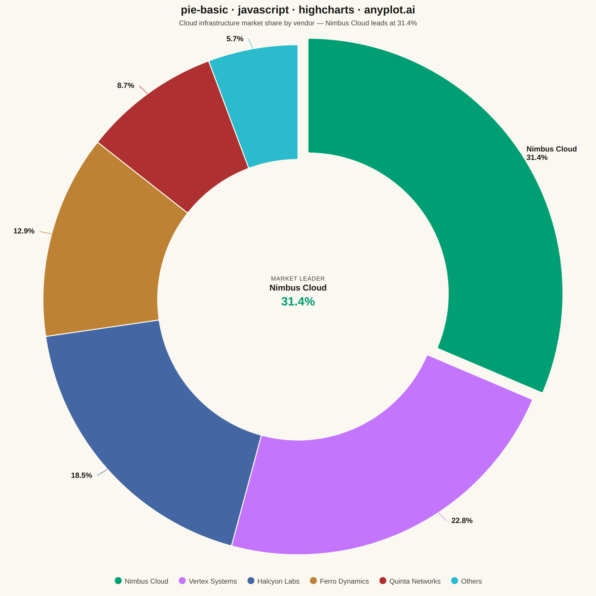
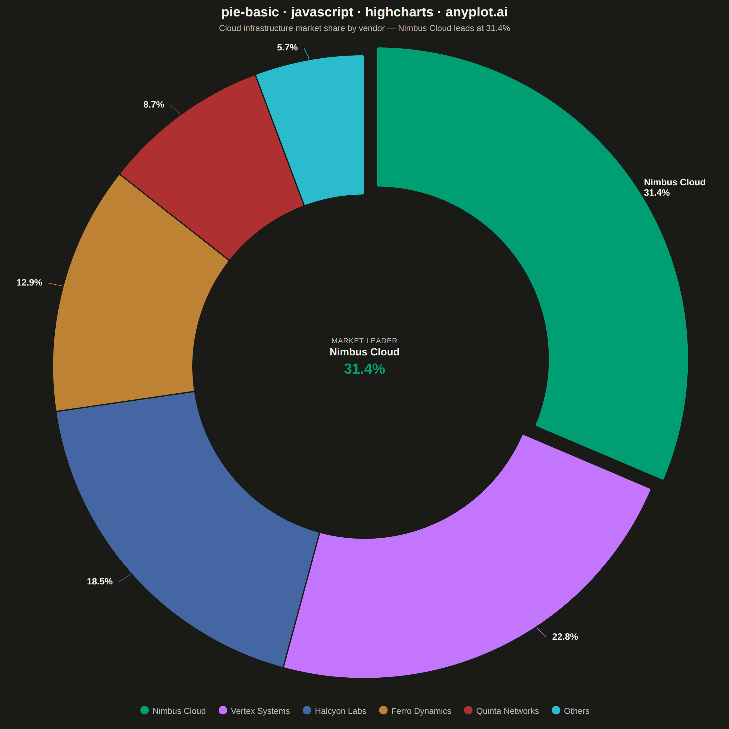
A pie chart showing proportions of categorical data as slices of a circle. Each slice represents a category's contribution to the whole, with the angle proportional to its value. Essential for visualizing parts-to-whole relationships in a simple, intuitive format.
// anyplot.ai
// pie-basic: Basic Pie Chart
// Library: highcharts 12.6.0 | JavaScript 22.23.2
// Quality: 95/100 | Created: 2026-08-20
//# anyplot-orientation: square

const t = window.ANYPLOT_TOKENS;

// --- Data (in-memory, deterministic) ---------------------------------------
const companies = ["Nimbus Cloud", "Vertex Systems", "Halcyon Labs", "Ferro Dynamics", "Quinta Networks", "Others"];
const marketShare = [31.4, 22.8, 18.5, 12.9, 8.7, 5.7];
const leader = { name: companies[0], share: marketShare[0] };

// Slightly explode the largest slice for emphasis
const sliceData = companies.map((name, i) => ({
  name,
  y: marketShare[i],
  sliced: i === 0,
  selected: i === 0,
}));

// --- Chart -----------------------------------------------------------------
Highcharts.chart("container", {
  chart: {
    type: "pie",
    backgroundColor: "transparent",
    animation: false,
    style: { fontFamily: "inherit" },
    // Highcharts-distinctive touch: draw a center label into the donut hole
    // via the SVG renderer, reinforcing the "market leader" story.
    events: {
      render() {
        if (this.centerLabel) this.centerLabel.destroy();
        this.centerLabel = this.renderer
          .text(
            `<div style="text-align:center;line-height:1.35">` +
              `<div style="font-size:12px;letter-spacing:0.05em;text-transform:uppercase;color:${t.inkSoft}">Market leader</div>` +
              `<div style="font-size:17px;font-weight:700;color:${t.ink}">${leader.name}</div>` +
              `<div style="font-size:24px;font-weight:700;color:${t.palette[0]}">${leader.share.toFixed(1)}%</div>` +
              `</div>`,
            0,
            0,
            true,
          )
          .add();
        const box = this.centerLabel.getBBox();
        this.centerLabel.attr({
          x: this.plotLeft + this.plotWidth / 2 - box.width / 2,
          y: this.plotTop + this.plotHeight / 2 - box.height / 2,
        });
      },
    },
  },
  credits: { enabled: false },
  colors: t.palette,
  title: {
    text: "pie-basic · javascript · highcharts · anyplot.ai",
    style: { color: t.ink, fontSize: "22px", fontWeight: "600" },
  },
  subtitle: {
    text: `Cloud infrastructure market share by vendor — ${leader.name} leads at ${leader.share.toFixed(1)}%`,
    style: { color: t.inkSoft, fontSize: "14px" },
  },
  tooltip: {
    pointFormat: "{series.name}: <b>{point.percentage:.1f}%</b>",
  },
  legend: {
    enabled: true,
    itemStyle: { color: t.inkSoft, fontSize: "14px" },
    itemHoverStyle: { color: t.ink },
  },
  plotOptions: {
    series: { animation: false },
    pie: {
      allowPointSelect: false,
      showInLegend: true,
      innerSize: "55%",
      borderWidth: 2,
      borderColor: t.pageBg,
      slicedOffset: 24,
      dataLabels: {
        enabled: true,
        distance: 20,
        useHTML: true,
        // Highcharts-distinctive connector shape (not a generic default) plus
        // a bolder, name-carrying label on the leading slice only.
        connectorShape: "crookedLine",
        crookDistance: "70%",
        style: {
          color: t.ink,
          fontSize: "15px",
          fontWeight: "600",
          textOutline: "none",
        },
        formatter() {
          if (this.point.index === 0) {
            return `<b>${this.point.name}</b><br/>${this.point.percentage.toFixed(1)}%`;
          }
          return `${this.point.percentage.toFixed(1)}%`;
        },
      },
    },
  },
  series: [
    {
      name: "Market share",
      colorByPoint: true,
      data: sliceData,
    },
  ],
});
Runnable source as JSON, for any HTTP client: https://api.anyplot.ai/specs/pie-basic/highcharts/code. Any spec id and library id listed in llms-full.txt fit the same URL shape; every URL below is complete and callable.
{
  "spec_id": "pie-basic",
  "language": "javascript",
  "library": "highcharts",
  "page": "https://anyplot.ai/pie-basic/javascript/highcharts",
  "hub": "https://anyplot.ai/pie-basic",
  "code_json": "https://api.anyplot.ai/specs/pie-basic/highcharts/code",
  "spec_json": "https://api.anyplot.ai/specs/pie-basic",
  "render_light_png": "https://storage.googleapis.com/anyplot-images/plots/pie-basic/javascript/highcharts/plot-light.png",
  "render_dark_png": "https://storage.googleapis.com/anyplot-images/plots/pie-basic/javascript/highcharts/plot-dark.png",
  "interactive_light_html": "https://storage.googleapis.com/anyplot-images/plots/pie-basic/javascript/highcharts/plot-light.html",
  "interactive_dark_html": "https://storage.googleapis.com/anyplot-images/plots/pie-basic/javascript/highcharts/plot-dark.html",
  "quality_score": 95.0,
  "license": "MIT",
  "guide": "https://anyplot.ai/llms.txt"
}
Part of Basic Pie Chart on anyplot.ai.