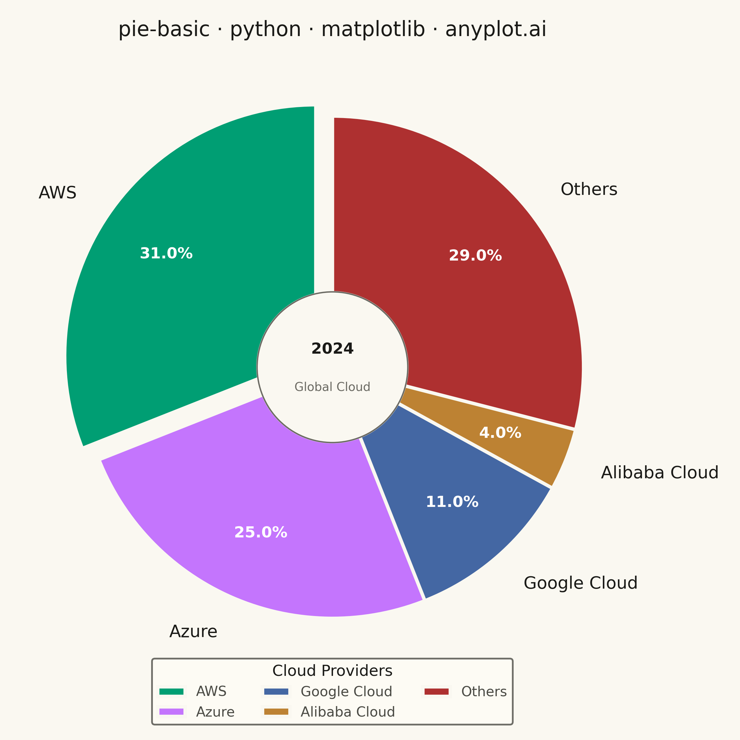
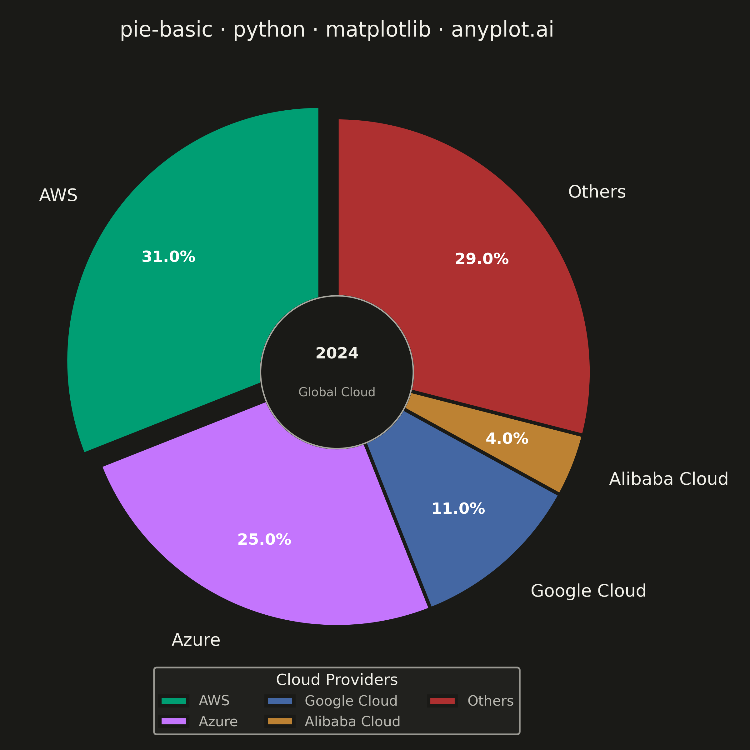
A pie chart showing proportions of categorical data as slices of a circle. Each slice represents a category's contribution to the whole, with the angle proportional to its value. Essential for visualizing parts-to-whole relationships in a simple, intuitive format.
""" anyplot.ai
pie-basic: Basic Pie Chart
Library: matplotlib 3.10.9 | Python 3.13.13
Quality: 88/100 | Updated: 2026-05-28
"""

import os

import matplotlib.pyplot as plt
from matplotlib.patches import Circle


# Theme tokens
THEME = os.getenv("ANYPLOT_THEME", "light")
PAGE_BG = "#FAF8F1" if THEME == "light" else "#1A1A17"
ELEVATED_BG = "#FFFDF6" if THEME == "light" else "#242420"
INK = "#1A1A17" if THEME == "light" else "#F0EFE8"
INK_SOFT = "#4A4A44" if THEME == "light" else "#B8B7B0"
INK_MUTED = "#6B6A63" if THEME == "light" else "#A8A79F"

# anyplot categorical palette — positions 1→5
IMPRINT_PALETTE = ["#009E73", "#C475FD", "#4467A3", "#BD8233", "#AE3030"]

# Data — global cloud infrastructure market share (2024)
companies = ["AWS", "Azure", "Google Cloud", "Alibaba Cloud", "Others"]
market_share = [31, 25, 11, 4, 29]

# Explode the largest slice (AWS) for emphasis
explode = [0.08, 0, 0, 0, 0]

# Plot — square canvas, appropriate for pie charts
fig, ax = plt.subplots(figsize=(6, 6), dpi=400, facecolor=PAGE_BG)
ax.set_facecolor(PAGE_BG)

wedges, texts, autotexts = ax.pie(
    market_share,
    labels=companies,
    autopct="%1.1f%%",
    explode=explode,
    colors=IMPRINT_PALETTE,
    startangle=90,
    textprops={"fontsize": 10, "color": INK},
    wedgeprops={"linewidth": 2, "edgecolor": PAGE_BG},
    pctdistance=0.72,
    labeldistance=1.15,
)

# Percentage labels: bold white for contrast against colored slices
for autotext in autotexts:
    autotext.set_fontsize(9)
    autotext.set_fontweight("bold")
    autotext.set_color("white")

# Center context medallion — matplotlib.patches overlay: adds data context
# and showcases the library's direct primitive drawing capability
center_fill = Circle((0, 0), 0.30, color=PAGE_BG, zorder=5)
center_ring = Circle((0, 0), 0.30, fill=False, edgecolor=INK_MUTED, linewidth=0.8, zorder=6)
ax.add_patch(center_fill)
ax.add_patch(center_ring)
ax.text(0, 0.07, "2024", ha="center", va="center", fontsize=9, fontweight="bold", color=INK, zorder=7)
ax.text(0, -0.08, "Global Cloud", ha="center", va="center", fontsize=7, color=INK_MUTED, zorder=7)

# Title — reduced pad to eliminate unused vertical whitespace
ax.set_title("pie-basic · python · matplotlib · anyplot.ai", fontsize=12, fontweight="medium", color=INK, pad=10)

# Legend — category identification
leg = ax.legend(
    wedges,
    companies,
    title="Cloud Providers",
    loc="lower center",
    bbox_to_anchor=(0.5, -0.08),
    fontsize=8,
    title_fontsize=9,
    ncol=3,
)
leg.get_frame().set_facecolor(ELEVATED_BG)
leg.get_frame().set_edgecolor(INK_SOFT)
plt.setp(leg.get_texts(), color=INK_SOFT)
leg.get_title().set_color(INK)

plt.tight_layout()
plt.savefig(f"plot-{THEME}.png", dpi=400, facecolor=PAGE_BG)
Runnable source as JSON, for any HTTP client: https://api.anyplot.ai/specs/pie-basic/matplotlib/code. Any spec id and library id listed in llms-full.txt fit the same URL shape; every URL below is complete and callable.
{
  "spec_id": "pie-basic",
  "language": "python",
  "library": "matplotlib",
  "page": "https://anyplot.ai/pie-basic/python/matplotlib",
  "hub": "https://anyplot.ai/pie-basic",
  "code_json": "https://api.anyplot.ai/specs/pie-basic/matplotlib/code",
  "spec_json": "https://api.anyplot.ai/specs/pie-basic",
  "render_light_png": "https://storage.googleapis.com/anyplot-images/plots/pie-basic/python/matplotlib/plot-light.png",
  "render_dark_png": "https://storage.googleapis.com/anyplot-images/plots/pie-basic/python/matplotlib/plot-dark.png",
  "quality_score": 88.0,
  "license": "MIT",
  "guide": "https://anyplot.ai/llms.txt"
}
Part of Basic Pie Chart on anyplot.ai.