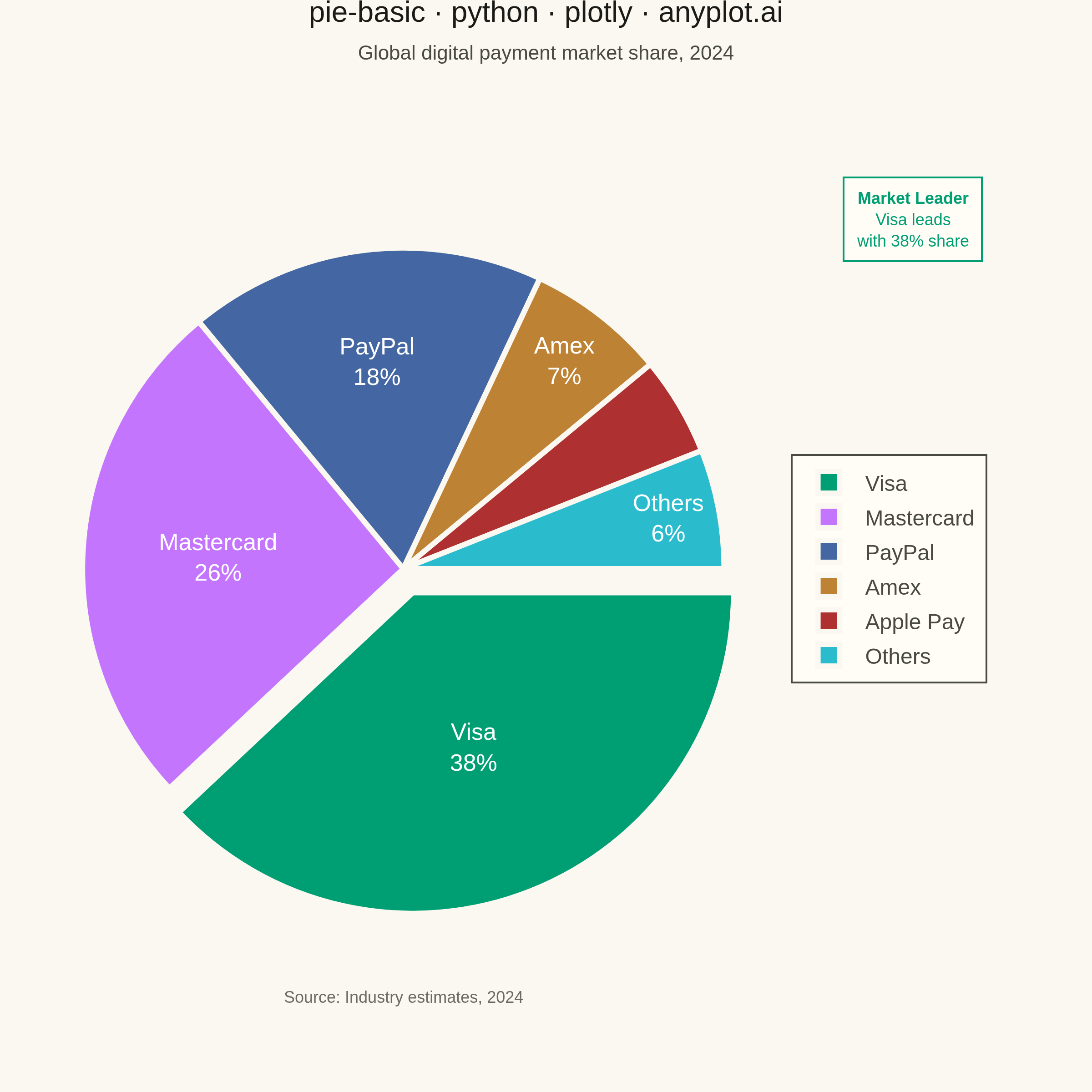
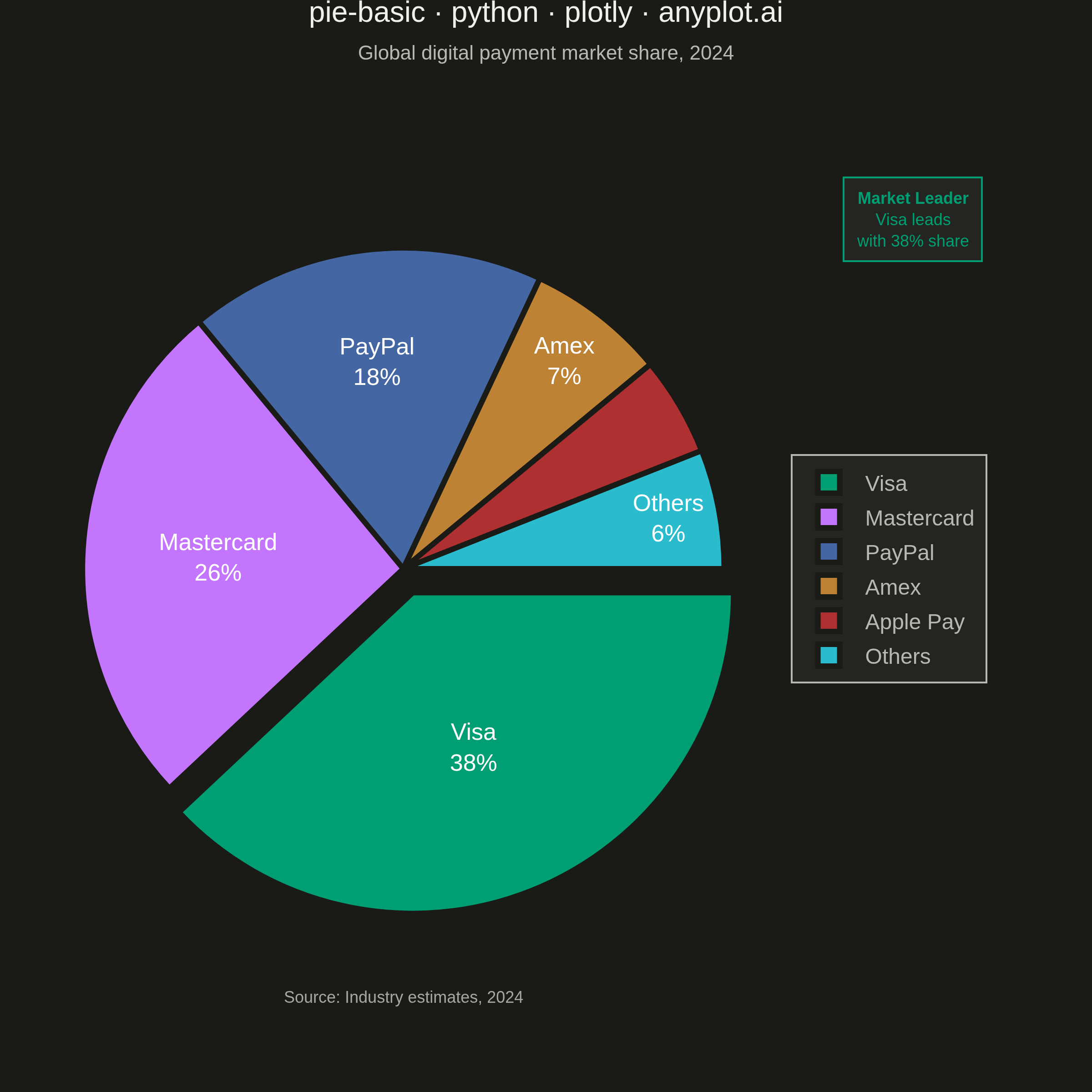
A pie chart showing proportions of categorical data as slices of a circle. Each slice represents a category's contribution to the whole, with the angle proportional to its value. Essential for visualizing parts-to-whole relationships in a simple, intuitive format.
""" anyplot.ai
pie-basic: Basic Pie Chart
Library: plotly 6.7.0 | Python 3.13.13
Quality: 87/100 | Updated: 2026-05-28
"""

import os

import plotly.graph_objects as go


# Theme
THEME = os.getenv("ANYPLOT_THEME", "light")
PAGE_BG = "#FAF8F1" if THEME == "light" else "#1A1A17"
ELEVATED_BG = "#FFFDF6" if THEME == "light" else "#242420"
INK = "#1A1A17" if THEME == "light" else "#F0EFE8"
INK_SOFT = "#4A4A44" if THEME == "light" else "#B8B7B0"
INK_MUTED = "#6B6A63" if THEME == "light" else "#A8A79F"

# Data - Digital payment processor market share (2024)
processors = ["Visa", "Mastercard", "PayPal", "Amex", "Apple Pay", "Others"]
market_share = [38, 26, 18, 7, 5, 6]
rankings = [1, 2, 3, 4, 5, 6]

# Colors - Imprint palette positions 1-6
colors = ["#009E73", "#C475FD", "#4467A3", "#BD8233", "#AE3030", "#2ABCCD"]

# Pure pie chart (no donut hole — per spec)
fig = go.Figure(
    data=[
        go.Pie(
            labels=processors,
            values=market_share,
            customdata=rankings,
            texttemplate="%{label}<br>%{percent:.0%}",
            textposition="inside",
            insidetextorientation="horizontal",
            textfont={"size": 13, "color": "#FFFFFF"},
            hovertemplate=("<b>%{label}</b><br>%{value}% market share<br>Rank #%{customdata} globally<extra></extra>"),
            marker={"colors": colors, "line": {"color": PAGE_BG, "width": 3}},
            pull=[0.08, 0, 0, 0, 0, 0],
            sort=False,
            direction="clockwise",
            rotation=90,
            domain={"x": [0.02, 0.70], "y": [0.07, 0.93]},
        )
    ]
)

# Market leader callout (above legend)
fig.add_annotation(
    text="<b>Market Leader</b><br>Visa leads<br>with 38% share",
    x=0.86,
    y=0.88,
    xref="paper",
    yref="paper",
    showarrow=False,
    font={"size": 9, "color": colors[0], "family": "Arial, sans-serif"},
    xanchor="center",
    yanchor="middle",
    bgcolor=ELEVATED_BG,
    bordercolor=colors[0],
    borderwidth=1,
    borderpad=6,
    align="center",
)

# Source note
fig.add_annotation(
    text="Source: Industry estimates, 2024",
    x=0.36,
    y=0.02,
    xref="paper",
    yref="paper",
    showarrow=False,
    font={"size": 9, "color": INK_MUTED, "family": "Arial, sans-serif"},
    xanchor="center",
    yanchor="bottom",
)

# Layout
fig.update_layout(
    autosize=False,
    title={
        "text": (
            "pie-basic · python · plotly · anyplot.ai"
            f"<br><span style='font-size:11px;color:{INK_SOFT}'>"
            "Global digital payment market share, 2024</span>"
        ),
        "font": {"size": 16, "color": INK, "family": "Arial, sans-serif"},
        "x": 0.5,
        "xanchor": "center",
        "y": 0.98,
    },
    legend={
        "font": {"size": 12, "color": INK_SOFT},
        "orientation": "v",
        "yanchor": "middle",
        "y": 0.5,
        "xanchor": "left",
        "x": 0.74,
        "bgcolor": ELEVATED_BG,
        "bordercolor": INK_SOFT,
        "borderwidth": 1,
    },
    paper_bgcolor=PAGE_BG,
    plot_bgcolor=PAGE_BG,
    font={"color": INK},
    margin={"t": 60, "b": 35, "l": 20, "r": 20},
    uniformtext={"minsize": 10, "mode": "hide"},
)

# Save
fig.write_image(f"plot-{THEME}.png", width=600, height=600, scale=4)
fig.write_html(f"plot-{THEME}.html", include_plotlyjs="cdn")
Runnable source as JSON, for any HTTP client: https://api.anyplot.ai/specs/pie-basic/plotly/code. Any spec id and library id listed in llms-full.txt fit the same URL shape; every URL below is complete and callable.
{
  "spec_id": "pie-basic",
  "language": "python",
  "library": "plotly",
  "page": "https://anyplot.ai/pie-basic/python/plotly",
  "hub": "https://anyplot.ai/pie-basic",
  "code_json": "https://api.anyplot.ai/specs/pie-basic/plotly/code",
  "spec_json": "https://api.anyplot.ai/specs/pie-basic",
  "render_light_png": "https://storage.googleapis.com/anyplot-images/plots/pie-basic/python/plotly/plot-light.png",
  "render_dark_png": "https://storage.googleapis.com/anyplot-images/plots/pie-basic/python/plotly/plot-dark.png",
  "interactive_light_html": "https://storage.googleapis.com/anyplot-images/plots/pie-basic/python/plotly/plot-light.html",
  "interactive_dark_html": "https://storage.googleapis.com/anyplot-images/plots/pie-basic/python/plotly/plot-dark.html",
  "quality_score": 87.0,
  "license": "MIT",
  "guide": "https://anyplot.ai/llms.txt"
}
Part of Basic Pie Chart on anyplot.ai.