The same plot in 14 other libraries — Python: Altair, Bokeh, lets-plot, Matplotlib, Plotly, Pygal, Seaborn; R: ggplot2; Julia: Makie.jl; JavaScript: Chart.js, D3.js, Apache ECharts, Highcharts, MUI X Charts. Compare all 15 side by side: Basic Pie Chart in Python, R, Julia and JavaScript.
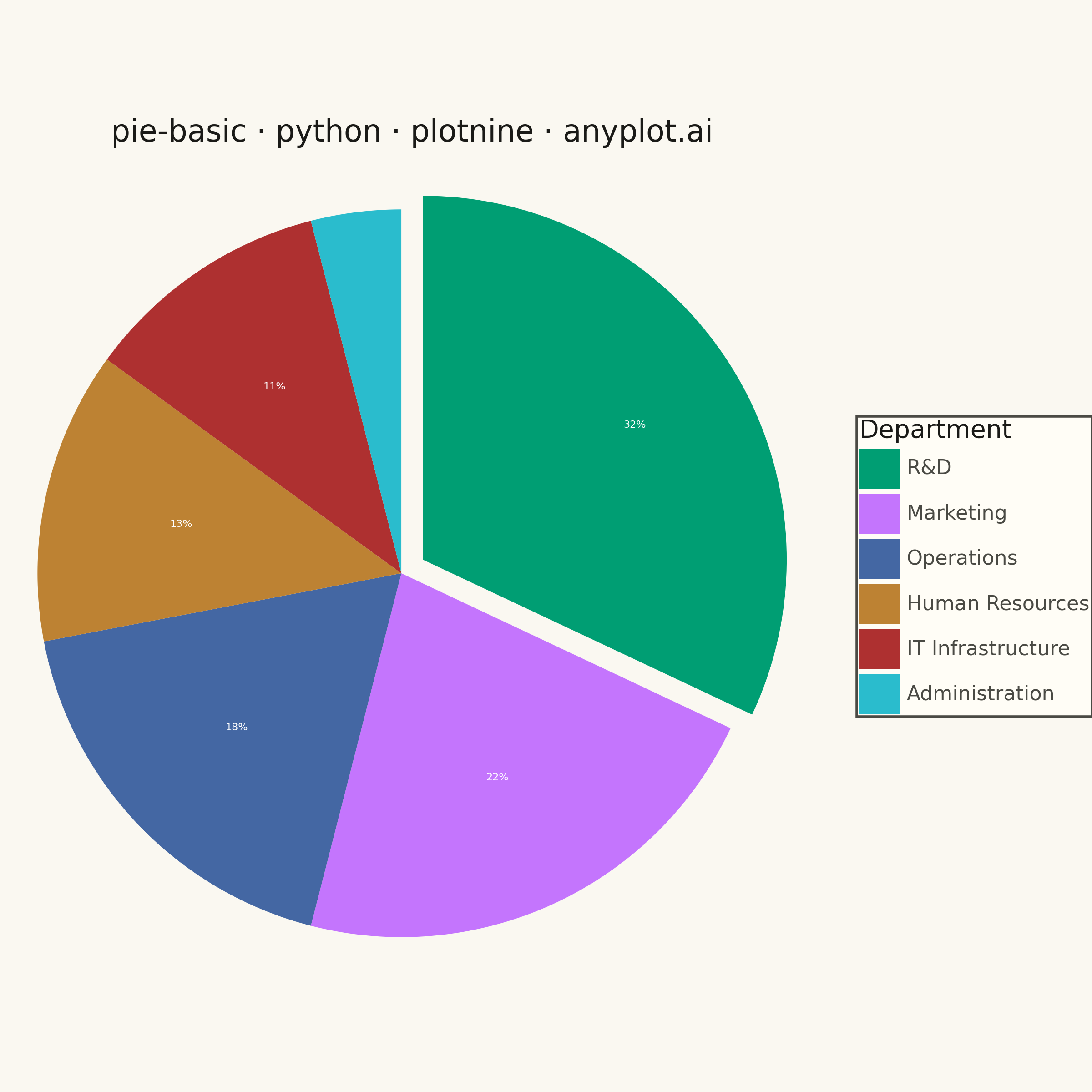
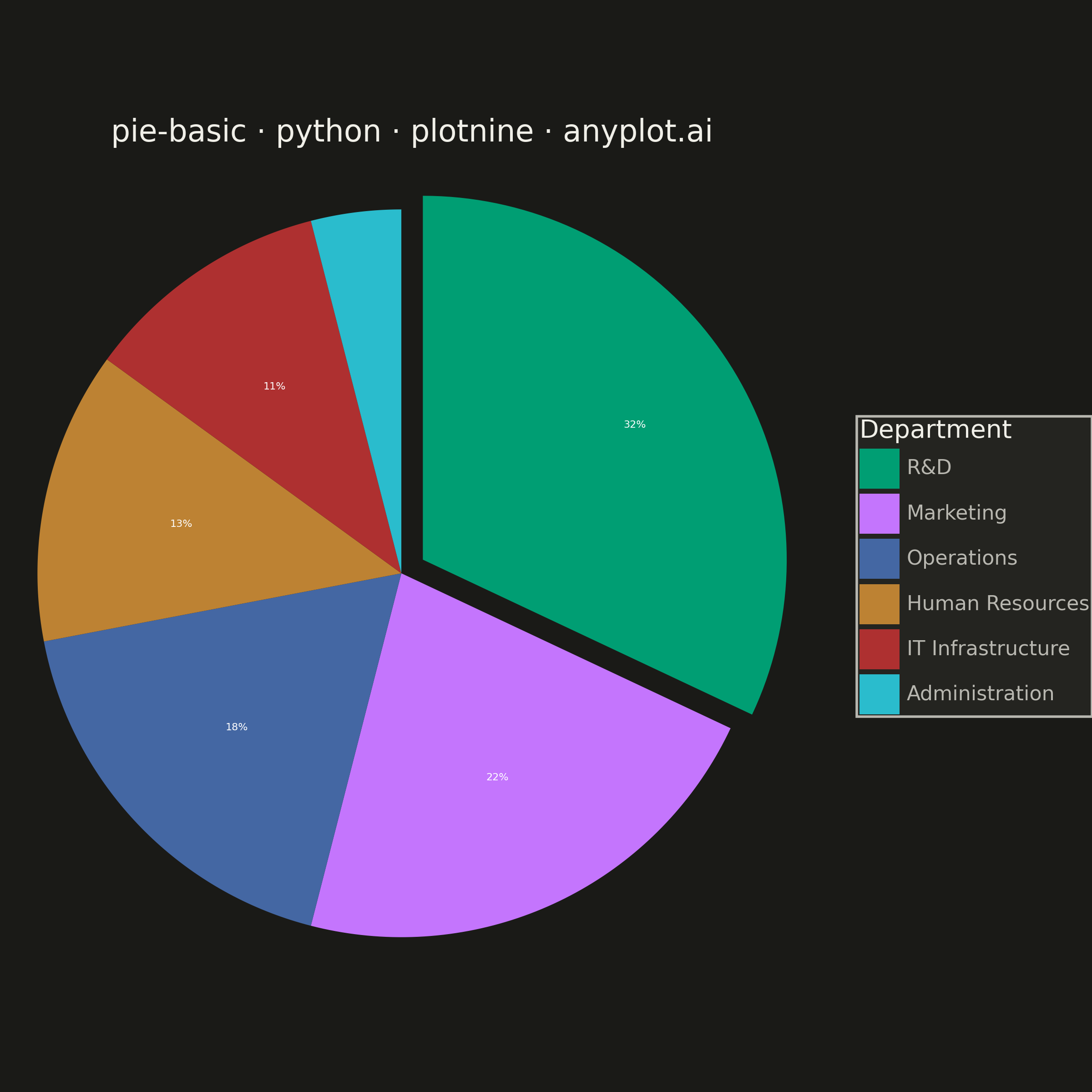
A pie chart showing proportions of categorical data as slices of a circle. Each slice represents a category's contribution to the whole, with the angle proportional to its value. Essential for visualizing parts-to-whole relationships in a simple, intuitive format.
""" anyplot.ai
pie-basic: Basic Pie Chart
Library: plotnine 0.15.4 | Python 3.13.13
Quality: 81/100 | Created: 2026-05-28
"""

import os
import sys


# Remove this file's directory from sys.path to prevent self-import
# (this file is named plotnine.py, same as the library being imported)
_dir = os.path.dirname(os.path.abspath(__file__))
sys.path = [p for p in sys.path if os.path.abspath(p) != _dir]

import matplotlib.pyplot as plt
import numpy as np
import pandas as pd
from plotnine import (
    aes,
    coord_equal,
    element_rect,
    element_text,
    geom_polygon,
    geom_text,
    ggplot,
    labs,
    scale_fill_manual,
    theme,
    theme_void,
)


# Theme tokens
THEME = os.getenv("ANYPLOT_THEME", "light")
PAGE_BG = "#FAF8F1" if THEME == "light" else "#1A1A17"
ELEVATED_BG = "#FFFDF6" if THEME == "light" else "#242420"
INK = "#1A1A17" if THEME == "light" else "#F0EFE8"
INK_SOFT = "#4A4A44" if THEME == "light" else "#B8B7B0"

IMPRINT_PALETTE = ["#009E73", "#C475FD", "#4467A3", "#BD8233", "#AE3030", "#2ABCCD"]

# Data — annual R&D budget allocation by department
departments = ["R&D", "Marketing", "Operations", "Human Resources", "IT Infrastructure", "Administration"]
budget_shares = [32, 22, 18, 13, 11, 4]
total = sum(budget_shares)

# Build pie wedge polygons starting at 12 o'clock, going clockwise
N_ARC = 80
EXPLODE_OFFSET = 0.07  # slight offset for the largest slice

wedge_rows = []
label_rows = []

cumsum = 0
for cat, val in zip(departments, budget_shares, strict=False):
    pct = val / total
    # Clockwise from 12 o'clock: start at π/2, decrease by pct * 2π
    start_angle = np.pi / 2 - 2 * np.pi * cumsum
    end_angle = np.pi / 2 - 2 * np.pi * (cumsum + pct)
    mid_angle = (start_angle + end_angle) / 2

    # Explode largest slice (R&D) outward along its bisector
    offset = EXPLODE_OFFSET if cat == "R&D" else 0.0
    dx, dy = offset * np.cos(mid_angle), offset * np.sin(mid_angle)

    # Wedge vertices: center → arc → (auto-closed by geom_polygon)
    angles = np.linspace(start_angle, end_angle, N_ARC)
    xs = np.concatenate([[0.0], np.cos(angles)]) + dx
    ys = np.concatenate([[0.0], np.sin(angles)]) + dy

    for xi, yi in zip(xs, ys, strict=False):
        wedge_rows.append({"x": xi, "y": yi, "category": cat})

    # Percentage label at 62% of radius, only show if slice >= 5%
    if pct >= 0.05:
        label_r = 0.62 + offset
        label_rows.append(
            {
                "x": label_r * np.cos(mid_angle) + dx,
                "y": label_r * np.sin(mid_angle) + dy,
                "label": f"{round(pct * 100)}%",
            }
        )

    cumsum += pct

df_wedges = pd.DataFrame(wedge_rows)
df_wedges["category"] = pd.Categorical(df_wedges["category"], categories=departments, ordered=True)
df_labels = pd.DataFrame(label_rows)

title = "pie-basic · python · plotnine · anyplot.ai"

# Plot
plot = (
    ggplot()
    + geom_polygon(data=df_wedges, mapping=aes(x="x", y="y", fill="category", group="category"))
    + geom_text(data=df_labels, mapping=aes(x="x", y="y", label="label"), size=4.0, color="white")
    + scale_fill_manual(values=IMPRINT_PALETTE)
    + coord_equal()
    + labs(title=title, fill="Department")
    + theme_void()
    + theme(
        figure_size=(6, 6),
        plot_background=element_rect(fill=PAGE_BG, color=PAGE_BG),
        panel_background=element_rect(fill=PAGE_BG),
        plot_title=element_text(size=12, color=INK, ha="center"),
        legend_text=element_text(size=8, color=INK_SOFT),
        legend_title=element_text(size=10, color=INK),
        legend_background=element_rect(fill=ELEVATED_BG, color=INK_SOFT),
        legend_key=element_rect(fill=ELEVATED_BG, color=ELEVATED_BG),
    )
)

# Draw and save — use subplots_adjust to give the right-side legend breathing room
fig = plot.draw()
fig.subplots_adjust(right=0.85)
fig.savefig(f"plot-{THEME}.png", dpi=400)
plt.close(fig)
Runnable source as JSON, for any HTTP client: https://api.anyplot.ai/specs/pie-basic/plotnine/code. Any spec id and library id listed in llms-full.txt fit the same URL shape; every URL below is complete and callable.
{
  "spec_id": "pie-basic",
  "language": "python",
  "library": "plotnine",
  "page": "https://anyplot.ai/pie-basic/python/plotnine",
  "hub": "https://anyplot.ai/pie-basic",
  "code_json": "https://api.anyplot.ai/specs/pie-basic/plotnine/code",
  "spec_json": "https://api.anyplot.ai/specs/pie-basic",
  "render_light_png": "https://storage.googleapis.com/anyplot-images/plots/pie-basic/python/plotnine/plot-light.png",
  "render_dark_png": "https://storage.googleapis.com/anyplot-images/plots/pie-basic/python/plotnine/plot-dark.png",
  "quality_score": 81.0,
  "license": "MIT",
  "guide": "https://anyplot.ai/llms.txt"
}
Part of Basic Pie Chart on anyplot.ai.