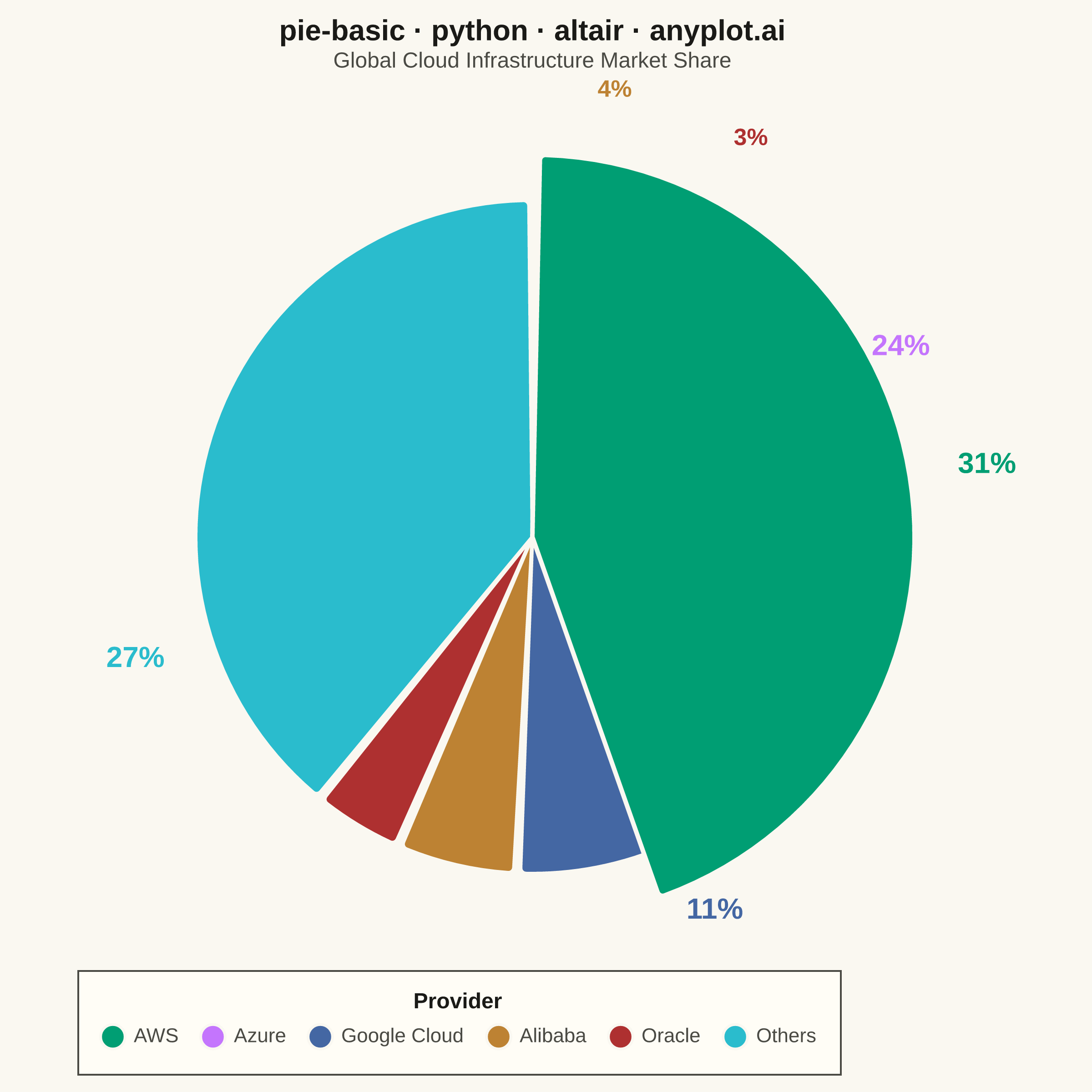
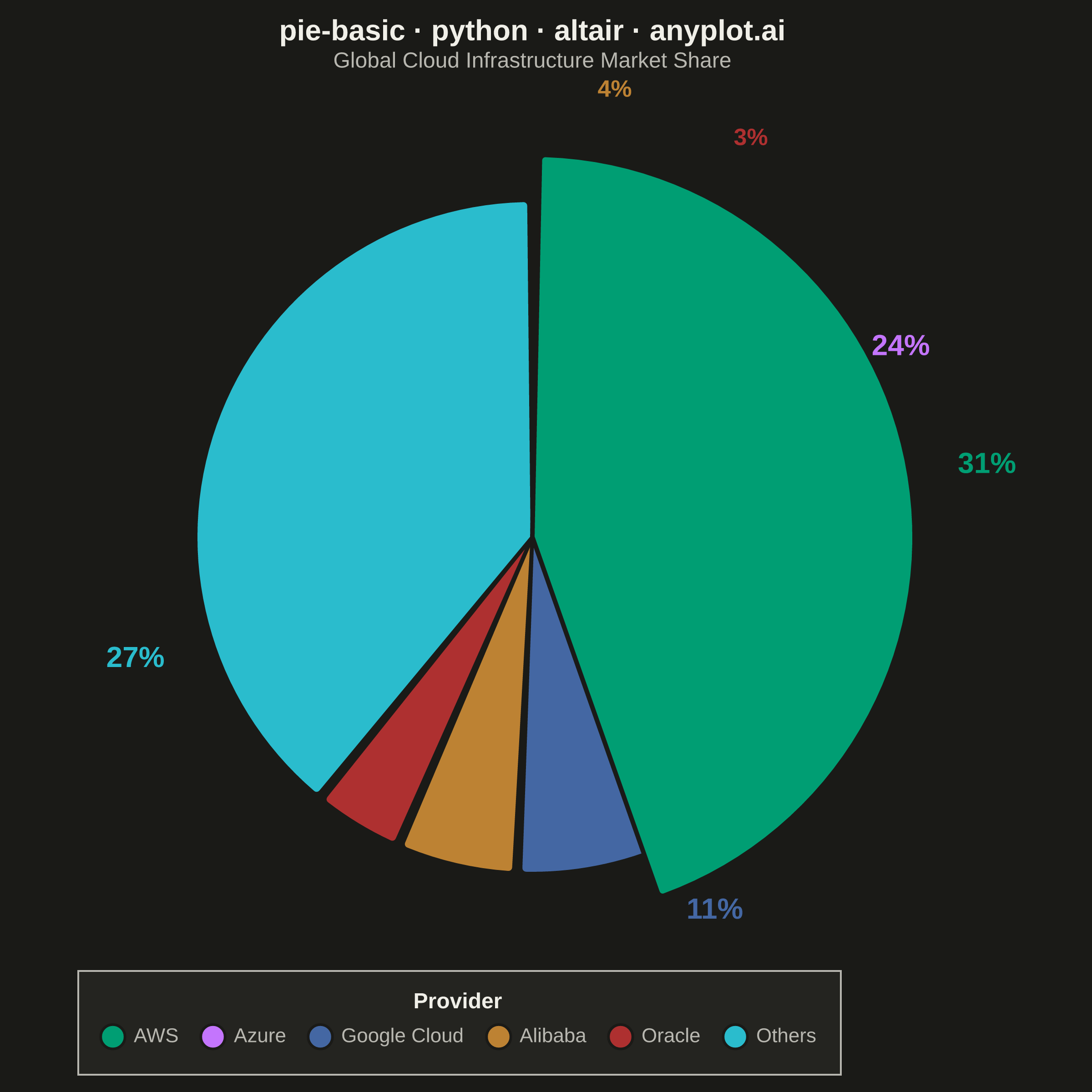
A pie chart showing proportions of categorical data as slices of a circle. Each slice represents a category's contribution to the whole, with the angle proportional to its value. Essential for visualizing parts-to-whole relationships in a simple, intuitive format.
""" anyplot.ai
pie-basic: Basic Pie Chart
Library: altair 6.1.0 | Python 3.13.13
Quality: 90/100 | Updated: 2026-05-28
"""

import os
import sys


# This file is named altair.py — same as the library. Remove the script
# directory from sys.path so Python finds the real altair package in the venv.
_here = os.path.normcase(os.path.abspath(os.path.dirname(__file__)))
sys.path[:] = [p for p in sys.path if os.path.normcase(os.path.abspath(p if p else os.getcwd())) != _here]

import altair as alt
import pandas as pd
from PIL import Image


# Theme tokens
THEME = os.getenv("ANYPLOT_THEME", "light")
PAGE_BG = "#FAF8F1" if THEME == "light" else "#1A1A17"
ELEVATED_BG = "#FFFDF6" if THEME == "light" else "#242420"
INK = "#1A1A17" if THEME == "light" else "#F0EFE8"
INK_SOFT = "#4A4A44" if THEME == "light" else "#B8B7B0"
INK_MUTED = "#6B6A63" if THEME == "light" else "#A8A79F"

IMPRINT_PALETTE = ["#009E73", "#C475FD", "#4467A3", "#BD8233", "#AE3030", "#2ABCCD"]

# Data — cloud infrastructure market share
data = pd.DataFrame(
    {"category": ["AWS", "Azure", "Google Cloud", "Alibaba", "Oracle", "Others"], "value": [31, 24, 11, 4, 3, 27]}
)

total = data["value"].sum()
data["percentage"] = data["value"] / total * 100
data["label"] = data["percentage"].apply(lambda x: f"{x:.0f}%")
data["order"] = range(len(data))

domain = data["category"].tolist()
color_scale = alt.Scale(domain=domain, range=IMPRINT_PALETTE)

title_str = "pie-basic · python · altair · anyplot.ai"

# Shared base encodings
base = alt.Chart(data).encode(
    theta=alt.Theta("value:Q", stack=True),
    order=alt.Order("order:O"),
    color=alt.Color(
        "category:N",
        scale=color_scale,
        legend=alt.Legend(
            title="Provider",
            titleFontSize=12,
            labelFontSize=11,
            symbolSize=180,
            orient="bottom",
            direction="horizontal",
            columns=6,
            titleAnchor="middle",
        ),
    ),
)

# Non-AWS pie slices
pie = (
    base.transform_filter(alt.datum.category != "AWS")
    .mark_arc(outerRadius=185, innerRadius=0, stroke=PAGE_BG, strokeWidth=2, padAngle=0.02, cornerRadius=3)
    .encode(tooltip=[alt.Tooltip("category:N", title="Provider"), alt.Tooltip("value:Q", title="Market Share (%)")])
)

# Exploded AWS slice — emphasises the market leader
exploded_aws = (
    base.transform_filter(alt.datum.category == "AWS")
    .mark_arc(
        outerRadius=185, innerRadius=0, radiusOffset=25, stroke=PAGE_BG, strokeWidth=2.5, padAngle=0.04, cornerRadius=3
    )
    .encode(tooltip=[alt.Tooltip("category:N", title="Provider"), alt.Tooltip("value:Q", title="Market Share (%)")])
)

# Percentage labels for slices ≥5% at standard radius
text_main = (
    base.transform_filter((alt.datum.category != "AWS") & (alt.datum.percentage >= 5))
    .mark_text(radius=228, fontSize=16, fontWeight="bold", color=INK)
    .encode(text="label:N")
)

# Small slices (<5%) pushed further out to reduce crowding between 3% and 4% labels
text_small = (
    base.transform_filter((alt.datum.category != "AWS") & (alt.datum.percentage < 5))
    .mark_text(radius=250, fontSize=13, fontWeight="bold", color=INK_SOFT)
    .encode(text="label:N")
)

# AWS label with matching radiusOffset
text_aws = (
    base.transform_filter(alt.datum.category == "AWS")
    .mark_text(radius=228, radiusOffset=25, fontSize=16, fontWeight="bold", color=INK)
    .encode(text="label:N")
)

chart = (
    alt.layer(pie, exploded_aws, text_main, text_small, text_aws)
    .properties(
        width=500,
        height=460,
        background=PAGE_BG,
        title=alt.Title(
            text=title_str,
            subtitle="Global Cloud Infrastructure Market Share",
            fontSize=16,
            subtitleFontSize=12,
            subtitleColor=INK_SOFT,
            anchor="middle",
            color=INK,
        ),
    )
    .configure_view(fill=PAGE_BG, strokeWidth=0)
    .configure_legend(
        fillColor=ELEVATED_BG, strokeColor=INK_SOFT, labelColor=INK_SOFT, titleColor=INK, padding=12, offset=8
    )
)

# Save PNG targeting 2400×2400 (square — pie chart)
chart.save(f"plot-{THEME}.png", scale_factor=4.0)

# PAD-only-to-target (2400×2400) — DO NOT crop
TW, TH = 2400, 2400
PAGE_BG_RGB = tuple(int(PAGE_BG.lstrip("#")[i : i + 2], 16) for i in (0, 2, 4))
_img = Image.open(f"plot-{THEME}.png").convert("RGB")
_w, _h = _img.size
if _w > TW or _h > TH:
    raise SystemExit(
        f"altair vl-convert produced {_w}×{_h}, exceeds target {TW}×{TH}. "
        f"Shrink chart .properties(width=, height=) values and re-render."
    )
if _w < TW or _h < TH:
    _canvas = Image.new("RGB", (TW, TH), PAGE_BG_RGB)
    _canvas.paste(_img, ((TW - _w) // 2, (TH - _h) // 2))
    _canvas.save(f"plot-{THEME}.png")

chart.save(f"plot-{THEME}.html")
Runnable source as JSON, for any HTTP client: https://api.anyplot.ai/specs/pie-basic/altair/code. Any spec id and library id listed in llms-full.txt fit the same URL shape; every URL below is complete and callable.
{
  "spec_id": "pie-basic",
  "language": "python",
  "library": "altair",
  "page": "https://anyplot.ai/pie-basic/python/altair",
  "hub": "https://anyplot.ai/pie-basic",
  "code_json": "https://api.anyplot.ai/specs/pie-basic/altair/code",
  "spec_json": "https://api.anyplot.ai/specs/pie-basic",
  "render_light_png": "https://storage.googleapis.com/anyplot-images/plots/pie-basic/python/altair/plot-light.png",
  "render_dark_png": "https://storage.googleapis.com/anyplot-images/plots/pie-basic/python/altair/plot-dark.png",
  "interactive_light_html": "https://storage.googleapis.com/anyplot-images/plots/pie-basic/python/altair/plot-light.html",
  "interactive_dark_html": "https://storage.googleapis.com/anyplot-images/plots/pie-basic/python/altair/plot-dark.html",
  "quality_score": 90.0,
  "license": "MIT",
  "guide": "https://anyplot.ai/llms.txt"
}
Part of Basic Pie Chart on anyplot.ai.