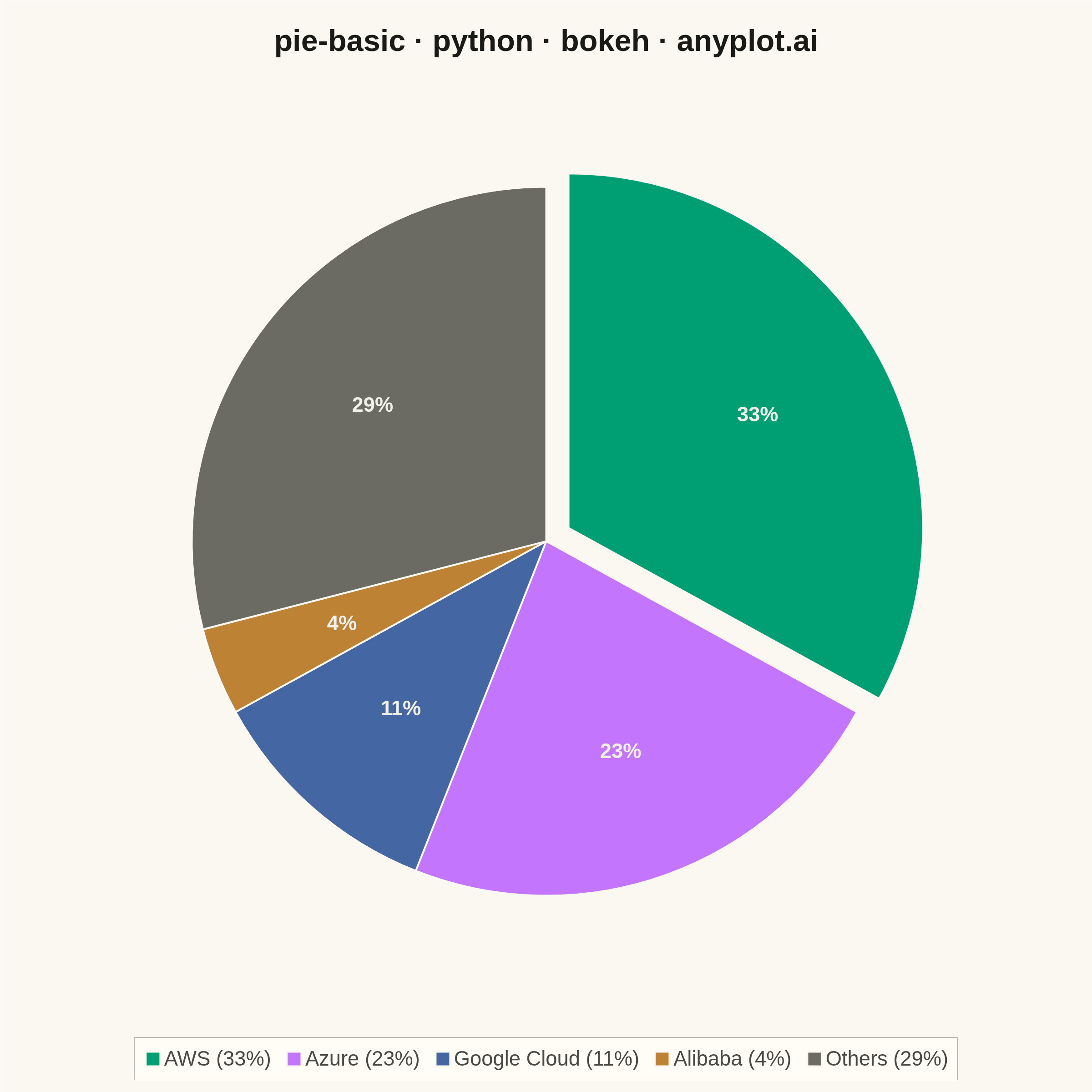
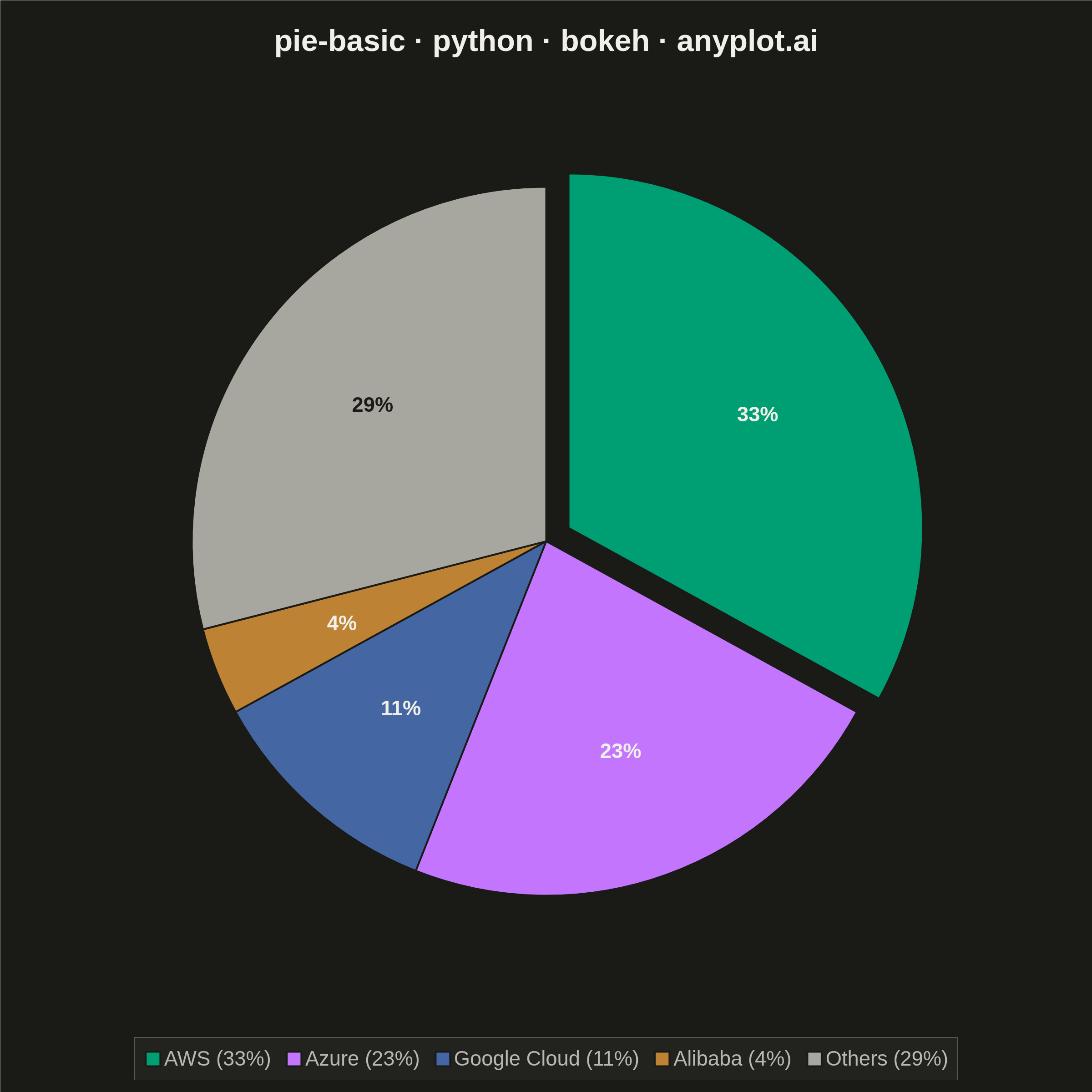
A pie chart showing proportions of categorical data as slices of a circle. Each slice represents a category's contribution to the whole, with the angle proportional to its value. Essential for visualizing parts-to-whole relationships in a simple, intuitive format.
""" anyplot.ai
pie-basic: Basic Pie Chart
Library: bokeh 3.9.0 | Python 3.13.13
Quality: 89/100 | Updated: 2026-05-28
"""

import io
import math
import os
import time
from pathlib import Path

from bokeh.io import output_file, save
from bokeh.models import ColumnDataSource, Label, Legend, LegendItem
from bokeh.plotting import figure
from PIL import Image
from selenium import webdriver
from selenium.webdriver.chrome.options import Options


# Theme
THEME = os.getenv("ANYPLOT_THEME", "light")
PAGE_BG = "#FAF8F1" if THEME == "light" else "#1A1A17"
ELEVATED_BG = "#FFFDF6" if THEME == "light" else "#242420"
INK = "#1A1A17" if THEME == "light" else "#F0EFE8"
INK_SOFT = "#4A4A44" if THEME == "light" else "#B8B7B0"
INK_MUTED = "#6B6A63" if THEME == "light" else "#A8A79F"

IMPRINT_PALETTE = ["#009E73", "#C475FD", "#4467A3", "#BD8233", "#AE3030", "#2ABCCD", "#954477", "#99B314"]

# Data - Cloud infrastructure market share (2024)
categories = ["AWS", "Azure", "Google Cloud", "Alibaba", "Others"]
values = [33, 23, 11, 4, 29]
# First 4 use canonical Imprint palette order; "Others" uses semantic muted anchor
colors = [IMPRINT_PALETTE[0], IMPRINT_PALETTE[1], IMPRINT_PALETTE[2], IMPRINT_PALETTE[3], INK_MUTED]

# Compute angles and percentages
total = sum(values)
percentages = [v / total * 100 for v in values]
angles = [v / total * 2 * math.pi for v in values]

# Start/end angles (clockwise from top)
start_angles = []
end_angles = []
current = math.pi / 2
for a in angles:
    start_angles.append(current)
    current -= a
    end_angles.append(current)

mid_angles = [(s + e) / 2 for s, e in zip(start_angles, end_angles, strict=True)]

# Explode the largest slice (AWS) for emphasis
explode_idx = 0
explode_r = 0.06
offsets_x = [0.0] * len(categories)
offsets_y = [0.0] * len(categories)
offsets_x[explode_idx] = explode_r * math.cos(mid_angles[explode_idx])
offsets_y[explode_idx] = explode_r * math.sin(mid_angles[explode_idx])

# Title sizing — scale down only if longer than 67-char baseline
title = "pie-basic · python · bokeh · anyplot.ai"
title_pt = round(50 * (67 / len(title))) if len(title) > 67 else 50

# Figure — 2400×2400 square (canonical for symmetric plots like pie charts)
W, H = 2400, 2400
radius = 0.82

p = figure(
    width=W,
    height=H,
    title=title,
    x_range=(-1.2, 1.2),
    y_range=(-1.05, 1.1),
    toolbar_location=None,
    min_border_bottom=200,
    min_border_left=60,
    min_border_top=130,
    min_border_right=60,
)

# Wedges
source = ColumnDataSource(
    data={"x": offsets_x, "y": offsets_y, "start": start_angles, "end": end_angles, "color": colors}
)
renderers = p.wedge(
    x="x",
    y="y",
    radius=radius,
    start_angle="start",
    end_angle="end",
    direction="clock",
    fill_color="color",
    line_color=PAGE_BG,
    line_width=4,
    source=source,
)

# Percentage labels — near-white on all palette colors (all medium-dark)
# except ANYPLOT_MUTED in dark theme which is lighter and needs dark text
slice_label_colors = ["#F0EFE8"] * 4 + ["#1A1A17" if THEME == "dark" else "#F0EFE8"]

label_r = radius * 0.62
for i in range(len(categories)):
    lx = label_r * math.cos(mid_angles[i]) + offsets_x[i]
    ly = label_r * math.sin(mid_angles[i]) + offsets_y[i]
    p.add_layout(
        Label(
            x=lx,
            y=ly,
            text=f"{percentages[i]:.0f}%",
            text_font_size="34pt",
            text_color=slice_label_colors[i],
            text_font_style="bold",
            text_align="center",
            text_baseline="middle",
        )
    )

# Legend with category names and percentages
legend_items = [
    LegendItem(label=f"{categories[i]} ({percentages[i]:.0f}%)", renderers=[renderers], index=i)
    for i in range(len(categories))
]
legend = Legend(
    items=legend_items,
    location="center",
    orientation="horizontal",
    label_text_font_size="34pt",
    label_text_color=INK_SOFT,
    glyph_width=40,
    glyph_height=40,
    spacing=30,
    padding=20,
    background_fill_color=ELEVATED_BG,
    background_fill_alpha=0.9,
    border_line_color=INK_SOFT,
)
p.add_layout(legend, "below")

# Styling
p.title.text_font_size = f"{title_pt}pt"
p.title.align = "center"
p.title.text_color = INK
p.axis.visible = False
p.grid.visible = False
p.outline_line_color = PAGE_BG
p.background_fill_color = PAGE_BG
p.border_fill_color = PAGE_BG

# Save HTML (interactive catalog artifact)
output_file(f"plot-{THEME}.html")
save(p)

# Screenshot with headless Chrome — window is H+200 tall so bokeh canvas fills
# exactly W×H; PIL crops to the target rect before saving.
opts = Options()
for arg in (
    "--headless=new",
    "--no-sandbox",
    "--disable-dev-shm-usage",
    "--disable-gpu",
    f"--window-size={W},{H + 200}",
    "--hide-scrollbars",
    "--force-device-scale-factor=1",
):
    opts.add_argument(arg)
driver = webdriver.Chrome(options=opts)
driver.set_window_size(W, H + 200)
driver.get(f"file://{Path(f'plot-{THEME}.html').resolve()}")
time.sleep(3)
raw = driver.get_screenshot_as_png()
driver.quit()
Image.open(io.BytesIO(raw)).crop((0, 0, W, H)).save(f"plot-{THEME}.png")
Runnable source as JSON, for any HTTP client: https://api.anyplot.ai/specs/pie-basic/bokeh/code. Any spec id and library id listed in llms-full.txt fit the same URL shape; every URL below is complete and callable.
{
  "spec_id": "pie-basic",
  "language": "python",
  "library": "bokeh",
  "page": "https://anyplot.ai/pie-basic/python/bokeh",
  "hub": "https://anyplot.ai/pie-basic",
  "code_json": "https://api.anyplot.ai/specs/pie-basic/bokeh/code",
  "spec_json": "https://api.anyplot.ai/specs/pie-basic",
  "render_light_png": "https://storage.googleapis.com/anyplot-images/plots/pie-basic/python/bokeh/plot-light.png",
  "render_dark_png": "https://storage.googleapis.com/anyplot-images/plots/pie-basic/python/bokeh/plot-dark.png",
  "interactive_light_html": "https://storage.googleapis.com/anyplot-images/plots/pie-basic/python/bokeh/plot-light.html",
  "interactive_dark_html": "https://storage.googleapis.com/anyplot-images/plots/pie-basic/python/bokeh/plot-dark.html",
  "quality_score": 89.0,
  "license": "MIT",
  "guide": "https://anyplot.ai/llms.txt"
}
Part of Basic Pie Chart on anyplot.ai.