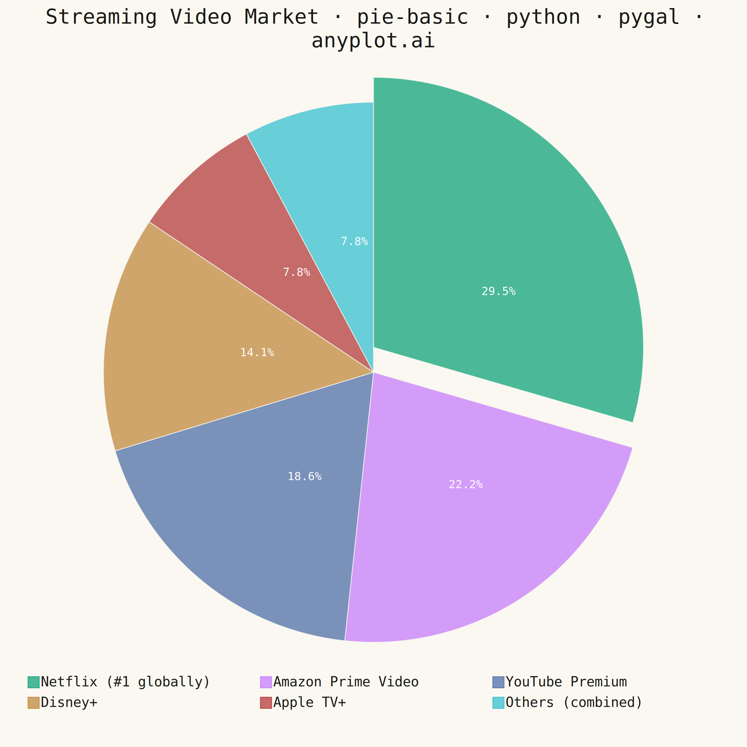
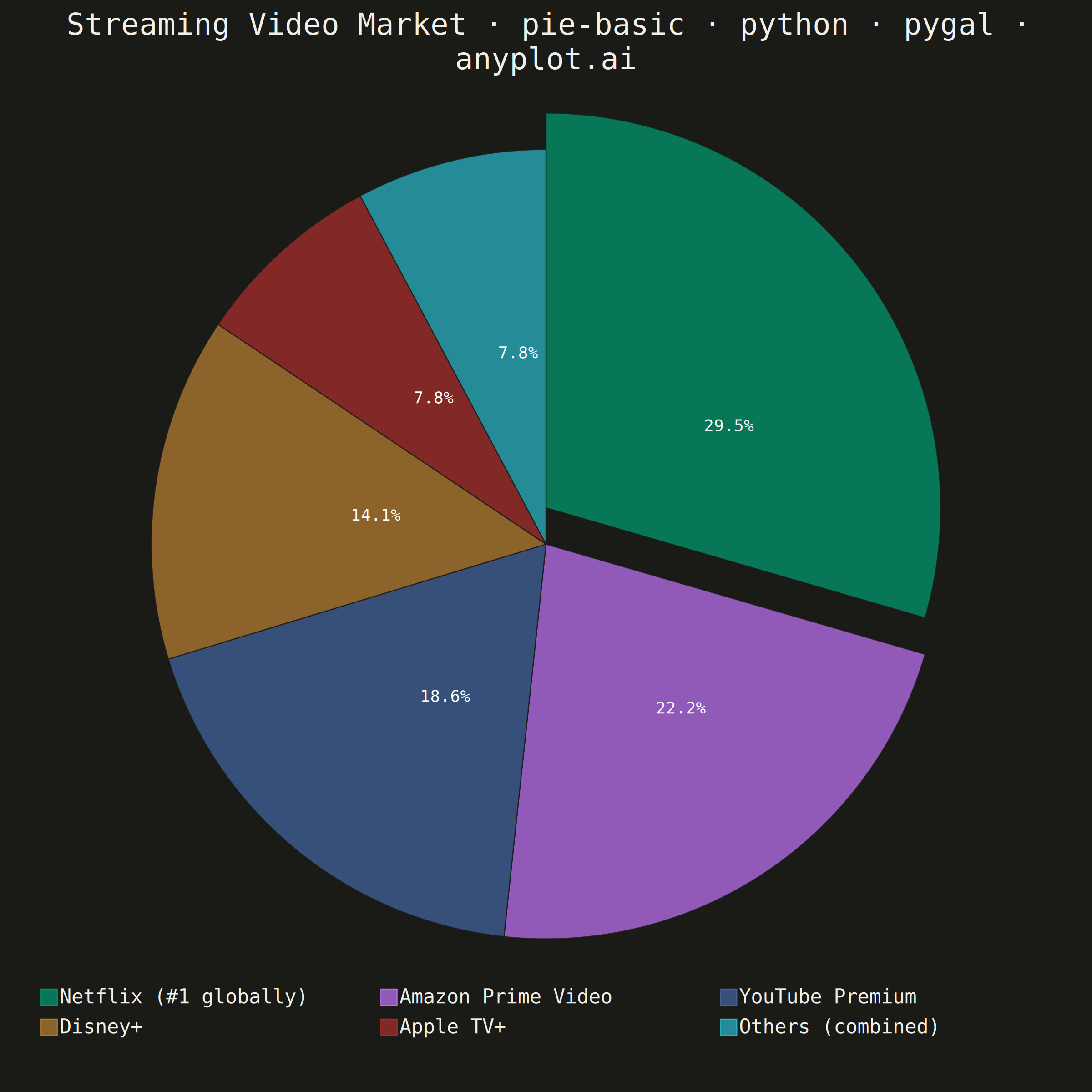
A pie chart showing proportions of categorical data as slices of a circle. Each slice represents a category's contribution to the whole, with the angle proportional to its value. Essential for visualizing parts-to-whole relationships in a simple, intuitive format.
""" anyplot.ai
pie-basic: Basic Pie Chart
Library: pygal 3.1.0 | Python 3.13.13
Quality: 87/100 | Updated: 2026-05-28
"""

import os

import pygal
from pygal.style import Style


# Theme tokens
THEME = os.getenv("ANYPLOT_THEME", "light")
PAGE_BG = "#FAF8F1" if THEME == "light" else "#1A1A17"
INK = "#1A1A17" if THEME == "light" else "#F0EFE8"
INK_MUTED = "#6B6A63" if THEME == "light" else "#A8A79F"

IMPRINT_PALETTE = ("#009E73", "#C475FD", "#4467A3", "#BD8233", "#AE3030", "#2ABCCD")

# Data — global streaming video platform market share (2024 estimates)
categories = [
    ("Netflix", 29.5),
    ("Amazon Prime Video", 22.2),
    ("YouTube Premium", 18.6),
    ("Disney+", 14.1),
    ("Apple TV+", 7.8),
    ("Others", 7.8),
]

title = "Streaming Video Market · pie-basic · python · pygal · anyplot.ai"
n = len(title)
title_font_size = max(44, round(66 * 67 / n)) if n > 67 else 66

custom_style = Style(
    background=PAGE_BG,
    plot_background=PAGE_BG,
    foreground=INK,
    foreground_strong=INK,
    foreground_subtle=INK_MUTED,
    colors=IMPRINT_PALETTE,
    title_font_size=title_font_size,
    label_font_size=56,
    major_label_font_size=44,
    legend_font_size=44,
    value_font_size=36,
    value_colors=("#FFFFFF",) * len(categories),
    stroke_width=2.5,
)

chart = pygal.Pie(
    width=2400,
    height=2400,
    style=custom_style,
    title=title,
    inner_radius=0,
    legend_at_bottom=True,
    legend_at_bottom_columns=3,
    legend_box_size=36,
    print_values=True,
    print_labels=False,
    print_values_position="center",
    value_formatter=lambda x: f"{x:.1f}%",
    margin=80,
    margin_bottom=120,
    truncate_legend=-1,
)

# Enriched legend names carry narrative context
legend_names = {"Netflix": "Netflix (#1 globally)", "Others": "Others (combined)"}

for service, value in categories:
    # Theme-adaptive stroke creates a clean gap between slices in both themes
    slice_data = {"value": value, "style": f"stroke: {PAGE_BG}; stroke-width: 4"}
    # Explode the largest slice (Netflix) prominently to signal market leadership
    if service == "Netflix":
        slice_data["node"] = {"transform": "translate(0, -80)"}

    name = legend_names.get(service, service)
    chart.add(name, [slice_data])

chart.render_to_png(f"plot-{THEME}.png")
with open(f"plot-{THEME}.html", "wb") as f:
    f.write(chart.render())
Runnable source as JSON, for any HTTP client: https://api.anyplot.ai/specs/pie-basic/pygal/code. Any spec id and library id listed in llms-full.txt fit the same URL shape; every URL below is complete and callable.
{
  "spec_id": "pie-basic",
  "language": "python",
  "library": "pygal",
  "page": "https://anyplot.ai/pie-basic/python/pygal",
  "hub": "https://anyplot.ai/pie-basic",
  "code_json": "https://api.anyplot.ai/specs/pie-basic/pygal/code",
  "spec_json": "https://api.anyplot.ai/specs/pie-basic",
  "render_light_png": "https://storage.googleapis.com/anyplot-images/plots/pie-basic/python/pygal/plot-light.png",
  "render_dark_png": "https://storage.googleapis.com/anyplot-images/plots/pie-basic/python/pygal/plot-dark.png",
  "interactive_light_html": "https://storage.googleapis.com/anyplot-images/plots/pie-basic/python/pygal/plot-light.html",
  "interactive_dark_html": "https://storage.googleapis.com/anyplot-images/plots/pie-basic/python/pygal/plot-dark.html",
  "quality_score": 87.0,
  "license": "MIT",
  "guide": "https://anyplot.ai/llms.txt"
}
Part of Basic Pie Chart on anyplot.ai.