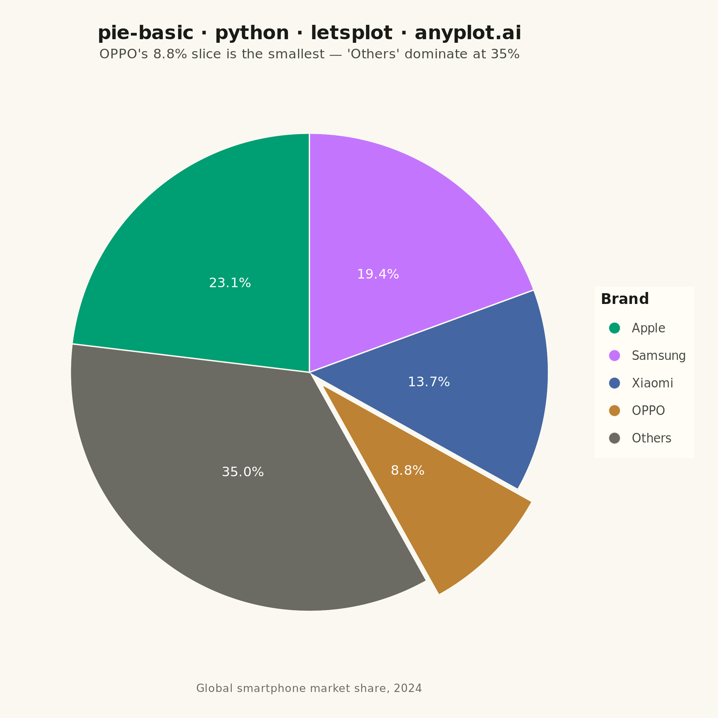
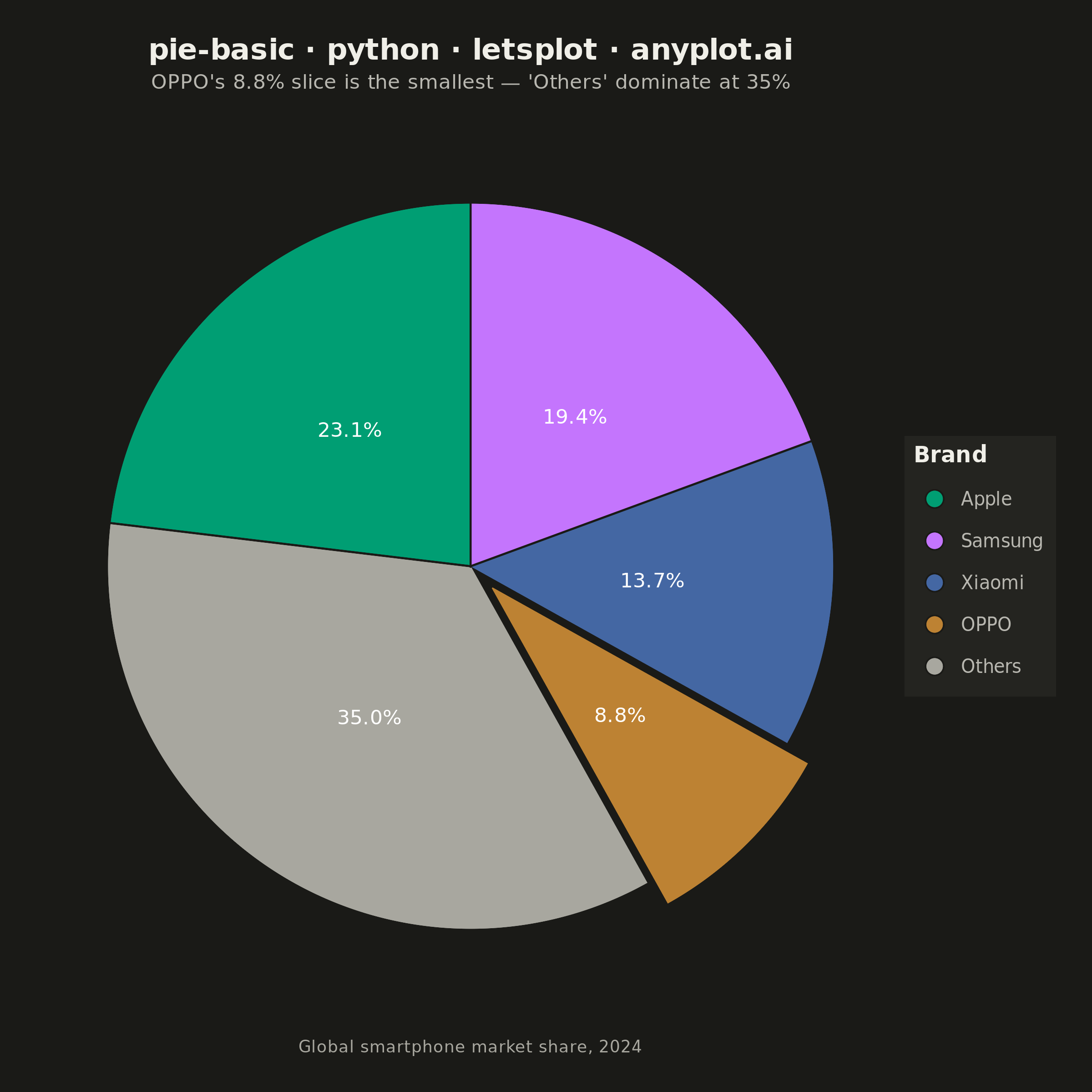
A pie chart showing proportions of categorical data as slices of a circle. Each slice represents a category's contribution to the whole, with the angle proportional to its value. Essential for visualizing parts-to-whole relationships in a simple, intuitive format.
""" anyplot.ai
pie-basic: Basic Pie Chart
Library: letsplot 4.10.1 | Python 3.13.13
Quality: 88/100 | Updated: 2026-05-28
"""

import os

from lets_plot import (
    LetsPlot,
    aes,
    element_rect,
    element_text,
    geom_pie,
    ggplot,
    ggsave,
    ggsize,
    labs,
    layer_labels,
    layer_tooltips,
    scale_fill_manual,
    theme,
    theme_void,
)


LetsPlot.setup_html()

# Theme tokens
THEME = os.getenv("ANYPLOT_THEME", "light")
PAGE_BG = "#FAF8F1" if THEME == "light" else "#1A1A17"
ELEVATED_BG = "#FFFDF6" if THEME == "light" else "#242420"
INK = "#1A1A17" if THEME == "light" else "#F0EFE8"
INK_SOFT = "#4A4A44" if THEME == "light" else "#B8B7B0"
ANYPLOT_MUTED = "#6B6A63" if THEME == "light" else "#A8A79F"

# anyplot categorical palette — first series always #009E73
IMPRINT_PALETTE = ["#009E73", "#C475FD", "#4467A3", "#BD8233", "#AE3030", "#2ABCCD", "#954477", "#99B314"]

# Data - Global smartphone market share (2024)
data = {
    "company": ["Apple", "Samsung", "Xiaomi", "OPPO", "Others"],
    "share": [23.1, 19.4, 13.7, 8.8, 35.0],
    "explode": [0.0, 0.0, 0.0, 0.08, 0.0],
}

# Colors: anyplot positions 1–4, muted for "Others" (rest category)
colors = [IMPRINT_PALETTE[0], IMPRINT_PALETTE[1], IMPRINT_PALETTE[2], IMPRINT_PALETTE[3], ANYPLOT_MUTED]

# Title — minimal required format
title = "pie-basic · python · letsplot · anyplot.ai"
title_size = 16

# Rich HTML tooltips — letsplot-specific interactivity
pie_tooltips = layer_tooltips().title("@company").format("@share", "{.1f}%").line("Market share|@share")

# Plot — square canvas (600×600 × scale=4 = 2400×2400 px)
plot = (
    ggplot(data)
    + geom_pie(
        aes(slice="share", fill="company", explode="explode"),
        stat="identity",
        size=40,
        hole=0,
        stroke=1.5,
        stroke_side="both",
        color=PAGE_BG,
        spacer_width=1.0,
        spacer_color=PAGE_BG,
        labels=layer_labels().line("@{share}").format("share", "{.1f}%").size(11),
        tooltips=pie_tooltips,
    )
    + scale_fill_manual(values=colors)
    + labs(
        title=title,
        subtitle="OPPO's 8.8% slice is the smallest — 'Others' dominate at 35%",
        fill="Brand",
        caption="Global smartphone market share, 2024",
    )
    + ggsize(600, 600)
    + theme_void()
    + theme(
        plot_background=element_rect(fill=PAGE_BG, color=PAGE_BG),
        plot_title=element_text(size=title_size, hjust=0.5, face="bold", color=INK),
        plot_subtitle=element_text(size=11, hjust=0.5, color=INK_SOFT),
        plot_caption=element_text(size=9, hjust=0.5, color=ANYPLOT_MUTED),
        legend_title=element_text(size=12, face="bold", color=INK),
        legend_text=element_text(size=10, color=INK_SOFT),
        legend_background=element_rect(fill=ELEVATED_BG, color=INK_SOFT),
        plot_margin=[20, 20, 20, 20],
        legend_position="right",
    )
)

# Save
ggsave(plot, f"plot-{THEME}.png", path=".", scale=4)
ggsave(plot, f"plot-{THEME}.html", path=".")
Runnable source as JSON, for any HTTP client: https://api.anyplot.ai/specs/pie-basic/letsplot/code. Any spec id and library id listed in llms-full.txt fit the same URL shape; every URL below is complete and callable.
{
  "spec_id": "pie-basic",
  "language": "python",
  "library": "letsplot",
  "page": "https://anyplot.ai/pie-basic/python/letsplot",
  "hub": "https://anyplot.ai/pie-basic",
  "code_json": "https://api.anyplot.ai/specs/pie-basic/letsplot/code",
  "spec_json": "https://api.anyplot.ai/specs/pie-basic",
  "render_light_png": "https://storage.googleapis.com/anyplot-images/plots/pie-basic/python/letsplot/plot-light.png",
  "render_dark_png": "https://storage.googleapis.com/anyplot-images/plots/pie-basic/python/letsplot/plot-dark.png",
  "interactive_light_html": "https://storage.googleapis.com/anyplot-images/plots/pie-basic/python/letsplot/plot-light.html",
  "interactive_dark_html": "https://storage.googleapis.com/anyplot-images/plots/pie-basic/python/letsplot/plot-dark.html",
  "quality_score": 88.0,
  "license": "MIT",
  "guide": "https://anyplot.ai/llms.txt"
}
Part of Basic Pie Chart on anyplot.ai.