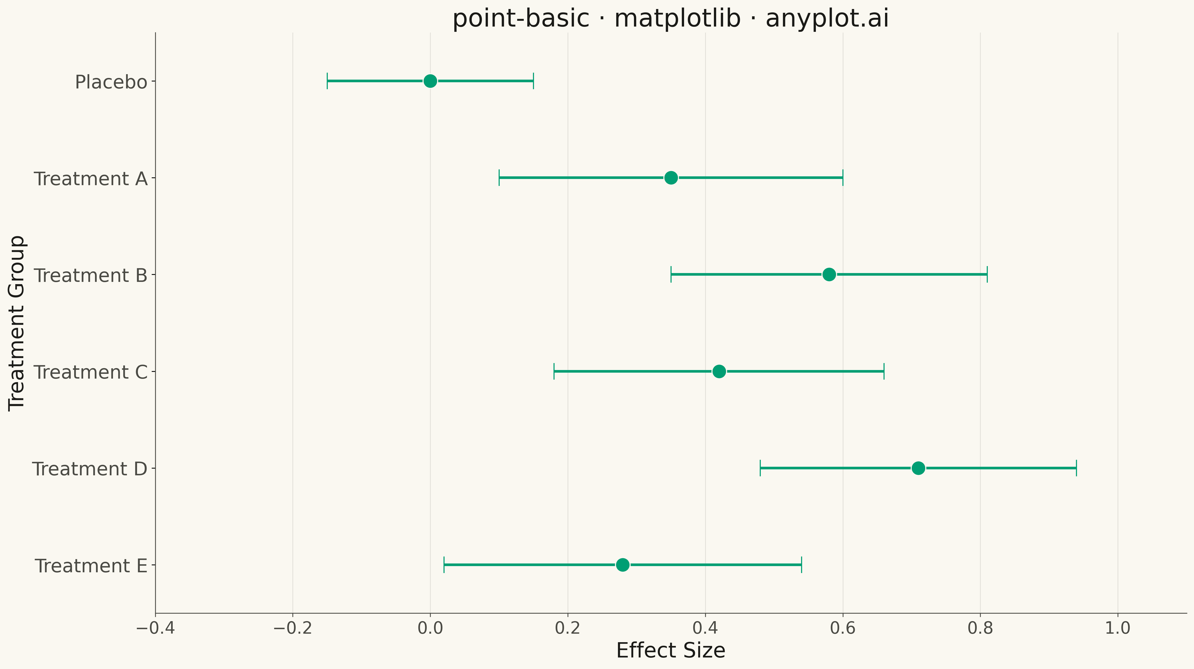
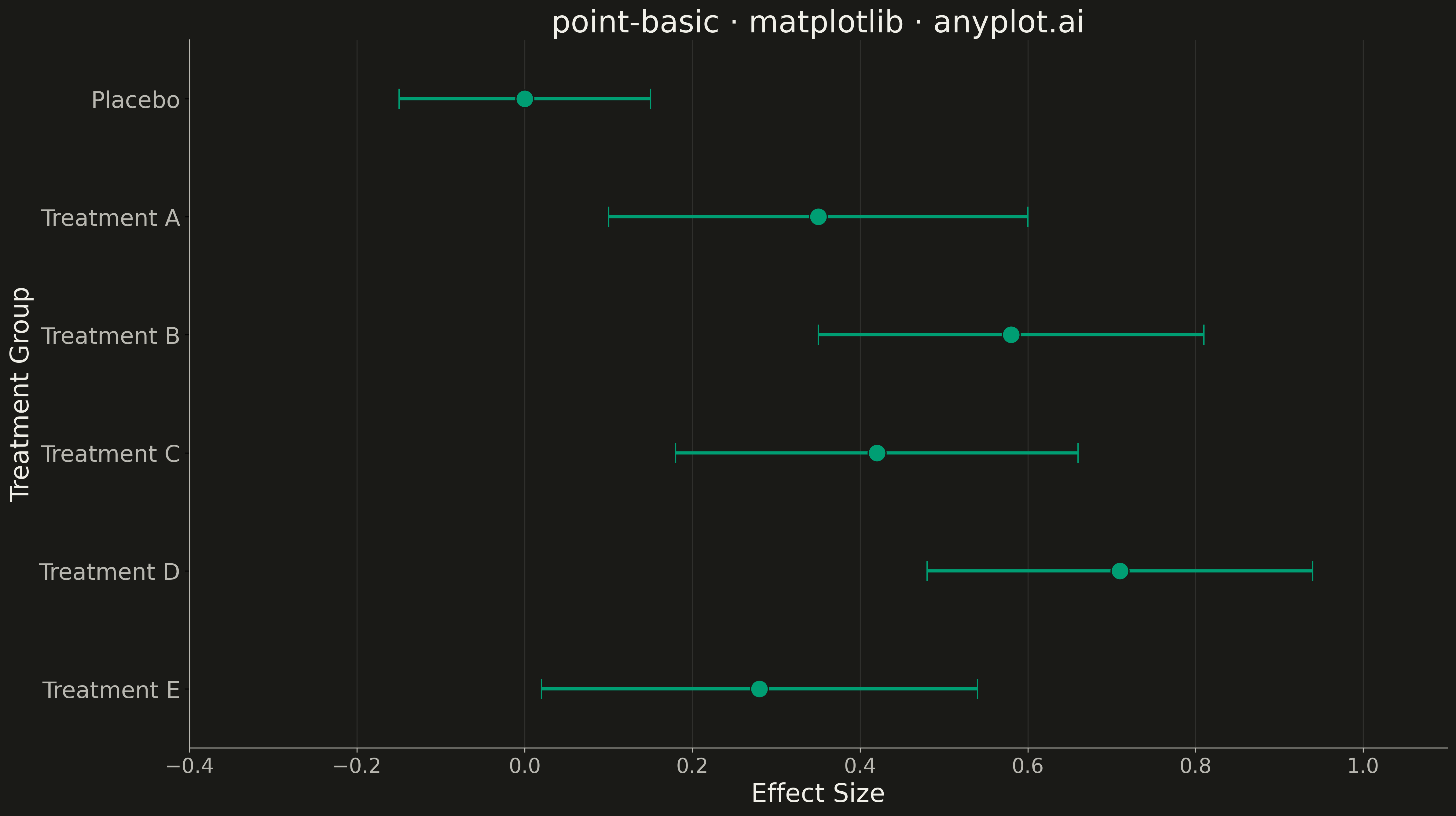
A point estimate plot displays central tendency values (means, medians, or other estimates) with confidence intervals or error bars for each category. Each point represents the estimate, and the lines extending from it show the uncertainty range.
""" anyplot.ai
point-basic: Point Estimate Plot
Library: matplotlib 3.10.9 | Python 3.13.13
Quality: 86/100 | Updated: 2026-05-11
"""

import os

import matplotlib.pyplot as plt
import numpy as np


# Theme tokens
THEME = os.getenv("ANYPLOT_THEME", "light")
PAGE_BG = "#FAF8F1" if THEME == "light" else "#1A1A17"
ELEVATED_BG = "#FFFDF6" if THEME == "light" else "#242420"
INK = "#1A1A17" if THEME == "light" else "#F0EFE8"
INK_SOFT = "#4A4A44" if THEME == "light" else "#B8B7B0"
BRAND = "#009E73"  # Okabe-Ito position 1

# Data - Clinical trial treatment effect estimates with 95% confidence intervals
np.random.seed(42)
treatments = ["Placebo", "Treatment A", "Treatment B", "Treatment C", "Treatment D", "Treatment E"]

# Simulated effect sizes (standardized mean differences) with confidence intervals
estimates = np.array([0.0, 0.35, 0.58, 0.42, 0.71, 0.28])
ci_lower = np.array([-0.15, 0.10, 0.35, 0.18, 0.48, 0.02])
ci_upper = np.array([0.15, 0.60, 0.81, 0.66, 0.94, 0.54])

# Calculate errors for errorbar (asymmetric)
lower_errors = estimates - ci_lower
upper_errors = ci_upper - estimates

# Plot
fig, ax = plt.subplots(figsize=(16, 9), facecolor=PAGE_BG)
ax.set_facecolor(PAGE_BG)

# Create horizontal point estimate plot with error bars
y_positions = np.arange(len(treatments))

ax.errorbar(
    estimates,
    y_positions,
    xerr=[lower_errors, upper_errors],
    fmt="o",
    color=BRAND,
    markersize=14,
    markeredgecolor=PAGE_BG,
    markeredgewidth=1,
    capsize=8,
    capthick=2.5,
    elinewidth=2.5,
    ecolor=BRAND,
)

# Styling
ax.set_yticks(y_positions)
ax.set_yticklabels(treatments, fontsize=18, color=INK_SOFT)
ax.set_xlabel("Effect Size", fontsize=20, color=INK)
ax.set_ylabel("Treatment Group", fontsize=20, color=INK)
ax.set_title("point-basic · matplotlib · anyplot.ai", fontsize=24, fontweight="medium", color=INK)
ax.tick_params(axis="x", labelsize=16, colors=INK_SOFT)

# Set x-axis limits with padding
ax.set_xlim(-0.4, 1.1)
ax.set_ylim(-0.5, len(treatments) - 0.5)

# Grid - subtle vertical lines only
ax.grid(True, axis="x", alpha=0.10, linewidth=0.8, color=INK)
ax.set_axisbelow(True)

# Spines
ax.spines["top"].set_visible(False)
ax.spines["right"].set_visible(False)
for spine in ("left", "bottom"):
    ax.spines[spine].set_color(INK_SOFT)

# Invert y-axis so first treatment is at top
ax.invert_yaxis()

plt.tight_layout()
plt.savefig(f"plot-{THEME}.png", dpi=300, bbox_inches="tight", facecolor=PAGE_BG)
Runnable source as JSON, for any HTTP client: https://api.anyplot.ai/specs/point-basic/matplotlib/code. Any spec id and library id listed in llms-full.txt fit the same URL shape; every URL below is complete and callable.
{
  "spec_id": "point-basic",
  "language": "python",
  "library": "matplotlib",
  "page": "https://anyplot.ai/point-basic/python/matplotlib",
  "hub": "https://anyplot.ai/point-basic",
  "code_json": "https://api.anyplot.ai/specs/point-basic/matplotlib/code",
  "spec_json": "https://api.anyplot.ai/specs/point-basic",
  "render_light_png": "https://storage.googleapis.com/anyplot-images/plots/point-basic/python/matplotlib/plot-light.png",
  "render_dark_png": "https://storage.googleapis.com/anyplot-images/plots/point-basic/python/matplotlib/plot-dark.png",
  "quality_score": 86.0,
  "license": "MIT",
  "guide": "https://anyplot.ai/llms.txt"
}
Part of Point Estimate Plot on anyplot.ai.