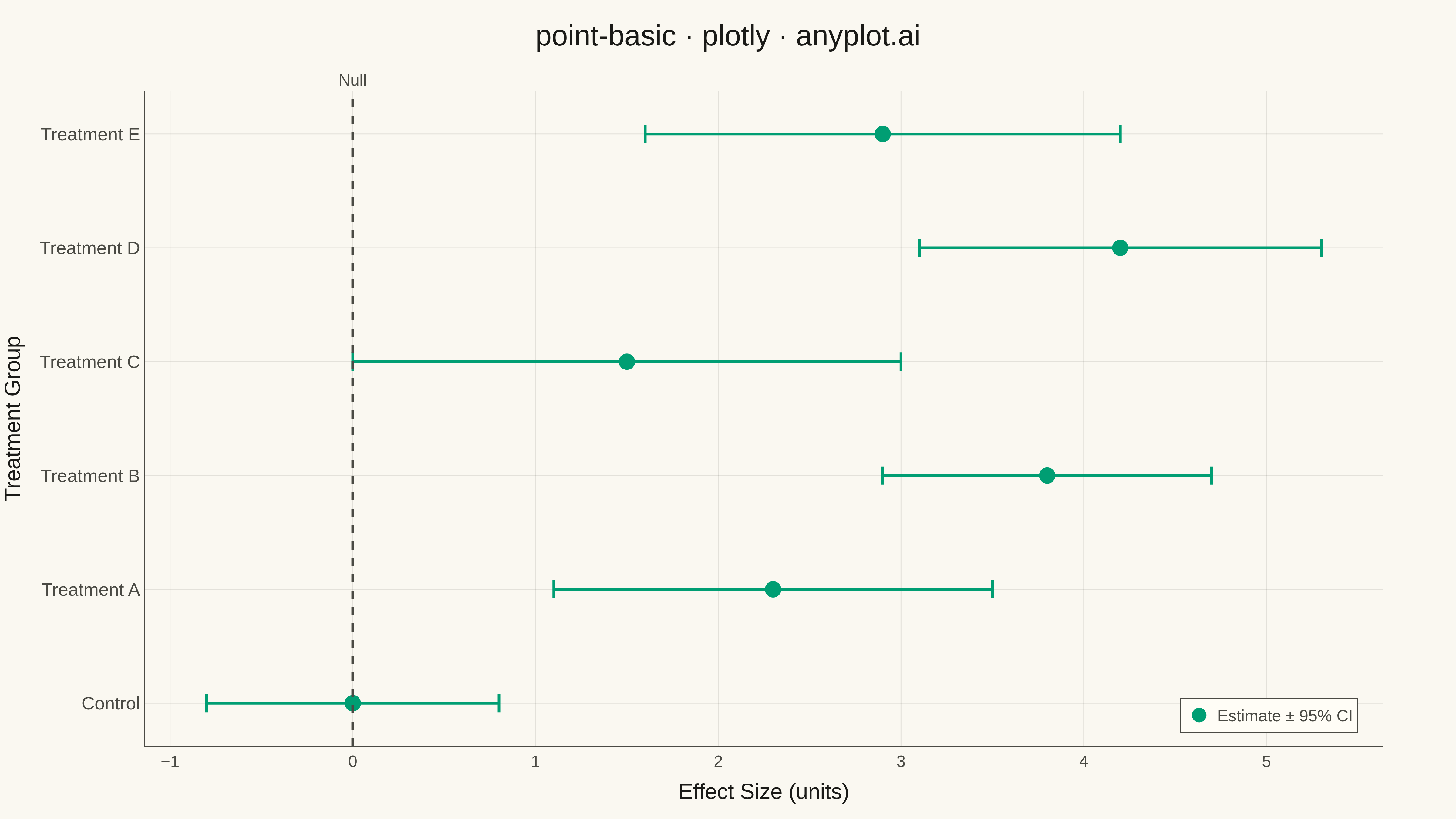
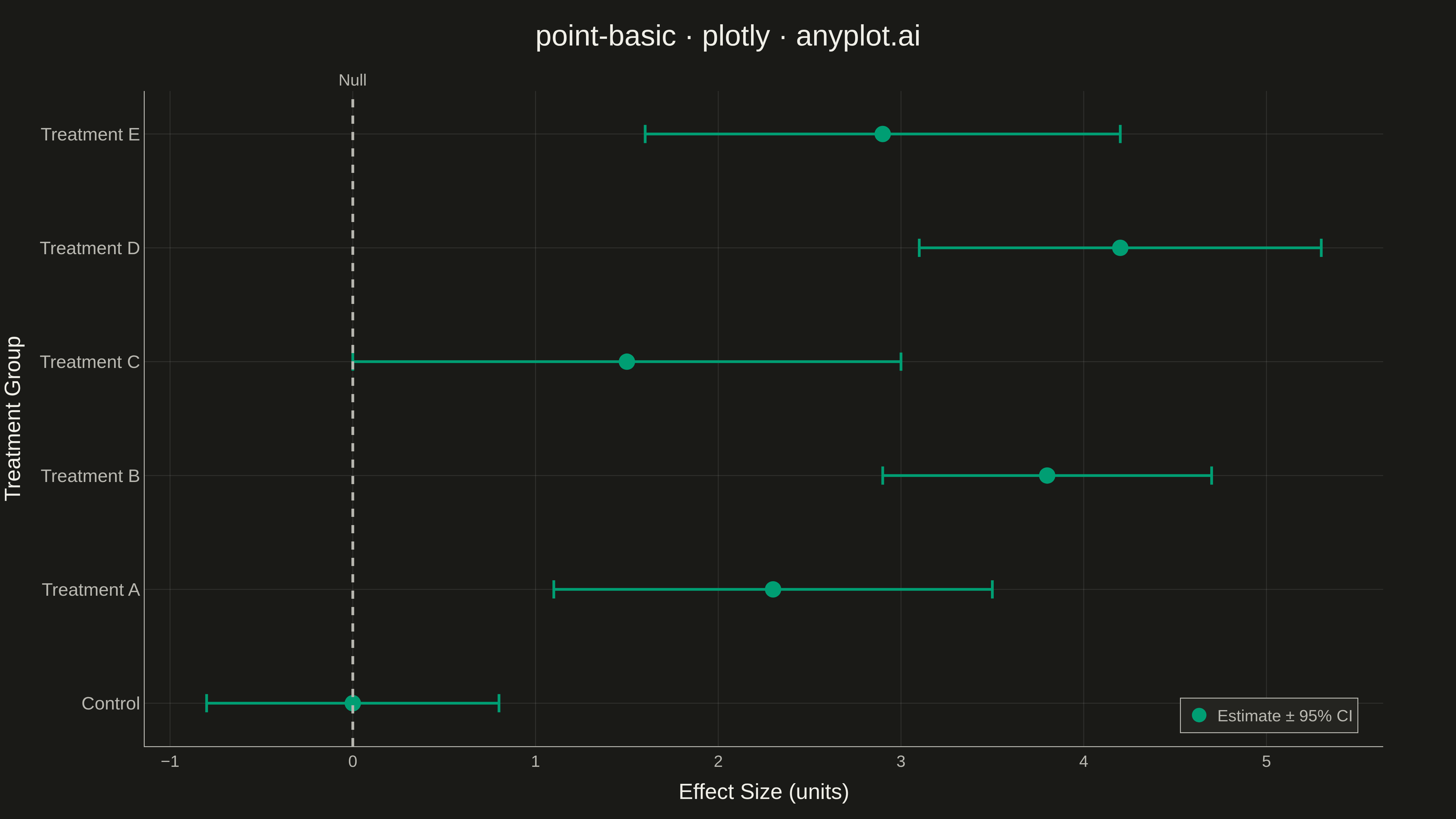
A point estimate plot displays central tendency values (means, medians, or other estimates) with confidence intervals or error bars for each category. Each point represents the estimate, and the lines extending from it show the uncertainty range.
""" anyplot.ai
point-basic: Point Estimate Plot
Library: plotly 6.7.0 | Python 3.13.13
Quality: 86/100 | Updated: 2026-05-11
"""

import os

import numpy as np
import plotly.graph_objects as go


THEME = os.getenv("ANYPLOT_THEME", "light")
PAGE_BG = "#FAF8F1" if THEME == "light" else "#1A1A17"
ELEVATED_BG = "#FFFDF6" if THEME == "light" else "#242420"
INK = "#1A1A17" if THEME == "light" else "#F0EFE8"
INK_SOFT = "#4A4A44" if THEME == "light" else "#B8B7B0"
GRID = "rgba(26,26,23,0.10)" if THEME == "light" else "rgba(240,239,232,0.10)"
BRAND = "#009E73"  # Okabe-Ito position 1

# Data - Treatment effects for different interventions
np.random.seed(42)
categories = ["Control", "Treatment A", "Treatment B", "Treatment C", "Treatment D", "Treatment E"]

# Generate realistic point estimates with varying confidence intervals
estimates = [0.0, 2.3, 3.8, 1.5, 4.2, 2.9]
# CI widths vary by sample size/variance
ci_widths = [0.8, 1.2, 0.9, 1.5, 1.1, 1.3]
lower = [e - w for e, w in zip(estimates, ci_widths, strict=False)]
upper = [e + w for e, w in zip(estimates, ci_widths, strict=False)]

# Create figure
fig = go.Figure()

# Add error bars (horizontal orientation)
fig.add_trace(
    go.Scatter(
        x=estimates,
        y=categories,
        mode="markers",
        marker={"size": 18, "color": BRAND, "symbol": "circle"},
        error_x={
            "type": "data",
            "symmetric": False,
            "array": [u - e for e, u in zip(estimates, upper, strict=False)],
            "arrayminus": [e - low for e, low in zip(estimates, lower, strict=False)],
            "color": BRAND,
            "thickness": 3,
            "width": 10,
        },
        name="Estimate ± 95% CI",
        showlegend=True,
    )
)

# Add reference line at zero (null hypothesis)
fig.add_vline(
    x=0,
    line={"color": INK_SOFT, "width": 3, "dash": "dash"},
    annotation_text="Null",
    annotation_position="top",
    annotation_font={"size": 18, "color": INK_SOFT},
)

# Layout
fig.update_layout(
    title={
        "text": "point-basic · plotly · anyplot.ai",
        "font": {"size": 32, "color": INK},
        "x": 0.5,
        "xanchor": "center",
    },
    xaxis={
        "title": {"text": "Effect Size (units)", "font": {"size": 24, "color": INK}},
        "tickfont": {"size": 18, "color": INK_SOFT},
        "zeroline": False,
        "gridcolor": GRID,
        "gridwidth": 1,
        "linecolor": INK_SOFT,
        "zerolinecolor": INK_SOFT,
    },
    yaxis={
        "title": {"text": "Treatment Group", "font": {"size": 24, "color": INK}},
        "tickfont": {"size": 20, "color": INK_SOFT},
        "gridcolor": GRID,
        "gridwidth": 1,
        "linecolor": INK_SOFT,
        "zerolinecolor": INK_SOFT,
    },
    paper_bgcolor=PAGE_BG,
    plot_bgcolor=PAGE_BG,
    font={"color": INK},
    template="plotly_white",
    legend={
        "font": {"size": 18, "color": INK_SOFT},
        "bgcolor": ELEVATED_BG,
        "bordercolor": INK_SOFT,
        "borderwidth": 1,
        "x": 0.98,
        "y": 0.02,
        "xanchor": "right",
        "yanchor": "bottom",
    },
    margin={"l": 150, "r": 80, "t": 100, "b": 80},
)

# Save as PNG and HTML
fig.write_image(f"plot-{THEME}.png", width=1600, height=900, scale=3)
fig.write_html(f"plot-{THEME}.html", include_plotlyjs="cdn")
Runnable source as JSON, for any HTTP client: https://api.anyplot.ai/specs/point-basic/plotly/code. Any spec id and library id listed in llms-full.txt fit the same URL shape; every URL below is complete and callable.
{
  "spec_id": "point-basic",
  "language": "python",
  "library": "plotly",
  "page": "https://anyplot.ai/point-basic/python/plotly",
  "hub": "https://anyplot.ai/point-basic",
  "code_json": "https://api.anyplot.ai/specs/point-basic/plotly/code",
  "spec_json": "https://api.anyplot.ai/specs/point-basic",
  "render_light_png": "https://storage.googleapis.com/anyplot-images/plots/point-basic/python/plotly/plot-light.png",
  "render_dark_png": "https://storage.googleapis.com/anyplot-images/plots/point-basic/python/plotly/plot-dark.png",
  "interactive_light_html": "https://storage.googleapis.com/anyplot-images/plots/point-basic/python/plotly/plot-light.html",
  "interactive_dark_html": "https://storage.googleapis.com/anyplot-images/plots/point-basic/python/plotly/plot-dark.html",
  "quality_score": 86.0,
  "license": "MIT",
  "guide": "https://anyplot.ai/llms.txt"
}
Part of Point Estimate Plot on anyplot.ai.