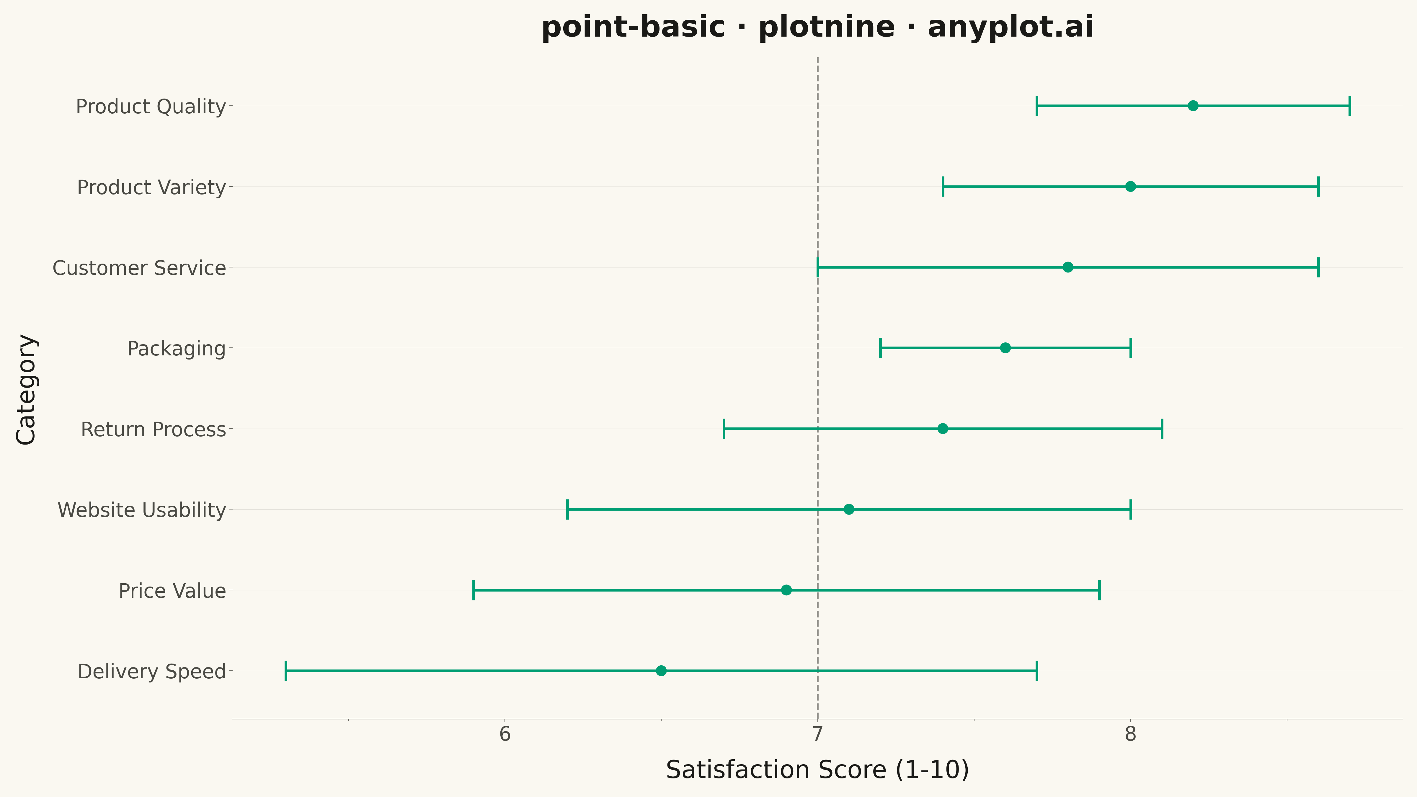
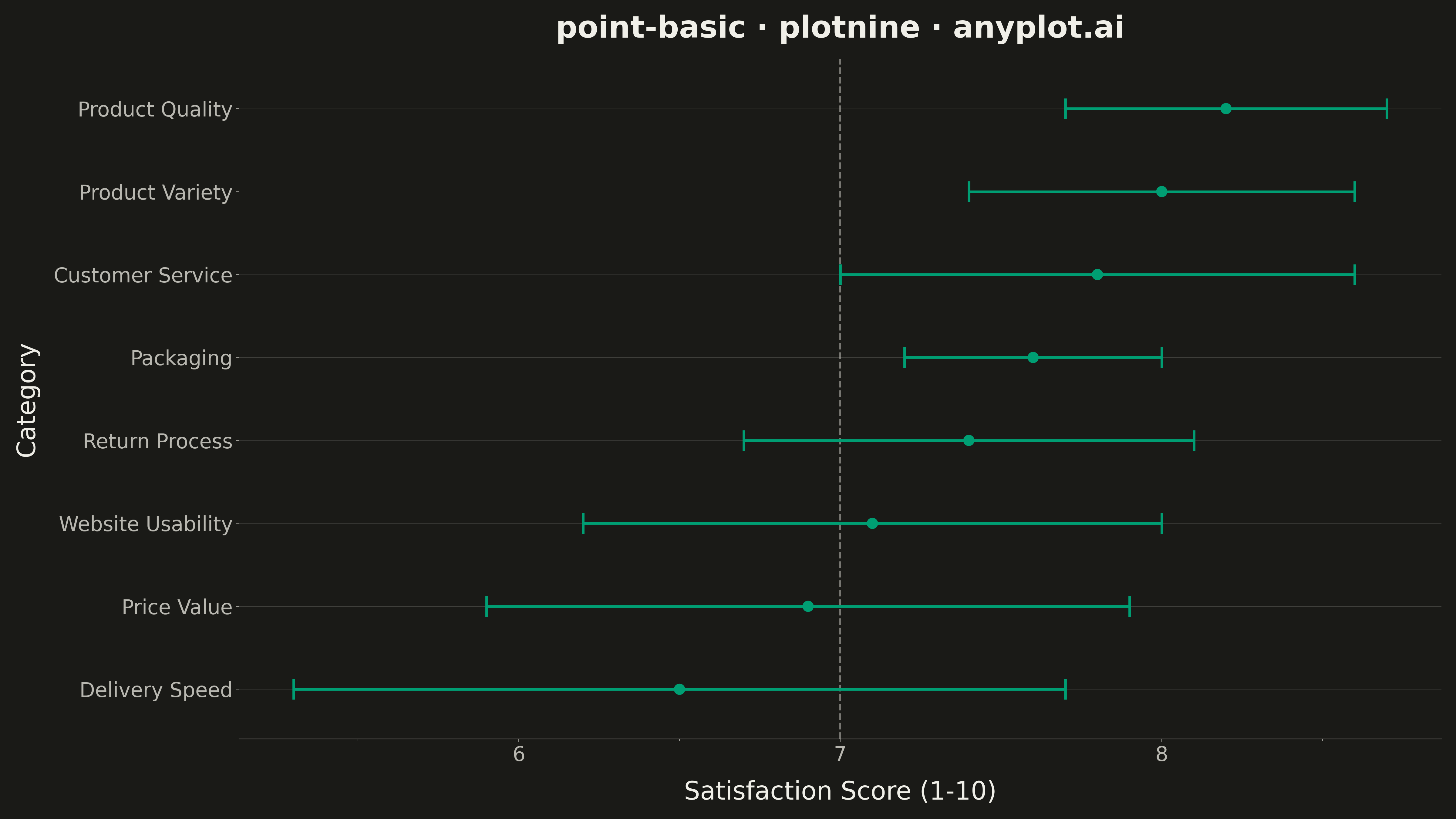
A point estimate plot displays central tendency values (means, medians, or other estimates) with confidence intervals or error bars for each category. Each point represents the estimate, and the lines extending from it show the uncertainty range.
""" anyplot.ai
point-basic: Point Estimate Plot
Library: plotnine 0.15.4 | Python 3.13.13
Quality: 89/100 | Updated: 2026-05-11
"""

import os

import numpy as np
import pandas as pd
from plotnine import (
    aes,
    element_line,
    element_rect,
    element_text,
    geom_errorbarh,
    geom_point,
    geom_vline,
    ggplot,
    labs,
    theme,
    theme_minimal,
)


# Theme tokens
THEME = os.getenv("ANYPLOT_THEME", "light")
PAGE_BG = "#FAF8F1" if THEME == "light" else "#1A1A17"
INK = "#1A1A17" if THEME == "light" else "#F0EFE8"
INK_SOFT = "#4A4A44" if THEME == "light" else "#B8B7B0"
BRAND = "#009E73"  # Okabe-Ito position 1

# Data: Product satisfaction scores with 95% confidence intervals
np.random.seed(42)

categories = [
    "Customer Service",
    "Product Quality",
    "Delivery Speed",
    "Website Usability",
    "Price Value",
    "Return Process",
    "Product Variety",
    "Packaging",
]

# Generate realistic satisfaction scores (1-10 scale) with varying uncertainty
estimates = np.array([7.8, 8.2, 6.5, 7.1, 6.9, 7.4, 8.0, 7.6])
# Confidence intervals vary by sample size/variance
ci_widths = np.array([0.8, 0.5, 1.2, 0.9, 1.0, 0.7, 0.6, 0.4])

df = pd.DataFrame(
    {"category": categories, "estimate": estimates, "lower": estimates - ci_widths, "upper": estimates + ci_widths}
)

# Sort by estimate for better visualization
df = df.sort_values("estimate").reset_index(drop=True)
df["category"] = pd.Categorical(df["category"], categories=df["category"], ordered=True)

# Plot
anyplot_theme = theme(
    figure_size=(16, 9),
    plot_background=element_rect(fill=PAGE_BG, color=PAGE_BG),
    panel_background=element_rect(fill=PAGE_BG),
    panel_grid_major=element_line(color=INK_SOFT, size=0.3, linewidth=0.3),
    panel_grid_minor=element_line(linewidth=0),
    panel_border=element_rect(color=INK_SOFT, fill=None),
    axis_title=element_text(color=INK, size=20),
    axis_text=element_text(color=INK_SOFT, size=16),
    axis_line=element_line(color=INK_SOFT, size=0.5),
    plot_title=element_text(color=INK, size=24, weight="bold"),
    legend_background=element_rect(fill=PAGE_BG, color=INK_SOFT),
    legend_text=element_text(color=INK_SOFT, size=16),
    legend_title=element_text(color=INK, size=16),
)

plot = (
    ggplot(df, aes(x="estimate", y="category"))
    + geom_vline(xintercept=7.0, linetype="dashed", color=INK_SOFT, size=0.8)
    + geom_errorbarh(aes(xmin="lower", xmax="upper"), height=0.3, size=1.5, color=BRAND)
    + geom_point(size=5, color=BRAND)
    + labs(x="Satisfaction Score (1-10)", y="Category", title="point-basic · plotnine · anyplot.ai")
    + theme_minimal()
    + anyplot_theme
)

# Save
plot.save(f"plot-{THEME}.png", dpi=300)
Runnable source as JSON, for any HTTP client: https://api.anyplot.ai/specs/point-basic/plotnine/code. Any spec id and library id listed in llms-full.txt fit the same URL shape; every URL below is complete and callable.
{
  "spec_id": "point-basic",
  "language": "python",
  "library": "plotnine",
  "page": "https://anyplot.ai/point-basic/python/plotnine",
  "hub": "https://anyplot.ai/point-basic",
  "code_json": "https://api.anyplot.ai/specs/point-basic/plotnine/code",
  "spec_json": "https://api.anyplot.ai/specs/point-basic",
  "render_light_png": "https://storage.googleapis.com/anyplot-images/plots/point-basic/python/plotnine/plot-light.png",
  "render_dark_png": "https://storage.googleapis.com/anyplot-images/plots/point-basic/python/plotnine/plot-dark.png",
  "quality_score": 89.0,
  "license": "MIT",
  "guide": "https://anyplot.ai/llms.txt"
}
Part of Point Estimate Plot on anyplot.ai.