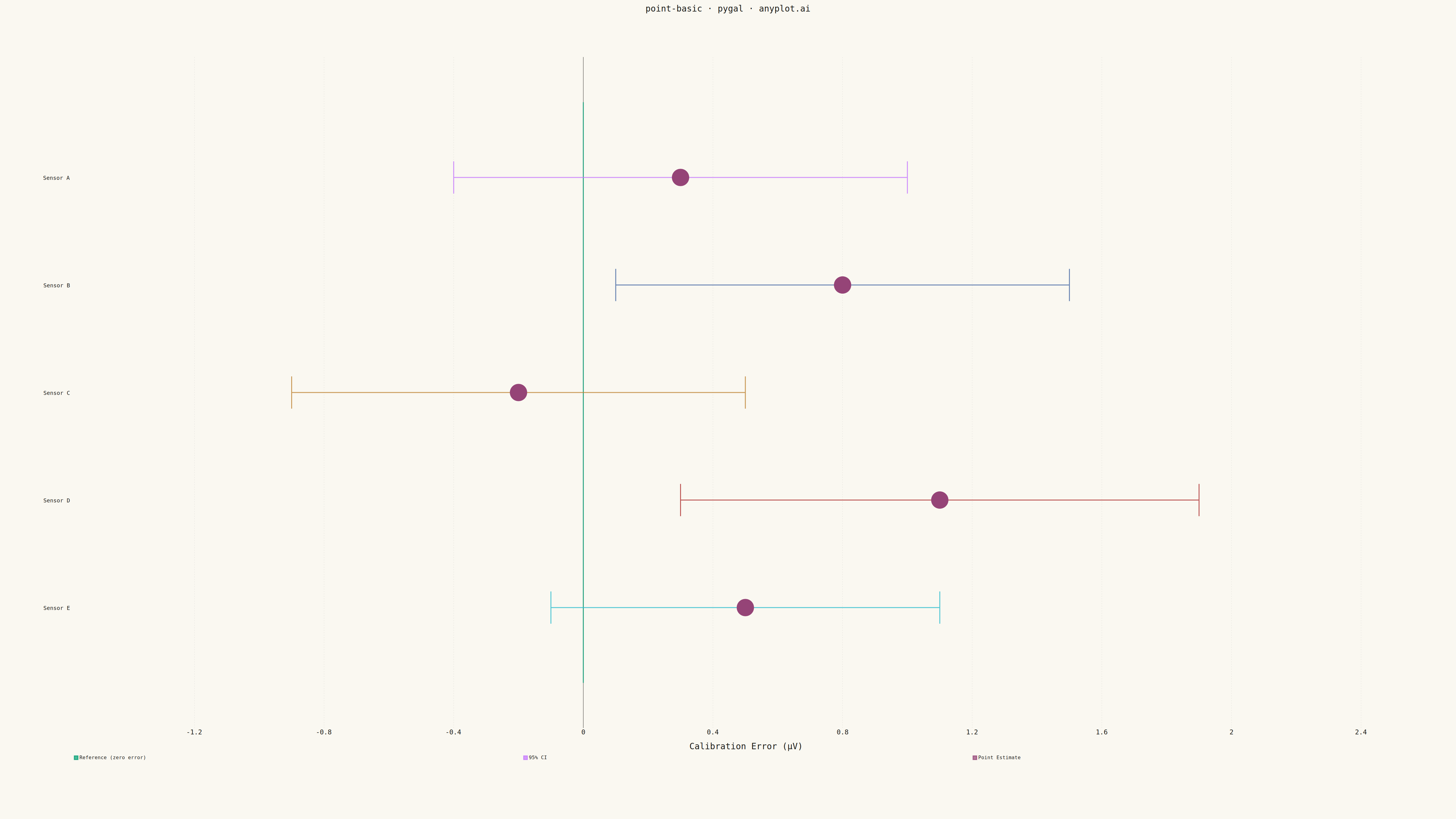
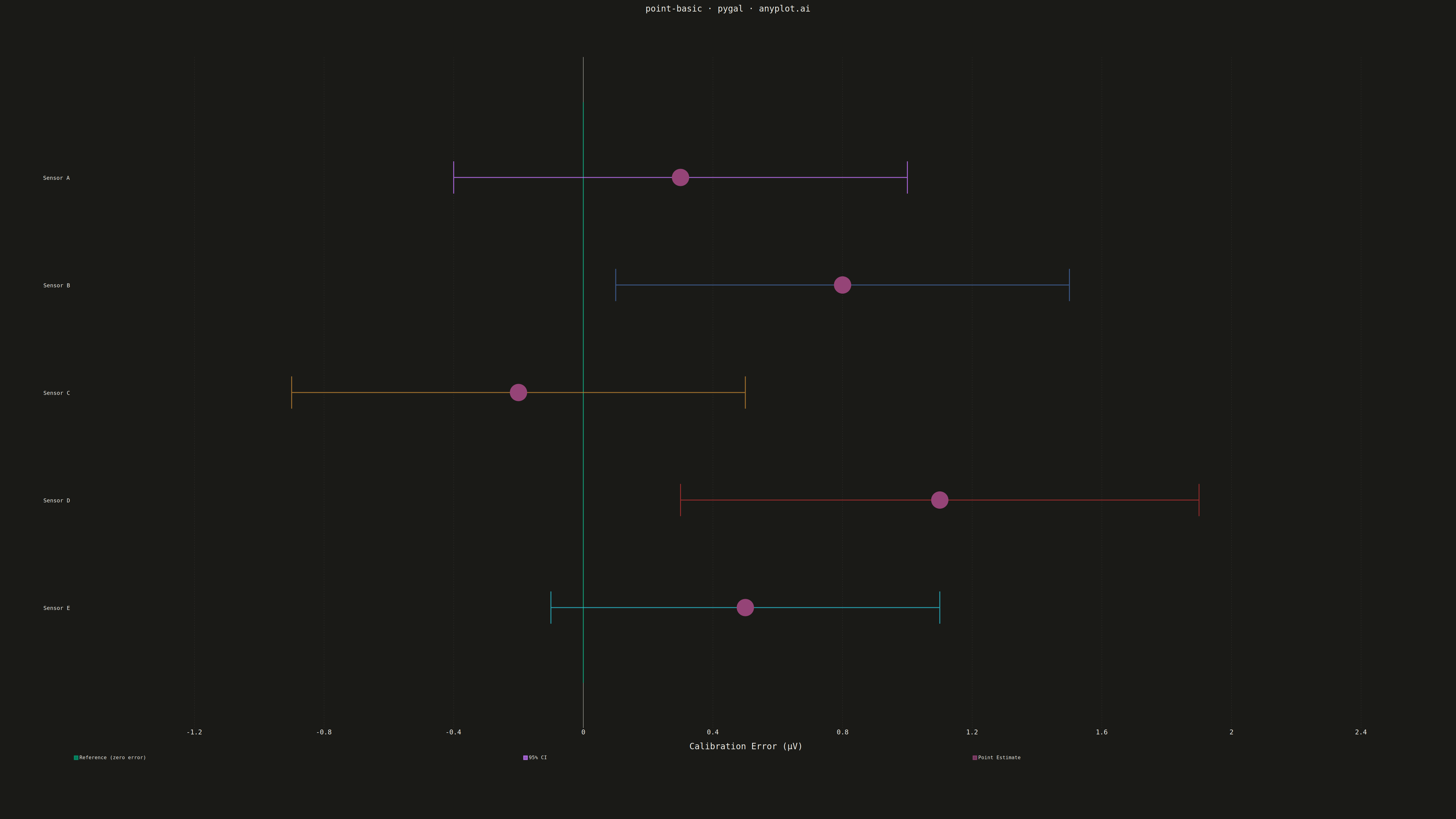
A point estimate plot displays central tendency values (means, medians, or other estimates) with confidence intervals or error bars for each category. Each point represents the estimate, and the lines extending from it show the uncertainty range.
""" anyplot.ai
point-basic: Point Estimate Plot
Library: pygal 3.1.0 | Python 3.13.13
Quality: 87/100 | Updated: 2026-05-11
"""

import os

import pygal
from pygal.style import Style


# Theme tokens
THEME = os.getenv("ANYPLOT_THEME", "light")
PAGE_BG = "#FAF8F1" if THEME == "light" else "#1A1A17"
INK = "#1A1A17" if THEME == "light" else "#F0EFE8"
INK_SOFT = "#4A4A44" if THEME == "light" else "#B8B7B0"
BRAND = "#009E73"  # Okabe-Ito position 1

# Data: Sensor calibration accuracy with 95% confidence intervals
categories = ["Sensor A", "Sensor B", "Sensor C", "Sensor D", "Sensor E"]
estimates = [0.3, 0.8, -0.2, 1.1, 0.5]
lower_bounds = [-0.4, 0.1, -0.9, 0.3, -0.1]
upper_bounds = [1.0, 1.5, 0.5, 1.9, 1.1]

# Custom style for 4800x2700 canvas with theme support
custom_style = Style(
    background=PAGE_BG,
    plot_background=PAGE_BG,
    foreground=INK,
    foreground_strong=INK,
    foreground_subtle=INK_SOFT,
    colors=(BRAND, "#C475FD", "#4467A3", "#BD8233", "#AE3030", "#2ABCCD", "#954477"),
    title_font_size=28,
    label_font_size=22,
    major_label_font_size=18,
    legend_font_size=16,
    value_font_size=14,
    stroke_width=3,
    guide_stroke_color="rgba(26,26,23,0.10)" if THEME == "light" else "rgba(240,239,232,0.10)",
)

# Create XY chart for point estimates with confidence intervals
chart = pygal.XY(
    width=4800,
    height=2700,
    style=custom_style,
    title="point-basic · pygal · anyplot.ai",
    x_title="Calibration Error (μV)",
    show_legend=True,
    legend_at_bottom=True,
    legend_at_bottom_columns=3,
    show_y_guides=False,
    show_x_guides=True,
    dots_size=24,
    stroke=False,
    margin_left=120,
    margin_right=120,
    margin_top=150,
    margin_bottom=180,
    xrange=(-1.5, 2.5),
    range=(0, 6),
)

# Map categories to y-values (numeric) - reversed for top-to-bottom display
y_positions = list(range(len(categories), 0, -1))

# Add reference line at zero (null hypothesis)
ref_line = [(0, 0.3), (0, 5.7)]
chart.add("Reference (zero error)", ref_line, stroke=True, show_dots=False, stroke_width=4)

# Add each CI as a separate series with caps
for i, (low, high, y) in enumerate(zip(lower_bounds, upper_bounds, y_positions, strict=True)):
    # CI line with caps (drawn as separate segments)
    cap_height = 0.15
    ci_data = [
        (low, y - cap_height),  # left cap bottom
        (low, y + cap_height),  # left cap top
        (low, y),  # start of CI line
        (high, y),  # end of CI line
        (high, y - cap_height),  # right cap bottom
        (high, y + cap_height),  # right cap top
    ]
    if i == 0:
        chart.add("95% CI", ci_data, stroke=True, show_dots=False, stroke_width=5)
    else:
        chart.add(None, ci_data, stroke=True, show_dots=False, stroke_width=5)

# Add point estimates (on top of CI lines)
point_data = [(est, y) for est, y in zip(estimates, y_positions, strict=True)]
chart.add("Point Estimate", point_data, dots_size=28, stroke=False)

# Custom y-axis labels with category names
chart.y_labels_major = [5, 4, 3, 2, 1]
chart.y_labels = [
    {"value": 5, "label": "Sensor A"},
    {"value": 4, "label": "Sensor B"},
    {"value": 3, "label": "Sensor C"},
    {"value": 2, "label": "Sensor D"},
    {"value": 1, "label": "Sensor E"},
]

# Save as PNG and HTML with theme suffix
chart.render_to_png(f"plot-{THEME}.png")
with open(f"plot-{THEME}.html", "wb") as f:
    f.write(chart.render())
Runnable source as JSON, for any HTTP client: https://api.anyplot.ai/specs/point-basic/pygal/code. Any spec id and library id listed in llms-full.txt fit the same URL shape; every URL below is complete and callable.
{
  "spec_id": "point-basic",
  "language": "python",
  "library": "pygal",
  "page": "https://anyplot.ai/point-basic/python/pygal",
  "hub": "https://anyplot.ai/point-basic",
  "code_json": "https://api.anyplot.ai/specs/point-basic/pygal/code",
  "spec_json": "https://api.anyplot.ai/specs/point-basic",
  "render_light_png": "https://storage.googleapis.com/anyplot-images/plots/point-basic/python/pygal/plot-light.png",
  "render_dark_png": "https://storage.googleapis.com/anyplot-images/plots/point-basic/python/pygal/plot-dark.png",
  "interactive_light_html": "https://storage.googleapis.com/anyplot-images/plots/point-basic/python/pygal/plot-light.html",
  "interactive_dark_html": "https://storage.googleapis.com/anyplot-images/plots/point-basic/python/pygal/plot-dark.html",
  "quality_score": 87.0,
  "license": "MIT",
  "guide": "https://anyplot.ai/llms.txt"
}
Part of Point Estimate Plot on anyplot.ai.