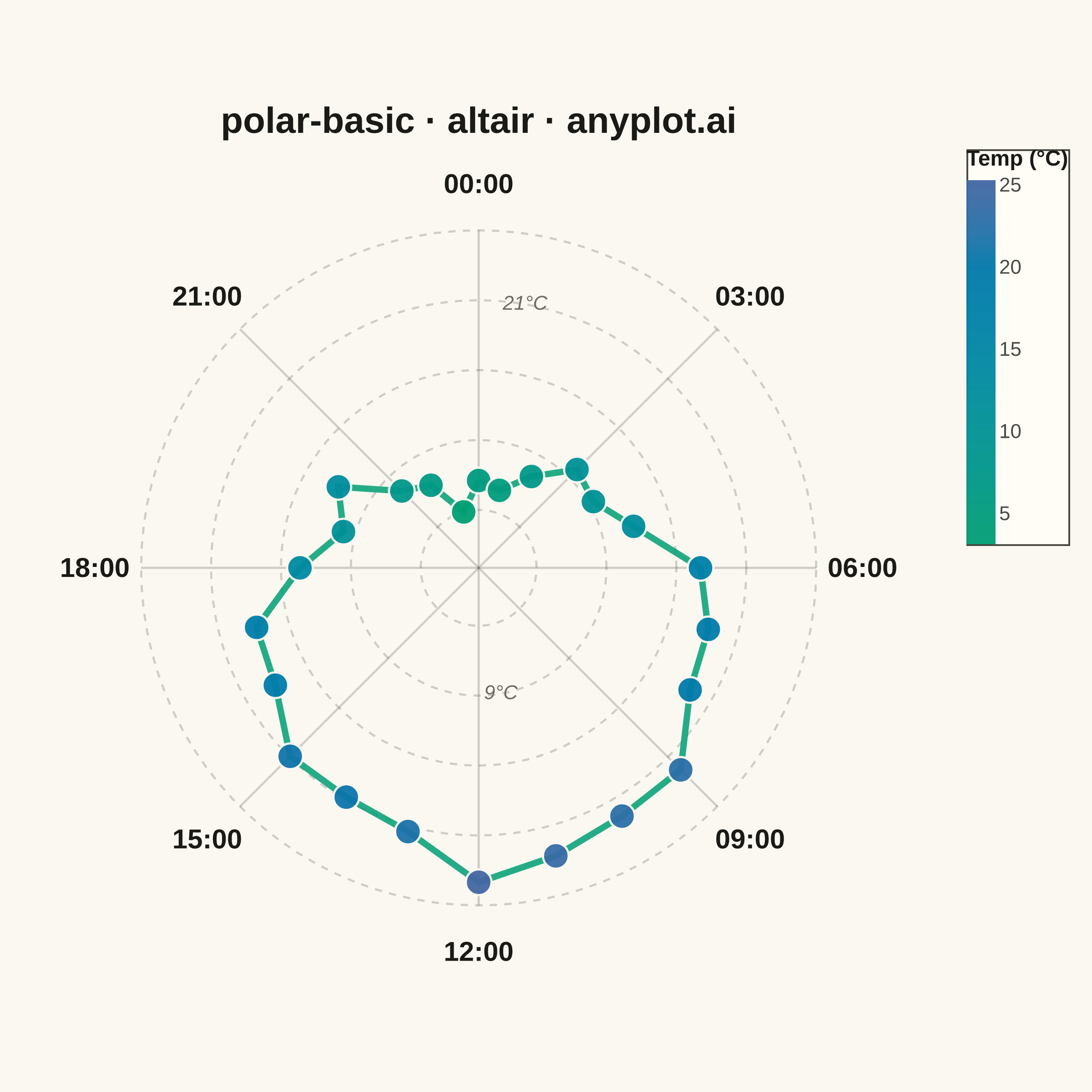
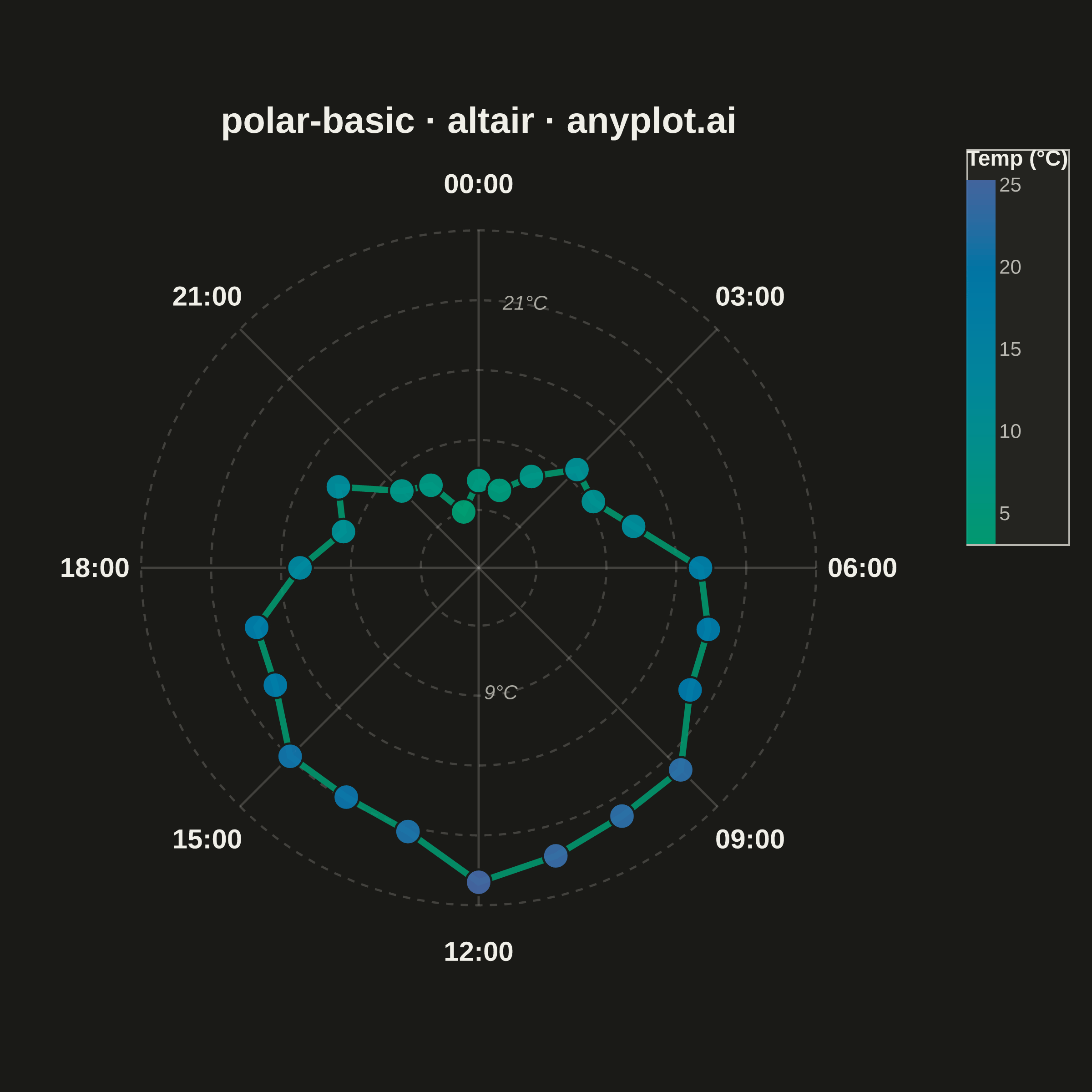
A polar chart displays data points on a circular coordinate system where position is determined by angle (theta) and distance from center (radius). This visualization is ideal for cyclical patterns, directional data, or any dataset where angular relationships are meaningful. It reveals periodic trends and directional distributions that would be obscured in Cartesian coordinates.
""" anyplot.ai
polar-basic: Basic Polar Chart
Library: altair 6.2.2 | Python 3.13.14
Quality: 89/100 | Updated: 2026-07-25
"""

import os

import altair as alt
import numpy as np
import pandas as pd
from PIL import Image


# Theme tokens
THEME = os.getenv("ANYPLOT_THEME", "light")
PAGE_BG = "#FAF8F1" if THEME == "light" else "#1A1A17"
ELEVATED_BG = "#FFFDF6" if THEME == "light" else "#242420"
INK = "#1A1A17" if THEME == "light" else "#F0EFE8"
INK_SOFT = "#4A4A44" if THEME == "light" else "#B8B7B0"
INK_MUTED = "#6B6A63" if THEME == "light" else "#A8A79F"
BRAND = "#009E73"

# Data - Hourly temperature pattern (24-hour cycle)
np.random.seed(42)
hours = np.arange(24)

base_temp = 15 + 10 * np.sin((hours - 9) * np.pi / 12)
temperatures = base_temp + np.random.randn(24) * 1.5

theta = (90 - hours * 15) * np.pi / 180
radius = temperatures - temperatures.min() + 5

x = radius * np.cos(theta)
y = radius * np.sin(theta)

df = pd.DataFrame({"hour": hours, "temperature": temperatures, "x": x, "y": y})

# Radial gridlines (concentric circles)
max_radius = radius.max() + 2
grid_radii = np.linspace(5, max_radius, 5)
circle_angles = np.linspace(0, 2 * np.pi, 101)

grid_rows = []
for i, r in enumerate(grid_radii):
    for j, angle in enumerate(circle_angles):
        grid_rows.append({"x": r * np.cos(angle), "y": r * np.sin(angle), "circle_id": i, "order": j})

grid_df = pd.DataFrame(grid_rows)

# Angular gridlines (spokes at major hours)
spoke_data = []
major_hours = [0, 3, 6, 9, 12, 15, 18, 21]
for hour in major_hours:
    angle = (90 - hour * 15) * np.pi / 180
    spoke_data.append({"x": 0, "y": 0, "xend": max_radius * np.cos(angle), "yend": max_radius * np.sin(angle)})

spoke_df = pd.DataFrame(spoke_data)

# Hour labels around perimeter
label_data = []
hour_labels_map = {0: "00:00", 3: "03:00", 6: "06:00", 9: "09:00", 12: "12:00", 15: "15:00", 18: "18:00", 21: "21:00"}
label_radius = max_radius + 4
for hour, label in hour_labels_map.items():
    angle = (90 - hour * 15) * np.pi / 180
    label_data.append({"label": label, "x": label_radius * np.cos(angle), "y": label_radius * np.sin(angle)})

label_df = pd.DataFrame(label_data)

# Radial scale-reference labels — 2 of the 5 concentric rings, each placed at an
# angle where the data path sits far from that ring (avoids crossing the line).
ring_label_specs = [(1, -80), (3, 80)]
ring_label_data = []
for idx, angle_deg in ring_label_specs:
    r = grid_radii[idx]
    temp_value = r - 5 + temperatures.min()
    angle = np.deg2rad(angle_deg)
    ring_label_data.append({"label": f"{temp_value:.0f}°C", "x": r * np.cos(angle), "y": r * np.sin(angle)})

ring_label_df = pd.DataFrame(ring_label_data)

# Closed path for the data line
df_sorted = df.sort_values("hour").copy()
df_sorted["order"] = df_sorted["hour"]
first_row = df_sorted.iloc[[0]].copy()
first_row["order"] = 24
df_path = pd.concat([df_sorted, first_row], ignore_index=True)

# Shared coordinate scale — the square inner view (500x460) is not literally
# square, so the x-domain is widened by the width/height ratio to keep the
# polar gridlines circular instead of squashed into ellipses.
VIEW_W, VIEW_H = 500, 460
outer_extent = label_radius + 3
aspect = VIEW_W / VIEW_H
X_SCALE = alt.Scale(domain=[-outer_extent * aspect, outer_extent * aspect])
Y_SCALE = alt.Scale(domain=[-outer_extent, outer_extent])

# Hover selection — highlights the nearest hour's point/tooltip in the HTML export
hover = alt.selection_point(on="pointerover", nearest=True, fields=["hour"], empty=False)

# Plot
GRID_OPACITY = 0.25

circles = (
    alt.Chart(grid_df)
    .mark_line(strokeWidth=1.2, opacity=GRID_OPACITY, color=INK_SOFT, strokeDash=[4, 4])
    .encode(
        x=alt.X("x:Q", axis=None, scale=X_SCALE),
        y=alt.Y("y:Q", axis=None, scale=Y_SCALE),
        detail="circle_id:N",
        order="order:O",
    )
)

spokes = (
    alt.Chart(spoke_df)
    .mark_rule(strokeWidth=1.2, opacity=GRID_OPACITY, color=INK_SOFT)
    .encode(
        x=alt.X("x:Q", axis=None, scale=X_SCALE), y=alt.Y("y:Q", axis=None, scale=Y_SCALE), x2="xend:Q", y2="yend:Q"
    )
)

labels = (
    alt.Chart(label_df)
    .mark_text(fontSize=15, fontWeight="bold", color=INK)
    .encode(x=alt.X("x:Q", axis=None, scale=X_SCALE), y=alt.Y("y:Q", axis=None, scale=Y_SCALE), text="label:N")
)

ring_labels = (
    alt.Chart(ring_label_df)
    .mark_text(fontSize=11, fontStyle="italic", color=INK_MUTED)
    .encode(x=alt.X("x:Q", axis=None, scale=X_SCALE), y=alt.Y("y:Q", axis=None, scale=Y_SCALE), text="label:N")
)

line = (
    alt.Chart(df_path)
    .mark_line(strokeWidth=3.5, color=BRAND, opacity=0.85)
    .encode(x=alt.X("x:Q", axis=None, scale=X_SCALE), y=alt.Y("y:Q", axis=None, scale=Y_SCALE), order="order:O")
)

points = (
    alt.Chart(df)
    .mark_point(filled=True, size=200, opacity=0.95, stroke=PAGE_BG, strokeWidth=1.2)
    .encode(
        x=alt.X("x:Q", axis=None, scale=X_SCALE),
        y=alt.Y("y:Q", axis=None, scale=Y_SCALE),
        color=alt.Color(
            "temperature:Q",
            scale=alt.Scale(range=[BRAND, "#4467A3"]),  # imprint_seq: single-polarity continuous
            legend=alt.Legend(title="Temp (°C)"),
        ),
        size=alt.condition(hover, alt.value(400), alt.value(200)),
        tooltip=[
            alt.Tooltip("hour:O", title="Hour"),
            alt.Tooltip("temperature:Q", title="Temperature (°C)", format=".1f"),
        ],
    )
    .add_params(hover)
)

chart = (
    alt.layer(circles, spokes, line, points, labels, ring_labels)
    .properties(
        background=PAGE_BG,
        width=VIEW_W,
        height=VIEW_H,
        title=alt.Title(text="polar-basic · python · altair · anyplot.ai", fontSize=18, anchor="middle"),
    )
    .configure_view(strokeWidth=0, fill=PAGE_BG)
    .configure_title(color=INK)
    .configure_legend(
        fillColor=ELEVATED_BG,
        strokeColor=INK_SOFT,
        labelColor=INK_SOFT,
        titleColor=INK,
        labelFontSize=11,
        titleFontSize=10,
        titleLimit=200,
        gradientThickness=20,
        padding=6,
    )
)

# Save
chart.save(f"plot-{THEME}.png", scale_factor=4.0)

# Pad-only to the canonical 2400x2400 square — vl-convert pads the view with
# title/legend extents outside width/height, so the raw save rarely lands
# exactly on target. Never crop: that would clip title/label text at the edges.
TW, TH = 2400, 2400
_img = Image.open(f"plot-{THEME}.png").convert("RGB")
_w, _h = _img.size
if _w > TW or _h > TH:
    raise SystemExit(
        f"altair vl-convert produced {_w}x{_h}, exceeds target {TW}x{TH}. "
        f"Shrink chart .properties(width=, height=) values and re-render."
    )
if _w < TW or _h < TH:
    _canvas = Image.new("RGB", (TW, TH), PAGE_BG)
    _canvas.paste(_img, ((TW - _w) // 2, (TH - _h) // 2))
    _canvas.save(f"plot-{THEME}.png")

chart.save(f"plot-{THEME}.html")
Runnable source as JSON, for any HTTP client: https://api.anyplot.ai/specs/polar-basic/altair/code. Any spec id and library id listed in llms-full.txt fit the same URL shape; every URL below is complete and callable.
{
  "spec_id": "polar-basic",
  "language": "python",
  "library": "altair",
  "page": "https://anyplot.ai/polar-basic/python/altair",
  "hub": "https://anyplot.ai/polar-basic",
  "code_json": "https://api.anyplot.ai/specs/polar-basic/altair/code",
  "spec_json": "https://api.anyplot.ai/specs/polar-basic",
  "render_light_png": "https://storage.googleapis.com/anyplot-images/plots/polar-basic/python/altair/plot-light.png",
  "render_dark_png": "https://storage.googleapis.com/anyplot-images/plots/polar-basic/python/altair/plot-dark.png",
  "interactive_light_html": "https://storage.googleapis.com/anyplot-images/plots/polar-basic/python/altair/plot-light.html",
  "interactive_dark_html": "https://storage.googleapis.com/anyplot-images/plots/polar-basic/python/altair/plot-dark.html",
  "quality_score": 89.0,
  "license": "MIT",
  "guide": "https://anyplot.ai/llms.txt"
}
Part of Basic Polar Chart on anyplot.ai.