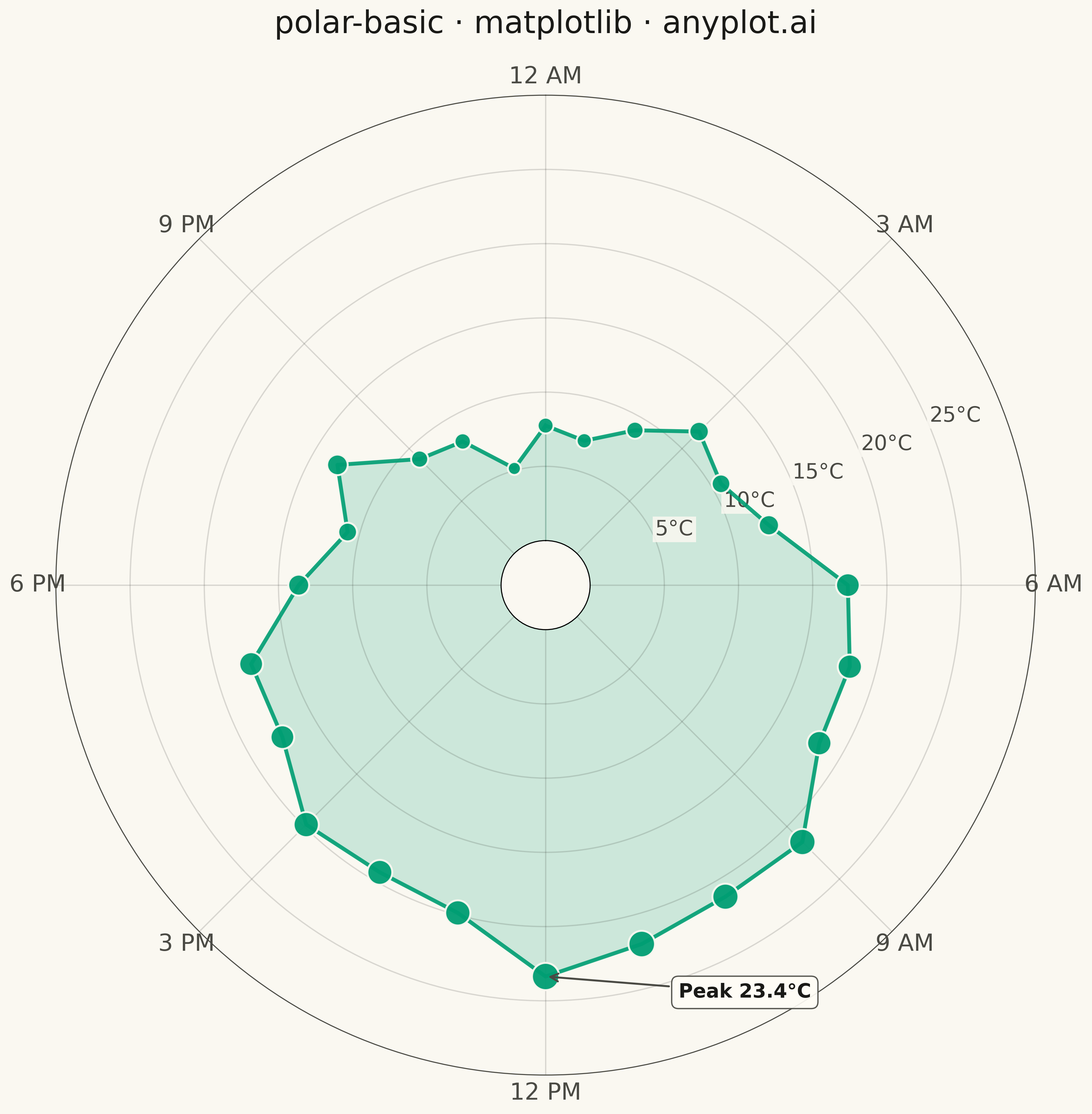
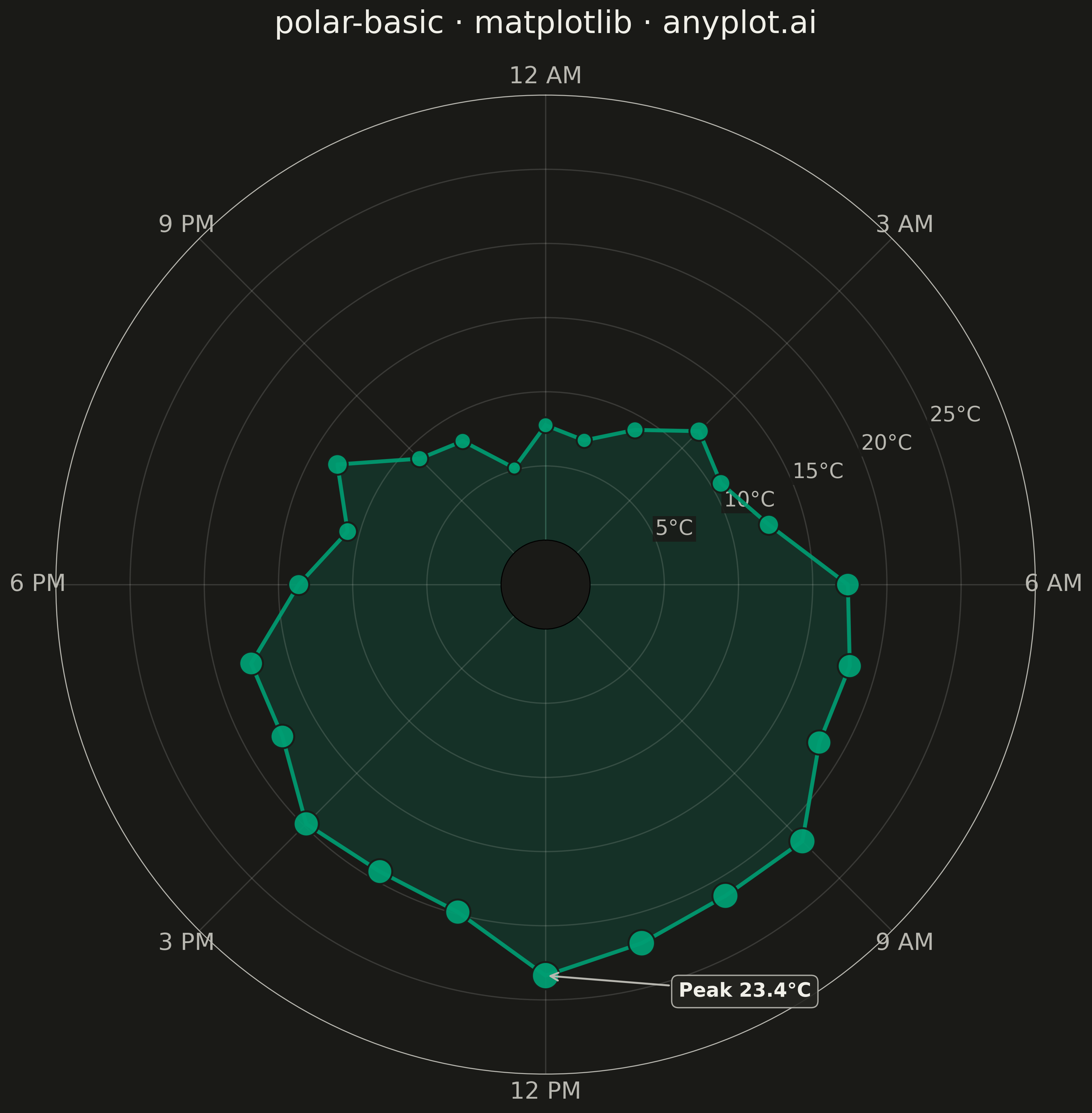
A polar chart displays data points on a circular coordinate system where position is determined by angle (theta) and distance from center (radius). This visualization is ideal for cyclical patterns, directional data, or any dataset where angular relationships are meaningful. It reveals periodic trends and directional distributions that would be obscured in Cartesian coordinates.
""" anyplot.ai
polar-basic: Basic Polar Chart
Library: matplotlib 3.10.9 | Python 3.13.13
Quality: 88/100 | Updated: 2026-04-30
"""

import os

import matplotlib.pyplot as plt
import numpy as np


# Theme tokens
THEME = os.getenv("ANYPLOT_THEME", "light")
PAGE_BG = "#FAF8F1" if THEME == "light" else "#1A1A17"
INK = "#1A1A17" if THEME == "light" else "#F0EFE8"
INK_SOFT = "#4A4A44" if THEME == "light" else "#B8B7B0"
BRAND = "#009E73"

# Data - Hourly temperature pattern (24-hour cycle)
np.random.seed(42)
hours = np.arange(24)
theta = hours * (2 * np.pi / 24)

base_temp = 15 + 8 * np.sin(theta - np.pi / 2)  # Peak at 3 PM (hour 15)
noise = np.random.randn(24) * 1.5
radius = base_temp + noise

theta_closed = np.append(theta, theta[0])
radius_closed = np.append(radius, radius[0])

# Plot - Square format for polar chart (12x12 @ 300 dpi = 3600x3600 px)
fig, ax = plt.subplots(figsize=(12, 12), subplot_kw={"projection": "polar"}, facecolor=PAGE_BG)
ax.set_facecolor(PAGE_BG)

# Filled area from center to data for visual weight
ax.fill_between(theta_closed, 0, radius_closed, color=BRAND, alpha=0.18)

# Connecting line showing the cyclical pattern
ax.plot(theta_closed, radius_closed, color=BRAND, linewidth=3, alpha=0.9, zorder=2)

# Scatter points for individual hourly readings
ax.scatter(theta, radius, s=280, color=BRAND, alpha=0.95, zorder=3, edgecolors=PAGE_BG, linewidth=1.5)

# Configure angular axis (hours of day, midnight at top, clockwise)
ax.set_theta_zero_location("N")
ax.set_theta_direction(-1)
hour_labels = ["12 AM", "3 AM", "6 AM", "9 AM", "12 PM", "3 PM", "6 PM", "9 PM"]
ax.set_xticks(np.linspace(0, 2 * np.pi, 8, endpoint=False))
ax.set_xticklabels(hour_labels, fontsize=18)

# Configure radial axis (temperature)
ax.set_ylim(0, 30)
ax.set_yticks([5, 10, 15, 20, 25])
ax.set_yticklabels(["5°C", "10°C", "15°C", "20°C", "25°C"], fontsize=16)
ax.set_rlabel_position(67.5)

# Theme-adaptive styling
ax.set_title(
    "Hourly Temperature Pattern · polar-basic · matplotlib · anyplot.ai",
    fontsize=24,
    pad=25,
    fontweight="medium",
    color=INK,
)
ax.grid(True, alpha=0.15, linewidth=1.0, color=INK)
ax.spines["polar"].set_color(INK_SOFT)
ax.tick_params(colors=INK_SOFT, labelcolor=INK_SOFT)

plt.tight_layout()
plt.savefig(f"plot-{THEME}.png", dpi=300, bbox_inches="tight", facecolor=PAGE_BG)
Runnable source as JSON, for any HTTP client: https://api.anyplot.ai/specs/polar-basic/matplotlib/code. Any spec id and library id listed in llms-full.txt fit the same URL shape; every URL below is complete and callable.
{
  "spec_id": "polar-basic",
  "language": "python",
  "library": "matplotlib",
  "page": "https://anyplot.ai/polar-basic/python/matplotlib",
  "hub": "https://anyplot.ai/polar-basic",
  "code_json": "https://api.anyplot.ai/specs/polar-basic/matplotlib/code",
  "spec_json": "https://api.anyplot.ai/specs/polar-basic",
  "render_light_png": "https://storage.googleapis.com/anyplot-images/plots/polar-basic/python/matplotlib/plot-light.png",
  "render_dark_png": "https://storage.googleapis.com/anyplot-images/plots/polar-basic/python/matplotlib/plot-dark.png",
  "quality_score": 88.0,
  "license": "MIT",
  "guide": "https://anyplot.ai/llms.txt"
}
Part of Basic Polar Chart on anyplot.ai.