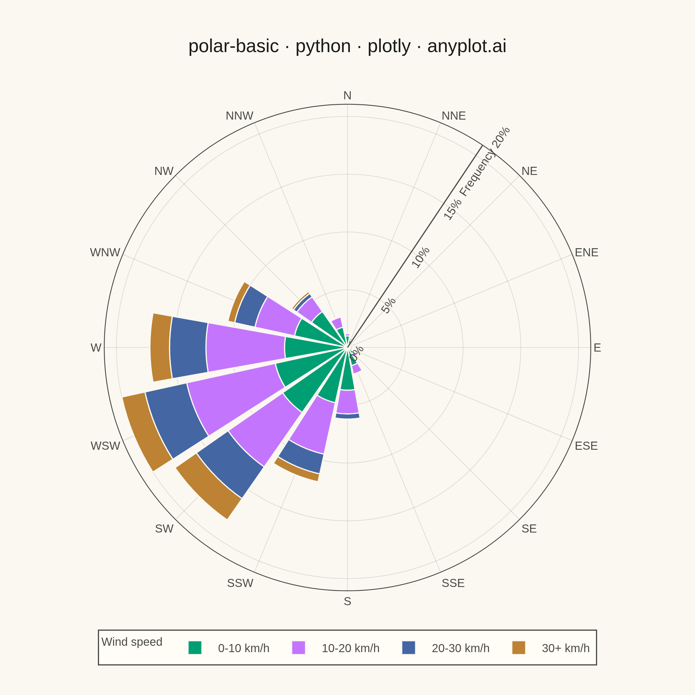
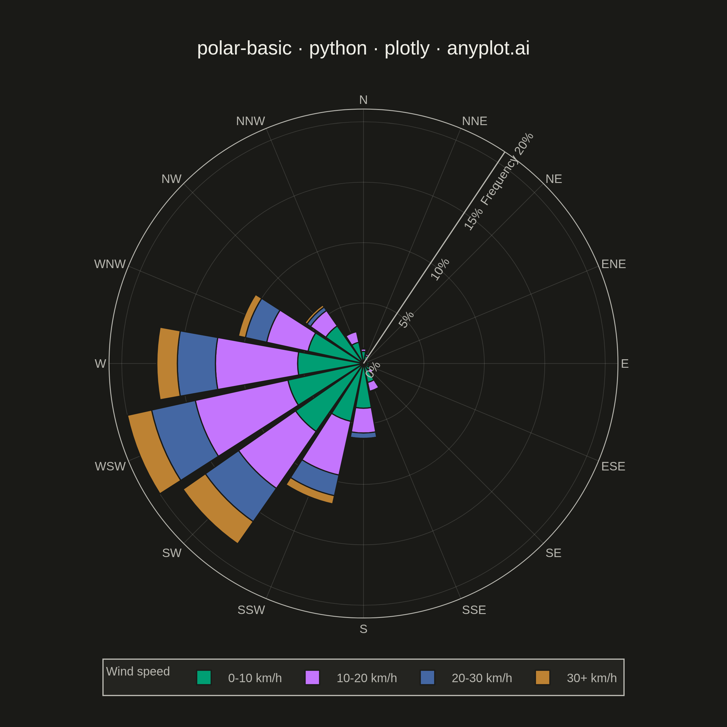
A polar chart displays data points on a circular coordinate system where position is determined by angle (theta) and distance from center (radius). This visualization is ideal for cyclical patterns, directional data, or any dataset where angular relationships are meaningful. It reveals periodic trends and directional distributions that would be obscured in Cartesian coordinates.
""" anyplot.ai
polar-basic: Basic Polar Chart
Library: plotly 6.9.0 | Python 3.13.14
Quality: 88/100 | Updated: 2026-07-24
"""

import os

import numpy as np
import plotly.graph_objects as go


# Theme tokens
THEME = os.getenv("ANYPLOT_THEME", "light")
PAGE_BG = "#FAF8F1" if THEME == "light" else "#1A1A17"
ELEVATED_BG = "#FFFDF6" if THEME == "light" else "#242420"
INK = "#1A1A17" if THEME == "light" else "#F0EFE8"
INK_SOFT = "#4A4A44" if THEME == "light" else "#B8B7B0"
GRID = "rgba(26,26,23,0.15)" if THEME == "light" else "rgba(240,239,232,0.15)"

# Imprint categorical palette — canonical order, abstract speed bins
IMPRINT_PALETTE = ["#009E73", "#C475FD", "#4467A3", "#BD8233"]

# Data - Wind rose: observed wind direction & speed at a coastal weather station
np.random.seed(42)
n_obs = 2000
compass_dirs = ["N", "NNE", "NE", "ENE", "E", "ESE", "SE", "SSE", "S", "SSW", "SW", "WSW", "W", "WNW", "NW", "NNW"]
prevailing_deg = 247.5  # WSW is the prevailing direction at this station

direction_rad = np.random.vonmises(np.radians(prevailing_deg), kappa=2.0, size=n_obs)
direction_deg = np.degrees(direction_rad) % 360
dir_idx = ((direction_deg + 11.25) // 22.5).astype(int) % 16

alignment = np.clip(np.cos(direction_rad - np.radians(prevailing_deg)), 0, 1)
speed = np.random.gamma(shape=2.2, scale=6.0, size=n_obs) * (0.6 + 0.6 * alignment)

speed_bins = ["0-10 km/h", "10-20 km/h", "20-30 km/h", "30+ km/h"]
speed_bin_idx = np.clip(np.digitize(speed, [10, 20, 30]), 0, 3)

counts = np.zeros((16, 4))
np.add.at(counts, (dir_idx, speed_bin_idx), 1)
freq_pct = counts / n_obs * 100

# Radial ticks: fold the "Frequency" axis label into the outermost tick text
# instead of a separate rotated title, so it never overlaps the tick values.
radial_max = int(np.ceil(freq_pct.sum(axis=1).max() / 5) * 5)
radial_tickvals = list(range(0, radial_max + 5, 5))
radial_ticktext = [f"{v}%" for v in radial_tickvals]
radial_ticktext[-1] = f"Frequency {radial_ticktext[-1]}"

# Plot
fig = go.Figure()

for j, (label, color) in enumerate(zip(speed_bins, IMPRINT_PALETTE, strict=True)):
    fig.add_trace(
        go.Barpolar(
            r=freq_pct[:, j],
            theta=compass_dirs,
            name=label,
            marker={"color": color, "line": {"color": PAGE_BG, "width": 1}},
            hovertemplate=f"<b>%{{theta}}</b><br>{label}: %{{r:.1f}}%<extra></extra>",
        )
    )

fig.update_layout(
    autosize=False,
    barmode="stack",
    title={
        "text": "polar-basic · python · plotly · anyplot.ai",
        "font": {"size": 16, "color": INK},
        "x": 0.5,
        "xanchor": "center",
    },
    polar={
        "bgcolor": PAGE_BG,
        "radialaxis": {
            "visible": True,
            "tickmode": "array",
            "tickvals": radial_tickvals,
            "ticktext": radial_ticktext,
            "tickfont": {"size": 10, "color": INK_SOFT},
            "gridcolor": GRID,
            "gridwidth": 0.5,
            "linecolor": INK_SOFT,
            "linewidth": 1,
            "angle": 56.25,
        },
        "angularaxis": {
            "categoryarray": compass_dirs,
            "categoryorder": "array",
            "direction": "clockwise",
            "rotation": 90,
            "tickfont": {"size": 10, "color": INK_SOFT},
            "gridcolor": GRID,
            "gridwidth": 0.5,
            "linecolor": INK_SOFT,
            "linewidth": 0.75,
        },
    },
    legend={
        "title": {"text": "Wind speed", "font": {"size": 10, "color": INK_SOFT}},
        "font": {"size": 10, "color": INK_SOFT},
        "bgcolor": ELEVATED_BG,
        "bordercolor": INK_SOFT,
        "borderwidth": 1,
        "orientation": "h",
        "x": 0.5,
        "xanchor": "center",
        "y": -0.08,
    },
    paper_bgcolor=PAGE_BG,
    font={"color": INK},
    margin={"l": 60, "r": 60, "t": 90, "b": 90},
)

# Save
fig.write_image(f"plot-{THEME}.png", width=600, height=600, scale=4)
fig.write_html(f"plot-{THEME}.html", include_plotlyjs="cdn")
Runnable source as JSON, for any HTTP client: https://api.anyplot.ai/specs/polar-basic/plotly/code. Any spec id and library id listed in llms-full.txt fit the same URL shape; every URL below is complete and callable.
{
  "spec_id": "polar-basic",
  "language": "python",
  "library": "plotly",
  "page": "https://anyplot.ai/polar-basic/python/plotly",
  "hub": "https://anyplot.ai/polar-basic",
  "code_json": "https://api.anyplot.ai/specs/polar-basic/plotly/code",
  "spec_json": "https://api.anyplot.ai/specs/polar-basic",
  "render_light_png": "https://storage.googleapis.com/anyplot-images/plots/polar-basic/python/plotly/plot-light.png",
  "render_dark_png": "https://storage.googleapis.com/anyplot-images/plots/polar-basic/python/plotly/plot-dark.png",
  "interactive_light_html": "https://storage.googleapis.com/anyplot-images/plots/polar-basic/python/plotly/plot-light.html",
  "interactive_dark_html": "https://storage.googleapis.com/anyplot-images/plots/polar-basic/python/plotly/plot-dark.html",
  "quality_score": 88.0,
  "license": "MIT",
  "guide": "https://anyplot.ai/llms.txt"
}
Part of Basic Polar Chart on anyplot.ai.