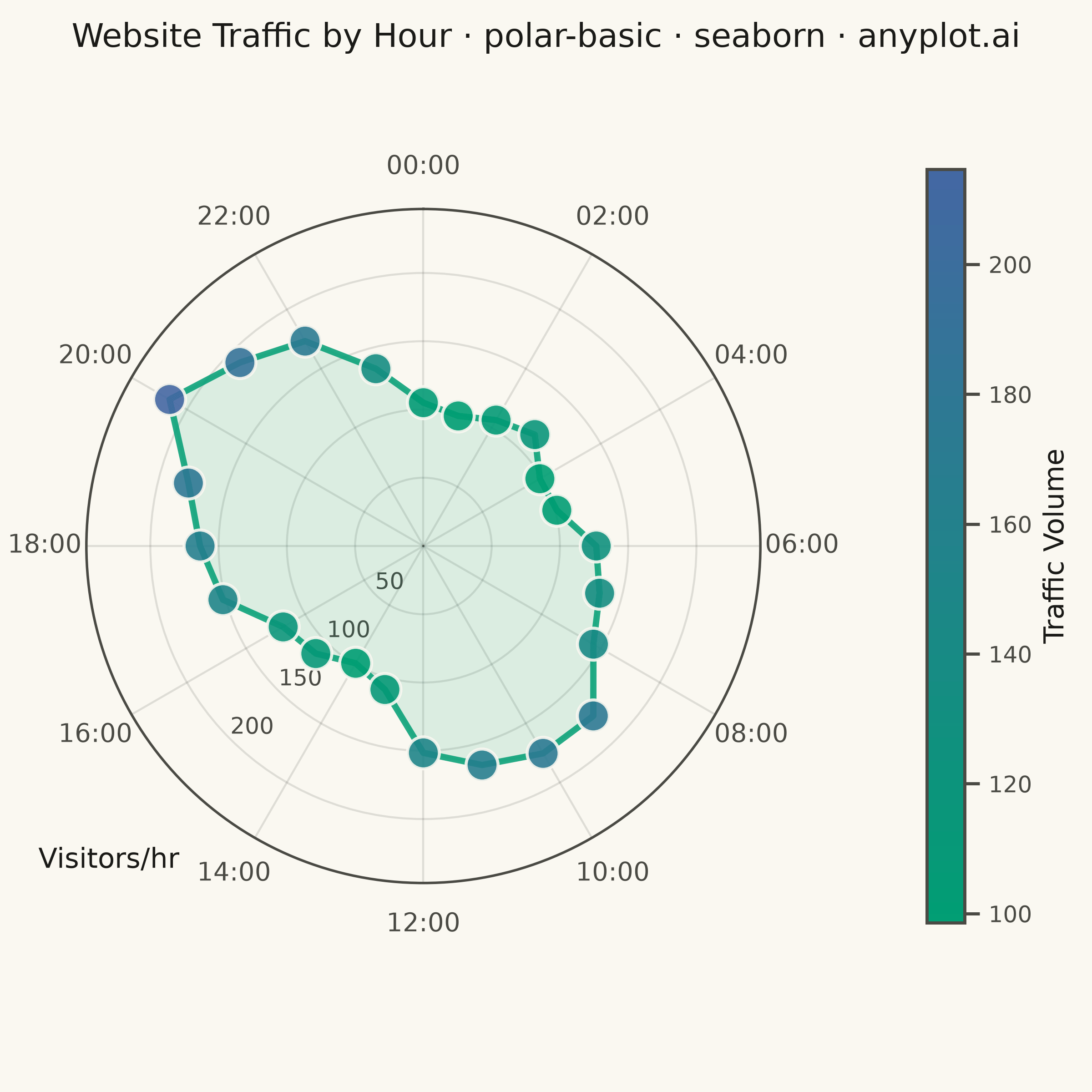
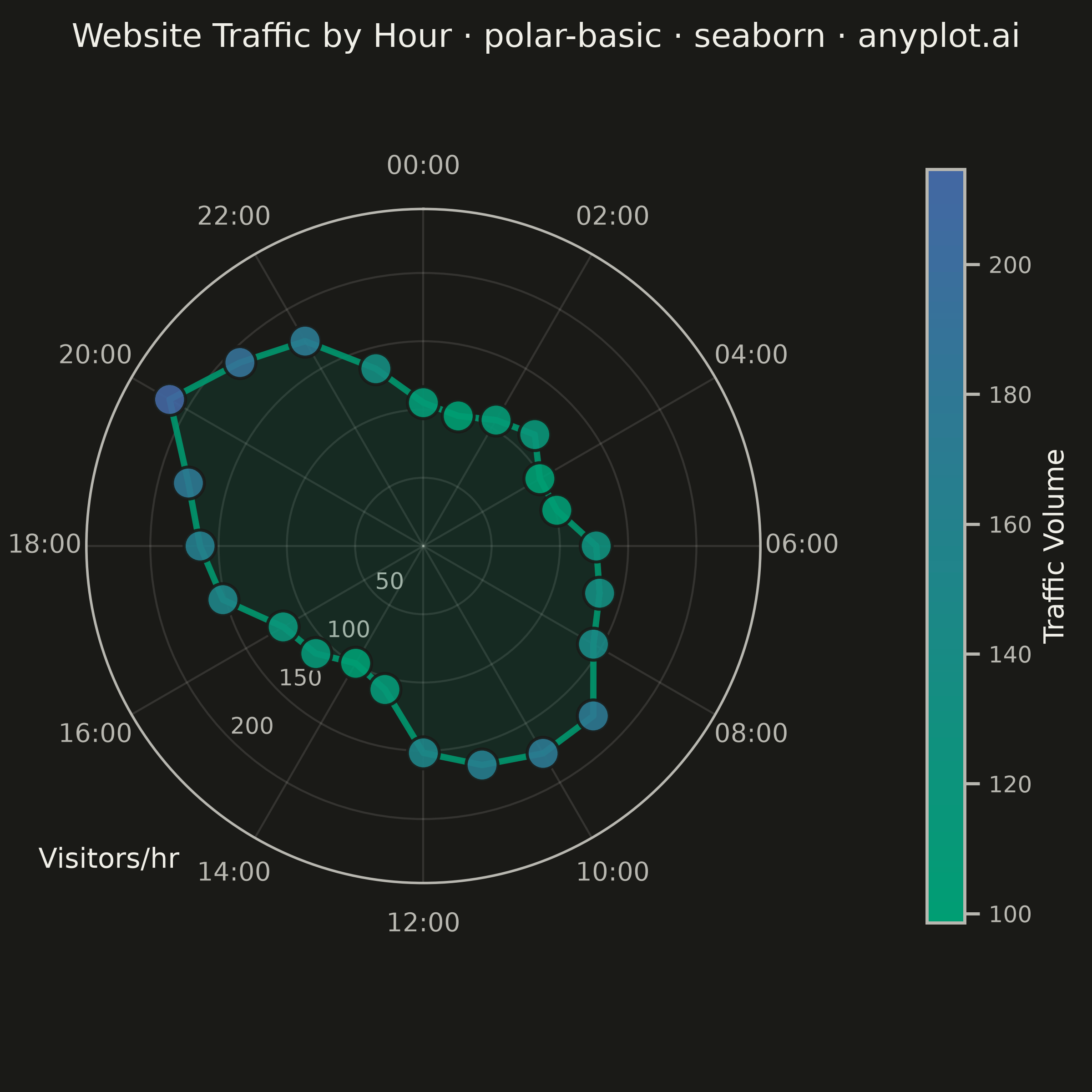
A polar chart displays data points on a circular coordinate system where position is determined by angle (theta) and distance from center (radius). This visualization is ideal for cyclical patterns, directional data, or any dataset where angular relationships are meaningful. It reveals periodic trends and directional distributions that would be obscured in Cartesian coordinates.
""" anyplot.ai
polar-basic: Basic Polar Chart
Library: seaborn 0.13.2 | Python 3.13.14
Quality: 88/100 | Updated: 2026-07-24
"""

import os

import matplotlib.pyplot as plt
import numpy as np
import pandas as pd
import seaborn as sns
from matplotlib.cm import ScalarMappable
from matplotlib.colors import LinearSegmentedColormap, Normalize


# Theme tokens
THEME = os.getenv("ANYPLOT_THEME", "light")
PAGE_BG = "#FAF8F1" if THEME == "light" else "#1A1A17"
ELEVATED_BG = "#FFFDF6" if THEME == "light" else "#242420"
INK = "#1A1A17" if THEME == "light" else "#F0EFE8"
INK_SOFT = "#4A4A44" if THEME == "light" else "#B8B7B0"
BRAND = "#009E73"

# Imprint sequential colormap (single-polarity magnitude: traffic volume)
imprint_seq = LinearSegmentedColormap.from_list("imprint_seq", ["#009E73", "#4467A3"])

sns.set_theme(
    style="ticks",
    rc={
        "figure.facecolor": PAGE_BG,
        "axes.facecolor": PAGE_BG,
        "axes.edgecolor": INK_SOFT,
        "axes.labelcolor": INK,
        "text.color": INK,
        "xtick.color": INK_SOFT,
        "ytick.color": INK_SOFT,
        "grid.color": INK,
        "grid.alpha": 0.10,
        "legend.facecolor": ELEVATED_BG,
        "legend.edgecolor": INK_SOFT,
    },
)

# Data: Hourly website traffic (24-hour cycle)
np.random.seed(42)
hours = np.arange(0, 24)
theta = hours * (2 * np.pi / 24)

base_traffic = 100
morning_peak = 80 * np.exp(-0.5 * ((hours - 10) / 2) ** 2)
evening_peak = 100 * np.exp(-0.5 * ((hours - 20) / 2.5) ** 2)
noise = np.random.normal(0, 10, 24)
traffic = base_traffic + morning_peak + evening_peak + noise
traffic = np.clip(traffic, 20, None)

df = pd.DataFrame({"theta": theta, "traffic": traffic})

# Plot (square format for radial symmetry) — canonical 2400x2400 canvas
fig, ax = plt.subplots(
    figsize=(6, 6), dpi=400, subplot_kw={"projection": "polar"}, facecolor=PAGE_BG, layout="constrained"
)
ax.set_facecolor(PAGE_BG)

# Start at top (12 o'clock), clockwise direction — set before plotting
ax.set_theta_offset(np.pi / 2)
ax.set_theta_direction(-1)

# Scatter points: sns.scatterplot with continuous hue mapped through the Imprint sequential cmap
sns.scatterplot(
    data=df,
    x="theta",
    y="traffic",
    hue="traffic",
    palette=imprint_seq,
    s=160,
    alpha=0.9,
    ax=ax,
    legend=False,
    edgecolor=PAGE_BG,
    linewidth=1.2,
    zorder=5,
)

# Connecting line: sns.lineplot on polar axes
theta_closed = np.append(theta, theta[0])
traffic_closed = np.append(traffic, traffic[0])
df_line = pd.DataFrame({"theta": theta_closed, "traffic": traffic_closed})
sns.lineplot(
    data=df_line,
    x="theta",
    y="traffic",
    color=BRAND,
    linewidth=2.5,
    alpha=0.85,
    ax=ax,
    sort=False,
    estimator=None,
    zorder=4,
)

# Fill under the polygon (no seaborn equivalent for polar fill)
ax.fill(theta_closed, traffic_closed, color=BRAND, alpha=0.12, zorder=3)
ax.set_xlabel("")  # remove "theta" label added by sns.lineplot
ax.set_ylabel("")  # remove "traffic" label added by sns.lineplot — replaced by custom text below

# Focal-point callout on the evening peak (highest-traffic point)
peak_idx = int(np.argmax(traffic))
peak_theta, peak_traffic = theta[peak_idx], traffic[peak_idx]
ax.annotate(
    f"Peak: {peak_traffic:.0f}/hr",
    xy=(peak_theta, peak_traffic),
    xytext=(peak_theta + 0.28, peak_traffic + 55),
    fontsize=10,
    color=INK,
    fontweight="medium",
    ha="center",
    va="center",
    arrowprops={"arrowstyle": "-", "color": INK_SOFT, "linewidth": 0.9},
    zorder=6,
)

# Style — fig.suptitle (centered on the whole figure) rather than ax.set_title
# (centered on the axes only): the colorbar shifts the polar axes off-centre,
# and an axes-centered 60-char title would run off the left edge of the canvas.
fig.suptitle(
    "Website Traffic by Hour · polar-basic · python · seaborn · anyplot.ai",
    fontsize=11,
    fontweight="medium",
    color=INK,
    y=0.98,
)

# Angular labels: every 2 hours (12 labels) to reduce perimeter crowding
tick_hours = np.arange(0, 24, 2)
tick_theta = tick_hours * (2 * np.pi / 24)
ax.set_xticks(tick_theta)
ax.set_xticklabels([f"{h:02d}:00" for h in tick_hours], fontsize=10, color=INK_SOFT)

# Radial range
rmax = max(traffic) * 1.15
ax.set_ylim(0, rmax)

# Radial ticks + label placed in the low-traffic wedge between the 14:00 and
# 16:00 angular ticks — far from the title (top) and clear of neighbouring
# angular tick text, unlike the previous "right"-side placement that collided
# with the 06:00 angular tick label.
rlabel_theta_deg = 225  # data-space theta; renders at screen angle 225 (bottom-left) via offset+direction
ax.set_rlabel_position(rlabel_theta_deg)
ax.tick_params(axis="y", labelsize=9, colors=INK_SOFT)
ax.text(np.deg2rad(rlabel_theta_deg), rmax * 1.32, "Visitors/hr", fontsize=11, color=INK, ha="center", va="center")

# Grid: subtle, theme-adaptive
ax.grid(True, alpha=0.12, linewidth=0.8, color=INK)
ax.spines["polar"].set_color(INK_SOFT)
ax.spines["polar"].set_linewidth(1.0)

# Colorbar via ScalarMappable (seaborn handles point colors; we build the bar explicitly)
norm = Normalize(vmin=traffic.min(), vmax=traffic.max())
sm = ScalarMappable(cmap=imprint_seq, norm=norm)
sm.set_array([])
cbar = plt.colorbar(sm, ax=ax, pad=0.13, shrink=0.7)
cbar.set_label("Traffic Volume", fontsize=11, color=INK)
cbar.ax.tick_params(labelsize=9, colors=INK_SOFT)
plt.setp(cbar.ax.yaxis.get_ticklabels(), color=INK_SOFT)
cbar.outline.set_edgecolor(INK_SOFT)
cbar.ax.set_facecolor(PAGE_BG)

plt.savefig(f"plot-{THEME}.png", dpi=400, facecolor=PAGE_BG)
Runnable source as JSON, for any HTTP client: https://api.anyplot.ai/specs/polar-basic/seaborn/code. Any spec id and library id listed in llms-full.txt fit the same URL shape; every URL below is complete and callable.
{
  "spec_id": "polar-basic",
  "language": "python",
  "library": "seaborn",
  "page": "https://anyplot.ai/polar-basic/python/seaborn",
  "hub": "https://anyplot.ai/polar-basic",
  "code_json": "https://api.anyplot.ai/specs/polar-basic/seaborn/code",
  "spec_json": "https://api.anyplot.ai/specs/polar-basic",
  "render_light_png": "https://storage.googleapis.com/anyplot-images/plots/polar-basic/python/seaborn/plot-light.png",
  "render_dark_png": "https://storage.googleapis.com/anyplot-images/plots/polar-basic/python/seaborn/plot-dark.png",
  "quality_score": 88.0,
  "license": "MIT",
  "guide": "https://anyplot.ai/llms.txt"
}
Part of Basic Polar Chart on anyplot.ai.