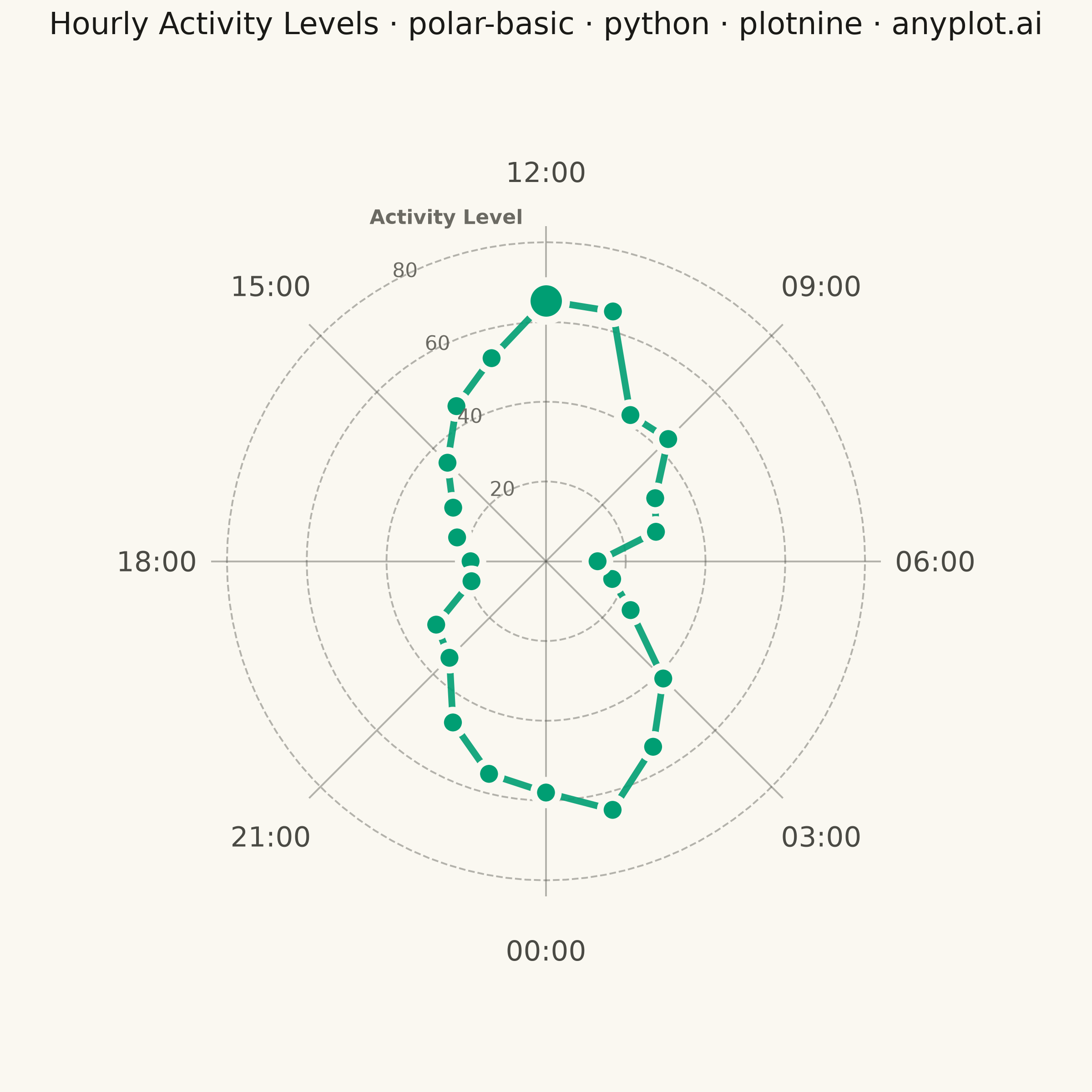
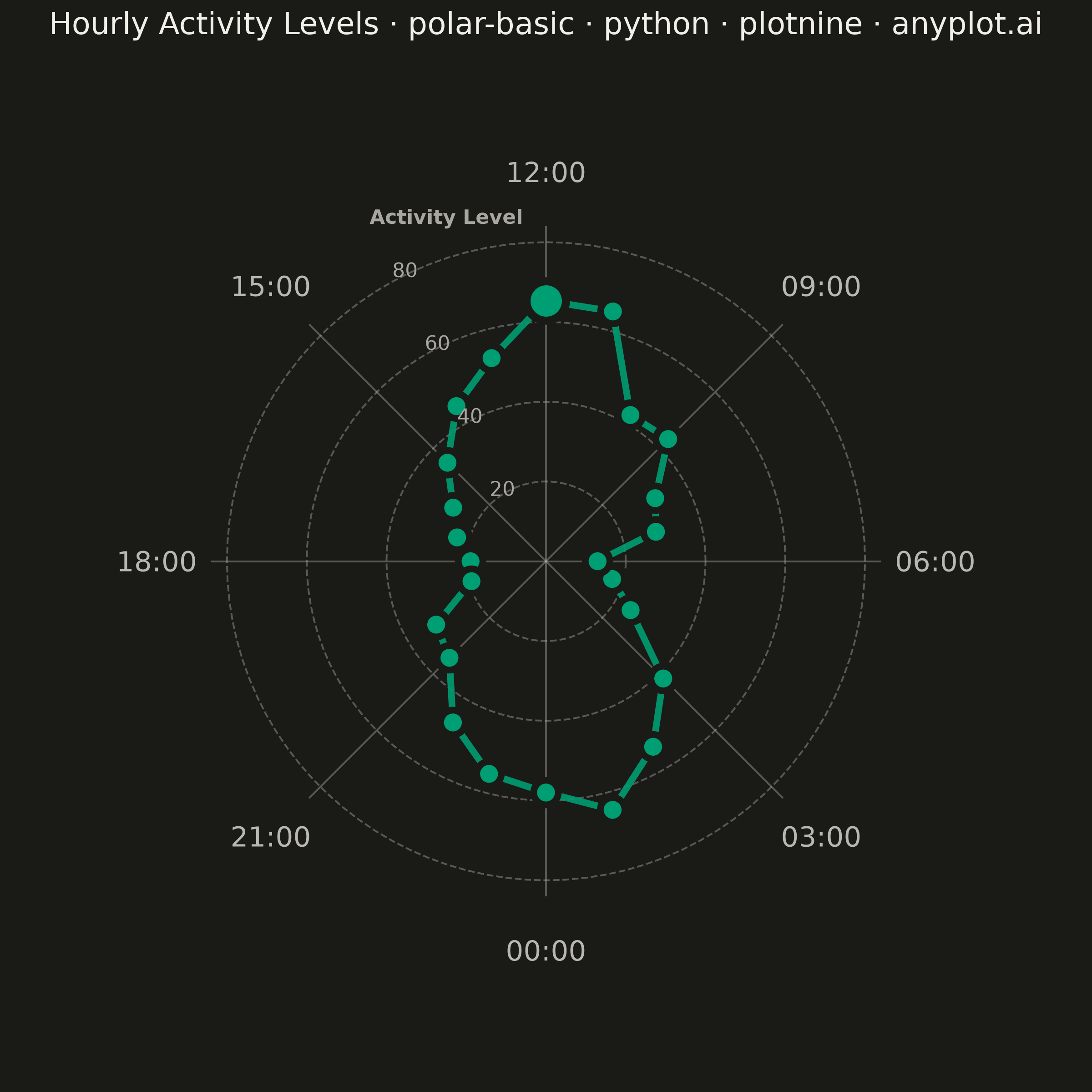
A polar chart displays data points on a circular coordinate system where position is determined by angle (theta) and distance from center (radius). This visualization is ideal for cyclical patterns, directional data, or any dataset where angular relationships are meaningful. It reveals periodic trends and directional distributions that would be obscured in Cartesian coordinates.
""" anyplot.ai
polar-basic: Basic Polar Chart
Library: plotnine 0.15.7 | Python 3.13.14
Quality: 83/100 | Updated: 2026-07-25
"""

import math
import os
import sys


# Prevent this file (plotnine.py) from shadowing the installed plotnine package
_here = os.path.normpath(os.path.abspath(os.path.dirname(__file__)))
sys.path = [p for p in sys.path if os.path.normpath(os.path.abspath(p or ".")) != _here]

import numpy as np
import pandas as pd
from plotnine import (
    aes,
    coord_fixed,
    element_blank,
    element_rect,
    element_text,
    geom_path,
    geom_point,
    geom_segment,
    geom_text,
    ggplot,
    labs,
    scale_x_continuous,
    scale_y_continuous,
    theme,
)


# Theme tokens
THEME = os.getenv("ANYPLOT_THEME", "light")
PAGE_BG = "#FAF8F1" if THEME == "light" else "#1A1A17"
INK = "#1A1A17" if THEME == "light" else "#F0EFE8"
INK_SOFT = "#4A4A44" if THEME == "light" else "#B8B7B0"
INK_MUTED = "#6B6A63" if THEME == "light" else "#A8A79F"
BRAND = "#009E73"  # Imprint palette position 1 — ALWAYS first series

# Data - Hourly activity levels throughout the day (cyclical pattern)
np.random.seed(42)
hours = np.arange(0, 24)
base_activity = 20 + 40 * np.sin((hours - 6) * np.pi / 12) ** 2
activity = base_activity + np.random.uniform(-8, 8, 24)
activity = np.clip(activity, 5, 100)

# Convert hours to angles (0 hours = bottom, increasing counter-clockwise)
theta = hours * 2 * math.pi / 24 - math.pi / 2

# Convert polar to Cartesian coordinates
x = activity * np.cos(theta)
y = activity * np.sin(theta)

df = pd.DataFrame({"hour": hours, "activity": activity, "theta": theta, "x": x, "y": y})

# Close the loop by adding first point at end
df_closed = pd.concat([df, df.iloc[[0]]], ignore_index=True)

# Peak point, highlighted below with a larger marker (visual emphasis, no text callout)
peak_df = df.iloc[[int(np.argmax(activity))]]

# Radial scale sized to the actual data range (+15% headroom) so the shape
# fills most of the polar area instead of a fixed 0-100 scale compressing it.
grid_max = math.ceil(activity.max() * 1.15 / 10) * 10
grid_radii = [grid_max / 4, grid_max / 2, 3 * grid_max / 4, grid_max]
spoke_radius = grid_max * 1.05
hour_label_radius = grid_max * 1.22
axis_limit = grid_max * 1.45

# Circular gridlines
grid_rows = []
grid_angles = np.linspace(0, 2 * math.pi, 101)
for radius in grid_radii:
    for angle in grid_angles:
        grid_rows.append({"x": radius * np.cos(angle), "y": radius * np.sin(angle), "radius": radius})

grid_df = pd.DataFrame(grid_rows)

# Radial spokes (every 3 hours = 8 spokes)
spoke_rows = []
spoke_hours = [0, 3, 6, 9, 12, 15, 18, 21]
for h in spoke_hours:
    angle = h * 2 * math.pi / 24 - math.pi / 2
    spoke_rows.append({"x1": 0, "y1": 0, "x2": spoke_radius * np.cos(angle), "y2": spoke_radius * np.sin(angle)})

spoke_df = pd.DataFrame(spoke_rows)

# Hour labels positioned outside the chart
label_rows = []
for h in spoke_hours:
    angle = h * 2 * math.pi / 24 - math.pi / 2
    label_rows.append(
        {"label": f"{h:02d}:00", "x": hour_label_radius * np.cos(angle), "y": hour_label_radius * np.sin(angle)}
    )

label_df = pd.DataFrame(label_rows)

# Radius labels (activity level scale), placed off to the upper-left between
# the 12:00 and 15:00 spokes — away from the 06:00/18:00 valleys on the
# horizontal axis where low-activity points would otherwise crowd the labels.
# Angle is kept roughly midway between the 12:00 (90°) and 15:00 (135°) spokes
# so the outermost "Activity Level" title clears the "12:00" hour label instead
# of sitting at nearly the same radius only 10° away from it.
radius_label_angle = math.radians(114)
radius_labels = [
    {"label": str(int(r)), "x": r * math.cos(radius_label_angle) - 6, "y": r * math.sin(radius_label_angle)}
    for r in grid_radii
]
radius_label_df = pd.DataFrame(radius_labels)

# Radial axis title, placed just beyond the outermost ring on the same spoke
radial_axis_label_df = pd.DataFrame(
    [
        {
            "label": "Activity Level",
            "x": (grid_max + 14) * math.cos(radius_label_angle) - 6,
            "y": (grid_max + 14) * math.sin(radius_label_angle),
        }
    ]
)

# Plot — plotnine has no coord_polar (unlike ggplot2), so the circle is built
# from Cartesian geoms: geom_path/geom_segment for the grid, geom_point/geom_text for data and labels.
plot = (
    ggplot()
    # Circular gridlines
    + geom_path(aes(x="x", y="y", group="radius"), data=grid_df, color=INK_SOFT, size=0.4, alpha=0.4, linetype="dashed")
    # Radial spokes
    + geom_segment(aes(x="x1", y="y1", xend="x2", yend="y2"), data=spoke_df, color=INK_SOFT, size=0.4, alpha=0.4)
    # Data line
    + geom_path(aes(x="x", y="y"), data=df_closed, color=BRAND, size=1.5, alpha=0.9)
    # Data points
    + geom_point(aes(x="x", y="y"), data=df, color=PAGE_BG, fill=BRAND, size=4, stroke=1.5)
    # Peak activity hour, emphasized with a larger marker
    + geom_point(aes(x="x", y="y"), data=peak_df, color=PAGE_BG, fill=BRAND, size=7, stroke=1.8)
    # Hour labels
    + geom_text(aes(x="x", y="y", label="label"), data=label_df, size=11, color=INK_SOFT)
    # Radius value labels
    + geom_text(aes(x="x", y="y", label="label"), data=radius_label_df, size=8, color=INK_MUTED, ha="left")
    # Radial axis title, describing what the radius numbers measure
    + geom_text(
        aes(x="x", y="y", label="label"),
        data=radial_axis_label_df,
        size=8,
        color=INK_MUTED,
        ha="left",
        fontweight="bold",
    )
    + coord_fixed(ratio=1)
    + scale_x_continuous(limits=(-axis_limit, axis_limit))
    + scale_y_continuous(limits=(-axis_limit, axis_limit))
    + labs(title="Hourly Activity Levels · polar-basic · python · plotnine · anyplot.ai")
    + theme(
        figure_size=(6, 6),
        plot_title=element_text(size=12, ha="center", color=INK),
        axis_title=element_blank(),
        axis_text=element_blank(),
        axis_ticks=element_blank(),
        axis_line=element_blank(),
        panel_grid_major=element_blank(),
        panel_grid_minor=element_blank(),
        panel_background=element_rect(fill=PAGE_BG, color=PAGE_BG),
        plot_background=element_rect(fill=PAGE_BG, color=PAGE_BG),
        plot_margin_top=0.01,
        plot_margin_bottom=0.02,
        plot_margin_left=0.02,
        plot_margin_right=0.02,
    )
)

# Save
plot.save(f"plot-{THEME}.png", dpi=400, width=6, height=6, units="in")
Runnable source as JSON, for any HTTP client: https://api.anyplot.ai/specs/polar-basic/plotnine/code. Any spec id and library id listed in llms-full.txt fit the same URL shape; every URL below is complete and callable.
{
  "spec_id": "polar-basic",
  "language": "python",
  "library": "plotnine",
  "page": "https://anyplot.ai/polar-basic/python/plotnine",
  "hub": "https://anyplot.ai/polar-basic",
  "code_json": "https://api.anyplot.ai/specs/polar-basic/plotnine/code",
  "spec_json": "https://api.anyplot.ai/specs/polar-basic",
  "render_light_png": "https://storage.googleapis.com/anyplot-images/plots/polar-basic/python/plotnine/plot-light.png",
  "render_dark_png": "https://storage.googleapis.com/anyplot-images/plots/polar-basic/python/plotnine/plot-dark.png",
  "quality_score": 83.0,
  "license": "MIT",
  "guide": "https://anyplot.ai/llms.txt"
}
Part of Basic Polar Chart on anyplot.ai.