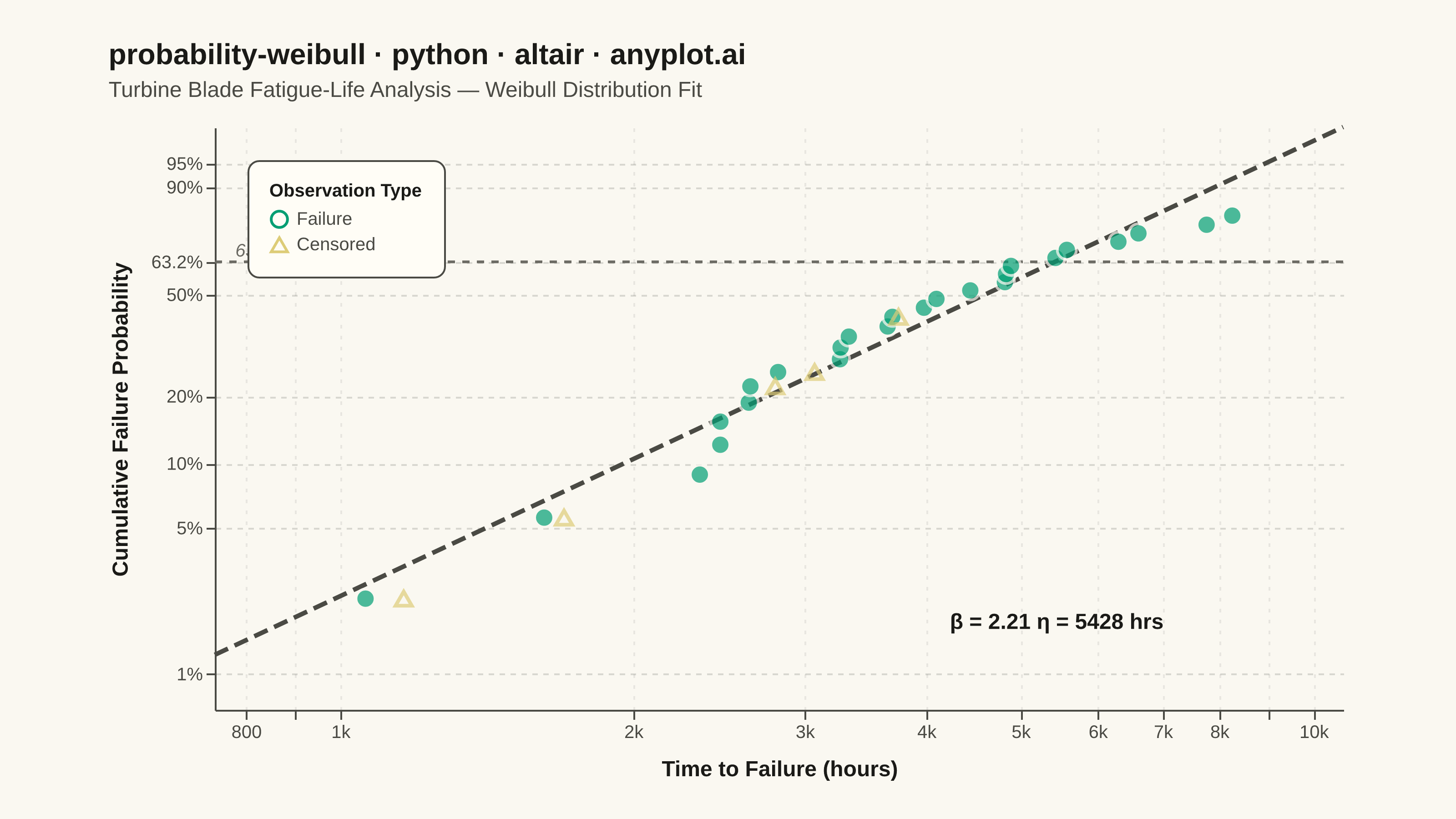
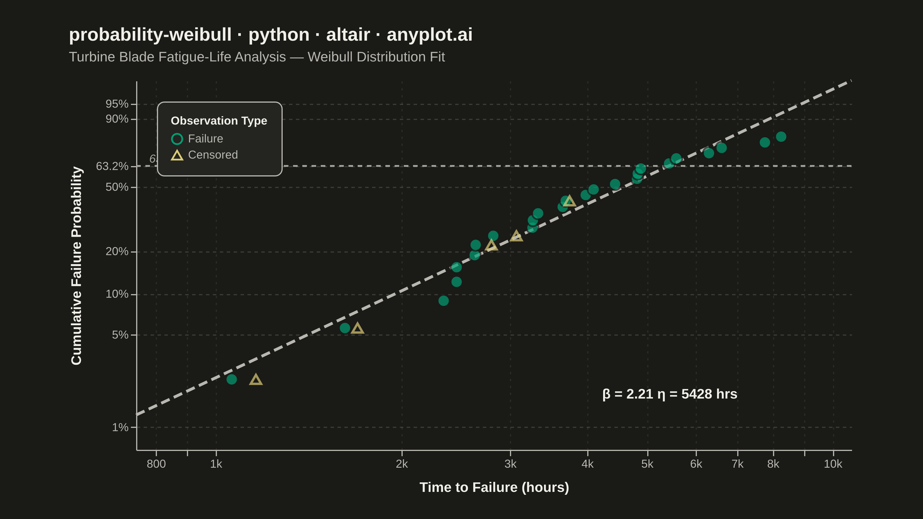
A Weibull probability plot displays failure or lifetime data on Weibull probability paper (logarithmic x-axis for time/cycles, linearized Weibull CDF on y-axis) with a fitted straight line. It is the standard tool in reliability engineering for estimating Weibull distribution parameters (shape and scale), assessing whether data follow a Weibull distribution, and extrapolating failure probabilities. The slope of the fitted line gives the shape parameter (beta), while the characteristic life (eta) is read at the 63.2% failure probability crossing.
""" anyplot.ai
probability-weibull: Weibull Probability Plot for Reliability Analysis
Library: altair 6.2.1 | Python 3.13.13
Quality: 90/100 | Updated: 2026-06-07
"""

import os

import altair as alt
import numpy as np
import pandas as pd
from PIL import Image
from scipy import stats


# Theme tokens
THEME = os.getenv("ANYPLOT_THEME", "light")
PAGE_BG = "#FAF8F1" if THEME == "light" else "#1A1A17"
ELEVATED_BG = "#FFFDF6" if THEME == "light" else "#242420"
INK = "#1A1A17" if THEME == "light" else "#F0EFE8"
INK_SOFT = "#4A4A44" if THEME == "light" else "#B8B7B0"
INK_MUTED = "#6B6A63" if THEME == "light" else "#A8A79F"

# Imprint palette — first series always #009E73
CLR_FAILURE = "#009E73"  # brand green — primary data (failures)
CLR_CENSORED = "#DDCC77"  # amber — suspended/uncertain observations

# Data - Turbine blade fatigue-life (hours)
np.random.seed(42)
n_failures = 25
n_censored = 5
shape_true = 2.5
scale_true = 5000

failure_times = np.sort(stats.weibull_min.rvs(shape_true, scale=scale_true, size=n_failures))
censored_times = np.sort(np.random.uniform(1000, 4500, size=n_censored))

all_times = np.concatenate([failure_times, censored_times])
is_failure = np.concatenate([np.ones(n_failures), np.zeros(n_censored)])

sort_idx = np.argsort(all_times)
all_times = all_times[sort_idx]
is_failure = is_failure[sort_idx]

# Median rank plotting positions for failures only
failure_ranks = np.cumsum(is_failure)
n_total = n_failures + n_censored
median_rank = (failure_ranks - 0.3) / (n_total + 0.4)

# Weibull y-axis transform: ln(-ln(1 - F))
weibull_y = np.log(-np.log(1 - median_rank))
log_times = np.log(all_times)

failure_mask = is_failure == 1
slope, intercept, _, _, _ = stats.linregress(log_times[failure_mask], weibull_y[failure_mask])
beta_est = slope
eta_est = np.exp(-intercept / slope)

df = pd.DataFrame(
    {
        "time": all_times,
        "log_time": log_times,
        "weibull_y": weibull_y,
        "status": np.where(is_failure == 1, "Failure", "Censored"),
    }
)

# Fitted line data
fit_log_x = np.linspace(np.log(all_times.min() * 0.7), np.log(all_times.max() * 1.3), 200)
fit_y = slope * fit_log_x + intercept
fit_time = np.exp(fit_log_x)
df_fit = pd.DataFrame({"time": fit_time, "weibull_y": fit_y})

# Reference line at 63.2% (characteristic life)
ref_y = np.log(-np.log(1 - 0.632))

# Y-axis range
data_y_min = weibull_y[failure_mask].min()
data_y_max = weibull_y[failure_mask].max()
y_padding = (data_y_max - data_y_min) * 0.2
y_min = data_y_min - y_padding
y_max = data_y_max + y_padding

# X-axis domain
x_min = all_times.min() * 0.7
x_max = all_times.max() * 1.3

# Weibull probability labels for y-axis
prob_levels = np.array([0.01, 0.05, 0.10, 0.20, 0.50, 0.632, 0.90, 0.95, 0.99])
weibull_ticks = np.log(-np.log(1 - prob_levels))
prob_labels = ["1%", "5%", "10%", "20%", "50%", "63.2%", "90%", "95%", "99%"]
mask_ticks = (weibull_ticks >= y_min) & (weibull_ticks <= y_max)
visible_ticks = weibull_ticks[mask_ticks]
visible_labels = [prob_labels[i] for i in range(len(prob_labels)) if mask_ticks[i]]

label_cases = " : ".join(
    f"abs(datum.value - {val:.4f}) < 0.01 ? '{lbl}'" for val, lbl in zip(visible_ticks, visible_labels, strict=True)
)
y_label_expr = f"{label_cases} : ''"

# Shared axis encodings
x_enc = alt.X(
    "time:Q",
    scale=alt.Scale(type="log", domain=[x_min, x_max], nice=False),
    title="Time to Failure (hours)",
    axis=alt.Axis(format="~s"),
)
y_enc = alt.Y(
    "weibull_y:Q",
    scale=alt.Scale(domain=[y_min, y_max]),
    title="Cumulative Failure Probability",
    axis=alt.Axis(values=visible_ticks.tolist(), labelExpr=y_label_expr),
)
tooltip_enc = [
    alt.Tooltip("time:Q", title="Time (hrs)", format=",.0f"),
    alt.Tooltip("status:N", title="Status"),
    alt.Tooltip("weibull_y:Q", title="Weibull Y", format=".2f"),
]

# Failure points (filled circles)
failures_chart = (
    alt.Chart(df[df["status"] == "Failure"])
    .mark_point(size=110, filled=True, color=CLR_FAILURE, strokeWidth=1.5, stroke=PAGE_BG)
    .encode(x=x_enc, y=y_enc, tooltip=tooltip_enc)
)

# Censored points (open triangles)
censored_chart = (
    alt.Chart(df[df["status"] == "Censored"])
    .mark_point(size=80, filled=False, shape="triangle-up", color=CLR_CENSORED, strokeWidth=2.0)
    .encode(x=x_enc, y=y_enc, tooltip=tooltip_enc)
)

# Legend layer — invisible markers that expose color+shape in the legend
legend_points = (
    alt.Chart(df)
    .mark_point(size=80, strokeWidth=2)
    .encode(
        x=alt.X("time:Q"),
        y=alt.Y("weibull_y:Q"),
        color=alt.Color(
            "status:N",
            scale=alt.Scale(domain=["Failure", "Censored"], range=[CLR_FAILURE, CLR_CENSORED]),
            legend=alt.Legend(title="Observation Type", symbolSize=80, labelFontSize=10, titleFontSize=10),
        ),
        shape=alt.Shape(
            "status:N", scale=alt.Scale(domain=["Failure", "Censored"], range=["circle", "triangle-up"]), legend=None
        ),
        opacity=alt.value(0),
    )
)

# Fitted Weibull line
fit_line = (
    alt.Chart(df_fit)
    .mark_line(strokeWidth=2.5, color=INK_SOFT, strokeDash=[8, 4])
    .encode(x=alt.X("time:Q", scale=alt.Scale(type="log")), y=alt.Y("weibull_y:Q"))
)

# Reference line at 63.2% characteristic life
df_ref = pd.DataFrame({"weibull_y": [ref_y, ref_y], "time": [x_min, x_max]})
ref_line = (
    alt.Chart(df_ref)
    .mark_line(strokeWidth=1.5, color=INK_MUTED, strokeDash=[4, 4])
    .encode(x=alt.X("time:Q", scale=alt.Scale(type="log")), y=alt.Y("weibull_y:Q"))
)

# Parameter annotation (beta and eta in lower-right)
df_annotation = pd.DataFrame(
    {
        "time": [all_times.max() * 0.85],
        "weibull_y": [y_min + (y_max - y_min) * 0.10],
        "text": [f"β = {beta_est:.2f}   η = {eta_est:.0f} hrs"],
    }
)
param_text = (
    alt.Chart(df_annotation)
    .mark_text(fontSize=12, align="right", fontWeight="bold", color=INK)
    .encode(x=alt.X("time:Q", scale=alt.Scale(type="log")), y=alt.Y("weibull_y:Q"), text="text:N")
)

# 63.2% label
df_ref_label = pd.DataFrame(
    {"time": [x_min * 1.05], "weibull_y": [ref_y + 0.12], "text": ["63.2% Characteristic Life"]}
)
ref_label = (
    alt.Chart(df_ref_label)
    .mark_text(fontSize=10, align="left", color=INK_MUTED, fontStyle="italic")
    .encode(x=alt.X("time:Q", scale=alt.Scale(type="log")), y=alt.Y("weibull_y:Q"), text="text:N")
)

# Interactive hover highlight on failure points
highlight = alt.selection_point(name="hover", on="pointerover", fields=["status"], empty=False)
failures_interactive = failures_chart.add_params(highlight).encode(
    size=alt.condition(highlight, alt.value(170), alt.value(110))
)

# Title: 50 chars — under 67 baseline, no fontsize scaling needed
title_str = "probability-weibull · python · altair · anyplot.ai"

# Combine all layers
chart = (
    (ref_line + fit_line + failures_interactive + censored_chart + legend_points + param_text + ref_label)
    .properties(
        width=620,
        height=320,
        background=PAGE_BG,
        title=alt.Title(
            title_str,
            fontSize=16,
            fontWeight="bold",
            color=INK,
            subtitle="Turbine Blade Fatigue-Life Analysis  —  Weibull Distribution Fit",
            subtitleFontSize=12,
            subtitleColor=INK_SOFT,
            subtitlePadding=6,
            anchor="start",
            offset=12,
        ),
    )
    .configure_view(continuousWidth=620, continuousHeight=320, strokeWidth=0, fill=PAGE_BG)
    .configure_axisX(
        labelFontSize=10,
        titleFontSize=12,
        gridOpacity=0.08,
        gridDash=[2, 4],
        gridColor=INK,
        domainColor=INK_SOFT,
        tickColor=INK_SOFT,
        labelColor=INK_SOFT,
        titleColor=INK,
        titlePadding=10,
    )
    .configure_axisY(
        labelFontSize=10,
        titleFontSize=12,
        gridOpacity=0.15,
        gridDash=[3, 3],
        gridColor=INK,
        domainColor=INK_SOFT,
        tickColor=INK_SOFT,
        labelColor=INK_SOFT,
        titleColor=INK,
        titlePadding=10,
    )
    .configure_legend(
        orient="top-left",
        padding=12,
        cornerRadius=6,
        strokeColor=INK_SOFT,
        fillColor=ELEVATED_BG,
        labelFontSize=10,
        titleFontSize=10,
        labelColor=INK_SOFT,
        titleColor=INK,
    )
)

# Save PNG (scale_factor=4.0 → inner view 620×320 maps to ~3200×1800 after vl-convert padding)
chart.save(f"plot-{THEME}.png", scale_factor=4.0)

# Pad to exact 3200×1800 canvas with PAGE_BG fill; never crop (AR-09)
TW, TH = 3200, 1800
_img = Image.open(f"plot-{THEME}.png").convert("RGB")
_w, _h = _img.size
if _w > TW or _h > TH:
    raise SystemExit(
        f"altair vl-convert produced {_w}×{_h}, exceeds target {TW}×{TH}. "
        f"Shrink chart .properties(width=, height=) values and re-render."
    )
if _w < TW or _h < TH:
    _canvas = Image.new("RGB", (TW, TH), PAGE_BG)
    _canvas.paste(_img, ((TW - _w) // 2, (TH - _h) // 2))
    _canvas.save(f"plot-{THEME}.png")

chart.save(f"plot-{THEME}.html")
Runnable source as JSON, for any HTTP client: https://api.anyplot.ai/specs/probability-weibull/altair/code. Any spec id and library id listed in llms-full.txt fit the same URL shape; every URL below is complete and callable.
{
  "spec_id": "probability-weibull",
  "language": "python",
  "library": "altair",
  "page": "https://anyplot.ai/probability-weibull/python/altair",
  "hub": "https://anyplot.ai/probability-weibull",
  "code_json": "https://api.anyplot.ai/specs/probability-weibull/altair/code",
  "spec_json": "https://api.anyplot.ai/specs/probability-weibull",
  "render_light_png": "https://storage.googleapis.com/anyplot-images/plots/probability-weibull/python/altair/plot-light.png",
  "render_dark_png": "https://storage.googleapis.com/anyplot-images/plots/probability-weibull/python/altair/plot-dark.png",
  "interactive_light_html": "https://storage.googleapis.com/anyplot-images/plots/probability-weibull/python/altair/plot-light.html",
  "interactive_dark_html": "https://storage.googleapis.com/anyplot-images/plots/probability-weibull/python/altair/plot-dark.html",
  "quality_score": 90.0,
  "license": "MIT",
  "guide": "https://anyplot.ai/llms.txt"
}
Part of Weibull Probability Plot for Reliability Analysis on anyplot.ai.