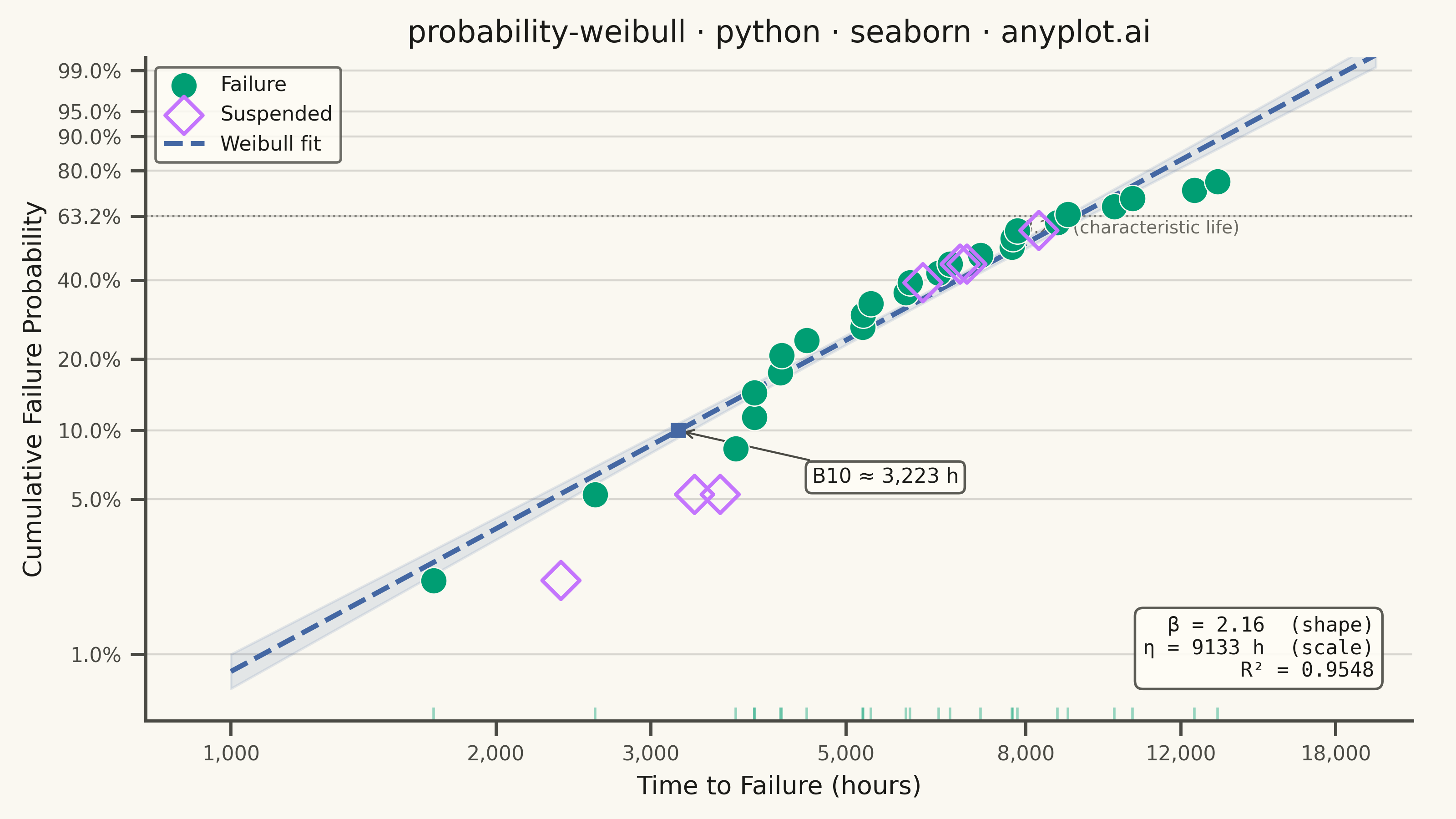
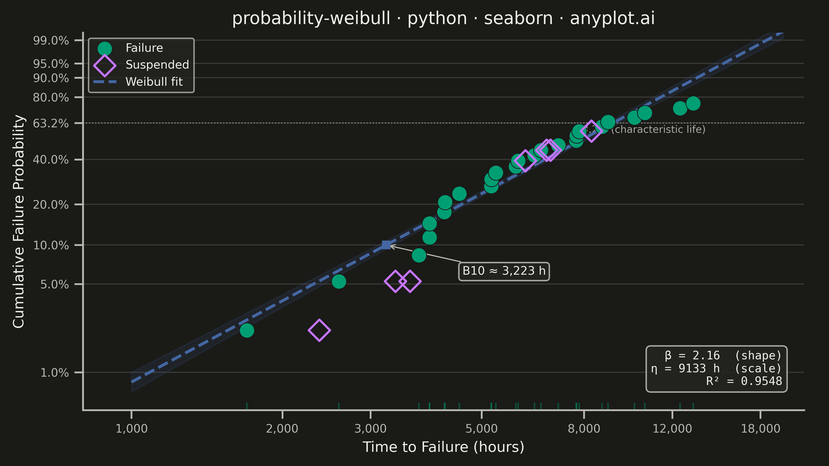
A Weibull probability plot displays failure or lifetime data on Weibull probability paper (logarithmic x-axis for time/cycles, linearized Weibull CDF on y-axis) with a fitted straight line. It is the standard tool in reliability engineering for estimating Weibull distribution parameters (shape and scale), assessing whether data follow a Weibull distribution, and extrapolating failure probabilities. The slope of the fitted line gives the shape parameter (beta), while the characteristic life (eta) is read at the 63.2% failure probability crossing.
""" anyplot.ai
probability-weibull: Weibull Probability Plot for Reliability Analysis
Library: seaborn 0.13.2 | Python 3.13.13
Quality: 88/100 | Updated: 2026-06-07
"""

import os
import sys


# Prevent local .py files from shadowing real packages (matplotlib.py, seaborn.py, etc.)
sys.path = [
    p
    for p in sys.path
    if p not in ("", ".") and not p.endswith("/implementations/python") and not p.endswith("/implementations")
]

import matplotlib.pyplot as plt
import numpy as np
import pandas as pd
import seaborn as sns
from scipy import stats


# Theme tokens
THEME = os.getenv("ANYPLOT_THEME", "light")
PAGE_BG = "#FAF8F1" if THEME == "light" else "#1A1A17"
ELEVATED_BG = "#FFFDF6" if THEME == "light" else "#242420"
INK = "#1A1A17" if THEME == "light" else "#F0EFE8"
INK_SOFT = "#4A4A44" if THEME == "light" else "#B8B7B0"
INK_MUTED = "#6B6A63" if THEME == "light" else "#A8A79F"

# Imprint palette — canonical order, first series always #009E73
IMPRINT_PALETTE = ["#009E73", "#C475FD", "#4467A3", "#BD8233", "#AE3030", "#2ABCCD", "#954477", "#99B314"]
COLOR_FAILURE = IMPRINT_PALETTE[0]  # brand green — failures
COLOR_CENSORED = IMPRINT_PALETTE[1]  # lavender — suspended observations
COLOR_FIT = IMPRINT_PALETTE[2]  # blue — Weibull fit line

sns.set_theme(
    style="ticks",
    rc={
        "figure.facecolor": PAGE_BG,
        "axes.facecolor": PAGE_BG,
        "axes.edgecolor": INK_SOFT,
        "axes.labelcolor": INK,
        "text.color": INK,
        "xtick.color": INK_SOFT,
        "ytick.color": INK_SOFT,
        "grid.color": INK,
        "grid.alpha": 0.15,
        "legend.facecolor": ELEVATED_BG,
        "legend.edgecolor": INK_SOFT,
    },
)

# Data — turbine blade fatigue-life (hours)
np.random.seed(42)
shape_true = 2.5
scale_true = 8000
n_failures = 25
n_censored = 7
n_total = n_failures + n_censored

failure_times = np.sort(stats.weibull_min.rvs(shape_true, scale=scale_true, size=n_failures))
censor_times = np.sort(np.random.uniform(2000, 10000, size=n_censored))

all_times = np.concatenate([failure_times, censor_times])
is_censored = np.concatenate([np.zeros(n_failures, dtype=bool), np.ones(n_censored, dtype=bool)])

sort_idx = np.argsort(all_times)
all_times = all_times[sort_idx]
is_censored = is_censored[sort_idx]

# Median rank plotting positions (Benard approximation) for all points
failure_rank = np.cumsum(~is_censored)
median_rank = (failure_rank - 0.3) / (n_total + 0.4)

# Weibull linearized y-axis: ln(-ln(1-F)) — transforms Weibull CDF to straight line
weibull_y = np.log(-np.log(1 - median_rank))
log_times = np.log(all_times)

# Fit line via linear regression on failure points only
failure_mask = ~is_censored
slope, intercept, r_value, _, _ = stats.linregress(log_times[failure_mask], weibull_y[failure_mask])
beta = slope
eta = np.exp(-intercept / slope)

# Fit line data
x_fit = np.linspace(np.log(1000), np.log(20000), 200)
y_fit = slope * x_fit + intercept
df_fit = pd.DataFrame({"log_time": x_fit, "weibull_y": y_fit})

# DataFrame for scatter
df = pd.DataFrame(
    {"log_time": log_times, "weibull_y": weibull_y, "Status": np.where(is_censored, "Suspended", "Failure")}
)

# Plot — landscape canvas: figsize=(8, 4.5) × dpi=400 → 3200×1800 px
fig, ax = plt.subplots(figsize=(8, 4.5), dpi=400, facecolor=PAGE_BG)
ax.set_facecolor(PAGE_BG)

df_failures = df[df["Status"] == "Failure"]
df_suspended = df[df["Status"] == "Suspended"]

sns.scatterplot(
    data=df_failures,
    x="log_time",
    y="weibull_y",
    color=COLOR_FAILURE,
    s=110,
    marker="o",
    edgecolor=PAGE_BG,
    linewidth=0.5,
    label="Failure",
    zorder=5,
    ax=ax,
)

sns.scatterplot(
    data=df_suspended,
    x="log_time",
    y="weibull_y",
    color="none",
    s=110,
    marker="D",
    edgecolor=COLOR_CENSORED,
    linewidth=1.5,
    label="Suspended",
    zorder=5,
    ax=ax,
)

sns.lineplot(
    data=df_fit,
    x="log_time",
    y="weibull_y",
    color=COLOR_FIT,
    linewidth=2.0,
    linestyle="--",
    label="Weibull fit",
    zorder=4,
    ax=ax,
)

# Confidence band on fit line (±1σ prediction interval approximation)
n_fit = failure_mask.sum()
x_mean = log_times[failure_mask].mean()
ss_xx = np.sum((log_times[failure_mask] - x_mean) ** 2)
se_fit = np.sqrt(np.sum((weibull_y[failure_mask] - (slope * log_times[failure_mask] + intercept)) ** 2) / (n_fit - 2))
ci_half = se_fit * np.sqrt(1 / n_fit + (x_fit - x_mean) ** 2 / ss_xx)
ax.fill_between(x_fit, y_fit - ci_half, y_fit + ci_half, color=COLOR_FIT, alpha=0.12, zorder=3)

# Reference line at 63.2% characteristic life
y_632 = np.log(-np.log(1 - 0.632))
ax.axhline(y=y_632, color=INK_SOFT, linewidth=0.8, linestyle=":", alpha=0.6, zorder=3)
ax.text(np.log(14000), y_632 - 0.18, "63.2% (characteristic life)", fontsize=7, color=INK_MUTED, ha="right")

# B10 life — time at 10% cumulative failure probability
b10_y = np.log(-np.log(1 - 0.10))
b10_x = (b10_y - intercept) / slope
b10_time = np.exp(b10_x)
ax.plot(b10_x, b10_y, "s", color=COLOR_FIT, markersize=5, zorder=6)
ax.annotate(
    f"B10 ≈ {b10_time:,.0f} h",
    xy=(b10_x, b10_y),
    xytext=(b10_x + 0.35, b10_y - 0.55),
    fontsize=8,
    color=INK,
    arrowprops={"arrowstyle": "->", "color": INK_SOFT, "linewidth": 0.8},
    bbox={"boxstyle": "round,pad=0.3", "facecolor": ELEVATED_BG, "edgecolor": INK_SOFT, "alpha": 0.9},
)

# Weibull parameters box
ax.text(
    0.97,
    0.06,
    f"β = {beta:.2f}  (shape)\nη = {eta:.0f} h  (scale)\nR² = {r_value**2:.4f}",
    transform=ax.transAxes,
    fontsize=8,
    fontfamily="monospace",
    ha="right",
    va="bottom",
    color=INK,
    bbox={"boxstyle": "round,pad=0.4", "facecolor": ELEVATED_BG, "edgecolor": INK_SOFT, "alpha": 0.9},
)

# Rugplot for failure time density (distinctive seaborn feature)
df_rug = pd.DataFrame({"log_time": log_times[failure_mask]})
sns.rugplot(data=df_rug, x="log_time", color=COLOR_FAILURE, height=0.02, alpha=0.4, ax=ax)

# Custom x-axis tick labels (real time values from log scale)
time_ticks = [1000, 2000, 3000, 5000, 8000, 12000, 18000]
ax.set_xticks([np.log(t) for t in time_ticks])
ax.set_xticklabels([f"{t:,}" for t in time_ticks])

# Custom y-axis tick labels (cumulative probability from linearized Weibull scale)
prob_ticks = [0.01, 0.05, 0.10, 0.20, 0.40, 0.632, 0.80, 0.90, 0.95, 0.99]
y_tick_vals = [np.log(-np.log(1 - p)) for p in prob_ticks]
ax.set_yticks(y_tick_vals)
ax.set_yticklabels([f"{p * 100:.1f}%" if p != 0.632 else "63.2%" for p in prob_ticks])

ax.set_xlim(np.log(800), np.log(22000))
ax.set_ylim(np.log(-np.log(1 - 0.005)), np.log(-np.log(1 - 0.995)))

# Title fontsize scaled for length (style guide formula)
title = "probability-weibull · python · seaborn · anyplot.ai"
n = len(title)
ratio = 67 / n if n > 67 else 1.0
title_fontsize = max(8, round(12 * ratio))

ax.set_title(title, fontsize=title_fontsize, fontweight="medium", color=INK)
ax.set_xlabel("Time to Failure (hours)", fontsize=10, color=INK)
ax.set_ylabel("Cumulative Failure Probability", fontsize=10, color=INK)
ax.tick_params(axis="both", labelsize=8, colors=INK_SOFT)

sns.despine(ax=ax)
ax.yaxis.grid(True, alpha=0.15, linewidth=0.8, color=INK)
ax.set_axisbelow(True)

ax.legend(fontsize=8, frameon=True, loc="upper left", facecolor=ELEVATED_BG, edgecolor=INK_SOFT)

fig.subplots_adjust(left=0.1, right=0.97, bottom=0.12, top=0.93)

# Save — bbox_inches must NOT be 'tight' (seaborn canvas rule: figsize × dpi = exact target)
plt.savefig(f"plot-{THEME}.png", dpi=400, facecolor=PAGE_BG)
plt.close()
Runnable source as JSON, for any HTTP client: https://api.anyplot.ai/specs/probability-weibull/seaborn/code. Any spec id and library id listed in llms-full.txt fit the same URL shape; every URL below is complete and callable.
{
  "spec_id": "probability-weibull",
  "language": "python",
  "library": "seaborn",
  "page": "https://anyplot.ai/probability-weibull/python/seaborn",
  "hub": "https://anyplot.ai/probability-weibull",
  "code_json": "https://api.anyplot.ai/specs/probability-weibull/seaborn/code",
  "spec_json": "https://api.anyplot.ai/specs/probability-weibull",
  "render_light_png": "https://storage.googleapis.com/anyplot-images/plots/probability-weibull/python/seaborn/plot-light.png",
  "render_dark_png": "https://storage.googleapis.com/anyplot-images/plots/probability-weibull/python/seaborn/plot-dark.png",
  "quality_score": 88.0,
  "license": "MIT",
  "guide": "https://anyplot.ai/llms.txt"
}
Part of Weibull Probability Plot for Reliability Analysis on anyplot.ai.