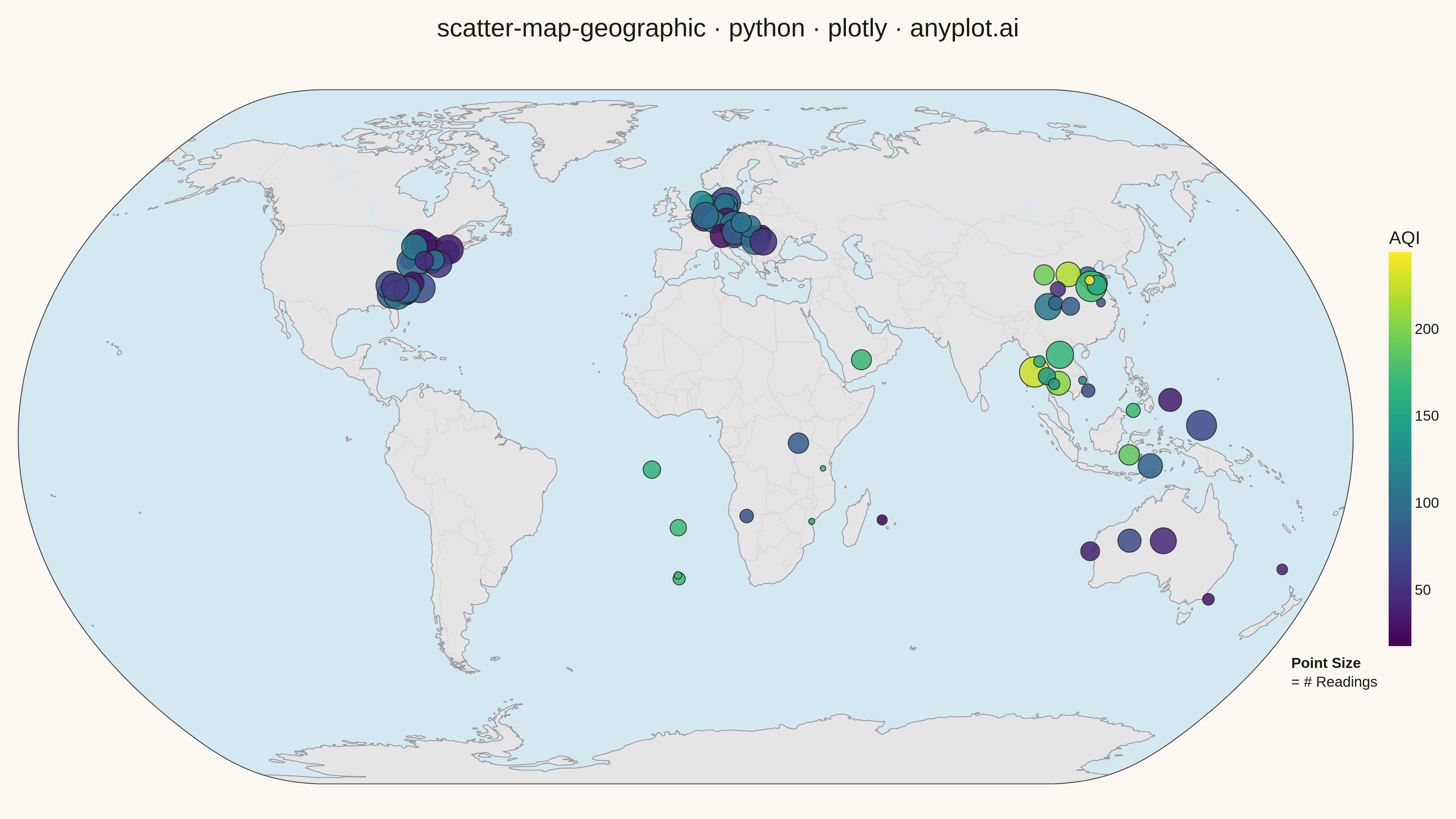
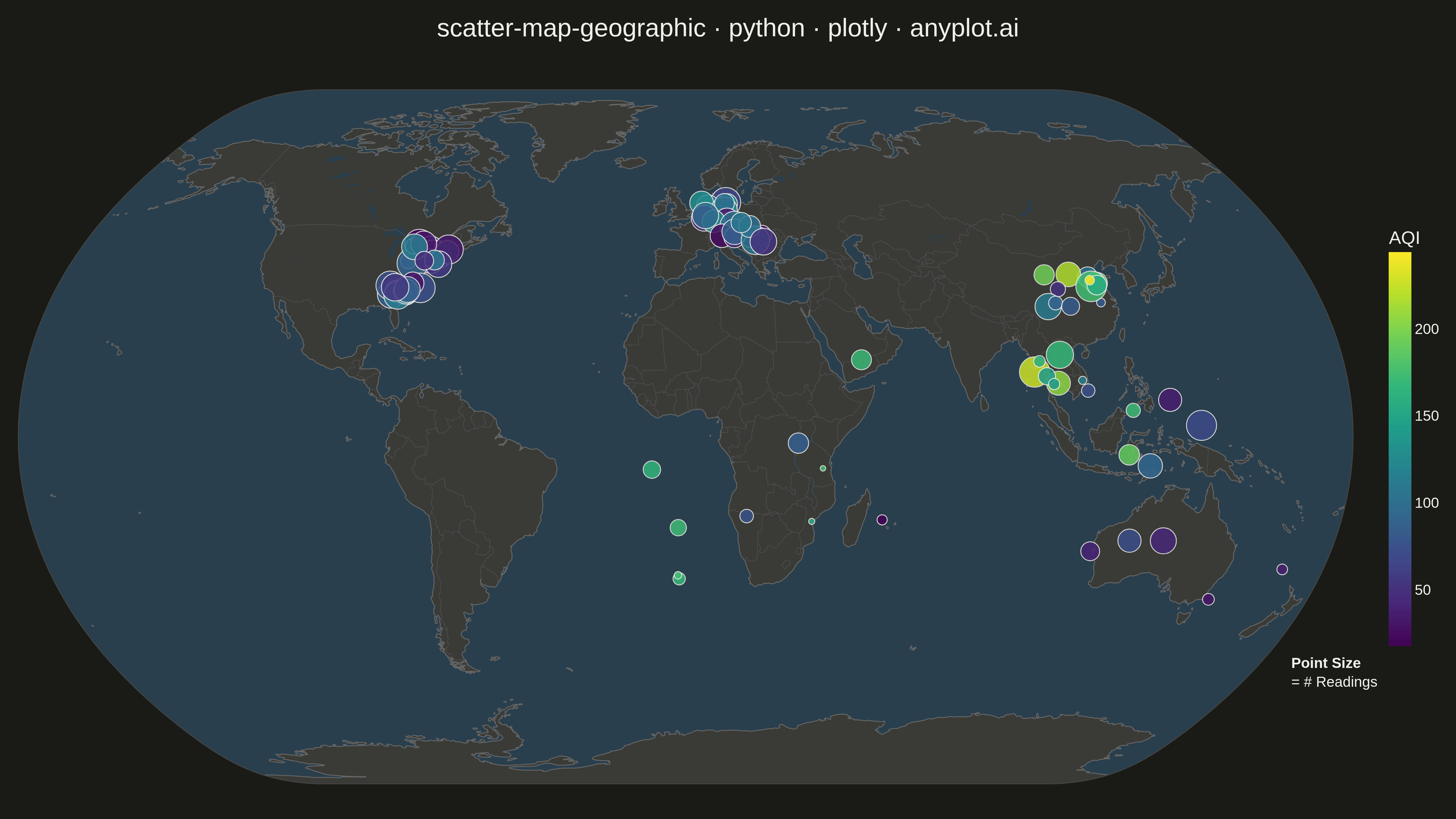
A geographic scatter plot that displays data points on a world or regional map, with each point positioned by its latitude and longitude coordinates. This visualization is ideal for showing spatial distributions of events, locations, or measurements across geographic areas. Points can optionally encode additional variables through size and color, enabling multi-dimensional geographic analysis at a glance.
""" anyplot.ai
scatter-map-geographic: Scatter Map with Geographic Points
Library: plotly 6.7.0 | Python 3.13.13
Quality: 91/100 | Updated: 2026-05-18
"""

import os

import numpy as np
import plotly.graph_objects as go


# Theme tokens
THEME = os.getenv("ANYPLOT_THEME", "light")
PAGE_BG = "#FAF8F1" if THEME == "light" else "#1A1A17"
INK = "#1A1A17" if THEME == "light" else "#F0EFE8"
INK_SOFT = "#4A4A44" if THEME == "light" else "#B8B7B0"
LAND_COLOR = "#E5E5E5" if THEME == "light" else "#3A3A36"
OCEAN_COLOR = "#D4E8F2" if THEME == "light" else "#2A3F4D"
COAST_COLOR = "#999999" if THEME == "light" else "#666666"
COUNTRY_COLOR = "#CCCCCC" if THEME == "light" else "#555555"

# Data: Global environmental sensor network monitoring air quality
np.random.seed(42)

# Sensor locations distributed across continents
# Urban and industrial regions with higher sensor density
n_points = 85

# North America - Eastern US industrial corridor
n_na = 25
na_lat = np.concatenate(
    [
        np.random.uniform(40, 45, 15),  # Northeast corridor
        np.random.uniform(32, 38, 10),  # Southeast
    ]
)
na_lon = np.concatenate(
    [
        np.random.uniform(-82, -70, 15),  # Northeast
        np.random.uniform(-85, -75, 10),  # Southeast
    ]
)

# Europe - Industrial centers
n_eu = 20
eu_lat = np.concatenate(
    [
        np.random.uniform(50, 55, 10),  # Central Europe
        np.random.uniform(45, 50, 10),  # Mediterranean
    ]
)
eu_lon = np.concatenate(
    [
        np.random.uniform(5, 15, 10),  # Central Europe
        np.random.uniform(10, 25, 10),  # Mediterranean
    ]
)

# Asia - Rapid development zones
n_asia = 25
asia_lat = np.concatenate(
    [
        np.random.uniform(30, 40, 12),  # China, India
        np.random.uniform(10, 20, 8),  # Southeast Asia
        np.random.uniform(-10, 10, 5),  # Indonesia
    ]
)
asia_lon = np.concatenate(
    [
        np.random.uniform(100, 120, 12),  # China, India
        np.random.uniform(95, 110, 8),  # Southeast Asia
        np.random.uniform(110, 140, 5),  # Indonesia
    ]
)

# Africa - Growing urban centers
n_africa = 10
africa_lat = np.random.uniform(-35, 20, n_africa)
africa_lon = np.random.uniform(-20, 55, n_africa)

# Australia-Pacific
n_pac = 5
pac_lat = np.random.uniform(-40, -15, n_pac)
pac_lon = np.random.uniform(110, 180, n_pac)

# Combine all data
latitudes = np.concatenate([na_lat, eu_lat, asia_lat, africa_lat, pac_lat])
longitudes = np.concatenate([na_lon, eu_lon, asia_lon, africa_lon, pac_lon])

# Air quality index (AQI) values scaled 0-500 (higher = worse air)
aqi_values = np.concatenate(
    [
        np.random.uniform(20, 120, n_na),  # North America - moderate
        np.random.uniform(25, 140, n_eu),  # Europe - moderate to high
        np.random.uniform(30, 250, n_asia),  # Asia - wide range
        np.random.uniform(15, 180, n_africa),  # Africa - growing industrial
        np.random.uniform(20, 80, n_pac),  # Pacific - cleaner
    ]
)

# Measurement counts (number of readings per sensor in the last month)
measurement_counts = np.concatenate(
    [
        np.random.uniform(15, 30, n_na),
        np.random.uniform(20, 30, n_eu),
        np.random.uniform(10, 30, n_asia),
        np.random.uniform(8, 25, n_africa),
        np.random.uniform(12, 28, n_pac),
    ]
)

# Scale point sizes based on measurement counts
sizes = (measurement_counts - measurement_counts.min()) / (
    measurement_counts.max() - measurement_counts.min()
)
sizes = sizes * 28 + 6  # Scale to 6-34 range for visibility

# Create hover text
hover_texts = [
    f"AQI: {aqi:.0f}<br>Readings: {count:.0f}"
    for aqi, count in zip(aqi_values, measurement_counts, strict=True)
]

# Create figure with geographic scatter
fig = go.Figure()

fig.add_trace(
    go.Scattergeo(
        lat=latitudes,
        lon=longitudes,
        mode="markers",
        marker={
            "size": sizes,
            "color": aqi_values,
            "colorscale": "Viridis",
            "colorbar": {
                "title": {"text": "AQI", "font": {"size": 20}},
                "tickfont": {"size": 16},
                "len": 0.6,
                "thickness": 25,
                "x": 1.02,
            },
            "line": {"width": 1, "color": INK},
            "opacity": 0.85,
        },
        text=hover_texts,
        hovertemplate="<b>Lat:</b> %{lat:.2f}°<br><b>Lon:</b> %{lon:.2f}°<br>%{text}<extra></extra>",
    )
)

# Layout with geographic projection
fig.update_layout(
    title={
        "text": "scatter-map-geographic · python · plotly · anyplot.ai",
        "font": {"size": 28, "color": INK},
        "x": 0.5,
        "xanchor": "center",
    },
    geo={
        "projection_type": "natural earth",
        "showland": True,
        "landcolor": LAND_COLOR,
        "showocean": True,
        "oceancolor": OCEAN_COLOR,
        "showcoastlines": True,
        "coastlinecolor": COAST_COLOR,
        "coastlinewidth": 1,
        "showcountries": True,
        "countrycolor": COUNTRY_COLOR,
        "countrywidth": 0.5,
        "showlakes": True,
        "lakecolor": OCEAN_COLOR,
        "bgcolor": PAGE_BG,
    },
    paper_bgcolor=PAGE_BG,
    plot_bgcolor=PAGE_BG,
    margin={"l": 20, "r": 100, "t": 80, "b": 20},
    font={"color": INK},
)

# Add size legend annotation
fig.add_annotation(
    x=1.02,
    y=0.15,
    xref="paper",
    yref="paper",
    text="<b>Point Size</b><br>= # Readings",
    showarrow=False,
    font={"size": 16, "color": INK},
    align="left",
)

# Save as PNG and HTML
script_dir = os.path.dirname(os.path.abspath(__file__))
fig.write_image(
    os.path.join(script_dir, f"plot-{THEME}.png"), width=1600, height=900, scale=3
)
fig.write_html(os.path.join(script_dir, f"plot-{THEME}.html"), include_plotlyjs="cdn")
Runnable source as JSON, for any HTTP client: https://api.anyplot.ai/specs/scatter-map-geographic/plotly/code. Any spec id and library id listed in llms-full.txt fit the same URL shape; every URL below is complete and callable.
{
  "spec_id": "scatter-map-geographic",
  "language": "python",
  "library": "plotly",
  "page": "https://anyplot.ai/scatter-map-geographic/python/plotly",
  "hub": "https://anyplot.ai/scatter-map-geographic",
  "code_json": "https://api.anyplot.ai/specs/scatter-map-geographic/plotly/code",
  "spec_json": "https://api.anyplot.ai/specs/scatter-map-geographic",
  "render_light_png": "https://storage.googleapis.com/anyplot-images/plots/scatter-map-geographic/python/plotly/plot-light.png",
  "render_dark_png": "https://storage.googleapis.com/anyplot-images/plots/scatter-map-geographic/python/plotly/plot-dark.png",
  "interactive_light_html": "https://storage.googleapis.com/anyplot-images/plots/scatter-map-geographic/python/plotly/plot-light.html",
  "interactive_dark_html": "https://storage.googleapis.com/anyplot-images/plots/scatter-map-geographic/python/plotly/plot-dark.html",
  "quality_score": 91.0,
  "license": "MIT",
  "guide": "https://anyplot.ai/llms.txt"
}
Part of Scatter Map with Geographic Points on anyplot.ai.